Specialist Subscription Box Services Pricing & Packages Website Template
Unbox is a luxe, overlap-style landing page template built for mystery box subscription brands. It features a stacked tier showcase header, scroll-driven past-box exhibitions, and a pinned upgrade call to action. The design pairs deep matte black with electric fuchsia and serotonin yellow to create a premium unboxing experience that moves browsers toward upgrading their subscription.
by Rocket studio
Quick summary
Unbox is a single-page subscription landing page template designed to showcase mystery box tiers, build desire through curated past-box reveals, and convert casual browsers into paying or upgrading subscribers. It uses an overlap and layered visual style, a bold Luxe Minimal palette, and a persistent upgrade call to action to keep momentum from the first scroll to the final purchase decision.
Who this template is for
This template is built for brands that sell monthly subscription boxes and need a page that does more than list features. It suits founders, marketers, and creative teams who want the page itself to feel like an experience, not a brochure.
- Subscription box businesses wanting to upsell existing basic-tier subscribers to higher plans
- Gift-box brands targeting buyers who want a standout present without picking individual items
- Curated product brands aiming to build taste-led trust with impulse-driven millennial shoppers
What problem this template solves
Most subscription box pages describe the product instead of making the visitor feel it. Browsers leave unconvinced because they cannot picture what arrives at their door or whether the value justifies the cost.
- Visitors cannot visualize what is inside the box, so they hesitate and bounce
- Basic subscribers have no clear reason to upgrade when tier differences are buried in text
- Gift-buyers need a fast emotional hook and a lateral purchase path, not a standard checkout flow
What you get with this template
You get a fully structured, single-page layout built around three conversion moments: the initial tier-stacking header, the scroll-driven collection exhibition, and the final value-reveal section. Every section is designed to move the visitor one step closer to clicking upgrade.
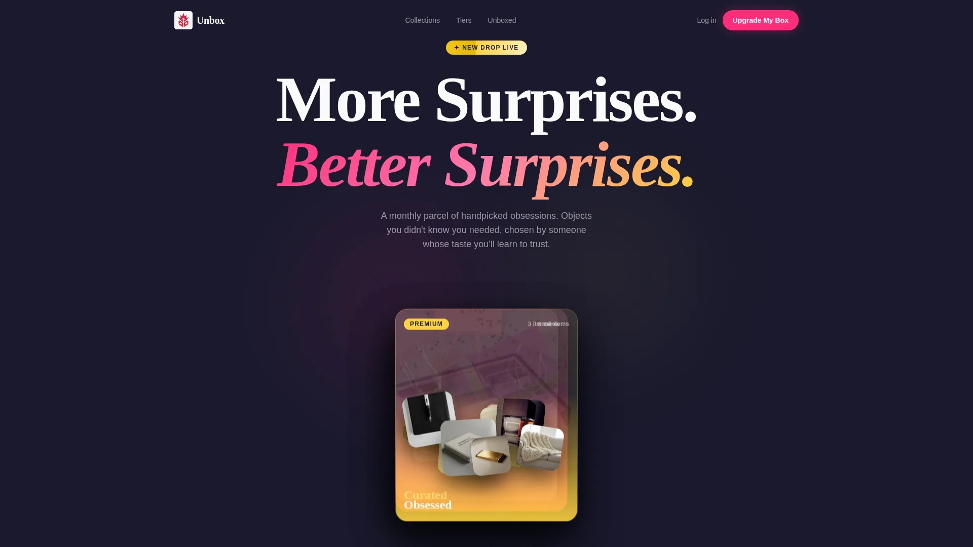
- A stacked, overlapping header showcasing three subscription tiers with real product photography spilling out of each box
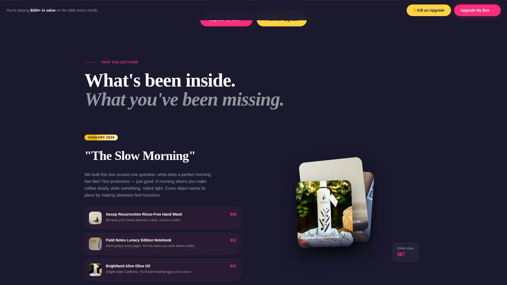
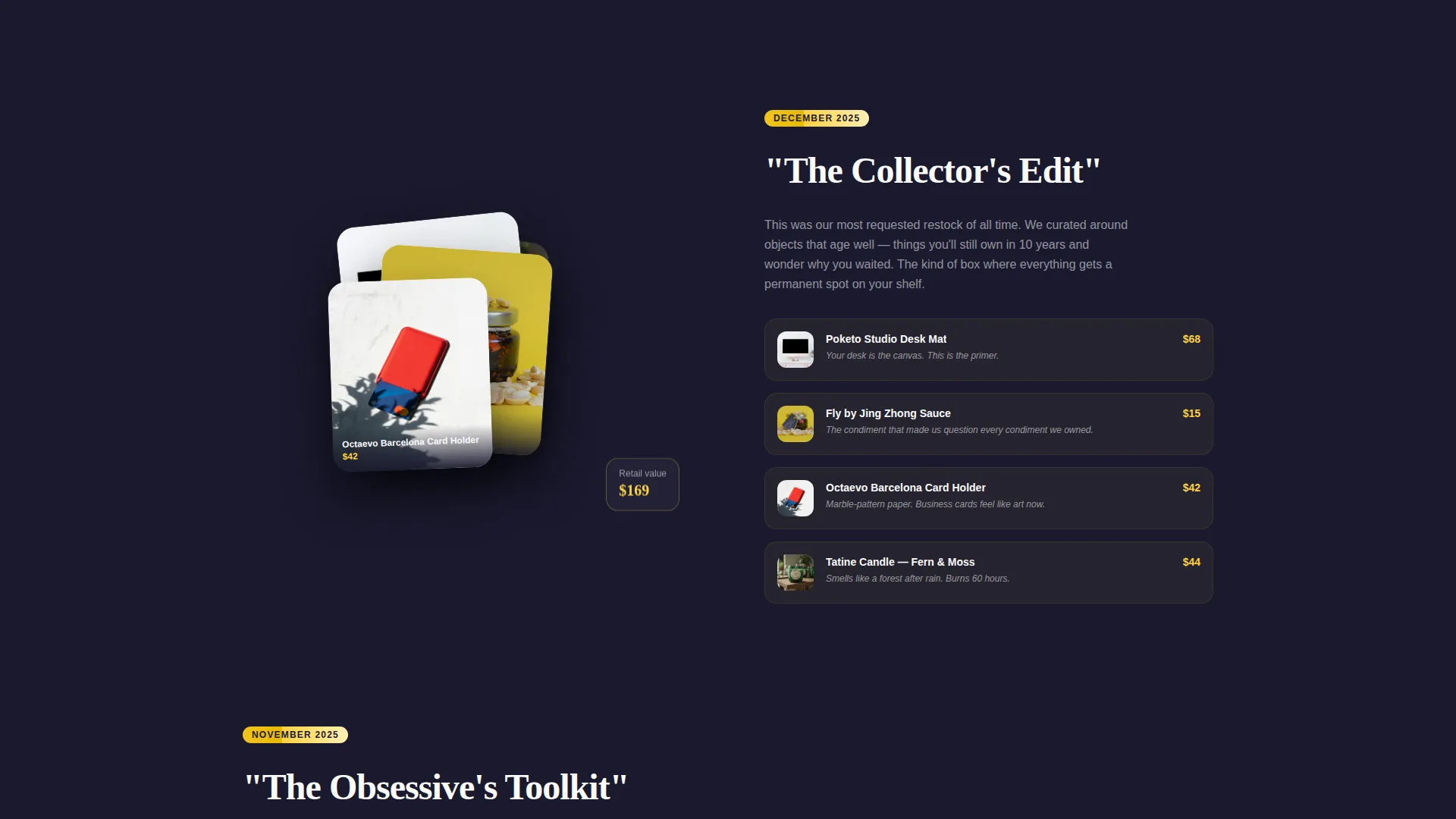
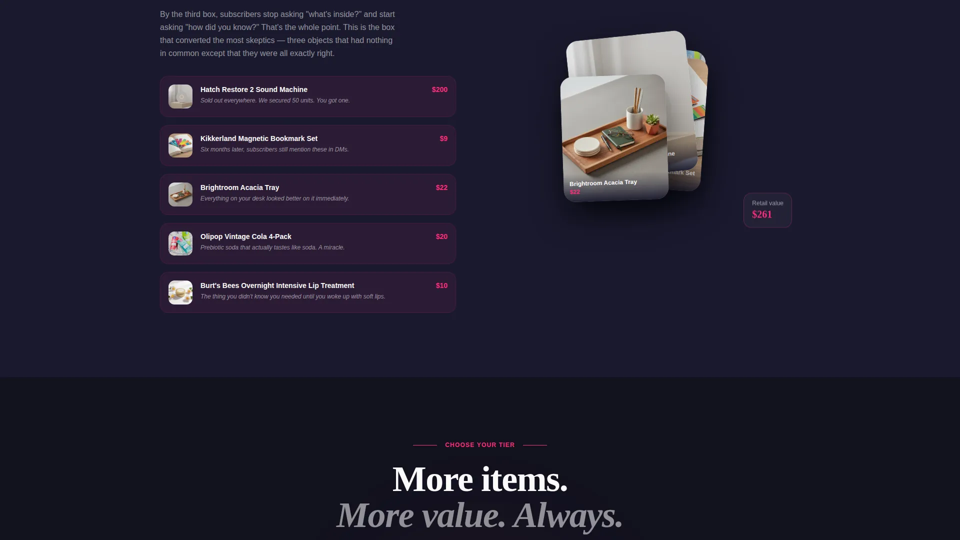
- A scrollable past-box exhibition with layered cards, individual item reveals, and curator notes explaining each product choice
- A mid-page tier comparison strip with toggleable item counts, exclusive perks, and retail-versus-subscription value breakdowns
Feature list
This template delivers six distinct design and layout features drawn directly from the brief. Each one serves a specific role in building desire and reducing hesitation.
Stacked Tier Header with Parallax Drift
Three subscription boxes are physically stacked and angled like opened gift boxes viewed from above. The base box shows three items, the mid-tier reveals five, and the premium tier overflows with eight-plus objects. A slow parallax drift separates the layers as the page loads, and the headline "More Surprises. Better Surprises." sits in clean white type across the negative space between boxes.
Scroll-Driven Past-Box Exhibitions
Each past box is presented as a museum-style exhibition. Layered cards overlap and reveal individual items one by one as the visitor scrolls. Brief curator notes explain the reasoning behind each product choice. Visual density increases section by section, building a sense of overflow and delight that mirrors the actual unboxing experience.
Pinned Upgrade Call to Action
After the first scroll, a fuchsia "Upgrade My Box" button pins to the bottom of the viewport and stays visible throughout the session. This keeps the primary action accessible at every point in the page without interrupting the reading flow.
Interactive Tier Comparison Strip
A mid-page toggle strip lets visitors switch between subscription tiers. Each tier displays item counts, exclusive perks, and a breakdown of past-box retail value versus the monthly subscription cost. The math is visible, direct, and designed to make the value gap obvious.
Dual Call-to-Action Architecture
Two calls to action serve two different buyer types. The primary "Upgrade My Box" button in electric fuchsia targets existing subscribers. The secondary "Gift an Upgrade" button in serotonin yellow catches lateral gift-buyers browsing for someone else.
Full Premium Unbox Reveal Section
The final section presents one past premium box fully unboxed. Every item is named and priced. The total retail value appears in large type beside the monthly subscription cost. No persuasion copy is needed because the numbers do the work.
Page sections overview
| Section | Purpose |
|---|---|
| Stacked Tier Header | Introduce all three subscription tiers with overlapping product photography and parallax layering |
| Past Box Exhibition | Build taste-led trust through scrollable, layered card reveals of previous curated boxes |
| Tier Comparison Strip | Let visitors toggle between tiers and see item counts, perks, and value breakdowns side by side |
| Gift Upgrade call to action | Capture lateral gift-buyers with a yellow secondary call to action alongside the primary upgrade button |
| Premium Unbox Reveal | Close with a fully itemized past premium box showing retail value versus monthly cost in large type |
Design & branding system
The visual identity follows a Luxe Minimal theme built on a Dopamine Pop color system. The palette restrains itself to four roles: black commands the background, white holds all body typography, fuchsia directs attention to actions, and yellow rewards interaction like a scratch-off moment.
- Deep matte black (#1A1A2E) dominates backgrounds to create a premium gallery atmosphere
- Electric fuchsia (#FF2D7B) drives primary accents, hover states, and the pinned upgrade button
- Serotonin yellow (#FFD23F) activates badges, upgrade tags, the gift call to action, and micro-animations
Mobile & speed optimization
The overlap and layered layout is structured to translate cleanly to smaller screens without losing the stacked visual hierarchy that makes the tier header work. Scroll-triggered card reveals and the pinned call to action are designed to function naturally on touch devices.
- Layered tier cards reflow for vertical mobile viewports while preserving the stacked depth effect
- The pinned "Upgrade My Box" button remains accessible at the bottom of the screen on all device sizes
- Micro-animations tied to serotonin yellow badges are kept lightweight to avoid disrupting the scroll experience
How this template helps you convert
The page is built around a single conversion goal: move the visitor from browsing to upgrading. Every layout decision reduces hesitation and increases perceived value.
- The stacked header makes tier differences immediately visual, so visitors grasp the upgrade value before reading a single word of copy.
- The scroll-driven past-box exhibitions build trust gradually, so by the third collection reveal the visitor is emotionally invested rather than skeptical.
- The final premium unbox section removes price objections by showing exact retail value against the subscription cost, letting the math close the sale.
Other information about this template
This template is part of the Overlap and Layered template style category inside the Subscription Box Services section of the marketplace. It is specifically suited to brands in the curated retail and gifting space.
- Template style: Overlap and Layered, with a Luxe Minimal theme and Dopamine Pop color system
- Creative direction: Curated Collection, with scroll-driven depth and increasing visual density through the page
- The layout is single-page and section-led, making it a focused landing page rather than a multi-page site
- Suitable for brands selling lifestyle, gift, or curated product subscriptions to millennial and gift-buyer audiences
Theme
Neo-Retro
Creative direction
Curated Collection
Color system
Lavender Dream
Style
Overlap/Layered
Direction
Marketplace/Multi
Page Sections
Stacked Tier Header with Parallax Drift
Scroll-driven Past-box Exhibitions
Pinned Upgrade Call to Action
Interactive Tier Comparison Strip
Dual Call-to-action Architecture
Full Premium Unbox Reveal
Related questions
Can I use this template if I only have one subscription tier?
Does the template include real product photography?
How does the page build trust without written testimonials?
Can the comparison strip be set to show one tier by default?
Is this template suitable for gift-box brands as well as subscriber upsell pages?



