Seasonal Decorations Subscription Landing Page Template
Unbox is a seasonal decorations subscription landing page built for curated box brands. It features a full-viewport UGC photo wall header, modular season-card clusters with flip interactions, a three-tier subscription comparison row, and an upsell-focused conversion flow. The Lavender Dream color system and wisteria serif typography give it a warm, editorial feel that matches the product's boutique character.
by Rocket studio
Quick summary
Unbox is a single-page template designed for a quarterly seasonal decorations subscription box. It opens with a masonry photo wall of real subscriber homes, flows through modular season collection cards, and closes with a smooth upgrade path for existing subscribers. Every section is styled in a soft Lavender Dream palette that feels editorial, not commercial.
Who this template is for
This template is built for subscription box brands that sell home decor, seasonal styling, or curated gift crates. It works equally well for new launches and for teams sending upgrade emails to an existing subscriber base.
- Subscription box founders selling seasonal home decorations four times a year
- E-commerce brands targeting apartment renters, busy professionals, and tradition-building families
- Marketers running upsell or upgrade campaigns to current subscribers via email links
What problem this template solves
Seasonal decoration brands often struggle to communicate the feel of a physical product through a digital page. Generic store layouts do not capture the tactile, gift-like experience that makes a subscription box worth paying for repeatedly.
- Visitors cannot visualize what arrives in the box, so they hesitate to commit
- Existing subscribers have no clear, frictionless path to upgrade their current plan
- Most landing pages ask for a decision before showing the full value of what is inside the box
What you get with this template
You get a fully structured, single-page layout built around the unboxing experience. Every section is purposeful, moving the visitor from discovery through desire to a confident click.
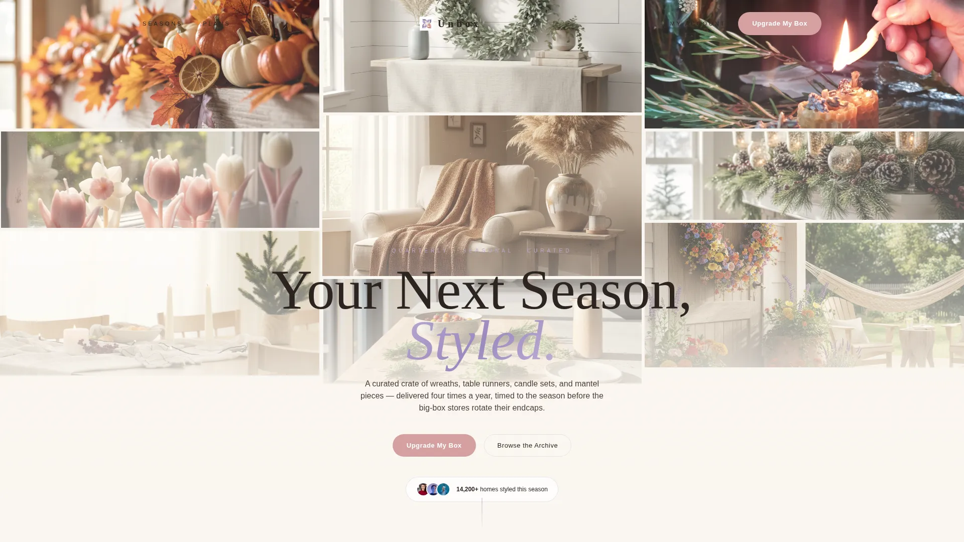
- A full-viewport UGC photo wall header with slow parallax animation and a translucent cream headline overlay
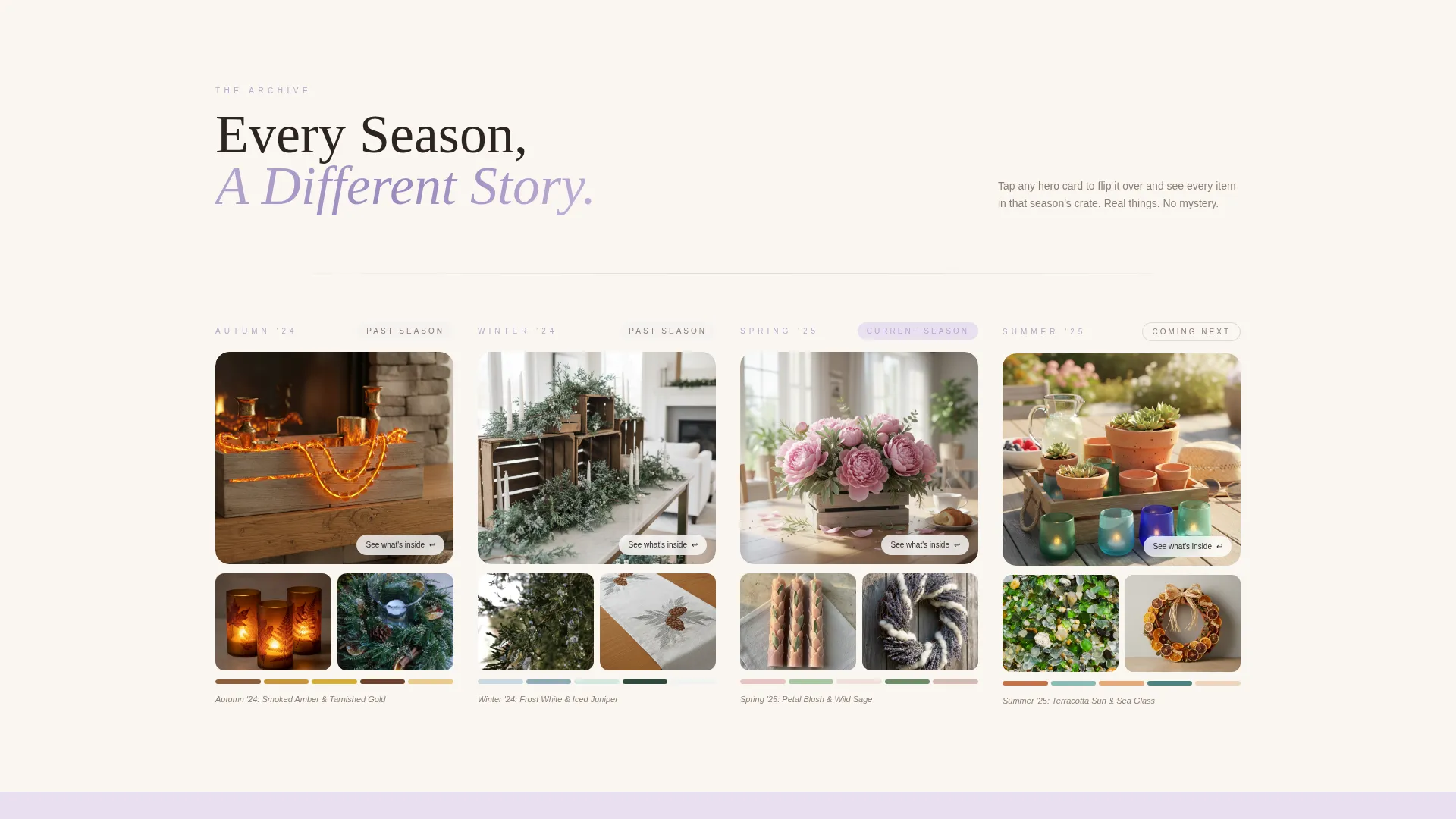
- Modular season card clusters that fan out like a mood board, with flip interactions revealing full item lists
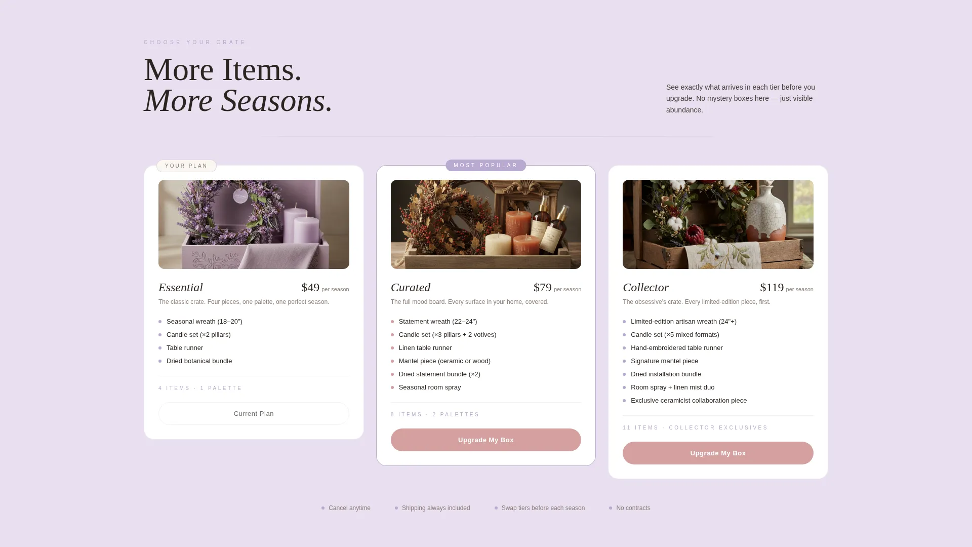
- A three-tier subscription comparison row, a sneak-peek frosted-glass reveal section, and a pinned upsell call-to-action flow
Feature list
This template delivers a set of carefully considered components that serve both new visitors and returning subscribers.
UGC Photo Wall Header
A masonry grid of warm-graded subscriber photos fills the entire viewport edge to edge. Images animate in a slow parallax drift. A translucent cream overlay carries the headline "Your Next Season, Styled" in wisteria serif type.
Modular Season Card Clusters
Each seasonal box gets its own card cluster: a hero product shot, two detail close-ups, a color-swatch strip, and a one-line editorial note. Cards flip on tap or click to reveal the full item list for that season.
Subscription Tier Comparison Row
Three side-by-side cards display each subscription plan clearly. A subtle glow highlights the recommended tier. The subscriber's current plan is pre-highlighted, reducing friction for anyone arriving from an email link.
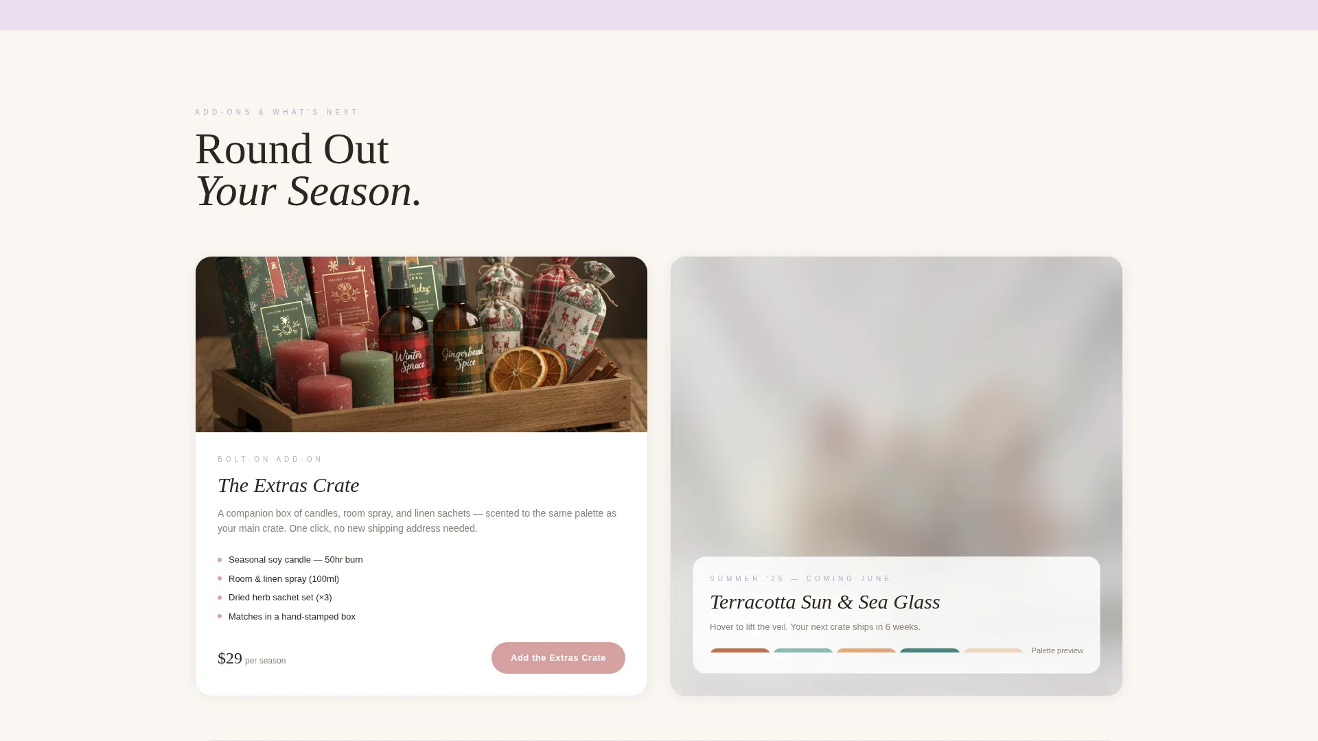
Frosted-Glass Sneak Peek
The final card cluster previews next season's box behind a frosted-glass blur effect. The blur sharpens on hover, rewarding curiosity and building anticipation before the next shipment.
Pinned Upsell Call-to-Action
A dusty rose "Upgrade My Box" button is pinned to the base of the tier comparison section. A secondary "Add the Extras Crate" option lets subscribers bolt on a companion candle and room spray add-on without leaving the page.
Pre-Filled Checkout Flow
Returning subscribers only need to select a new tier and confirm. Shipping and billing fields are pre-filled, removing the main point of friction in any upgrade decision.
Page sections overview
| Section | Purpose |
|---|---|
| UGC Photo Wall | Open with real subscriber homes to build social proof instantly |
| Headline Overlay | Deliver the brand promise over the photo grid with minimal distraction |
| Autumn Season Cards | Showcase the Autumn box contents through a flippable mood-board cluster |
| Winter Season Cards | Present the Winter box with hero shot, close-ups, and color swatch |
| Spring Season Cards | Display the Spring box editorial spread and item reveal on flip |
| Summer Season Cards | Complete the four-season archive with Summer palette and products |
| Tier Comparison Row | Let visitors compare all three subscription plans side by side |
| Extras Crate Offer | Introduce the companion add-on box with a secondary call-to-action |
| Sneak Peek Cluster | Tease next season behind a frosted blur that sharpens on hover |
| Upgrade call to action Strip | Pin the primary "Upgrade My Box" button for returning subscribers |
Design & branding system
The Lavender Dream color system creates a mood that feels like a dried flower arrangement pressed inside a linen-bound journal. Every color has a specific structural role on the page, so the visual hierarchy is always clear without needing heavy borders or drop shadows.
- Warm linen cream (#FAF6F0) dominates the background; pale lilac mist (#E8DFF0) separates card clusters; soft wisteria (#B8A9D0) anchors headings and section dividers
- Dusty rose (#D4A0A0) is reserved for every interactive surface: buttons, hover states, and active card outlines
- Typography uses a wisteria-toned serif for display headings, creating a tactile editorial contrast against the cream background
Mobile & speed optimization
The card grid layout is modular, so it collapses cleanly into a single-column scroll on smaller screens. Flip interactions and hover effects adapt to tap gestures on touch devices.
- Masonry photo wall re-stacks responsively so every home image remains visible and well-framed on mobile
- Tier comparison cards shift from a three-column row to a vertically stacked swipeable layout on narrow viewports
- The pinned "Upgrade My Box" button stays anchored at the bottom of the screen on mobile for easy one-thumb access
How this template helps you convert
The page is designed around a single insight: people buy what they can already picture in their home. Every layout decision removes doubt before asking for a commitment.
- Showing every item in the upgraded box before presenting the button means visitors arrive at the call-to-action with full information, not a leap of faith.
- Pre-filling shipping and billing details for returning subscribers reduces the steps between "I want this" and "I clicked confirm" to a single tap.
- The frosted sneak-peek section creates a specific reason to upgrade now rather than waiting, because the next season's items are visible but just out of reach.
Other information about this template
This template is categorized under Retail and E-Commerce, specifically within the Seasonal Decorations Store subcategory. It follows a Directory and Discovery theme with a Curated Collection creative direction, making it well-suited for brands that want their store to feel like a carefully edited editorial feed rather than a standard product catalogue.
- The template style is Scroll Reveal with progressive content disclosure, meaning richer detail appears as the visitor moves down the page
- The landing page direction is set for a multi-tier marketplace layout, making it practical for brands with more than one subscription option
- The intersection match score for this template against the Seasonal Decorations Dropshipping Store niche is 9 out of 10, reflecting strong alignment between the layout structure and the product category
Theme
Directory & Discovery
Creative direction
Curated Collection
Color system
Dopamine Pop
Style
Scroll Reveal (Progressive)
Direction
Marketplace/Multi
Page Sections
UGC Photo Wall Header
Modular Season Card Clusters
Three-tier Subscription Comparison
Frosted-glass Sneak Peek
Pinned Upsell Call-to-action
Related questions
Who is this landing page template best suited for?
Can I use this template for a new subscription launch as well as upsell campaigns?
How does the flip card interaction work?
What makes the frosted sneak-peek section effective?
Can the color palette and typography be customized?



