Outdoor Subscription Box Landing Page Template
Unbox is a masonry-style outdoor subscription box landing page built around the thrill of discovery. It pairs a bold price-anchored header with a Pinterest-style product grid, looping unboxing video interstitials, and a persistent call-to-action that routes visitors straight to checkout. The Citrus Burst palette and Surprise and Delight layout make every scroll feel like tearing into a new crate.
by Rocket studio
Quick summary
Unbox is a single-page subscription box landing page for sports and outdoor brands. It uses a masonry grid, price-contrast header, and looping video breaks to turn passive scrollers into confident buyers. The design feels tactile and spontaneous, like rummaging through gear at a campsite swap, and every scroll reinforces the value gap between retail prices and the monthly subscription cost.
Who this template is for
This template is built for outdoor subscription box brands that sell the thrill of discovery, not just gear. It works best when the product line is curated, eclectic, and genuinely hard to find on mainstream retail shelves.
- Subscription box founders in the sports and outdoor niche who want to lead with curation credibility
- E-commerce operators who need a high-impact click-through page without a built-in checkout form
- Marketing teams who have strong product photography and past box content ready to deploy
What problem this template solves
Most subscription box pages rely on generic hero images and vague promises. Visitors leave before they understand what they are actually paying for. This template solves that by stacking concrete proof, one product at a time, until the subscription price feels like an obvious win.
- Visitors struggle to visualize what a mystery box actually contains, so trust stays low
- Retail-versus-subscription price comparisons are often buried or missing entirely
- Generic grid layouts make curated products feel mass-produced instead of handpicked
What you get with this template
You get a fully structured, single-page landing page layout built specifically for outdoor subscription box marketing. Every section has a defined job: attract, prove value, and route the click.
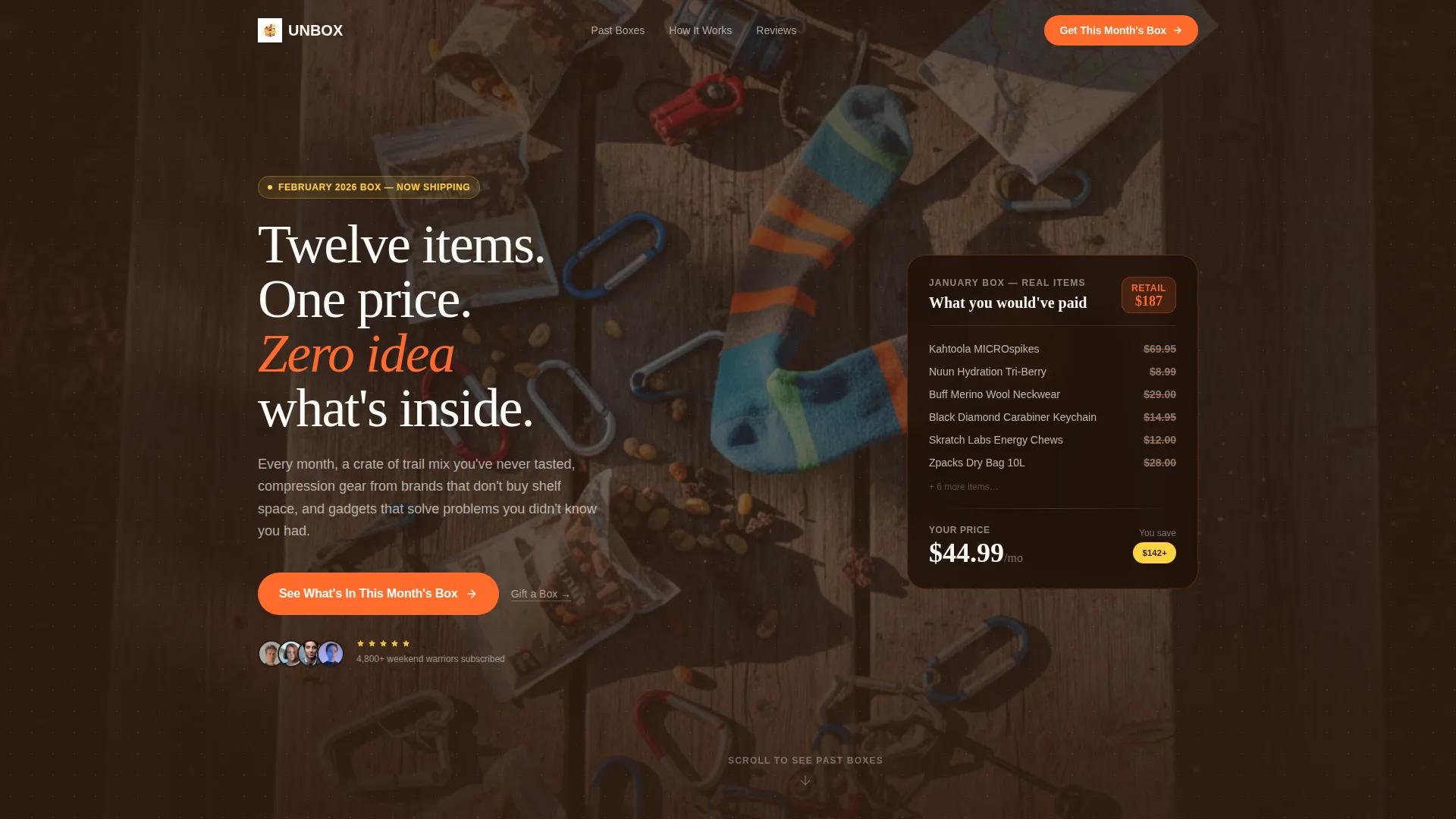
- A price-anchored hero header with strike-through retail pricing stacked against the subscription cost
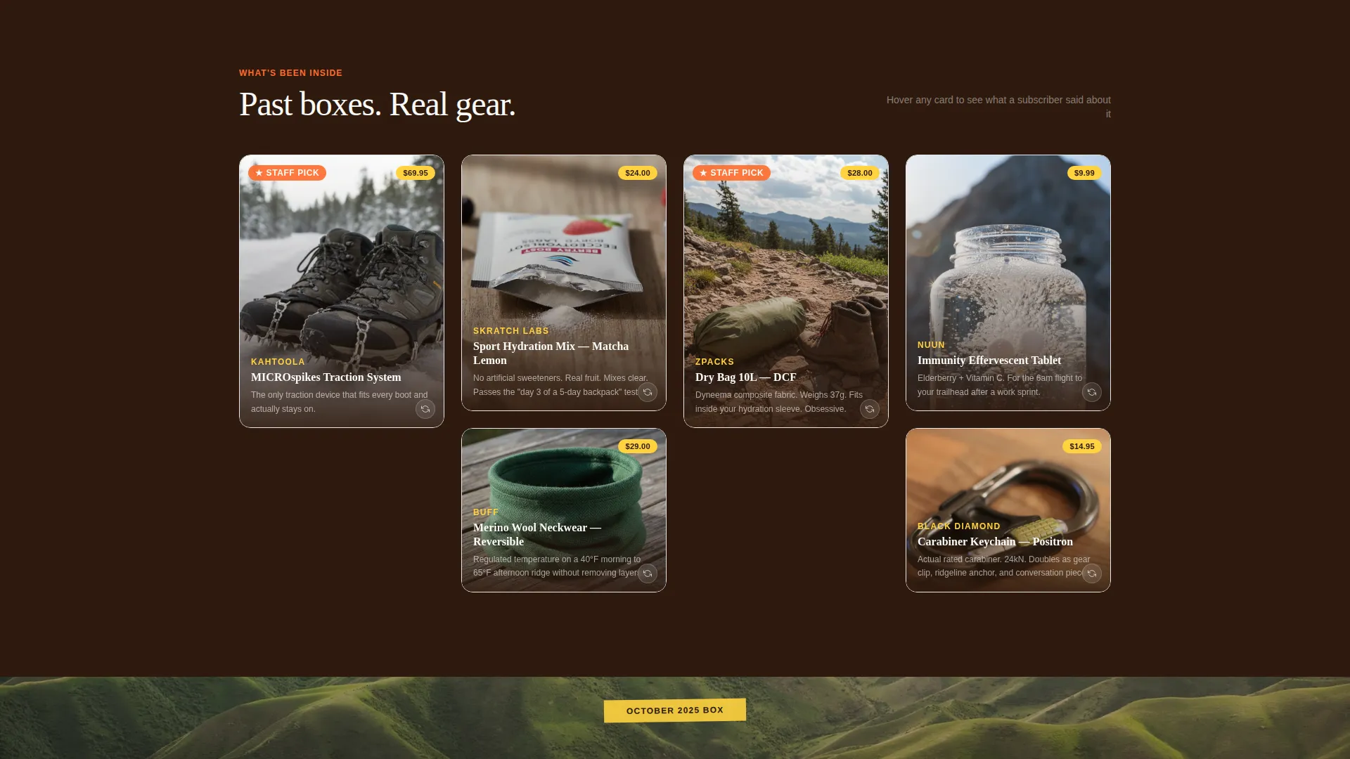
- A variable-height masonry product grid with flip-on-hover cards, retail price badges, and one-line curation notes
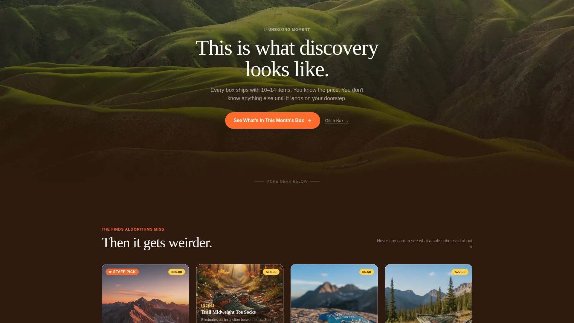
- Full-width video interstitial rows that break the grid every three rows with looping unboxing footage
Feature list
This template ships with a set of purpose-built layout components, each designed around the Surprise and Delight creative direction.
Price-Anchored Hero Header
The header displays individual past-box item prices with strike-through formatting, stacked to show a total retail value, set against the monthly subscription price. A scattered flat-lay photograph of real gear sits beneath the headline, shot from directly above with short noon shadows, making the value contrast impossible to ignore.
Variable-Height Masonry Grid
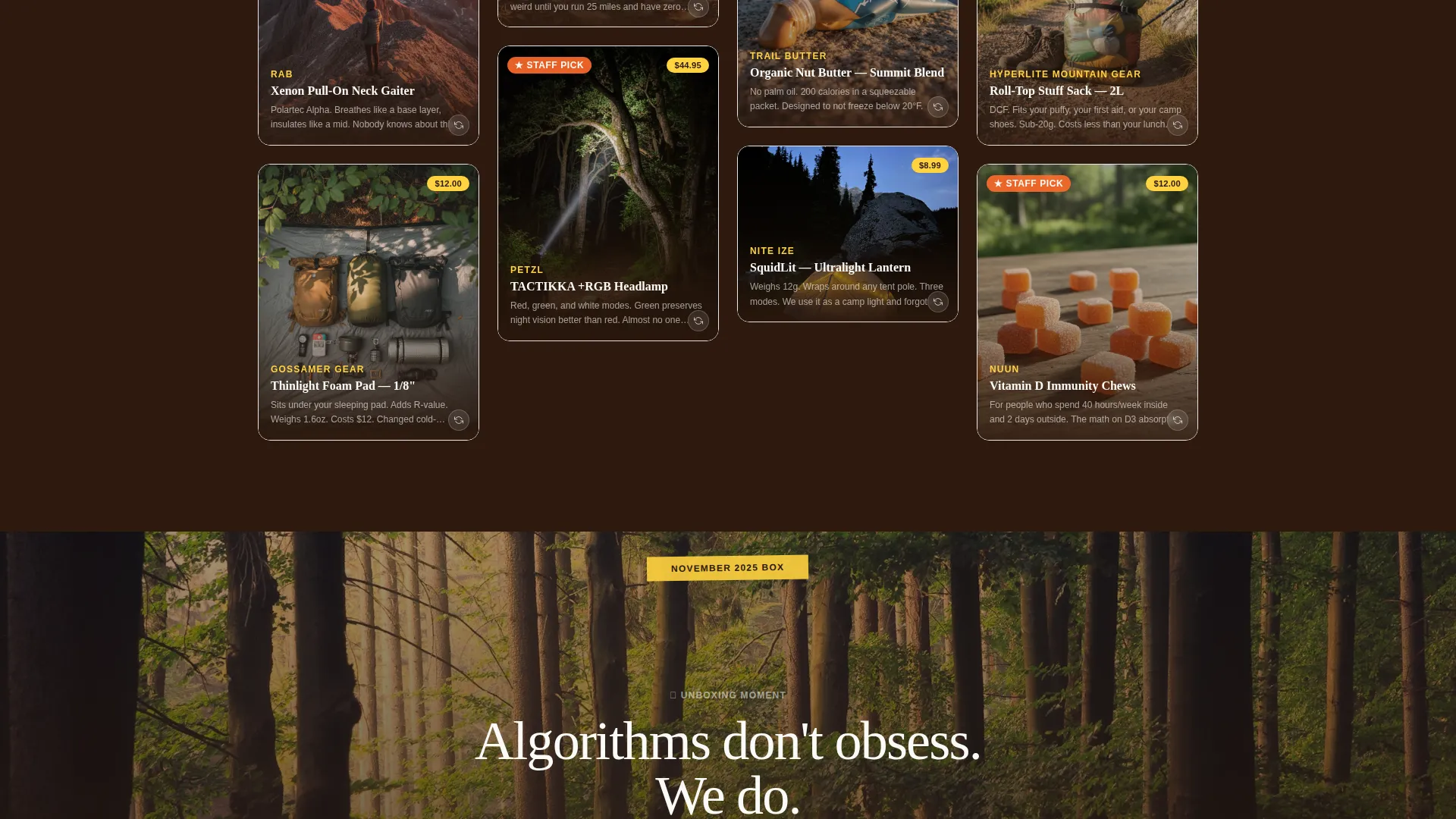
The product grid uses unequal card heights to avoid the catalogued feel of standard e-commerce grids. Tall hero shots sit beside tight detail crops. No two rows read the same way, which keeps the eye moving and the scroll feeling rewarding.
Flip-on-Hover Product Cards
Each grid card shows a product photo, brand name, one-line curation note, and a lemon-yellow retail price badge on the front. On hover, the card flips to reveal a real subscriber quote. This adds social proof without cluttering the visual layout.
Looping Video Interstitials
Every three rows of the masonry grid, a full-width interstitial replaces the cards with a short looping video of someone opening that month's box. Only hands are shown. Reaction audio plays. These breaks reset attention and escalate curiosity as the page deepens.
Persistent Click-Through Call-to-Action
The primary call-to-action button is pinned to the bottom of the viewport on mobile. On desktop, it anchors after the hero header and reappears after every video interstitial. A secondary text link for gifting sits quietly beside it, serving visitors who want to send a box rather than subscribe.
Escalating Curation Narrative
The grid is structured so products get progressively more niche and unexpected as the visitor scrolls deeper. This builds a quiet argument: algorithms cannot replicate what obsessed humans curate. By the time the visitor reaches the final interstitial, the case for subscribing has been made through sheer volume of proof.
Page sections overview
| Section | Purpose |
|---|---|
| Price-Anchored Header | Show retail-versus-subscription value contrast immediately |
| Hero Flat-Lay Photo | Anchor the headline with real product imagery |
| Masonry Product Grid | Display past box items as varied, scrollable proof cards |
| Flip-on-Hover Cards | Add subscriber quotes and retail badges per product |
| Video Interstitial Row | Break the grid with looping unboxing footage every three rows |
| Primary call to action Block | Route the click to checkout after the header and each interstitial |
| Gift a Box Link | Serve existing subscribers looking to gift a crate |
Design & branding system
The Citrus Burst color system drives the entire visual identity. The palette feels like peeling an orange at a trailhead in October: bright and alive against dark earth tones. Every color has a specific functional role so the page reads clearly even at speed.
- Electric tangerine (#FF6B2B) leads all calls-to-action and hover states; squeezed lemon (#FFD23F) marks retail price badges and category tags
- Deep trail-dirt brown (#2E1A0E) anchors all body typography and card borders, giving the page weight and legibility
- Crisp altitude white (#FAFAF7) fills the space between masonry tiles, giving the eye room to breathe between discoveries
Mobile & speed optimization
The pinned mobile call-to-action is the most important mobile-specific layout decision in this template. On smaller screens, the persistent button stays visible throughout the entire scroll, so the conversion path is never more than one tap away.
- The masonry grid adapts to narrower viewports without collapsing into a single uniform column layout
- Video interstitials are formatted to loop inline on mobile without requiring the visitor to tap play manually
How this template helps you convert
This template is built around a single conversion principle: proof before ask. The page earns the click by the time the visitor reaches it, not by pushing the button early.
- The price-anchored header creates an immediate value gap, showing $187 in retail value against a $44.99 subscription price before the visitor scrolls a single pixel
- The masonry grid and video interstitials repeat and deepen that value proof across the full scroll, so by the time the persistent call-to-action button is tapped, the decision already feels made
Other information about this template
This template is categorized under Retail and E-Commerce, specifically within the Sports and Outdoor E-Commerce subcategory. It is designed as a click-through landing page, meaning no purchase form, email capture form, or plan-selection interface lives on this page. All of that happens on a separate checkout page the primary call-to-action routes to.
- The Directory and Discovery theme means the page is built to feel exploratory, like browsing rather than being sold to
- The template style is Masonry and Pinterest-inspired, making it well-suited to brands with rich product photography libraries
- The Surprise and Delight creative direction assumes the brand has genuine curation stories to tell, not just product specs to list
Theme
Directory & Discovery
Creative direction
Surprise & Delight
Color system
Dopamine Pop
Style
Masonry/Pinterest
Direction
Marketplace/Multi
Page Sections
Price-anchored Hero Header
Variable-height Masonry Grid
Flip-on-hover Product Cards
Looping Video Interstitials
Persistent Click-through Call-to-action
Escalating Curation Narrative
Related questions
Does this template include a checkout or subscription form?
How many products should I plan to feature in the masonry grid?
What kind of video content works best for the interstitial rows?
Can I use this template if I only have one past box to show?
Is the Gift a Box option a separate page within the template?



