Underwriter Reviews Website Template
Underwrite is a sidebar companion landing page template built for underwriting desks that want brokers to trust them before submitting a risk. It pairs a persistent case-study navigation rail with a scrollable main column of broker testimonials, showing exactly how ambiguous risks become bound coverage. The result is a trust-first page that converts through proof, not promises.
by Rocket studio
Quick summary
Underwrite is a single-page broker testimonials and case study template designed for underwriting teams. It uses a sidebar navigation rail, a half-page photo header, and a three-act case study narrative structure to show wholesale brokers, managing general agents, and retail agents why this desk deserves their next submission.
Who this template is for
This template is built for underwriting desks that already have a story to tell but no structured page to tell it on. If your team binds complex surplus lines risks and you want brokers to submit more of them, this template gives you the layout to make that case.
- Wholesale brokers managing surplus lines submissions who need confidence before sending a risk
- Program administrators and managing general agents (MGAs) who want consistent appetite signals from an underwriting partner
- Retail agents tired of black-box declinations with no feedback or follow-up
What problem this template solves
Most underwriting desks are invisible to the brokers they could be serving. There is no place where a broker can read real outcomes, hear named voices, or understand how a particular desk thinks about risk. That silence creates friction and lost submissions.
- Brokers have no way to gauge appetite before committing time to a full submission
- Declinations with no explanation erode trust and discourage future business
- A generic contact page cannot communicate the nuance, depth, or decision-making character of an underwriting team
What you get with this template
This template delivers a fully structured, single-page layout that functions as both a social proof engine and a submission driver. Every component is purpose-built for an underwriting audience.
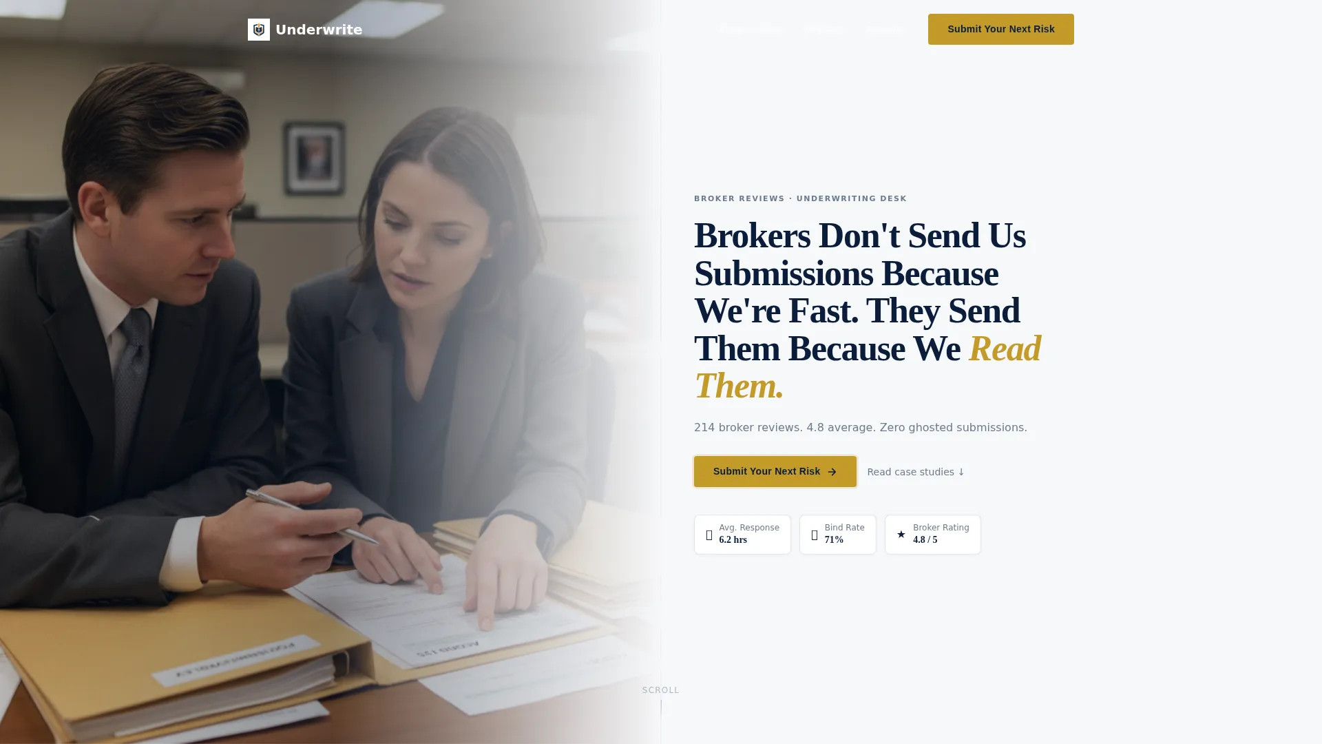
- A half-page photo and text header with a heavy serif headline, a pewter subhead stat line, and a gold call-to-action (call to action) button placed immediately below
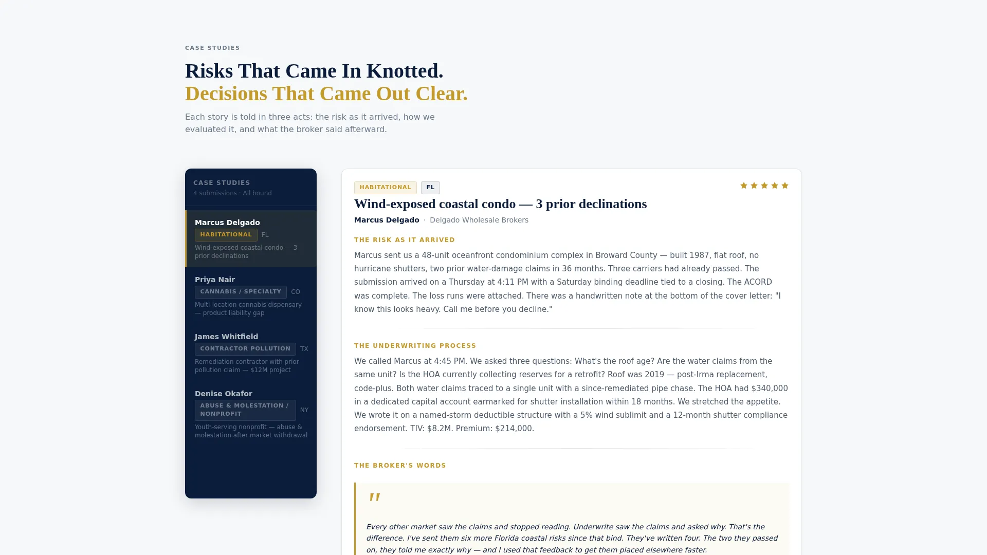
- A persistent sidebar navigation rail listing broker names, line of business, and state so visitors can jump directly to relevant case studies
- Three placed call to action buttons linked to a submission portal, each carrying a UTM source parameter so your team knows exactly where each broker came from
Feature list
This template is built around a small set of components that each carry real weight. Every feature exists to build trust and move a broker toward clicking "Submit Your Next Risk."
Half-Page Photo and Text Header
The header splits the viewport into two equal halves. The left side holds a warmly lit, shallow-depth-of-field photograph showing two professionals mid-conversation across a desk with submission folders and a visible ACORD form. The right side carries a heavy serif headline and a single-line pewter subhead pulling a real performance stat.
Persistent Sidebar Navigation Rail
The sidebar locks into position as the visitor scrolls and lists broker names, line of business, and state. It acts as a casebook index, letting wholesale brokers and MGAs jump directly to the case study most relevant to their own risk profile.
Three-Act Case Study Layout
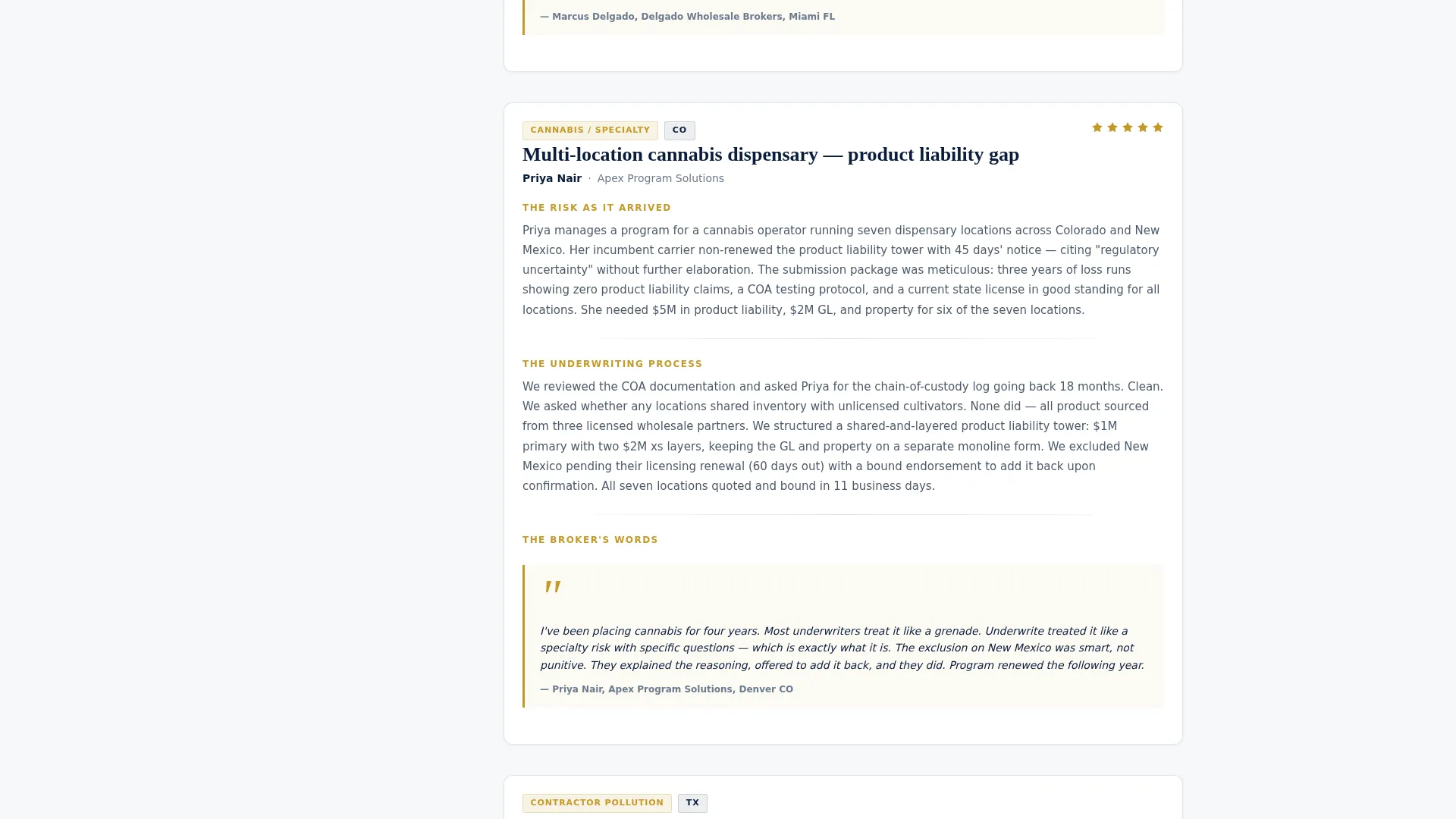
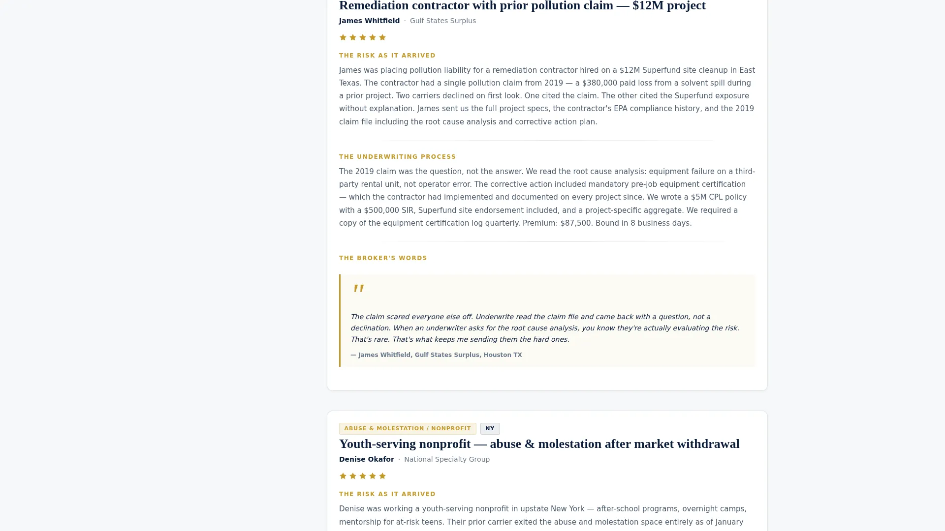
Each case study in the main column unfolds in three structured acts: the risk as it arrived, the underwriting process and questions asked, and the broker's own quoted words about the outcome. This narrative arc builds credibility one story at a time.
Gold call to action Button Placement System
The gold "Submit Your Next Risk" button appears in three deliberate positions: below the header stat line, floating at the sidebar bottom after the third case study, and anchoring a final section that shows current appetite classes and average turnaround time.
Appetite and Turnaround Section
A dedicated closing section displays current appetite classes and average turnaround time alongside the final call to action. It gives brokers the last piece of practical information they need before clicking through to the submission portal.
Star Ratings and Pull-Quote System
Gold star ratings and styled pull-quote marks are built into the case study layout. Named brokers with specific policy details appear alongside each rating, making every claim concrete and traceable rather than generic.
Page sections overview
| Section | Purpose |
|---|---|
| Photo Header | Establishes authority with a candid desk photograph, heavy serif headline, and real performance stat |
| Header call to action | Drives first click with a gold "Submit Your Next Risk" button placed below the stat line |
| Sidebar Navigation Rail | Lets visitors jump between broker case studies by name, line of business, and state |
| Case Study One | Opens the narrative with the first broker story told in a three-act structure |
| Case Study Two | Deepens credibility with a second, more complex risk resolution story |
| Case Study Three | Peaks the case study arc with the most layered story and resolution |
| Floating Sidebar call to action | Captures scroll-depth visitors with a call to action that appears after the third case study |
| Appetite and Turnaround | Shows current appetite classes and average turnaround time before the final call to action |
| Final call to action Anchor | Closes the page with the third gold button linked to the submission portal |
Design & branding system
The visual identity follows a Service Utility theme built around a Navy Authority color system. The palette references the inside cover of a leather-bound policy binder: institutional in weight, human in warmth.
- Deep charter navy (#0B1D3A) anchors the sidebar and section navigation rails, giving the layout structural authority
- Pressed-shirt white (#F7F8FA) fills the main content column, keeping the case study text open and readable
- Pewter gray (#6B7B8D) handles body text and secondary labels, while confident gold (#C49A2A) is reserved strictly for star ratings, pull-quote marks, and every call to action button
Mobile & speed optimization
The layout is structured for clear reading on any screen size. The sidebar navigation rail and multi-column header reflow cleanly so the case study narrative stays readable on mobile without losing the scroll-depth logic that drives the floating call to action.
- The persistent sidebar collapses gracefully on smaller screens so the main content column takes priority
- call to action button placement is preserved across breakpoints, keeping the submission portal link accessible at each scroll trigger point
How this template helps you convert
Trust is the conversion engine on this page. Every named broker, every star rating, and every specific policy detail earns the click by proving the desk deserves the next submission.
- The three-act case study structure gives brokers concrete evidence of how your team handles complexity, which removes hesitation before they submit a risk with prior declinations or tight deadlines.
- Three strategically placed gold call to action buttons tied to UTM-tracked portal links mean the submission path is always one click away, whether a broker is skimming the header or finishing the final case study.
Other information about this template
This template is designed as a companion page to a broader underwriting online presence. It is best used alongside a primary submission or appetite page, not as a standalone site.
- The UTM source parameter built into each call to action link allows the underwriting team to attribute inbound submissions directly to the reviews page without any additional setup
- The ACORD form visible in the header photograph is a design detail that signals industry fluency to wholesale brokers and retail agents who recognize it immediately
- This template fits naturally within a Professional Services online presence built for surplus lines underwriters, program administrators, and specialty risk desks
Theme
Educational Guide
Creative direction
Expert Panel
Color system
Slate & Sky
Style
Editorial/Magazine
Direction
Lead Generation
Page Sections
Half-page Photo and Text Header
Persistent Sidebar Navigation Rail
Three-act Case Study Structure
Strategic Three-point Call to Action System
Star Ratings and Named Pull-quote Blocks
Appetite and Turnaround Closing Section
Related questions
Does this template include a contact or submission form?
Can I replace the case studies with my own broker stories?
How many call to action buttons does this template include?
Who is this landing page template designed for?
Can I update the broker review count and star average shown in the header?



