Critical Illness Insurance Landing Page Template
Underwrite is a critical illness insurance landing page template built for Canadian mid-career professionals aged 35 to 55. It uses a zigzag layout, a three-step diagnostic form, and stats-first storytelling to move visitors from financial anxiety to informed action. The conversion asset is a personalized Coverage Gap Report, gated only by email after the visitor has already engaged with the numbers.
by Rocket studio
Quick summary
Underwrite is a single-page critical illness insurance resource designed for professionals navigating peak earning years. The template pairs a Legal Shield visual identity with a stats-driven zigzag layout. It opens with a bold diagnostic form, moves through gap-visualization sections, and closes with a gated Coverage Gap Report that earns the email address by giving away the math first.
Who this template is for
This template is built for financial advisors, insurance brokers, and insurance-focused marketing teams who serve Canadian mid-career professionals. It suits anyone offering lump-sum critical illness coverage to clients who carry mortgages, school fees, and family obligations.
- Independent insurance advisors producing client-facing educational resources
- Insurance brokerages building lead generation pages for professionals aged 35 to 55
- Financial planning teams who need a content-led conversion page for critical illness products
What problem this template solves
Mid-career professionals understand they need coverage, but they rarely understand the gap between what they have and what a diagnosis would actually cost. Generic insurance pages either overwhelm with jargon or undersell the urgency. This template solves both problems at once.
- It replaces abstract policy language with concrete, personalized gap math that the visitor can see on screen
- It removes the friction of early contact-info requests by delivering value through the diagnostic form before asking for an email
- It structures the emotional journey from fear to understanding to control, so visitors leave informed rather than anxious
What you get with this template
You get a fully structured, single-page critical illness landing page with five distinct content sections, a sticky footer call to action, and a multi-step diagnostic form at the top. Every component is built around the Stats-First Impact creative direction and the Plum Executive color system.
- A three-step header form styled as a diagnostic tool, with tappable age and income buttons and no dropdowns
- Four zigzag content sections covering gap statistics, employer versus standalone coverage comparisons, anonymized case math, and a report call to action
- Two calls to action: a primary "Download Your Coverage Gap Report" flow and a secondary "Book a 15-Minute Policy Review" button
Feature list
This section describes the core built-in components and capabilities included in the Underwrite template.
Three-Step Diagnostic Form Header
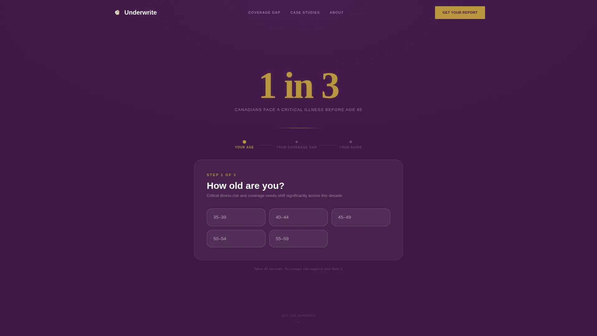
The header presents a multi-step form styled as a personal diagnostic. Step one collects age range and household income bracket using large, tappable buttons only. No dropdowns appear. A 120px gold "1 in 3" actuarial statistic floats above the form on a deep aubergine background. A micro-copy line below the form reads "Takes 40 seconds. No contact info required yet."
Zigzag Alternating Section Layout
Five content sections alternate between deep aubergine and brushed platinum panels. Each section opens with a single high-impact statistic before the explanation follows. The scroll rhythm shifts the visitor emotionally from exposure to comprehension to confidence across the full page.
Gap Visualization and Bar Charts
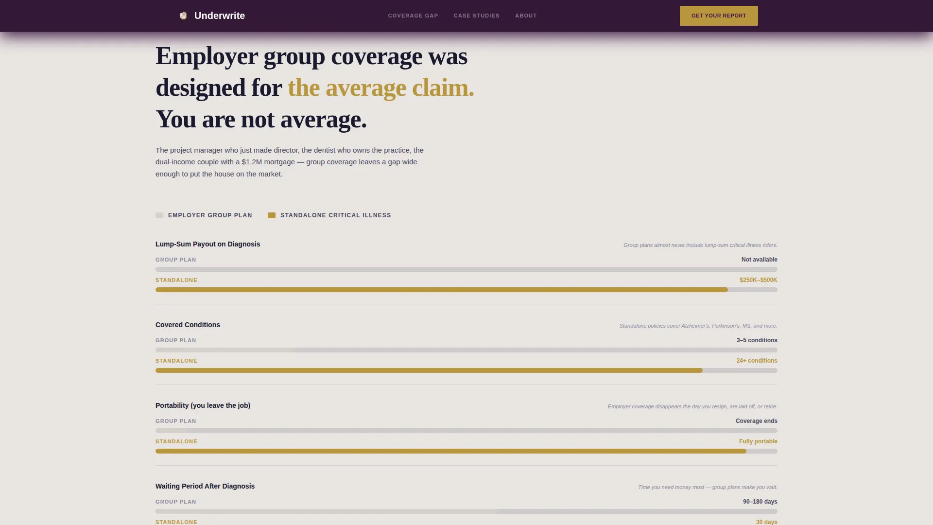
Section three compares employer group coverage against standalone critical illness policies using animated horizontal bar charts. Bars render in muted gold against the platinum panel background, making the gap between the two coverage types immediately visible without requiring the visitor to read a word.
Anonymized Case Math Scenarios
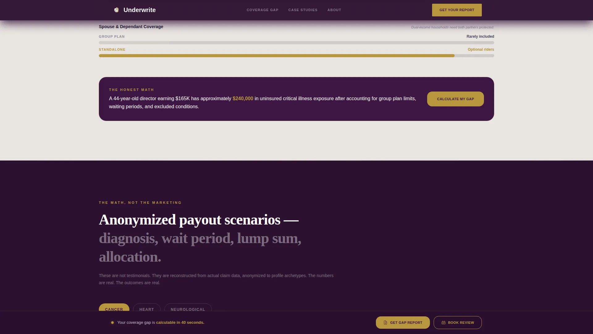
Section four presents real payout scenarios built from anonymized client data. Each scenario shows diagnosis type, wait period, lump-sum amount, and a breakdown of exactly where the money went. No testimonials are used. The math speaks for itself.
Personalized Coverage Gap Report Gate
The primary conversion asset is a PDF Coverage Gap Report generated from the visitor's multi-step form inputs. The email gate appears only at the final step, after the visitor has already invested time in their answers and seen their personal gap displayed in gold numbers on plum panels.
Sticky Footer Call to Action
A secondary "Book a 15-Minute Policy Review" call to action appears once after the case math section and again in a sticky footer that activates once the visitor scrolls past the halfway point of the page. The sticky footer remains visible without interrupting reading flow.
Page sections overview
| Section | Purpose |
|---|---|
| Hero diagnostic form | Collect age and income; display "1 in 3" actuarial stat to establish urgency |
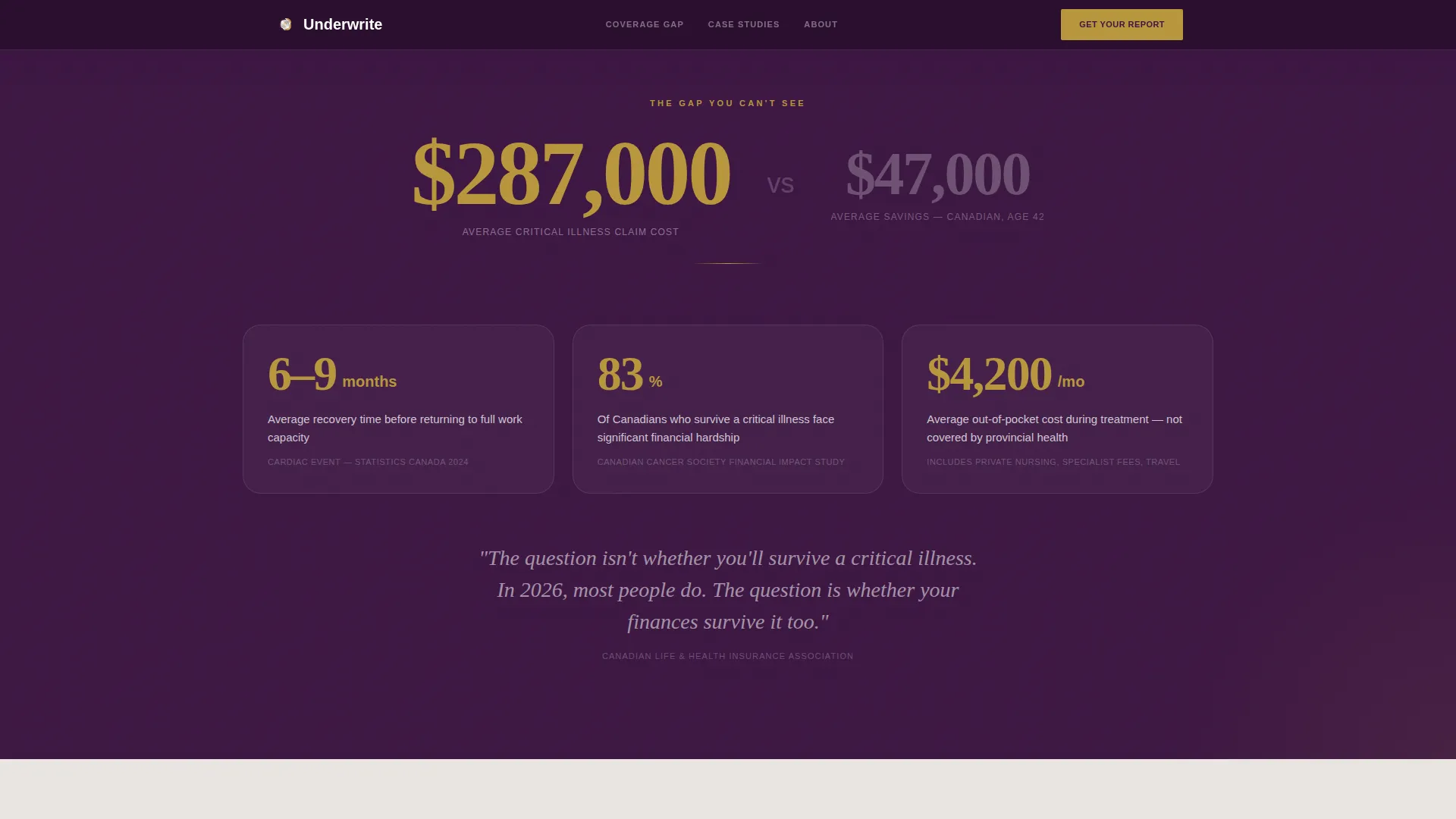
| Stats impact panel | Show $287K average claim versus $47K average savings gap on aubergine |
| Coverage gap charts | Animate employer versus standalone bar charts on platinum panel |
| Case math scenarios | Walk through anonymized diagnosis, lump sum, and allocation on aubergine |
| Report call to action | Gate the Coverage Gap Report PDF by email; surface policy review booking |
| Sticky footer bar | Persist secondary call to action after halfway scroll point |
Design & branding system
The Plum Executive color system gives this template a tone of quiet legal authority. It feels like the inside cover of a leather-bound policy document rather than a promotional insurance brochure. Typography pairs DM Sans for headings with Crimson Text for pull quotes and statistics.
- Deep aubergine (#3C1642) as the primary background on alternating sections; brushed platinum (#E8E4E1) on opposing panels; near-black ink (#1A1A2E) for all body text
- Muted gold (#B8963E) appears only on statistics, icons, and hover states; it never touches body copy
- Plum sections carry white text; platinum sections carry ink text; the palette holds a single visual rule throughout every section
Mobile & speed optimization
The template is built desktop-first, reflecting the professional audience that typically engages with financial content at a desk. A strong mobile fallback ensures the diagnostic form, bar charts, and sticky footer remain functional and readable on smaller screens.
- Tappable large buttons on the multi-step form replace dropdowns, making the form usable on touch screens without resizing
- GSAP scroll triggers, counter animations, and form step transitions are handled by client-side components, while static content uses server components to keep initial load lean
- The sticky footer activates at the halfway scroll point on both desktop and mobile, keeping the secondary call to action accessible without cluttering the reading experience
How this template helps you convert
The Underwrite template is structured around a content-first conversion model. It earns the click by delivering the math before asking for anything in return.
- The diagnostic form at the top personalizes the experience immediately. Visitors see their own age range and income bracket reflected back in the gap statistics, which makes the coverage numbers feel relevant rather than generic.
- The zigzag stat-then-explanation rhythm builds cumulative understanding across four sections. By the time the email gate appears, the visitor has already processed their coverage gap in concrete dollar terms.
- The Coverage Gap Report acts as a natural next step rather than a cold ask. The visitor downloads a document that organizes what they have already seen on screen, making the email exchange feel like a fair trade.
Other information about this template
This template is localized for English Canadian audiences. All dollar figures display in Canadian dollars (CAD), and dates follow the DD/MM/YYYY format. The page is designed for the Finance and Insurance category with a specific focus on mid-career critical illness insurance for the 35 to 55 age bracket.
- The template style is Zigzag/Alternating with a Legal Shield theme and a Stats-First Impact creative direction
- The header concept is a Multi-Step Form diagnostic, and the landing page direction is Content/Resource, meaning the primary goal is education-led lead generation rather than direct sales
- The intersection niche is mid-career critical illness insurance, and the template is suitable for both advisor-facing deployment and direct consumer outreach
Theme
Legal Shield
Creative direction
Stats-First Impact
Color system
Plum Executive
Style
Zigzag/Alternating
Direction
Content/Resource
Page Sections
Three-step Diagnostic Form Header
Zigzag Alternating Section Layout
Gap Visualization Bar Charts
Anonymized Case Math Scenarios
Personalized Coverage Gap Report Gate
Sticky Footer Call to Action
Related questions
Who is the Underwrite template designed for?
What is the primary conversion goal of this template?
Does the template require visitors to enter contact details upfront?
What calls to action are included in the template?
Is this template localized for Canadian audiences?



