Insurance Consulting Landing Page Template
Underwrite is a split-screen landing page template built for insurance strategy consultancies that work with CFOs, risk officers, and mid-market firms. It pairs a commanding typographic headline with a logo-wall authority structure, a risk-scenario content flow, and a gated resource form, all styled in a Corporate Precision Charcoal and Amber palette that signals boardroom-level credibility.
by Rocket studio
Quick summary
Underwrite is a single-page, split-screen landing page template designed for insurance consulting firms that advise sophisticated clients on coverage strategy. It opens with a bold serif headline, builds authority through a client logo wall, and guides visitors through escalating risk scenarios toward two clear conversion paths: a downloadable audit framework and a portfolio review request.
Who this template is for
This template is built for consultancies that position themselves as strategic advisors, not brokers. It speaks directly to firms whose clients ask harder questions than a standard agent can answer.
- Insurance strategy consultants serving mid-market manufacturers, private equity-backed companies, and family businesses
- Consulting practices that lead with intellectual authority and need a page that reflects that positioning
- Advisors building a qualified lead pipeline through gated content and direct discovery calls
What problem this template solves
Most insurance consulting firms rely on referrals and relationships, but a poorly designed page undermines credibility the moment a CFO looks you up. This template solves the trust gap between a firm's real expertise and how that expertise reads online.
- Visitors arrive without context and leave without converting because the page fails to establish authority quickly enough
- Existing templates designed for insurance agents feel transactional, not strategic, and misrepresent the consultancy's actual positioning
- No clear structure connects the visitor's specific concern to a concrete next step, causing high drop-off before any form is reached
What you get with this template
You get a fully structured, single-page layout that carries the visitor from headline to conversion through a deliberate sequence of credibility signals and content depth. Every section has a defined role in that sequence.
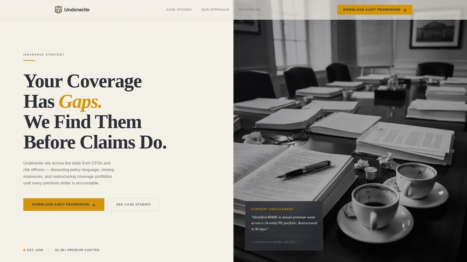
- A split-screen hero with a heavy serif headline on the left and a desaturated conference-table photograph on the right
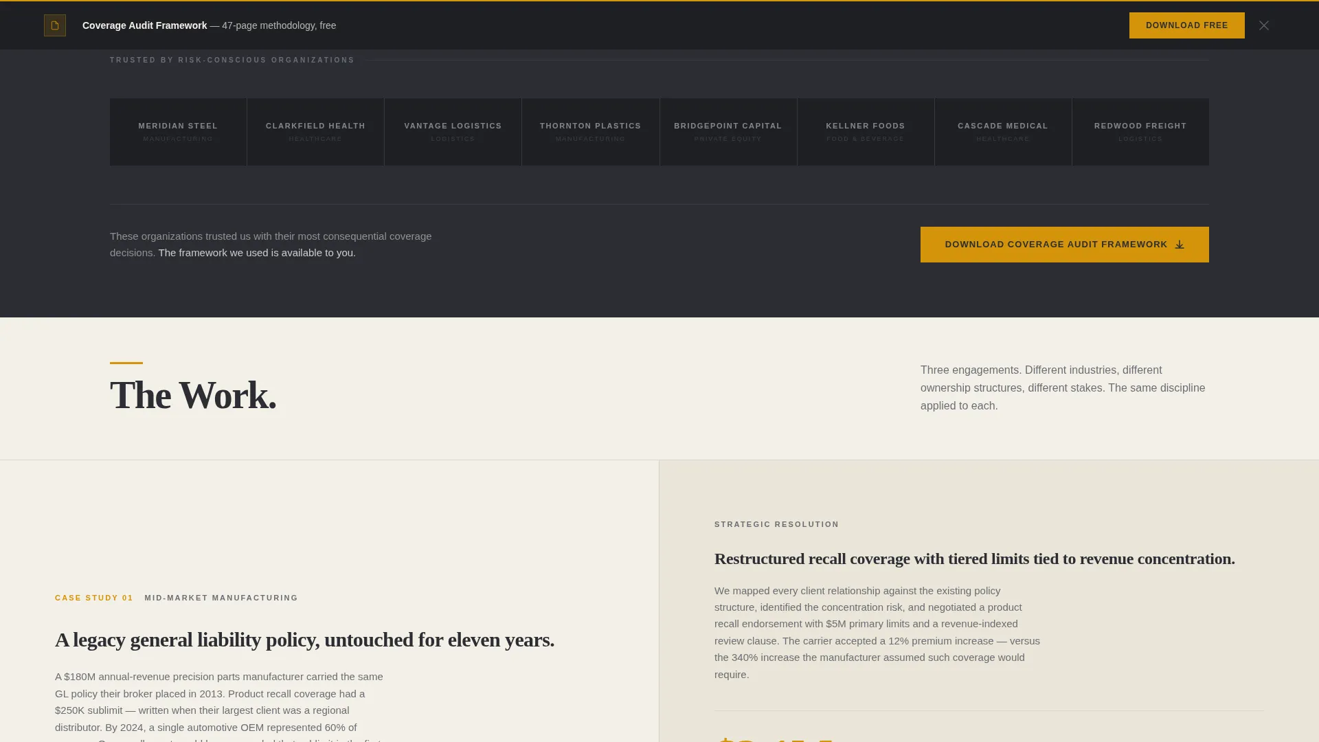
- A horizontal logo wall immediately below the fold, followed by paired risk-scenario and resolution sections that escalate in complexity
- Two conversion paths: a gated "Download the Coverage Audit Framework" form with a table-of-contents preview, and a "Schedule a Portfolio Review" call-to-action surfaced in the final section
Feature list
This template is built around a specific visual and structural logic. Each feature below corresponds directly to a design or layout decision described in the brief.
Split-Screen Hero Layout
The hero divides the viewport into two equal halves. The left holds a single typographic statement set in a heavy serif at roughly 72-point scale. The right displays a muted, desaturated conference-table photograph. Together they create immediate visual authority without relying on stock-photo clichés.
Logo Wall Authority Band
A horizontal band of client logos sits immediately below the hero fold. All logos render in monochrome charcoal with no color hierarchy. The effect is quiet mass rather than individual spotlight, signaling broad institutional trust at a glance.
Risk Scenario and Resolution Sections
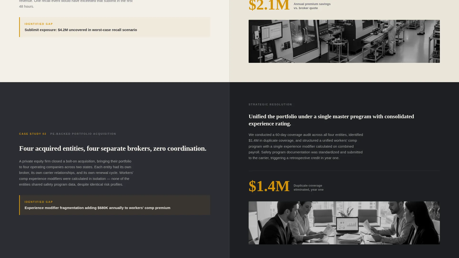
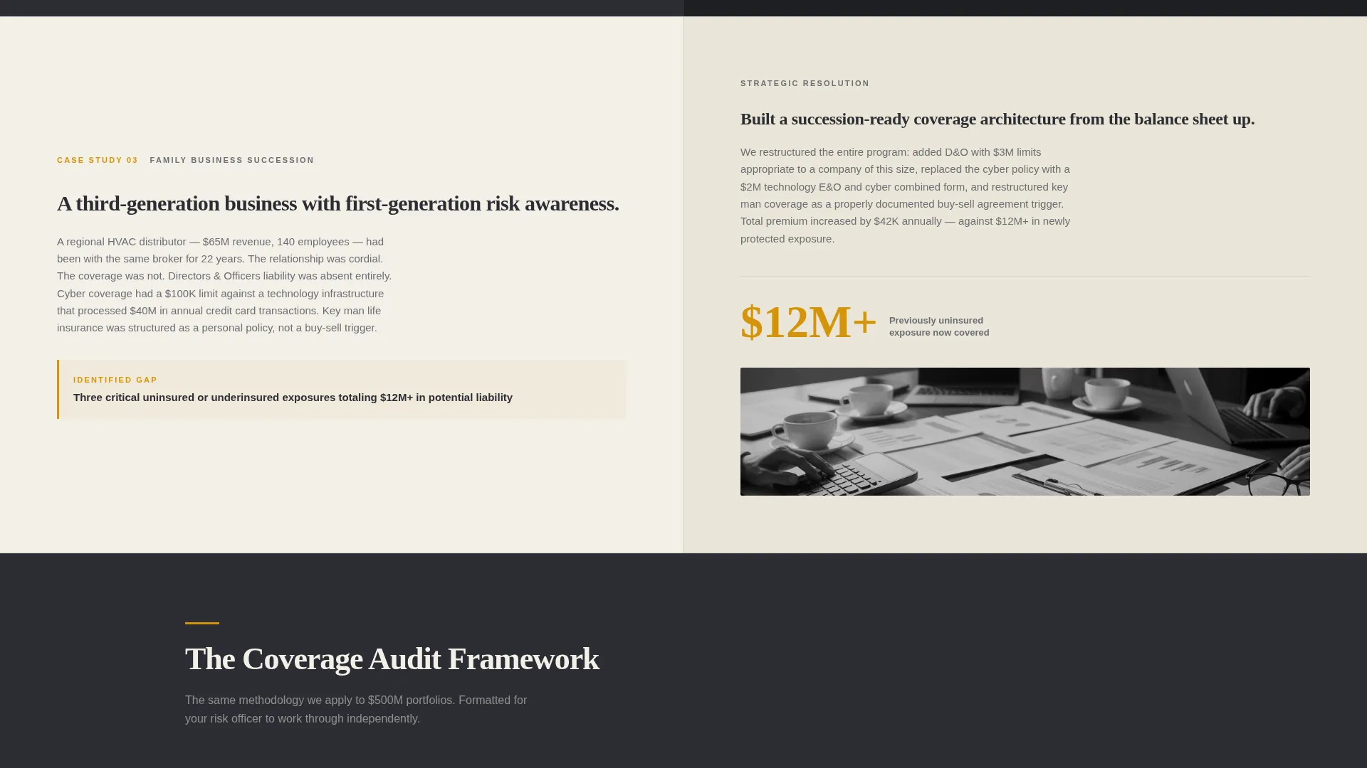
Each scroll section pairs a specific coverage gap on the left with the strategic resolution on the right. Stakes escalate from routine policy audits to complex multi-entity programs. This structure proves capability progressively rather than asserting it in a single claims block.
Gated Resource Form with Preview
The primary conversion point is a downloadable Coverage Audit Framework. The form collects business email, company name, and employee count to qualify firm size, with an optional field for primary coverage concern. A visible table-of-contents preview sits beside the form to reduce friction before the exchange.
Sticky Repeat Call-to-Action Bar
After the third risk-scenario section, a sticky bar resurfaces the "Download the Coverage Audit Framework" prompt. This keeps the primary conversion path visible without interrupting the reading flow of the content sections above it.
Secondary Portfolio Review Path
A "Schedule a Portfolio Review" call-to-action appears only in the final section, after the full authority sequence has played out. This placement targets visitors who are further down the decision funnel and ready for a direct conversation.
Page sections overview
| Section | Purpose |
|---|---|
| Split-Screen Hero | Establishes tone and primary headline |
| Client Logo Wall | Builds institutional trust immediately |
| Risk Scenario One | Demonstrates routine policy audit capability |
| Risk Scenario Two | Shows mid-complexity restructuring expertise |
| Risk Scenario Three | Proves multi-entity program management depth |
| Gated Resource Form | Captures qualified leads via audit framework |
| Sticky call to action Bar | Keeps download path visible post-scroll |
| Portfolio Review call to action | Converts high-intent, bottom-funnel visitors |
Design & branding system
The visual identity follows a Corporate Precision theme. Every color and typographic choice reinforces the feeling of opening a perfectly organized binder in a boardroom: authoritative, deliberate, and worth the fee.
- Color palette: deep boardroom charcoal (#2B2D33) for primary surfaces, warm parchment off-white (#F4F0E8) for backgrounds, polished amber (#D4940A) reserved for accent lines and interactive hover states, and muted graphite (#6B6E75) for secondary text and dividers
- Typography: heavy serif at headline scale for the hero statement, with clean secondary type for body content and form labels
- Photography direction: desaturated, overhead conference-table image with policy documents, an amber-capped pen, and two coffee cups, no faces, no handshakes, only the residue of serious work
Mobile & speed optimization
The split-screen layout is structured to adapt cleanly across screen sizes. The design prioritizes legibility and structural clarity so the authority sequence reads as well on a phone as it does on a wide desktop monitor.
- The 50/50 hero split stacks vertically on smaller screens so the headline and photograph each occupy full width in sequence
- Logo wall and risk-scenario sections reflow into single-column layouts, preserving the left-right pairing as stacked content blocks
- The sticky call-to-action bar remains visible across viewport sizes so the download path is never buried on mobile
How this template helps you convert
The conversion architecture of this template is deliberate. Every structural decision is aimed at moving a skeptical, senior buyer toward a meaningful action.
- The logo wall immediately below the hero answers the unspoken question of who trusts this firm, lowering resistance before any claim is made in the body copy
- The escalating risk-scenario sections build progressive proof of capability, so by the time the visitor reaches the form, the value of the audit framework feels self-evident
- The table-of-contents preview beside the form shows exactly what the PDF contains, removing the uncertainty that typically causes visitors to abandon gated content offers
Other information about this template
This template is part of a broader category of high-trust professional services landing pages built for advisors who sell expertise rather than products. A few practical notes for teams evaluating it.
- The template style is Split Screen (50/50), a layout well suited to consultancies that want to balance intellectual authority with visual restraint
- The landing page direction is Content and Resource, meaning the primary mechanism for lead capture is a high-value downloadable asset rather than a direct sales pitch
- The header concept is Giant Headline Left, placing the firm's core positioning statement at maximum visual weight immediately on load
- The creative direction is Logo Wall Authority, a proven structure for professional services firms that have notable client relationships to reference
- The theme is Corporate Precision and the color system is Charcoal and Amber, a combination that reads as financially serious without feeling cold or institutional
Theme
Corporate Precision
Creative direction
Logo Wall Authority
Color system
Charcoal & Amber
Style
Split Screen (50/50)
Direction
Content/Resource
Page Sections
Split-screen Hero with Serif Headline
Monochrome Client Logo Wall
Escalating Risk Scenario Sections
Gated Resource Form with Content Preview
Sticky Repeat Call to Action Bar
Bottom-funnel Portfolio Review Call to Action
Related questions
Can I change the headline and body copy to match my firm's voice?
Is the gated form connected to any specific email or lead platform?
Can I replace the logo wall with my own client logos?
What if I only want to use one conversion path instead of two?
Is this template suitable for a solo consultant or only for larger firms?



