Insurance Digital Transformation Landing Page Template
Underwrite is a split-screen landing page template built for insurance digital transformation consultancies. It pairs an editorial magazine aesthetic with a FAQ-driven content flow, guiding VP-level carrier executives and MGA founders from strategic anxiety to architectural confidence. The template leads with a resource download conversion path and a persistent archive sidebar, earning trust before asking for anything.
by Rocket studio
Quick summary
Underwrite is a single-page template designed for consultancies that modernize legacy insurance carriers. Its 50/50 split-screen layout separates bold editorial questions from authoritative answers. A dark, journal-like visual system builds immediate credibility with senior buyers. The primary conversion goal is a gated playbook download, supported by a persistent resource sidebar.
Who this template is for
This template is built for specialized consultancies working at the intersection of insurance operations and technology modernization. If your clients are executives evaluating eight-figure transformation programs, this page speaks their language from the first scroll.
- VP-level transformation leads at mid-market property and casualty carriers
- Life insurance Chief Information Officers managing mainframe migration decisions
- Managing General Agent founders building modern platforms without inheriting technical debt
What problem this template solves
Most professional services pages either overwhelm senior buyers with case-study carousels or under-deliver on the intellectual depth those buyers expect. Carrier executives are not browsing; they are evaluating. This template is designed to match that mindset.
- Generic agency pages fail to address the specific fears driving insurance technology decisions
- Lengthy proposal documents do not convert; a well-structured landing page that gives value first does
- Standard lead forms with phone number fields create friction and signal a mismatch in buyer tier
What you get with this template
You get a fully structured single-page layout that moves a senior insurance buyer through a credibility arc, from first impression to form submission, without a single wasted section.
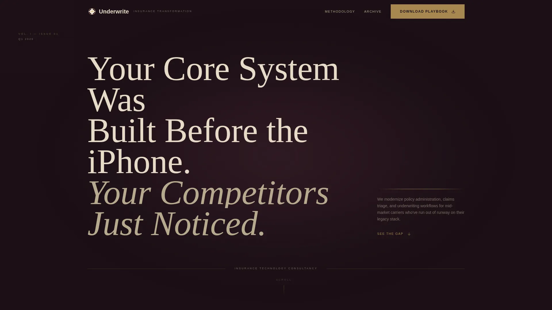
- A dark full-bleed header with a tarnished gold glow reveal and a champagne serif headline
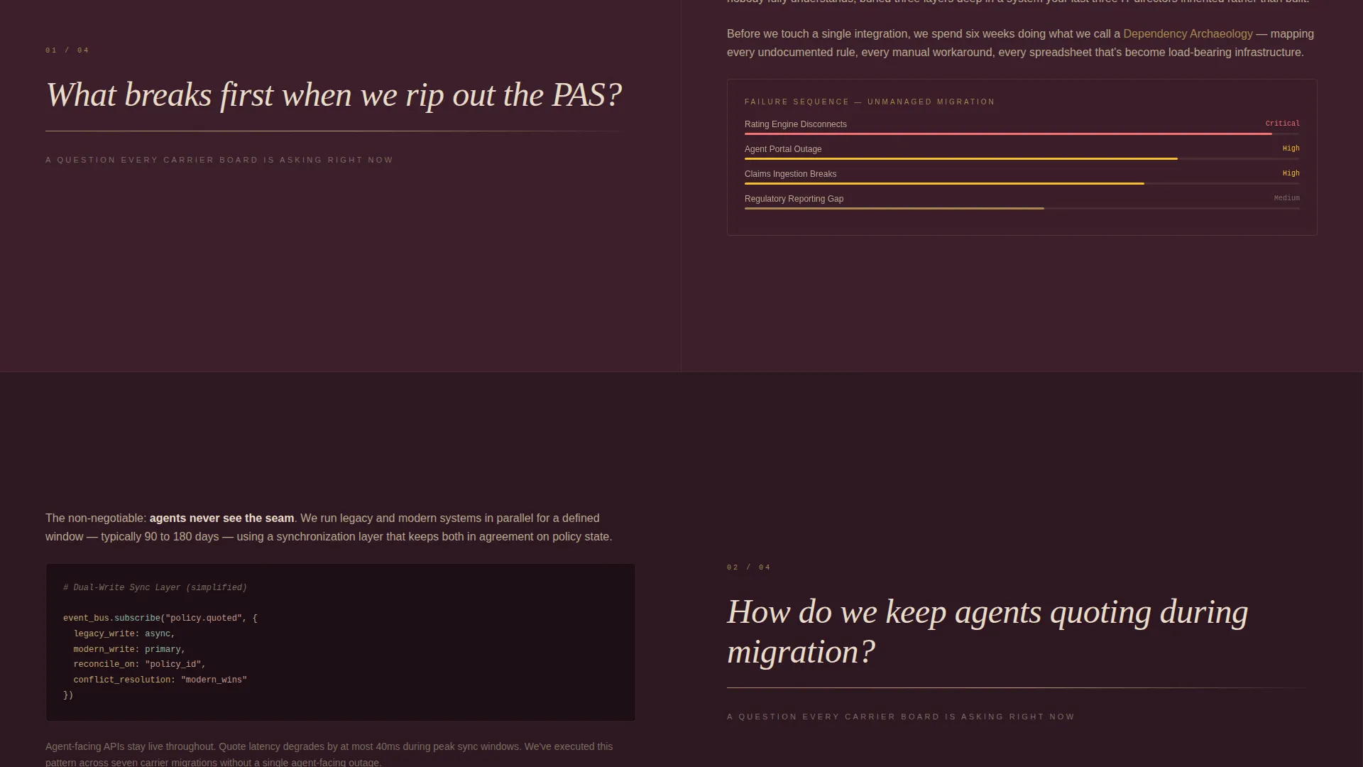
- A FAQ-driven split-screen body where each scroll pair escalates from strategic to architectural
- A three-field download form and a persistent sidebar linking to a broader resource archive
Feature list
This template is built around five purposeful design and content systems that work together.
Split-Screen FAQ Layout
Each scroll section places an editorial question in large serif type on the left panel and a structured answer on the right. The left panel includes a thin gold rule beneath the question. The right panel supports short prose, embedded diagrams, or downloadable framework links. The escalating specificity rewards readers who stay engaged.
Dark Full-Bleed Header with Glow Reveal
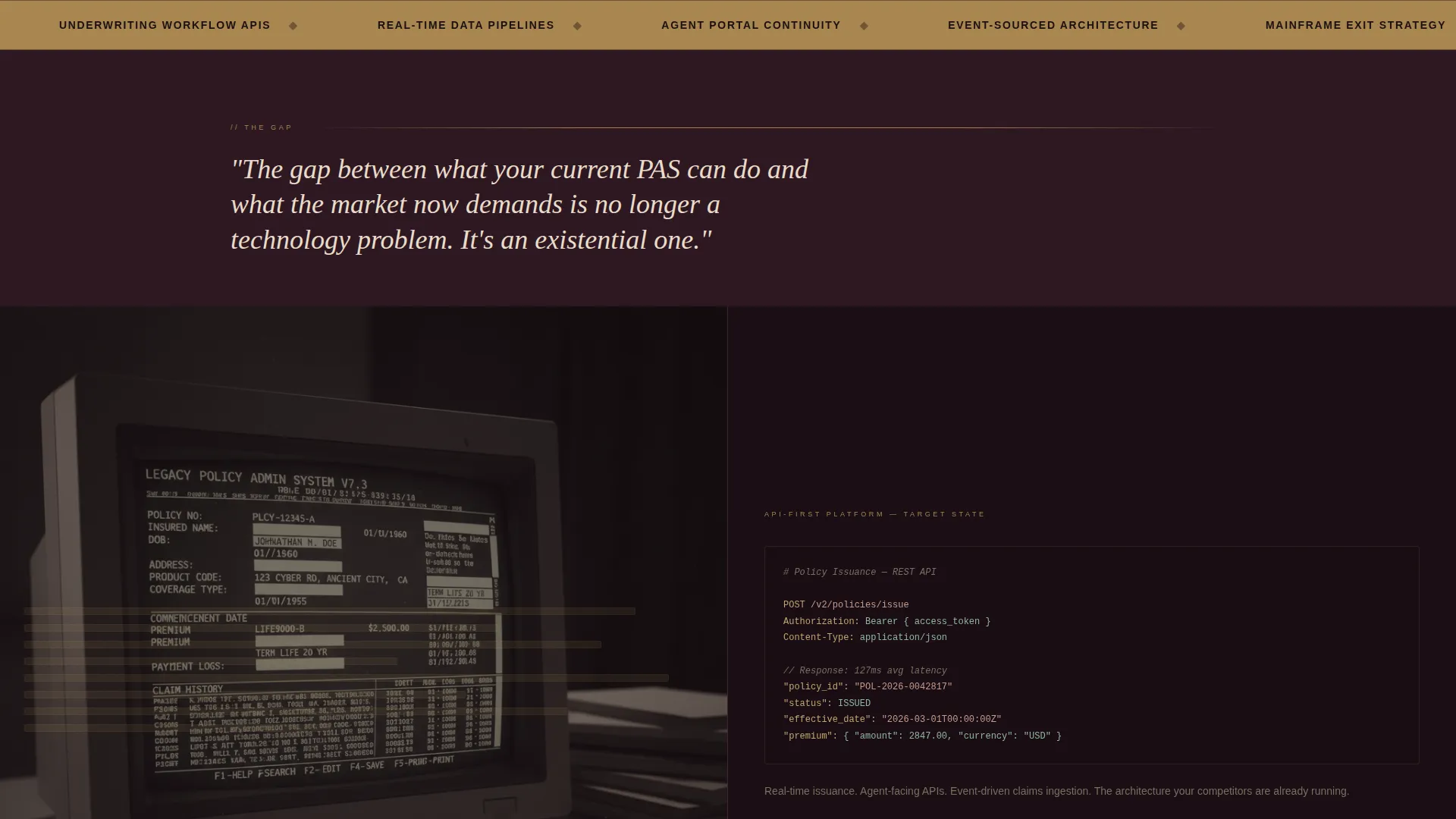
The header fills the full viewport with a near-black aubergine background. A single thin tarnished gold line pulses outward from center, simulating a system coming online. The headline appears in champagne serif type. Below the fold, a split-screen frame with a legacy screenshot and an API schema diagram sharpens as the visitor scrolls.
Gated Playbook Download Form
The primary call to action, labeled "Download the Migration Playbook," appears after the third FAQ pair. The form collects work email, company name, and role title in that order. There is no phone number field. This three-field sequence is deliberately low-friction for senior buyers who protect their time.
Persistent Resource Archive Sidebar
A secondary conversion path runs as a fixed sidebar tab labeled "Browse the Archive." It links to a resource library containing past whitepapers, recorded carrier roundtables, and vendor evaluation templates. This keeps high-intent visitors engaged even before they reach the primary form.
Editorial Plum Executive Visual System
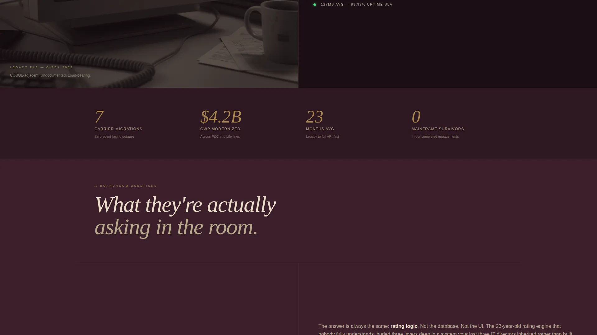
The full color palette is built around deep plum as the dominant background, muted champagne for body text and pull quotes, tarnished gold on accent rules and hover states, and near-black aubergine for section dividers and the footer. Typography uses a serif typeface throughout to reinforce the quarterly journal feel.
Page sections overview
| Section | Purpose |
|---|---|
| Full-Bleed Header | Establish authority with a cinematic glow reveal and a pointed headline |
| Legacy versus. Modern Split | Contrast old-system screenshot with clean API schema to frame the problem |
| FAQ Pair One | Address strategic anxiety around core system replacement |
| FAQ Pair Two | Answer agent continuity concerns during policy admin migration |
| FAQ Pair Three | Outline what a realistic twelve-month transformation roadmap looks like |
| Playbook Download Form | Capture work email, company name, and role title after credibility is built |
| Resource Archive Sidebar | Provide a persistent path to whitepapers, roundtables, and vendor templates |
| Section Dividers / Footer | Close with aubergine background and branded contact or next-step details |
Design & branding system
The visual identity draws from the look and feel of a heavyweight actuarial journal. Every design choice signals institutional authority rather than startup energy.
- Color palette: deep plum (#3B1F2B) dominant background, muted champagne (#E8DCC8) body text, tarnished gold (#A8874F) accents, near-black aubergine (#1A0E14) dividers and footer
- Typography: champagne serif headlines and pull quotes throughout, reinforcing the editorial magazine theme
- Interactive states: tarnished gold applied to hover effects and accent rules, adding warmth without breaking the somber tone
Mobile & speed optimization
The template is structured to translate its editorial weight into a clean single-column reading experience on smaller screens. The split-screen pairs stack vertically so the question always precedes the answer.
- Left and right panels reflow into a top-and-bottom stacked format on mobile viewports
- The persistent sidebar archive tab repositions to remain accessible without blocking the reading flow
- The three-field download form is compact by design and functions cleanly on touch interfaces
How this template helps you convert
The conversion strategy is built on the principle that senior buyers need to receive value before they give anything. The template earns the form submission rather than demanding it.
- The FAQ-driven scroll structure gives away genuinely useful thinking in every answer, so by the time the playbook form appears, the visitor has already been nodding along for three sections and is motivated to get the structured version.
- The three-field form sequence, work email first then company name then role title, reduces drop-off by removing the phone number field that signals a sales-pressure dynamic most VP-level buyers actively avoid.
- The persistent archive sidebar creates a second conversion lane for visitors who are not yet ready to download, keeping them inside the content ecosystem through whitepapers and recorded roundtables.
Other information about this template
This template is purpose-built for a specific professional services niche and is not a general consulting page. A few additional details worth knowing before customizing it.
- The template is categorized under Professional Services and Insurance Consulting, making it relevant for boutique transformation firms, independent advisory practices, and specialty technology integrators serving insurance carriers
- The FAQ content structure is intentionally modular; each question-and-answer pair can be swapped out to reflect your firm's specific practice areas or engagement models
- The resource archive sidebar is designed to link to an existing content library; building that library alongside this page will maximize the secondary conversion path
- The editorial magazine theme and Plum Executive color system are cohesive and intentional; significant color changes may reduce the authority signal the palette is designed to communicate
Theme
Editorial Magazine
Creative direction
FAQ-Driven
Color system
Plum Executive
Style
Split Screen (50/50)
Direction
Content/Resource
Page Sections
Split-screen FAQ Layout
Dark Full-bleed Header with Glow Reveal
Gated Playbook Download Form
Persistent Resource Archive Sidebar
Plum Executive Visual System
Related questions
Can I customize the FAQ questions to match my practice areas?
Does the template include the actual whitepaper or resource library content?
Is the three-field form connected to a specific email platform?
Who is the right audience for this landing page template?



