Underwriter Blog Website Template
Underwrite is a comparison table landing page built for surplus lines underwriters who need to demonstrate regional authority and convert agent inquiries into risk submissions. It combines an editorial navy-and-gold visual identity, a territory-mapped hero, a regional comparison table, and a progressive lead capture form into one focused, desktop-first page.
by Rocket studio
Quick summary
Underwrite is a single-page template designed for specialist underwriters operating in hard-to-place territories. It presents regional appetite, binding authority, and turnaround benchmarks inside a structured comparison table, backed by carrier logo proof and a sticky submission bar. The result is a page that reads like an annual report and converts like a lead engine.
Who this template is for
This template is built for insurance professionals who need to communicate deep territorial expertise to a skeptical, time-pressed audience. It speaks the language of surplus lines from the first scroll.
- Independent insurance agents hunting capacity for non-standard or difficult-to-place risks
- Managing General Agents (MGAs) expanding their footprint into new states and regions
- Carrier partners who need a regional underwriting desk with proven local knowledge
What problem this template solves
Surplus lines professionals often have the expertise but lack a page that communicates it with the authority the market expects. Generic service pages do not reassure an agent who is trying to place a wildfire-exposed commercial property in a county with shifting loss ratios.
- There is no clear way for agents to compare available lines, appetite classes, and binding limits across territories at a glance
- Browsers who are not yet ready to submit a risk have no secondary path to stay engaged
- The page fails to establish institutional credibility before asking for a submission
What you get with this template
This template delivers a fully structured, section-by-section landing page that guides agents from territory recognition to risk submission. Every layout decision reinforces the message that this underwriting desk already knows the market.
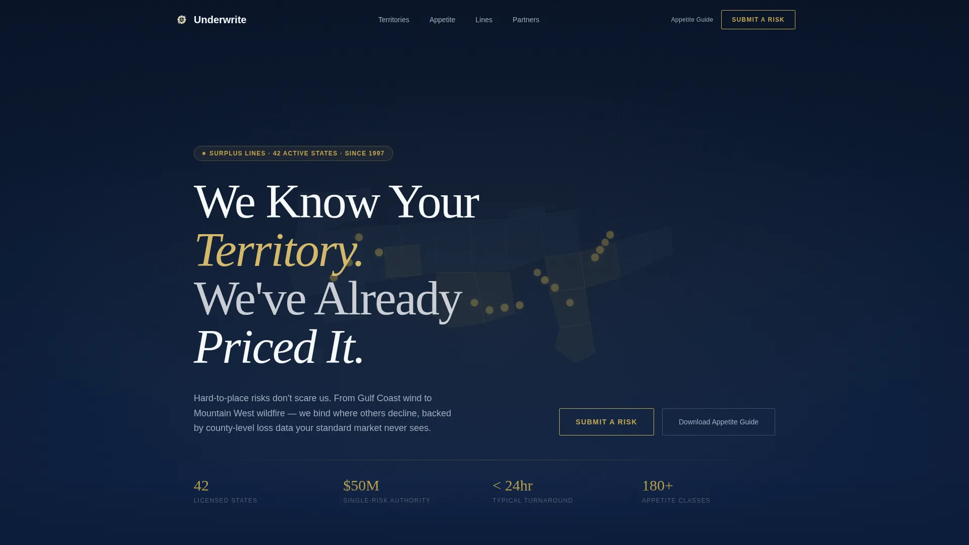
- A dark full-bleed hero with a luminous SVG United States map showing active service territories in gold
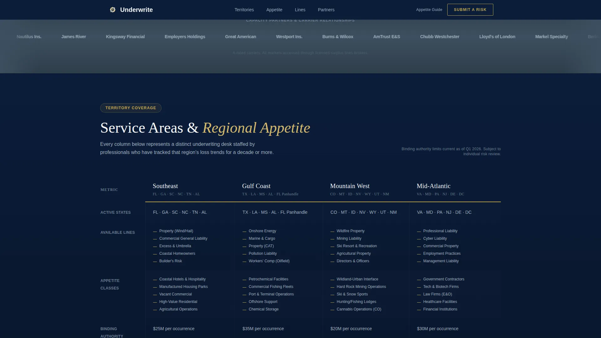
- A four-column regional comparison table covering Southeast, Gulf Coast, Mountain West, and Mid-Atlantic
- A sticky "Submit a Risk" bar, a slide-out lead form, and an email-gated appetite guide download
Feature list
This template packages several purposeful components into a single authoritative page. Each feature below is present in the described layout and serves a specific role in the conversion flow.
Dark Full-Bleed Territory Hero
A midnight navy viewport opens the page with a softly glowing SVG map of the United States. Active service territories pulse with a gold accent, signaling coverage depth before a single line of body copy is read. The editorial serif headline fades in above the map.
Regional Comparison Table
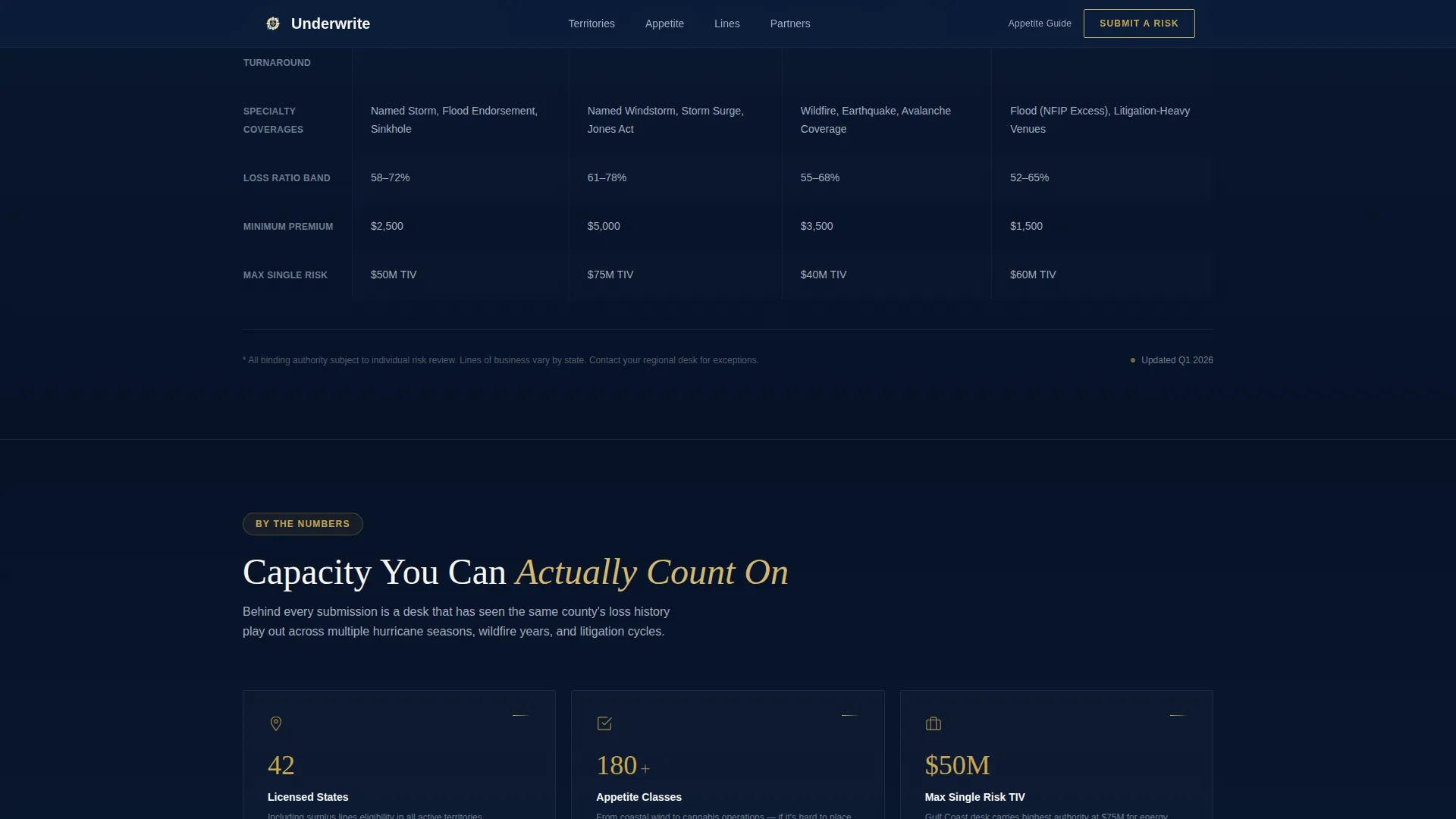
Four regional columns, Southeast, Gulf Coast, Mountain West, and Mid-Atlantic, organize available lines, appetite classes, binding authority limits, and average turnaround into a single scannable reference. Agents can assess fit in seconds rather than emailing back and forth.
Sticky Lead Capture Bar
A "Submit a Risk" call-to-action bar pins to the top of the viewport after the first scroll. It stays visible throughout the page, reducing friction for agents who decide to act at any point during their review.
Slide-Out Risk Submission Form
The primary form opens as a slide-out panel using progressive disclosure. It asks for state of risk first, then line of business, insured name, and agent email. This mirrors the intake workflow agents already use, making the submission feel familiar rather than bureaucratic.
Email-Gated Appetite Guide
A secondary conversion path offers a downloadable appetite guide behind an email gate. This captures agents and MGAs who are researching capacity options but are not yet ready to submit, keeping them in the funnel.
Partner Logo Wall
A horizontal band of carrier and MGA partner logos sits immediately below the hero on a gunmetal background. The logos scroll as a marquee, providing silent institutional proof before the comparison table demands attention.
Page sections overview
| Section | Purpose |
|---|---|
| Dark Hero Map | Establish territory authority with glowing SVG map and editorial headline |
| Partner Logo Wall | Display carrier and MGA logos as institutional credibility proof |
| Regional Comparison Table | Compare lines, appetite, binding limits, and turnaround by region |
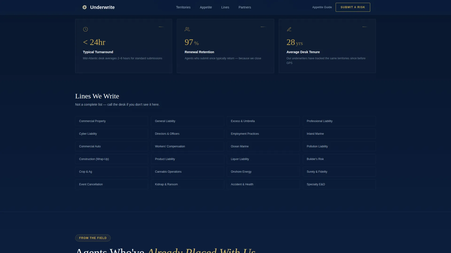
| Appetite and Binding Stats | Highlight key metrics and binding authority numbers in a bento layout |
| Agent Testimonials | Reinforce trust with territory-specific agent quotes |
| Sticky Submission Bar | Keep the primary call-to-action visible throughout the scroll |
| Slide-Out Lead Form | Capture risk submissions via a progressive disclosure panel |
| Email Gate Modal | Capture browsers with an appetite guide download behind an email gate |
| Two-Row Compact Footer | Close the page with structured contact and navigation links |
Design & branding system
The visual identity follows an Editorial Magazine direction built on the Navy Authority color system. Every color decision references a specific role: command, structure, clarity, or action.
- Deep command navy (#0B1D3A) anchors the hero, sticky bar, and primary call-to-action backgrounds
- Polished gunmetal (#3D4F5F) structures the logo wall and secondary surfaces, while crisp bond-paper white (#F7F8FA) keeps body sections readable
- Restrained gold (#C9A84C) is reserved for active states, hover lines, call-to-action borders, and pulsing map territories
Mobile & speed optimization
The template is designed desktop-first, reflecting the reality that independent agents and MGA underwriters primarily work from desktop workstations. Mobile fallback layouts are included so the page remains functional across devices.
- The comparison table adapts to a scrollable format on smaller screens, preserving column data without cropping
- The slide-out panel and sticky bar reflow cleanly for touch interfaces, keeping lead capture accessible on any device
How this template helps you convert
Every structural choice on this page is designed to reduce the distance between an agent's first impression and a completed risk submission. The page builds trust progressively, then makes action easy.
- The hero map immediately signals territorial familiarity, reassuring agents that this underwriting desk already knows their market before they read a single detail
- The comparison table removes the need for back-and-forth emails by giving agents a self-service reference for appetite, limits, and turnaround by region
- The sticky bar and slide-out form maintain a constant, low-friction submission path so agents can act the moment they feel confident
Other information about this template
This template is built specifically for the surplus lines and specialty insurance market in the United States. It uses Fraunces as the editorial serif display typeface and Manrope as the sans-serif body typeface. These two typefaces together give the page the visual weight of a financial publication without sacrificing on-screen readability.
- Animation is set to a high level, including map pulse effects, scroll reveal transitions, and sticky bar entrance behavior
- The slide-out risk submission form and email gate modal are interactive client-side components, while static sections use server components for efficient delivery
- The footer follows a Stripe Two-Row Compact pattern, keeping the closing section clean and structured
Theme
Editorial Magazine
Creative direction
Logo Wall Authority
Color system
Navy Authority
Style
Comparison Table
Direction
Lead Generation
Page Sections
Dark Full-bleed Territory Hero
Regional Comparison Table
Sticky Lead Capture Bar
Slide-out Risk Submission Form
Email-gated Appetite Guide
Partner Logo Wall Marquee
Related questions
Who is this template designed for?
Can I edit the regional columns in the comparison table?
What are the two conversion paths included in this template?
Is this template desktop-first or mobile-first?
What information does the slide-out submission form collect?



