Bold Insurance Agency Landing Page Template
Underwrite is a bold insurance influencer marketing agency landing page built on a masonry grid layout. It uses an Ink and Paper visual identity with an Obsidian and Gold color system to position your agency as the definitive bridge between insurance carriers and creators. Every scroll-stopping section builds authority, trust, and a clear path to partnership.
by Rocket studio
Quick summary
Underwrite is a single-page masonry landing page template for an insurance influencer marketing agency. It pairs a hand-drawn animated illustration header with an award-wall creative direction to turn compliance-heavy products into compelling creative proof. The Obsidian and Gold color system makes every metric, logo, and result feel earned and unmistakably premium.
Who this template is for
This template is built for agencies and consultancies that sit at the intersection of insurance and content marketing. It speaks directly to the people who have grown tired of generic digital advertising and want something that commands a second look.
- Chief Marketing Officers at regional insurance carriers who want fresher campaign results
- Marketing Vice Presidents at insurtechs launching direct-to-consumer product lines
- Agency network directors who need to attract younger producers by showing insurance can live on social media
What problem this template solves
Insurance marketing has a reputation problem. Policies are complex, compliance is strict, and most carrier pages look identical. This template solves the challenge of presenting a creative agency in a category where creativity is rarely expected.
- Carriers struggle to communicate whole life policies, bundled coverage, and annuity riders in ways that feel relevant and engaging to modern audiences
- Most agency pages list services in plain columns; this template replaces that with a trophy-wall scroll that builds authority row by row
- Prospective clients need a reason to trust an agency before they ever fill out a form; this design earns that trust visually before a single word is read
What you get with this template
You get a fully designed, single-page masonry landing page that functions as both a creative portfolio and a lead generation tool. Every section is purposeful and every design decision reinforces the agency's positioning.
- An animated illustration header featuring a self-drawing fountain pen nib that transitions from a social media feed to a policy document and finally to a signature
- A three-row masonry grid styled as an award wall, with campaign case studies, creator spotlights, and press mentions laid out on parchment-textured cards
- A slide-out contact form styled as a letterpress correspondence card, plus a secondary gated PDF lead magnet for nurturing prospects not yet ready to engage
Feature list
This template delivers a focused set of design and layout capabilities drawn directly from the source brief.
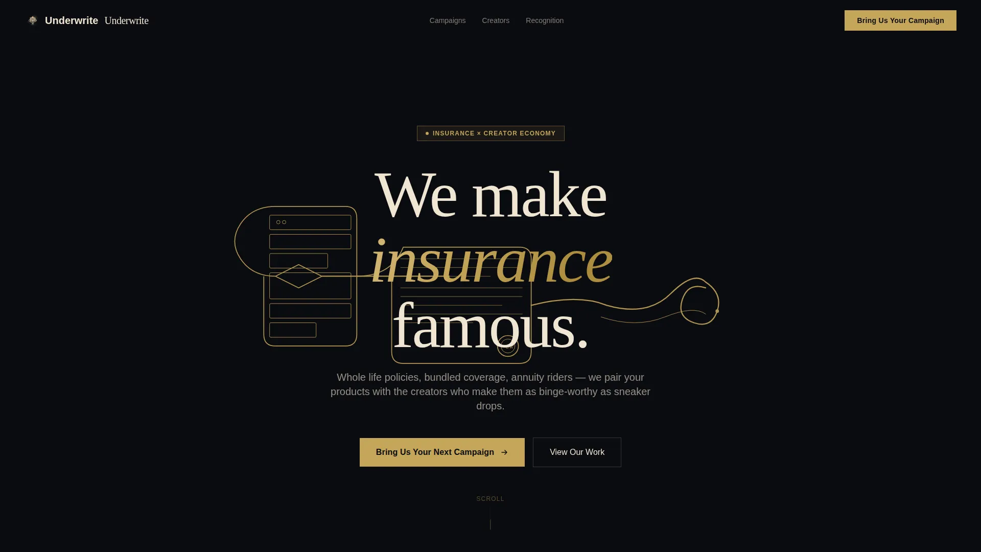
Self-Drawing Animated Header
The header runs a real-time ink illustration animation across the full viewport. A fountain pen nib draws a continuous line that morphs from a social media feed into a policy document and curls into a signature. The headline "We make insurance famous." materializes in serif type as the animation completes.
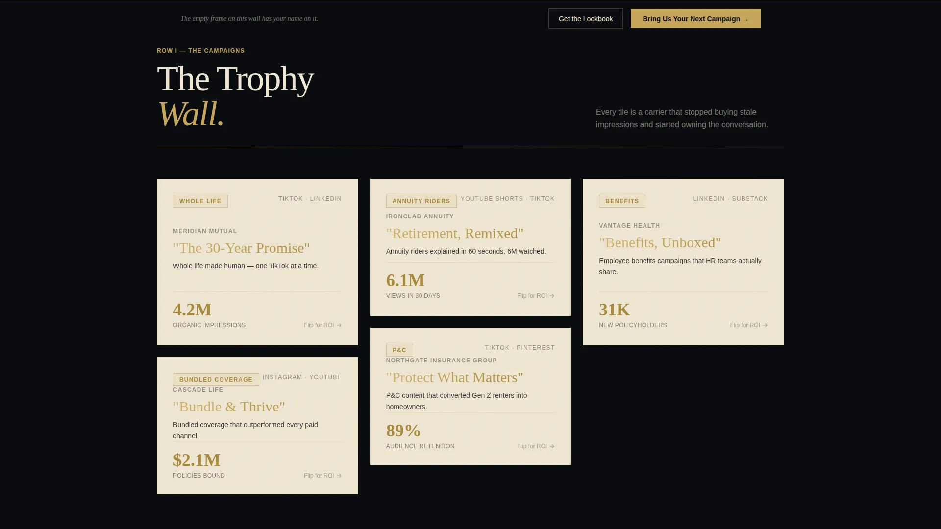
Masonry Award-Wall Grid
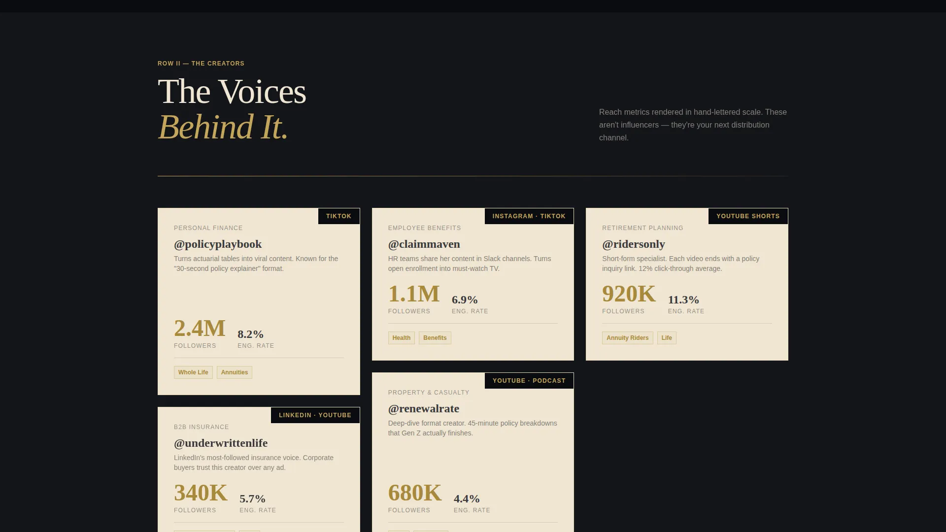
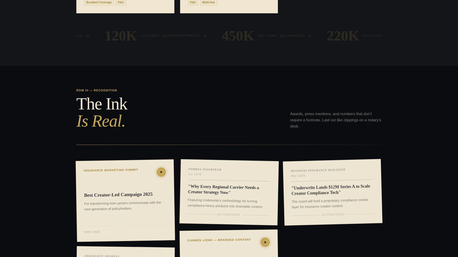
Three rows of masonry cards recreate the feeling of an editorial trophy wall. The first row pairs carrier logos with campaign names in gold foil lettering. The second row highlights creator spotlights with hand-lettered reach metrics. The third row presents industry awards and press mentions as newspaper clippings on parchment.
Flip-on-Hover Campaign Cards
Each masonry card lifts or flips on hover, revealing the campaign's return-on-investment data underneath. A subtle paper-texture shadow reinforces the Ink and Paper theme and makes every interaction feel tactile and considered.
Persistent Conversion Bottom Bar
After the visitor scrolls past sixty percent of the page, a persistent bottom bar appears with the primary call to action: "Bring Us Your Next Campaign." This ensures the prompt to act stays visible without interrupting the editorial flow of the content above.
Slide-Out Partnership Form
The primary call-to-action opens a slide-out panel styled like a letterpress correspondence card. It collects the carrier name, annual marketing budget range via dropdown, product line focus, and a free-text field asking what success looks like in six months.
Gated Carrier Lookbook Download
A secondary conversion path invites visitors to download a Carrier Lookbook PDF. The gate requires only an email address and company name, making it a low-friction entry point for leads who need more proof before committing to a conversation.
Page sections overview
| Section | Purpose |
|---|---|
| Animated Ink Header | Introduces the agency with a self-drawing illustration and the headline "We make insurance famous." |
| Campaign Logos Row | First masonry row pairs carrier logos with gold-foil campaign names to establish credibility |
| Creator Spotlights Row | Second masonry row showcases influencer reach metrics as hand-lettered numbers |
| Press and Awards Row | Third masonry row displays industry recognition and press mentions as parchment clippings |
| Primary call to action Block | Anchored call-to-action block after the third row prompting campaign partnership inquiry |
| Slide-Out Contact Form | Panel form collecting carrier details, budget range, product line, and success definition |
| Lookbook Download Path | Secondary lead capture gating a PDF behind email and company name |
| Persistent Bottom Bar | Sticky conversion bar appearing after sixty percent scroll depth |
Design & branding system
The visual identity follows an Ink and Paper theme built around a precise four-color Obsidian and Gold system. The palette feels deliberate and restrained, which makes every gold accent land with real weight.
- Deep obsidian black (#0B0C10) covers the primary background, iron-gall ink gray (#3A3A3C) handles body text, and aged parchment (#F0E6D3) surfaces cards and content blocks
- Liquid gold (#C5A55A) appears only on hover states, badges, accent borders, and earned results, never as a flood color, so it retains its premium signal every time it appears
- Typography pairs a calligraphic serif for headlines with clean body text, reinforcing the hand-crafted editorial tone throughout the page
Mobile & speed optimization
The masonry layout is designed to reflow cleanly across viewport sizes. The card-based structure adapts naturally from wide desktop columns down to single-column mobile stacks.
- Masonry cards scale and reorder responsively so the trophy-wall rhythm remains coherent on smaller screens
- The slide-out form panel and persistent bottom bar are each sized for thumb-friendly interaction on mobile devices
- The animated illustration header is built to complete its drawing sequence without blocking content access on slower connections
How this template helps you convert
This template is structured as a confidence-building journey rather than a simple service list. Each section does targeted conversion work.
- The animated header creates immediate memorability and signals that this agency is not a commodity, giving visitors a reason to keep scrolling before reading a single claim
- The masonry award wall accumulates social proof row by row, so by the time the primary call-to-action appears after the third row, the visitor has already seen carrier logos, creator reach numbers, and industry recognition
- The dual conversion paths, the slide-out form for ready buyers and the gated lookbook for researchers, mean the page captures both high-intent and early-stage leads without forcing either group into the wrong funnel
Other information about this template
This template is purpose-built for a very specific niche where creative positioning and compliance-heavy subject matter rarely meet. A few additional details worth noting before you build with it.
- The template is categorized under Portfolio and Agency with a subcategory of Insurance Marketing and Agency, making it relevant for any creative shop that works with regulated financial or insurance products
- The creative direction is Award and Recognition, meaning the scroll narrative is designed to make a prospective client feel the absence of their brand on the wall rather than simply listing your credentials
- The template style is Masonry and Pinterest-grid layout, a format typically associated with visual discovery platforms, here repurposed to give a B2B insurance agency page the energy of a curated editorial feed
- The landing-page direction is Partnership and B2B conversion, with both the form fields and the lookbook download path designed to qualify and nurture carrier-level marketing budgets
Theme
Ink & Paper
Creative direction
Award & Recognition
Color system
Obsidian & Gold
Style
Masonry/Pinterest
Direction
Partnership/B2B
Page Sections
Self-drawing Animated Header
Masonry Award-wall Grid
Flip-on-hover Campaign Cards
Slide-out Partnership Form
Persistent Scroll-triggered Bottom Bar
Gated Carrier Lookbook Download
Related questions
Who is the ideal client for an agency using this template?
Can the masonry card grid be updated with new campaign case studies?
What does the slide-out contact form collect from prospects?
What is the Carrier Lookbook download and how is it gated?
When does the persistent bottom bar appear on the page?


