Advanced Small Business Owner Insurance FAQ & Common Questions Website Template
The Underwrite Find Your Coverage Gap small business landing page template is designed specifically for self-employed professionals who carry no employer safety net. It combines a Data Command visual style, a scroll-tracked frequently asked question sidebar, and a five-step diagnostic quiz to help sole proprietors and LLC owners identify their disability insurance coverage gap and move toward a quote with confidence.
by Rocket studio
Quick summary
Underwrite is a single-page insurance landing page built for self-employed professionals who need to understand exactly where their disability coverage stands. It opens with trust-first credentials, walks visitors through real coverage gap questions via a scroll-tracked frequently asked question sidebar, and closes with a five-step quiz that turns a complex insurance decision into a clear, actionable next step.
Who this template is for
This template is for insurance brokers, agencies, and independent advisors who serve the self-employed market. The target audience is professionals whose income depends entirely on their own labor and whose existing policies may leave them dangerously exposed.
- Sole proprietors, LLC owners, and partnership principals in high-income professional fields
- Insurance professionals who need a good insurance landing page that educates before it sells
- Agencies offering disability insurance products to dentists, contractors, independent CPAs, and similar self-employed clients
What problem this template solves
Many self-employed professionals operate under a false sense of security. They assume their standard policies have them covered, but a thorough analysis of their existing policies often reveals a significant protection gap. When new risks emerge, those weak spots become costly. A herniated disc or cardiac event can eliminate 100% of a sole proprietor's income overnight, with no employer plan to bridge the loss.
- No structured way to show visitors where their coverage gap actually lives
- Complex policy language and fine print that discourages visitors from engaging with insurance options
- Lack of trust signals that stop potential clients from committing to a quote
What you get with this template
This insurance landing page delivers a full single-page structure built around education and conversion. Every section is designed to guide visitors through a gap analysis journey, from understanding their risk to requesting a quote. The page uses clear, benefit-driven copy and clinical visual precision to demystify complex coverage without overwhelming visitors.
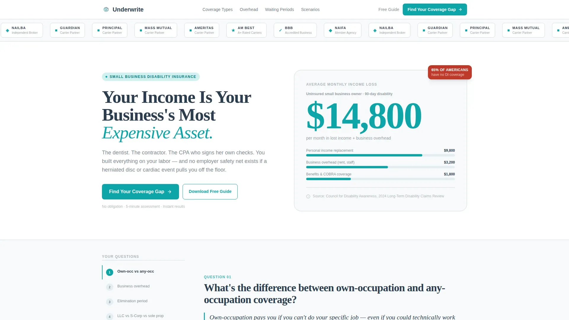
- Award badge hero section with credential rows, a catchy headline, and an oversized teal income-loss statistic
- Scroll-tracked frequently asked question sidebar that surfaces the right question at every scroll depth, including data tables and comparison charts
- Five-step "Find Your Coverage Gap" quiz modal with contextual micro-copy that connects each answer to the frequently asked question just read
Feature list
This insurance landing page is built around five core capabilities, each one designed to move a self-employed visitor from uncertainty to informed action.
Credential-First Hero Section
The page opens with a row of award badges, carrier ratings, and association seals above a heavy gunmetal headline. No hero image, no lifestyle photography. Instead, a single oversized statistic in signal teal shows the average monthly income loss for an uninsured small business owner after a 90-day disability. This approach places trust signals and social proof front and center, exactly where a good insurance landing page needs them.
Scroll-Tracked frequently asked question Sidebar
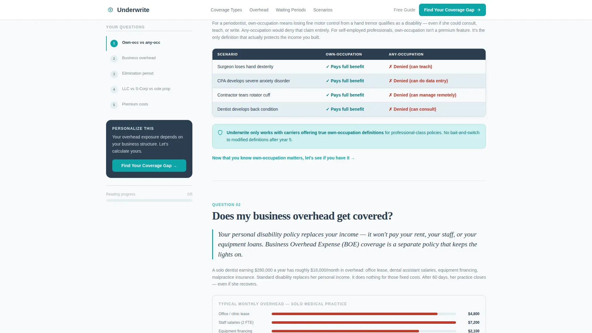
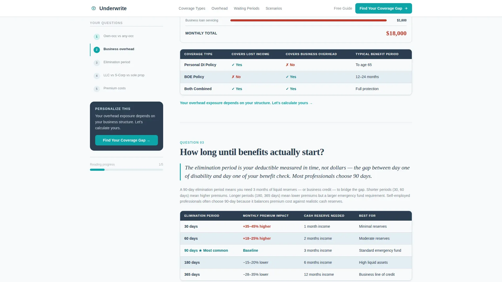
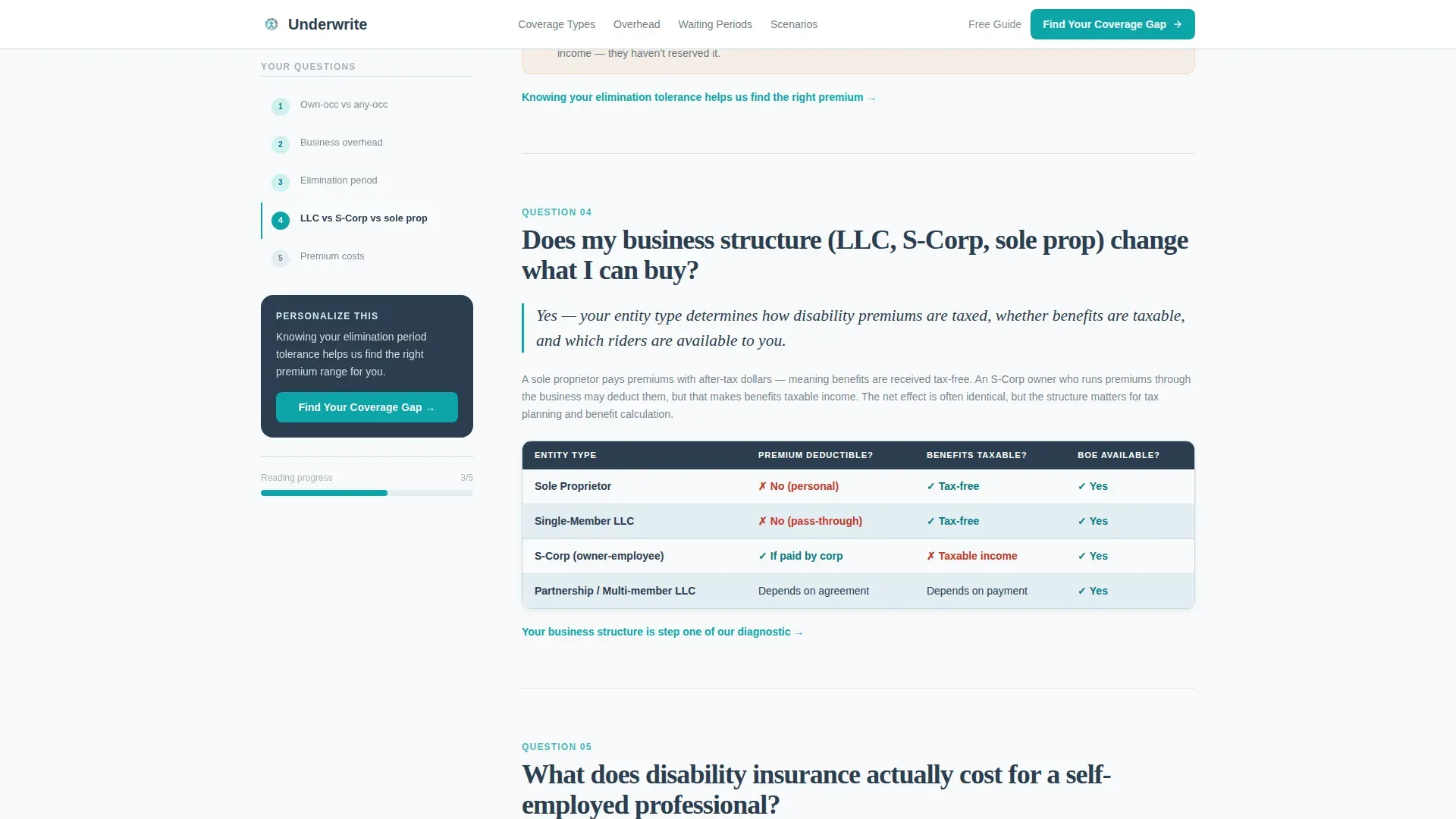
The persistent sidebar companion holds a numbered question list that tracks the visitor's scroll position in real time. Each main content section answers one specific question that self-employed professionals actually search for: coverage for business overhead, the difference between own-occupation and any-occupation definitions, and how long until benefits start. Each answer opens with a plain-English sentence, then unfolds into data tables and comparison charts. This frequently asked question-driven structure keeps users engaged and addresses the most common weak spots in coverage understanding.
Five-Step Coverage Gap Quiz
The primary call to action launches a five-step diagnostic modal. Visitors answer questions about their business structure, annual revenue range, current coverage status, number of dependents, and acceptable monthly premium range. The sidebar surfaces the quiz entry point at three scroll depths, each time with micro-copy tied to the section just read. This multi-step gap assessment tool helps users pinpoint their specific risks and moves them naturally toward a quote.
Email-Gated PDF Comparison Chart
Visitors who are not yet ready to quote can download a PDF comparison chart. The download is gated behind a simple email field, creating a secondary conversion path that captures leads without pressure. Simplifying forms this way helps reduce friction and improves the overall conversion rate for visitors at an earlier stage of their decision.
Coverage Scenario Calculator Section
A dedicated visual section shows income loss projections across different disability scenarios. Visitors can see what a 30-day, 90-day, or 180-day disability would mean in real dollar terms for their business. This section makes the coverage gap analysis tangible and personal, turning abstract risk into specific numbers that motivate action.
Page sections overview
| Section | Purpose |
|---|---|
| Award Badge Hero | Opens with credentials, catchy headline, and income-loss stat |
| frequently asked question Sidebar Companion | Scroll-tracked questions with data tables and comparison charts |
| Coverage Scenario Calculator | Visual income-loss projections across disability durations |
| Quiz Call to Action | Five-step diagnostic modal for gap analysis and quoting |
| PDF Download Gate | Email-gated comparison chart for early-stage visitors |
| Footer | Linear single-row footer with policy and contact links |
Design & branding system
The visual identity follows a Data Command theme. The palette feels like a medical chart printed on expensive paper: sterile, authoritative, and completely focused on the numbers. There is no lifestyle imagery and no decorative distraction. White space is used deliberately to create a clinical reading experience that builds confidence.
- Arctic White (#F8FAFB) and pale glacier blue (#E3EDF4) form the base, with gunmetal data ink (#2C3E50) for all primary type
- Signal teal (#0EA5A9) is reserved for interactive elements, progress indicators, and high-priority statistics
- DM Sans handles all body copy; Fraunces serif display type is used for stats and emphasis to create financial-document authority
Mobile & speed optimization
The template is built desktop-first to match the financial consultation experience its target audience expects. The layout is fully responsive and scales cleanly to tablet and mobile viewports. The page loads fast through a static-first architecture, with client components reserved only for interactive elements like the quiz modal, frequently asked question accordion, and scroll-position sidebar tracker.
- Interactive elements use staggered reveal animations and count-up stat effects that add motion without adding load weight
- The frequently asked question accordion, quiz modal, and email gate are handled as isolated client components to keep the base page lightweight
- The single-column mobile layout keeps the sidebar companion accessible without disrupting the reading flow
How this template helps you convert
Every element on this insurance landing page works toward one goal: moving a self-employed visitor from risk awareness to a submitted quote or a captured email address. The page does not try to sell multiple insurance products at once. It stays focused on a single conversion action at every scroll depth.
- The hero section establishes immediate credibility through industry awards, trust signals, and a single shocking statistic, giving the visitor a reason to keep reading before any coverage details appear.
- The scroll-tracked frequently asked question sidebar answers the exact questions self-employed professionals type into search bars, reducing anxiety and building the kind of trust that high converting landing pages depend on.
- The quiz modal and email-gated PDF offer two conversion paths at different levels of buyer readiness, so the page captures value from both the visitor who is ready to quote and the one who still needs more time.
Other information about this template
This template was designed to serve one of the most underserved segments in the insurance business: self-employed professionals who have no employer-sponsored safety net. It is worth noting that this gap analysis landing page applies beyond disability coverage alone. The same frequently asked question-driven structure, gap analysis framework, and quiz conversion path can be adapted for brokers who also serve clients with potential gaps in health insurance, cyber liability, or general liability coverage.
The gap analysis methodology built into the template reflects best practices for insurance gap analysis across personal and commercial lines. An insurance gap analysis is a systematic review designed to find blind spots and shortfalls in current policies. Performing one helps individuals and businesses understand their true vulnerabilities, including areas like cyber liability, data breach exposure, and liability risks that exceed standard policy limits.
A few examples of how this applies more broadly: property owners in a flood prone area may discover their basic homeowner policy does not cover flood damage, exposing them to major losses. Clients with auto insurance may carry coverage limits that have not been reviewed in years. Even travel insurance holders can face a protection gap if their current policies exclude specific natural disasters or climate change-related events. Rising premiums and emerging risks make regular gap analysis more important than ever.
The template is also a great example of how good insurance landing design principles translate into real business outcomes. A high-converting insurance landing page must build immediate trust and explain complex value without overwhelming visitors. This template does both. Removing the navigation menu keeps visitors focused on the conversion goal. A strong visual hierarchy places the headline and primary call to action above the fold. The hero image equivalent here is the credential row and stat block, not a stock photo.
Insurance companies, insurers, and independent brokers can all use this template as a foundation for their insurance landing strategy. The page is designed so that claims data and scenario projections can be dropped directly into the existing table and chart components. Actionable insights from real claims data make the coverage gap analysis section more persuasive. AI-driven automation can transform time-consuming policy reviews into actionable strategies, and this template is structured so that those insights can be surfaced cleanly within the frequently asked question accordion and scenario sections.
For agents who want to stay ahead of the market, the template also supports broader risk management conversations. Unique risks emerge constantly as new business structures appear and as climate change reshapes natural disasters exposure. The template helps agents address these new risks with the same structured, educational approach that makes the disability insurance landing page effective.
- This template is designed specifically for the disability insurance niche but adapts naturally to adjacent insurance products
- The frequently asked question-driven sidebar keeps users engaged and reduces drop-off by matching content to the exact questions in each visitor's mind
- Benefit-oriented copy, bullet points, and comparison charts make complex policy language scannable and understandable
- The five-step quiz provides actionable insights that guide visitors toward the right coverage without requiring expert advice upfront
- Small businesses with unique risks, high risk areas of operation, or evolving coverage needs will find the gap analysis structure especially useful
Theme
Data Command
Creative direction
FAQ-Driven
Color system
Arctic White
Style
Sidebar Companion
Direction
Quiz/Assessment
Page Sections
Credential-first Award Badge Hero
Scroll-tracked Frequently Asked Question Sidebar
Five-step Gap Analysis Quiz
Income Loss Scenario Calculator
Email-gated PDF Comparison Chart
Related questions
Can I use this template for insurance products beyond disability coverage?
Does the quiz modal connect to a quoting system automatically?
How does the scroll-tracked frequently asked question sidebar work?
What makes this a good insurance landing page for self-employed professionals?
Can the email-gated PDF section be removed if I only want the quiz conversion path?



