Insurance Agency Blog & Policy Education Website Template
Underwrite is a card grid landing page built for insurance agency blogs. It transforms dense policy content into fast, scannable reads using a dark cockpit aesthetic, animated stat counters, and a modular card layout. Designed to drive app downloads, it pairs sharp editorial design with kinetic scroll behavior, built for agents, families, and small business owners who need real answers fast.
by Rocket studio
Quick summary
Underwrite is a single-page insurance agency blog template built around a card grid layout and a Dynamic Motion theme. It opens with three animated stat counters, flows into a filterable article grid, and closes every fifth card with a contextual app download prompt. The page is built to prove content value first, then earn the tap.
Who this template is for
This template is designed for insurance agencies and independent agents who publish educational blog content. It fits teams that want their writing to feel as sharp as their advice, not buried in dense, hard-to-read policy language.
- Independent agents who publish carrier comparisons and coverage guides
- Insurance agencies targeting small business owners and young families
- Blog editors who want a structured, visually driven content hub
What problem this template solves
Most insurance blog pages look like static article archives. Readers bounce before they find value. This template fixes that by making the content feel live, urgent, and worth staying for.
- Dense policy language gets broken into short, scannable card formats
- Visitors have no clear path to act, this template adds a persistent app download bar
- Generic layouts fail to signal expertise, the stat wall does that immediately on load
What you get with this template
You get a fully structured landing page layout designed for an insurance agency blog. Every section has a specific role, from the animated header to the modular card grid to the sticky app conversion bar.
- An animated stats header with three odometer-style counters
- A color-coded, filterable card grid with staggered entry animations
- A sticky bottom bar and in-card prompts driving app downloads
Feature list
This template packs its functionality into visible, purposeful design components. Every feature pulls weight.
Animated Stats Header
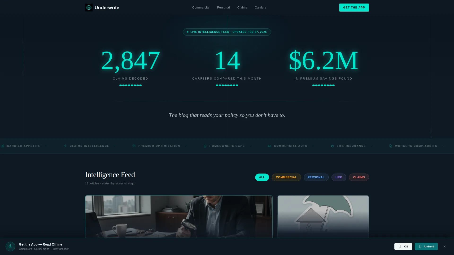
Three oversized counters animate upward on page load, each digit ticking like an odometer. The figures, claims decoded, carriers compared, and premium savings found, are rendered in reactor-core cyan against a cockpit dark background. A single headline in signal white anchors the section below the numbers.
Filterable Card Grid
Category chips labeled Commercial, Personal, Life, and Claims let visitors filter the article grid instantly. The shuffle animation is kinetic, with cards reordering fluidly rather than blinking in and out. This keeps the reader oriented while encouraging them to explore different content types.
Staggered Launch Energy Scroll
The first row of cards explodes outward from center on entry, staggered by 80 milliseconds per card. Each card tilts subtly as it enters, as if dealt from a deck. This rhythm pulls readers into the scroll and holds their attention through the grid.
Trending Now Pulse Cards
Every third card row includes a "Trending Now" card with a pulsing cyan border. The repeating heartbeat pattern creates a visual cadence that draws the eye and encourages deeper scrolling. It signals editorial curation without requiring any additional copy.
Sticky App Download Bar
A bottom bar slides up after the visitor scrolls past two cards. It houses a primary call-to-action button alongside platform icons, all on a cockpit dark background with a bouncing cyan download arrow. The bar stays present without blocking the reading experience.
In-Card Contextual Prompts
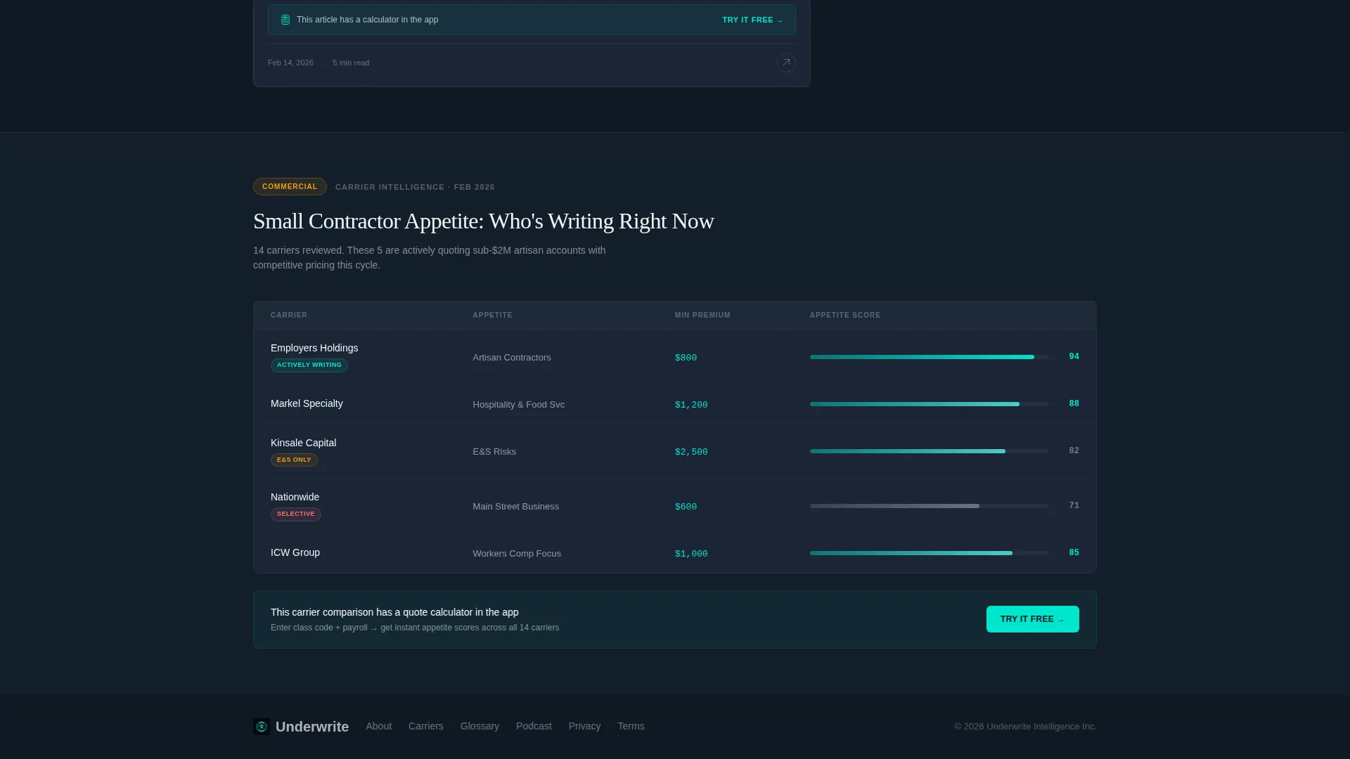
Every fifth card contains an embedded conversion prompt tied to the article content. The prompt references a calculator or interactive tool available in the app, paired with a "Try It Free" tap link. There are no form fields, the tap goes directly to the app store.
Page sections overview
| Section | Purpose |
|---|---|
| Animated stats wall | Opens with three live counters to establish credibility instantly |
| Tagline headline | Anchors the brand voice below the counters in signal white |
| Category filter chips | Lets visitors sort cards by Commercial, Personal, Life, or Claims |
| Launch card row | First article row animates outward with staggered entry |
| Modular card grid | Houses quick-read tips, carrier comparisons, and embedded calculators |
| Trending Now cards | Pulsing bordered cards appear every third row to signal popularity |
| In-card app prompts | Every fifth card includes a contextual "Try It Free" tap link |
| Sticky download bar | Persistent bottom bar with app store links slides up after two scrolls |
Design & branding system
The visual identity follows a Teal Catalyst color system built around the contrast between deep command teal and a near-black background canvas. The result feels like avionics instrumentation, calm authority with a visible pulse of energy underneath every interactive element.
- Deep command teal (#0D7377) anchors headers, card borders, and structural elements
- Reactor-core cyan (#00E5CC) activates on hover states, progress indicators, and the bouncing download arrow
- Cockpit dark (#0F1923) fills the background canvas; signal white (#F0F4F5) is used for body text and card faces
Mobile & speed optimization
The template is designed with a mobile-first reading context in mind. Every layout decision reflects how real readers engage with insurance content on small screens, between tasks, and on the go.
- Card grid scales to single-column layout on mobile without losing the staggered animation feel
- Sticky bottom bar is sized for thumb-tap interaction and stays clear of main content
- No images or illustrations are used, the layout relies entirely on data display and typography, keeping visual weight low
How this template helps you convert
The conversion strategy in this template is earned, not assumed. Every element builds credibility before asking for anything.
- The animated stats header establishes authority in the first three seconds, giving visitors a reason to keep scrolling before reading a single article.
- The persistent sticky bar and in-card prompts create two conversion touchpoints without interrupting the reading flow, so the ask never feels out of place.
Other information about this template
This template is part of the Insurance Agency Website Templates subcategory and sits within the broader Technology category on the marketplace. It is built as a single-page card grid landing page, not a multi-page site.
- Template style: Card Grid (Modular) with Dynamic Motion theme
- Color system: Teal Catalyst, a dark-background palette suited to data-forward insurance content
- Designed for app download conversion, not lead form capture or email sign-up
- No stock photography or illustration is used anywhere in the layout
- The page structure supports content that ranges from short tips to long-form carrier comparisons to embedded interactive calculators inside cards
Theme
Dynamic Motion
Creative direction
Launch Energy
Color system
Teal Catalyst
Style
Card Grid (Modular)
Direction
App Download
Page Sections
Animated Odometer Stats Header
Kinetic Filterable Card Grid
Staggered Card Entry Animation
Pulsing Trending Now Cards
Sticky App Download Bar
In-card Contextual App Prompts
Related questions
Who is this template built for?
Does this template include a contact form or lead capture field?
Can the card categories be changed to match my content?
What makes this layout different from a standard blog page?
Is this a single page or a multi-page website?


