Insurance Email Marketing Agency Landing Page
Underwrite is a scroll-jacked, overlap-layered landing page template built for insurance email marketing agencies. It simulates a live inbox experience, showcases real copy transformations through peelable card stacks, and drives B2B conversions with a persistent violet call to action bar. Built for regional carriers, managing general agents, and insurtech teams who need their email sequences to perform.
by Rocket studio
Quick summary
Underwrite is a single-page template designed for insurance email marketing agencies targeting B2B clients. The scroll-jacked header assembles a live inbox in real time, layered case study cards peel through raw briefs and rewritten copy, and two focused conversion paths capture high-intent partnership leads before the visitor reaches the bottom of the page.
Who this template is for
This template is built for specialized agencies and consultants who write email campaigns for the insurance industry. It speaks directly to the teams and founders who struggle to prove their value before a prospect clicks away.
- Insurance email marketing agencies pitching regional carriers and managing general agencies (MGAs)
- Insurtech founders whose platforms need agent re-engagement campaigns
- Marketing directors at carriers looking to revive lapsed-policy renewal sequences
What problem this template solves
Most agency portfolio pages read like capability decks. They tell visitors what the agency does without showing them why it works. For insurance email marketers, the stakes are higher because compliance-heavy copy, strict regulations, and skeptical buyers make the sell harder.
- Prospects leave before seeing a single proof point, because case studies are buried below the fold
- B2B buyers need to see real copy transformations, not just open-rate claims
- Generic landing page layouts do not match the niche credibility an insurance-focused agency needs
What you get with this template
This template gives you a fully structured, visually layered landing page that functions as an interactive portfolio and lead capture system. Every section is built around the insurance email marketing context from the ground up.
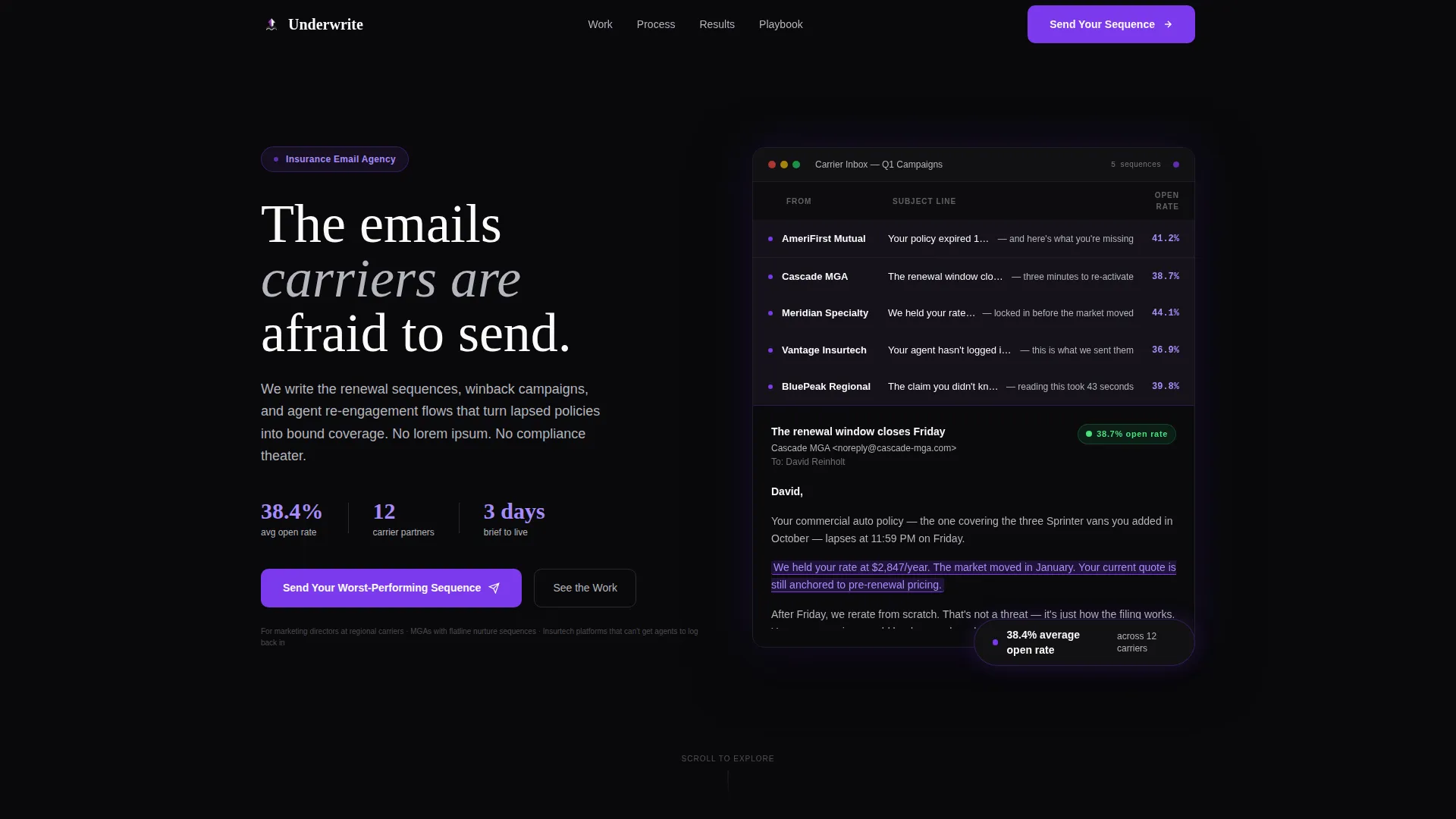
- A scroll-jacked hero that assembles a simulated email inbox, complete with rising open-rate counters and a full-screen email reveal
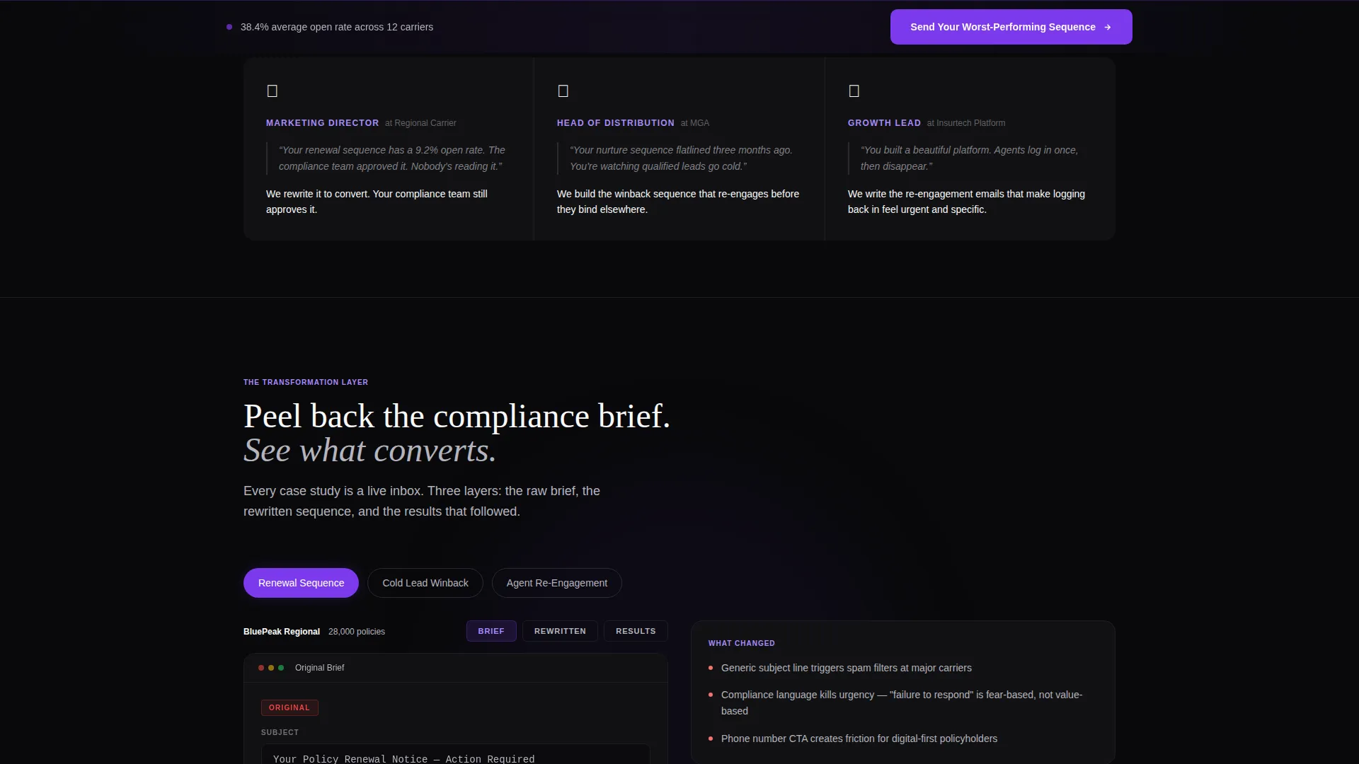
- Interactive card-stack case studies where each layer peels from compliance brief to rewritten subject line to live performance data
- Two conversion paths: a primary form capturing company name, email service provider (ESP), book size, and a worst-performing subject line, plus a gated secondary offer for the full carrier playbook
Feature list
This template ships as a cohesive experience rather than a collection of loose sections. Every feature ties back to one goal: earning the trust of a senior insurance buyer before the first conversation.
Scroll-Jacked Inbox Hero
The viewport locks on scroll as a simulated inbox assembles itself. Subject lines slide in from the right, open-rate counters tick upward in electric violet, and one email expands to full screen revealing highlighted conversion phrases. The sequence ends with the inbox collapsing into the agency logotype and a single proof stat: 38.4% average open rate across 12 carriers.
Peelable Case Study Card Stacks
Each case study is presented as a layered card stack the visitor peels through on scroll. Layer one shows the raw compliance brief. Layer two reveals the rewritten subject line. Layer three surfaces the open and click performance data. The narrative escalates from simple renewal sequences through multi-touch winback campaigns to full lifecycle automation builds.
Persistent Violet Conversion Bar
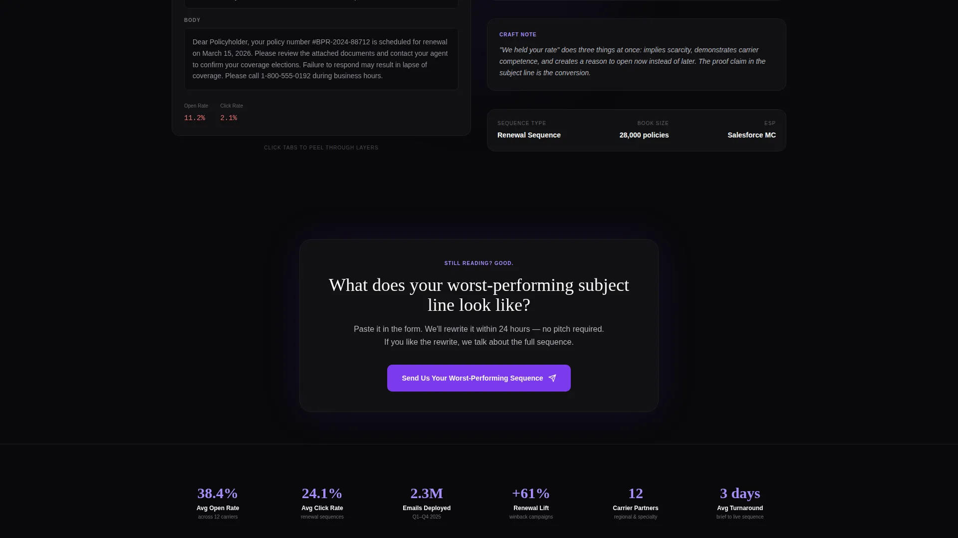
After the second case study, the primary call to action appears inline. It then anchors as a persistent bottom bar for the remainder of the page. The bar uses the electric violet signature color to stay visible against the void black canvas without interrupting the reading flow.
Dual Conversion Path Design
The primary path captures a partnership lead through a focused form: company name, current ESP, book size range (under 10K, 10K to 100K, or 100K and above), and a paste field for the visitor's lowest-performing subject line. The secondary path gates the full carrier playbook behind a business email address, giving lower-intent visitors a clear next step.
Void and Violet Visual System
The layout uses absolute void black as the primary canvas, electric violet for all interactive and accent elements, muted policy-paper gray for body text, and sharp claim-white for headlines that punch through layered cards. The result is a dark-office reading aesthetic where content floats forward and everything else recedes.
Page sections overview
| Section | Purpose |
|---|---|
| Scroll-Jacked Hero | Simulates live inbox assembly and delivers the agency's headline proof stat |
| Open Rate Counter | Reinforces credibility with a ticking violet counter during hero scroll sequence |
| Full-Screen Email Reveal | Expands one email to show real insurance copy with highlighted conversion phrases |
| Agency Logotype Collapse | Transitions the hero into the brand identity after the inbox sequence completes |
| Case Study Layer One | Displays the raw compliance brief as the starting point for each transformation |
| Case Study Layer Two | Reveals the rewritten subject line produced by the agency |
| Case Study Layer Three | Surfaces open rate and click data tied to the rewritten copy |
| Primary call to action Inline | First conversion prompt placed directly after the second case study |
| Partnership Lead Form | Captures company name, ESP, book size, and worst-performing subject line |
| Carrier Playbook Gate | Secondary conversion path gated behind a business email address |
| Persistent call to action Bar | Violet bottom bar that anchors the primary call to action on every scroll position |
Design & branding system
The Void and Violet color system gives this template a distinct visual personality that immediately separates it from generic agency layouts. The palette was chosen to evoke the experience of reading a glowing screen in a dark office, where the content commands full attention.
- Core colors: absolute void black (#09090B) for the canvas, electric violet (#7C3AED) for interactions and accents, muted policy-paper gray (#B4B4BD) for body text, and sharp claim-white (#FAFAFA) for headlines
- The Lens and Frame theme uses depth layering so each card and content block appears to float forward from a receding background
- Typography and spacing are calibrated for dark-mode reading, with high contrast between headline white and canvas black
Mobile & speed optimization
The overlap and layered design translates cleanly to narrower viewports without losing its depth effect. Scroll-jacked sequences are scoped to their containers so the overall page flow stays predictable on touch devices.
- Card stack interactions adapt to vertical scroll on mobile, maintaining the peel-through metaphor without requiring horizontal swipes
- The persistent violet call to action bar remains visible at the bottom of the screen on all viewport sizes, keeping the conversion action within reach
- Heavy visual elements like the inbox simulation are contained within defined scroll zones, so the rest of the page loads and renders independently
How this template helps you convert
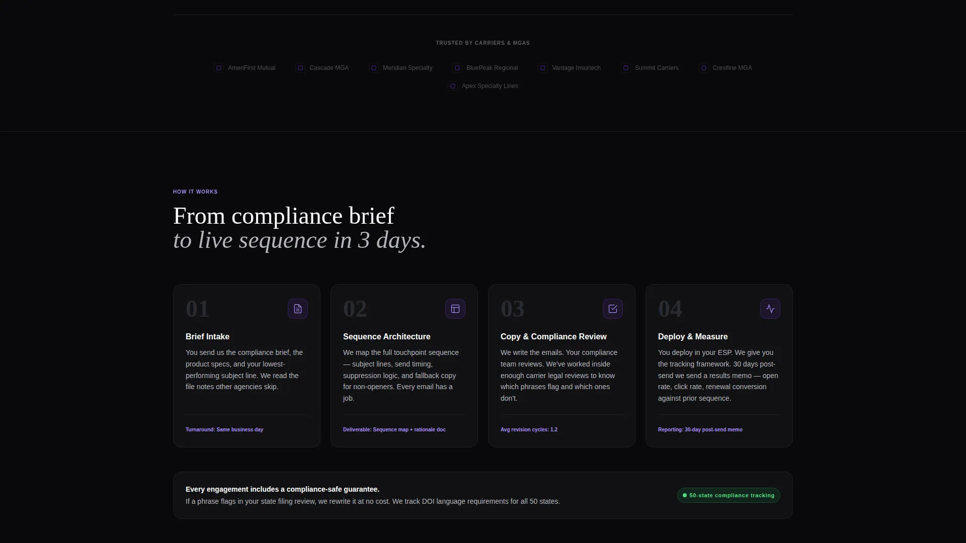
The page is engineered around a single psychological arc: show the problem, demonstrate the transformation, then make the ask feel obvious. By the time a visitor reaches the lead form, they have already watched their own situation play out in the case studies.
- The scroll-jacked hero establishes credibility in the first few seconds by showing a real stat and real copy, before the visitor reads a single word of marketing language.
- The layered case study stacks escalate in complexity, so a visitor who manages a small renewal book and one who runs a multi-carrier lifecycle program both find a scenario that mirrors their challenge.
- The dual call to action structure means high-intent buyers go straight to the partnership form while earlier-stage buyers download the carrier playbook, keeping both segments in the funnel.
Other information about this template
Underwrite is part of the Overlap and Layered template family within the Interactive Explorer creative direction. It is built as a single-page experience with a section-led scroll flow, making it well suited for direct campaign traffic and referral links shared within insurance industry networks.
- Template style: Overlap and Layered, following the Interactive Explorer creative direction
- Theme: Lens and Frame, using the Void and Violet color system
- Header concept: Scroll-Jacked Experience with a simulated inbox assembly sequence
- Landing page direction: Partnership and B2B conversion
- Category: Portfolio and Agency, subcategory Insurance Marketing and Agency
- Best suited for agencies, consultants, and insurtech teams in the insurance email marketing niche who want a portfolio page that functions as an active sales tool
Theme
Lens & Frame
Creative direction
Interactive Explorer
Color system
Void & Violet
Style
Overlap/Layered
Direction
Partnership/B2B
Page Sections
Scroll-jacked Inbox Hero
Peelable Case Study Card Stacks
Persistent Violet Conversion Bar
Dual Conversion Path Structure
Void and Violet Layered Design System
Related questions
Who is this landing page template designed for?
Can I adapt the case study card stacks for my own client work?
What does the lead capture form collect?
Is there a secondary conversion path for visitors who are not ready to submit a form?
How does the scroll-jacked hero sequence work?



