Young Professional Health Insurance Landing Page
Underwrite is a dashboard-style health insurance landing page built for young professionals navigating coverage for the first time. A live four-step quiz sits at the center of the page, translating visit frequency, prescriptions, income, and risk tolerance into a personalized coverage tier recommendation with estimated monthly costs. Every section feels like a spreadsheet filling itself in.
by Rocket studio
Quick summary
Underwrite is a single-page health insurance advisory template designed for young professionals who are choosing coverage on their own for the first time. A four-step quiz drives the entire experience, producing a personalized coverage score, an estimated monthly cost, and a network match. The page looks and feels like a data dashboard, not a brochure.
Who this template is for
This template is built for founders, advisors, and developers creating health insurance tools aimed at young adults entering the workforce or losing dependent coverage. It suits any product where the goal is turning a confusing decision into a clear, data-driven recommendation.
- Twenty-six-year-olds who have just aged off a parent's health plan and need immediate guidance
- First-year associates choosing between a Health Maintenance Organization (HMO) and a Preferred Provider Organization (PPO) during new-hire onboarding
- Freelancers and recent graduates who have gone without coverage and need a fast, low-friction entry point
What problem this template solves
Open-enrollment emails, deductible tables, and network-tier comparisons are genuinely hard to interpret without context. Most insurance pages respond with walls of text. Underwrite solves this by replacing static content with an interactive audit that produces answers specific to the visitor's situation.
- Young adults stall on coverage decisions because the terminology feels inaccessible and the stakes feel abstract
- Standard insurance pages offer generic plan lists with no personalized guidance, so visitors leave without acting
- The gap between "I need insurance" and "I know which plan to pick" is where this template lives and closes
What you get with this template
You get a complete, single-page dashboard template structured around a four-step quiz conversion flow. Every section is designed to build trust incrementally, raise awareness of real cost risks, and deliver a concrete recommendation before the visitor leaves.
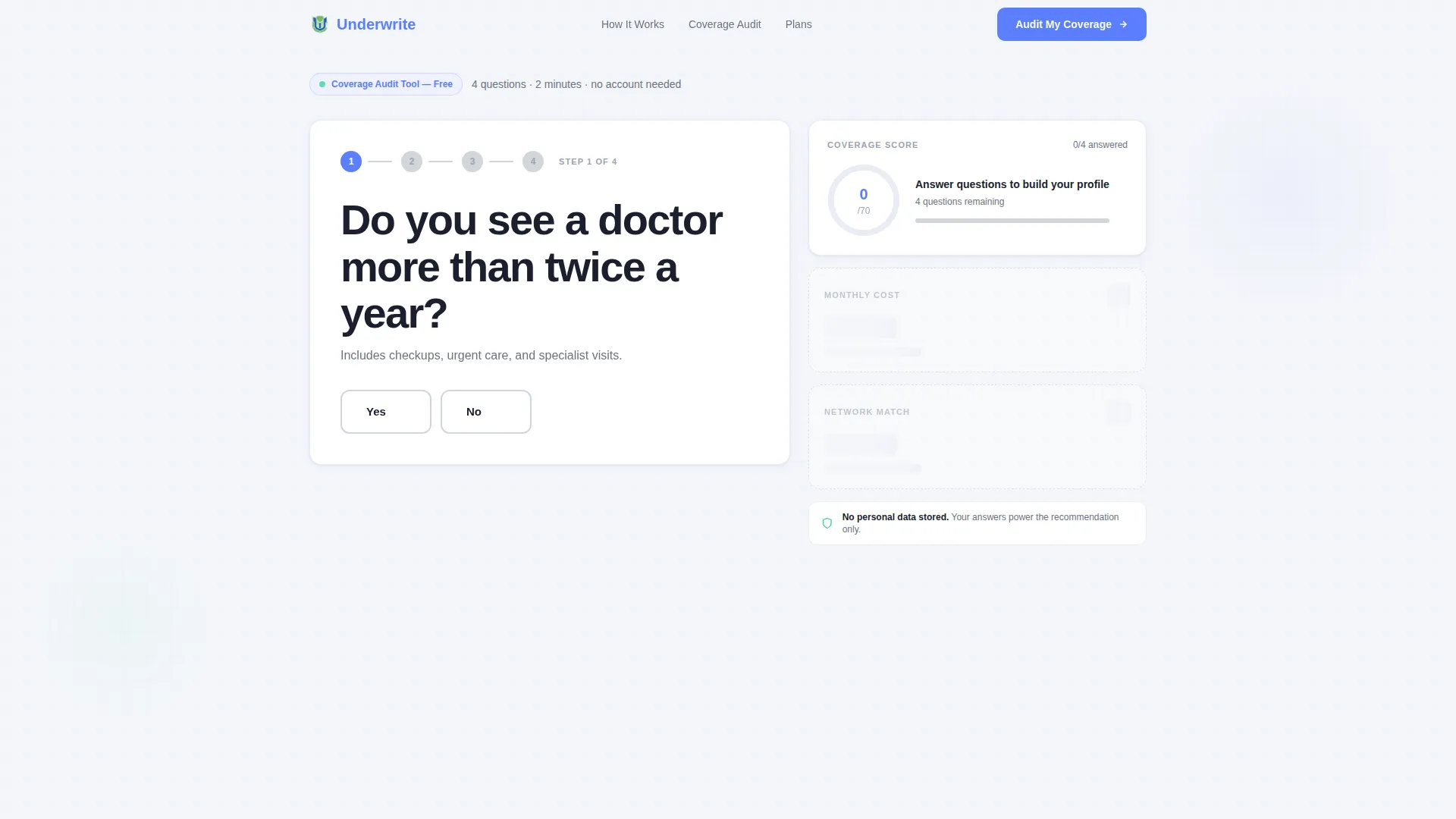
- A live multi-step quiz hero with grayed-out dashboard cards that fill in as answers progress
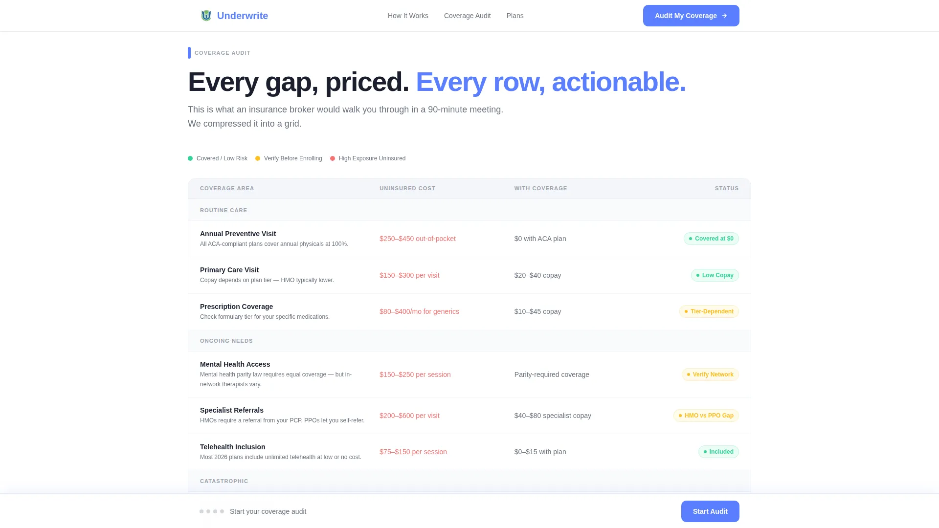
- A visual coverage audit grid with color-coded status rows across prescription, mental health, emergency, and telehealth coverage
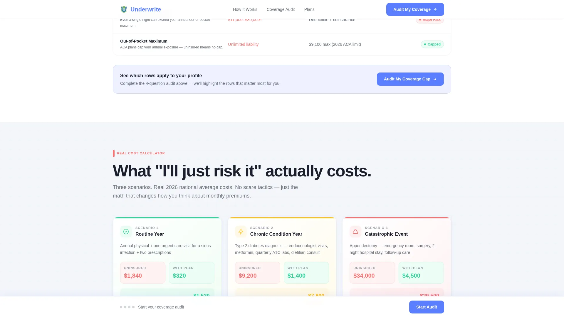
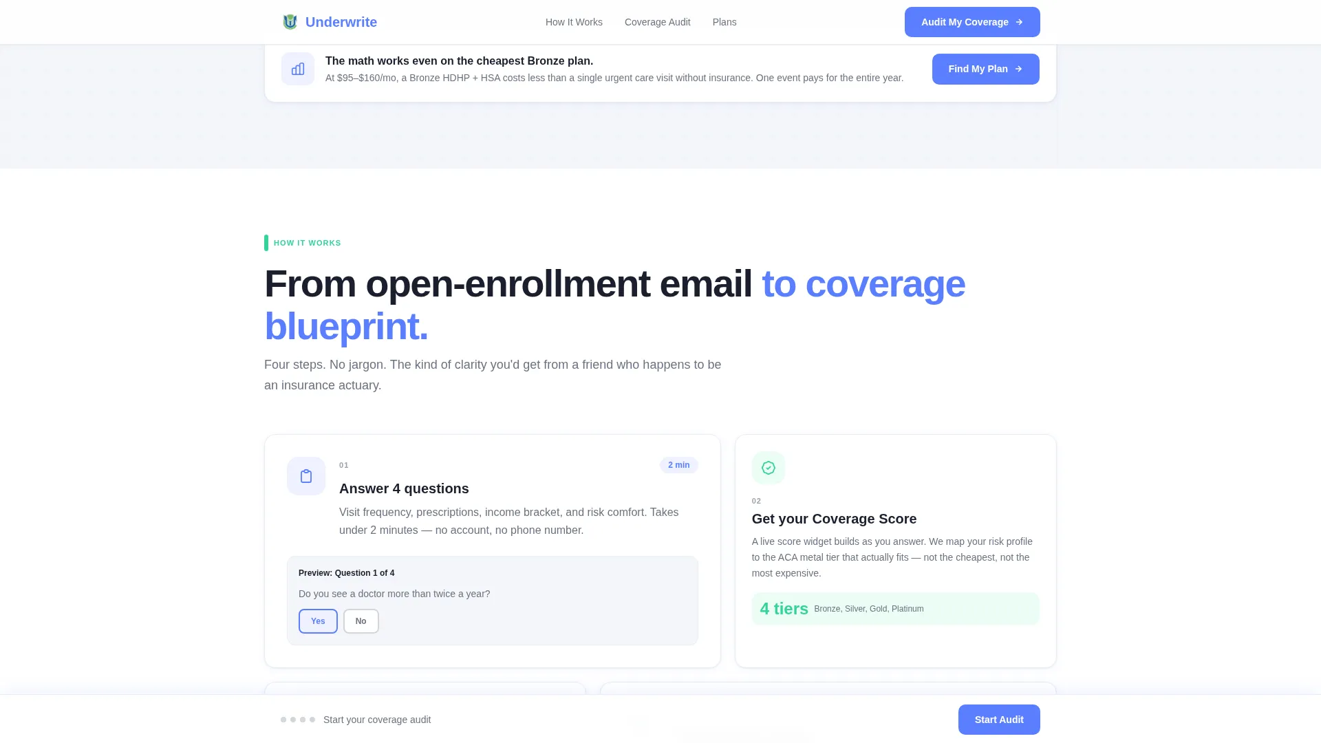
- An escalating cost-risk calculator, a four-step process bento grid, testimonial cards with named details, and an email-gated plan comparison call to action
Feature list
This template includes six purpose-built interactive and visual components, each grounded in the brief's conversion logic.
Live Four-Step Quiz Hero
The header is a functional multi-step form already mid-progress on load. Step one asks a single plain-language question. Surrounding dashboard cards for coverage score, estimated monthly cost, and network match display as grayed-out placeholders until the visitor begins answering, creating immediate visual motivation to engage.
Color-Coded Coverage Audit Grid
A scrollable checklist grid covers six coverage dimensions: prescription access, mental health services, emergency room cost caps, specialist referral requirements, and telehealth inclusion. Each row populates with a red, yellow, or green status indicator once the quiz is complete, making gaps visible at a glance.
Escalating Cost-Risk Calculator
Three scenario cards frame the financial stakes of going uninsured: routine care, chronic condition management, and catastrophic events. Each card shows a "what this costs uninsured" figure in USD, raising the perceived value of getting covered without relying on fear-based language.
Live Score Widget in Sidebar
As each quiz step is answered, a visible score widget updates in real time. The sidebar widget keeps the visitor oriented within the four-step flow and reinforces that their inputs are producing a tailored result, not a generic one.
Sticky Progress Bar with Live Counter
A bottom-anchored sticky bar tracks quiz progress with a plain-language counter such as "2 of 4 complete, keep going." The bar doubles as a persistent call-to-action anchor, ensuring the primary conversion prompt stays visible throughout the entire scroll experience.
Email-Gated Plan Comparison
After quiz completion, the results surface a personalized coverage tier recommendation with an estimated monthly cost. A secondary call to action, "Compare My Top 3 Plans," gates the detailed comparison behind a single email field. The friction is minimal because the visitor has already invested four steps of attention.
Page sections overview
| Section | Purpose |
|---|---|
| Quiz Hero Dashboard | Opens the quiz and displays waiting score cards |
| Coverage Audit Grid | Color-coded checklist reveals coverage gaps visually |
| Cost Risk Calculator | Escalating uninsured cost scenarios raise decision stakes |
| How Underwrite Works | Bento grid explains the four-step process clearly |
| Social Proof and call to action | Named testimonials and email-gated plan comparison close |
| Footer | Single-row linear footer with minimal navigation links |
Design & branding system
The visual identity follows an Executive Suite style using the Cloud Canvas color system. The palette feels airy and data-forward, built to reinforce competence and clarity rather than warmth or softness.
- Backgrounds use soft cumulus white (#F4F6FA) and atmospheric gray (#D2D6DC); data cards float on subtle shadows against these neutral registers
- Stratosphere blue (#5B7FFF) anchors all headers, interactive elements, and primary calls to action, while signal green (#34D399) appears exclusively for completion states and positive indicators, training the eye to associate green with progress
- Typography pairs Plus Jakarta Sans for headings with DM Sans for body text, delivering a clean, modern data-product feel throughout
Mobile & speed optimization
The template is designed desktop-first to honor the dashboard and data-grid aesthetic, with full responsiveness built in for tablet and mobile viewports. Interactive components are handled with performance in mind.
- The interactive quiz and live score widget use a Client Component pattern, while static sections use a Server Component approach to keep initial load efficient
- Card-reveal animations on scroll, form step transitions, and score widget live updates are all specified at high interactivity, giving the page a product-grade feel without sacrificing responsiveness
How this template helps you convert
Every design and layout decision in this template points toward a single outcome: getting the visitor to complete the quiz and submit their email to receive a plan comparison.
- The dashboard hero creates an immediate sense of incompleteness. Grayed-out cards labeled with outcomes the visitor wants, such as their coverage score and estimated monthly cost, make the quiz feel worth starting rather than skippable.
- The sticky progress bar keeps the call to action in view at every scroll depth, while the plain-language counter reduces abandonment by showing how close the visitor is to a personalized result.
- The email capture is positioned as saving progress rather than surrendering data, arriving only after four clicks of investment have already been made, which significantly lowers perceived friction.
Other information about this template
This template was designed for the Finance and Insurance category with a Young Professional Health Insurance niche focus. It suits teams building health insurance advisory tools, employee benefits platforms, or coverage education products targeting adults aged 22 to 30 in the United States.
- The template is localized for United States use: currency displays in USD, dates follow MM/DD/YYYY format, and plan terminology reflects US health insurance conventions including HMO and PPO structures
- Animation intensity is specified as high throughout, covering form step transitions, scroll-triggered card reveals, hover states on checklist rows, and real-time score widget updates
- The footer follows a linear single-row pattern to keep the page clean and keep attention on the quiz conversion rather than secondary navigation
Theme
Executive Suite
Creative direction
Checklist & Audit
Color system
Cloud Canvas
Style
Dashboard/Data Grid
Direction
Quiz/Assessment
Page Sections
Live Four-step Quiz Hero
Color-coded Coverage Audit Grid
Escalating Cost-risk Calculator
Live Sidebar Score Widget
Sticky Progress Bar
Email-gated Plan Comparison
Related questions
Who is this template designed for?
Does the quiz work out of the box?
Can I customize the coverage categories in the audit grid?
Is this template suitable for mobile users?
What is the primary call to action on this page?



