Insurance Agency Case Study & Premium Savings Website Template
Underwrite is a bold brutalist insurance agency landing page built for case-study-driven storytelling. It leads with a functional premium-gap calculator, anchors each named case study in its own self-contained block, and converts visitors through a freemium audit model. The template is designed for independent agents, commercial underwriters, and small business owners who need proof before they trust.
by Rocket studio
Quick summary
Underwrite is a hub and spoke landing page template for insurance agencies that publish real case studies. A live premium-gap calculator sits above the fold, anchor navigation links to named case blocks, and two lightweight conversion paths keep the signup friction low. The design uses a bold brutalist aesthetic with an iridescent color palette.
Who this template is for
This template is built for insurance professionals and business owners who want to replace vague marketing copy with documented proof. If your audience learns by reading actual files, this layout matches how they think.
- Independent agents building errors and omissions (E&O) proof workflows and client education resources
- Small business owners searching for answers to specific coverage questions outside business hours
- Commercial underwriters who benchmark loss ratios and want to see peer case detail in a structured format
What problem this template solves
Most insurance agency pages describe services in general terms. That approach does not satisfy a reader who already knows their coverage has a gap and needs evidence-backed guidance. This template gives agencies a structure that leads with a working tool and follows with documented case detail.
- Visitors leave generic agency sites without finding the specific answer they searched for
- Agents lack a repeatable format for publishing case studies that also capture qualified leads
- The gap between "we offer commercial coverage" and "here is the exact liability gap that sank a catering company" costs agencies trust and conversions
What you get with this template
You get a fully structured single-page layout with a calculator-first header, a sticky anchor navigation bar, and a series of self-contained case-study spoke blocks. Each piece of the layout has a defined purpose and a built-in conversion moment.
- A premium-gap calculator pre-loaded with sample data, active on page load with no gate required
- Three named case-study blocks, each with a styled declarations page, a coverage-gap diagram, and a before-and-after policy comparison
- Two conversion paths: a primary "Run My Full Policy Audit" freemium signup and a per-case "Download This Case as PDF" email capture
Feature list
Below is a breakdown of the key functional and design components built into this template.
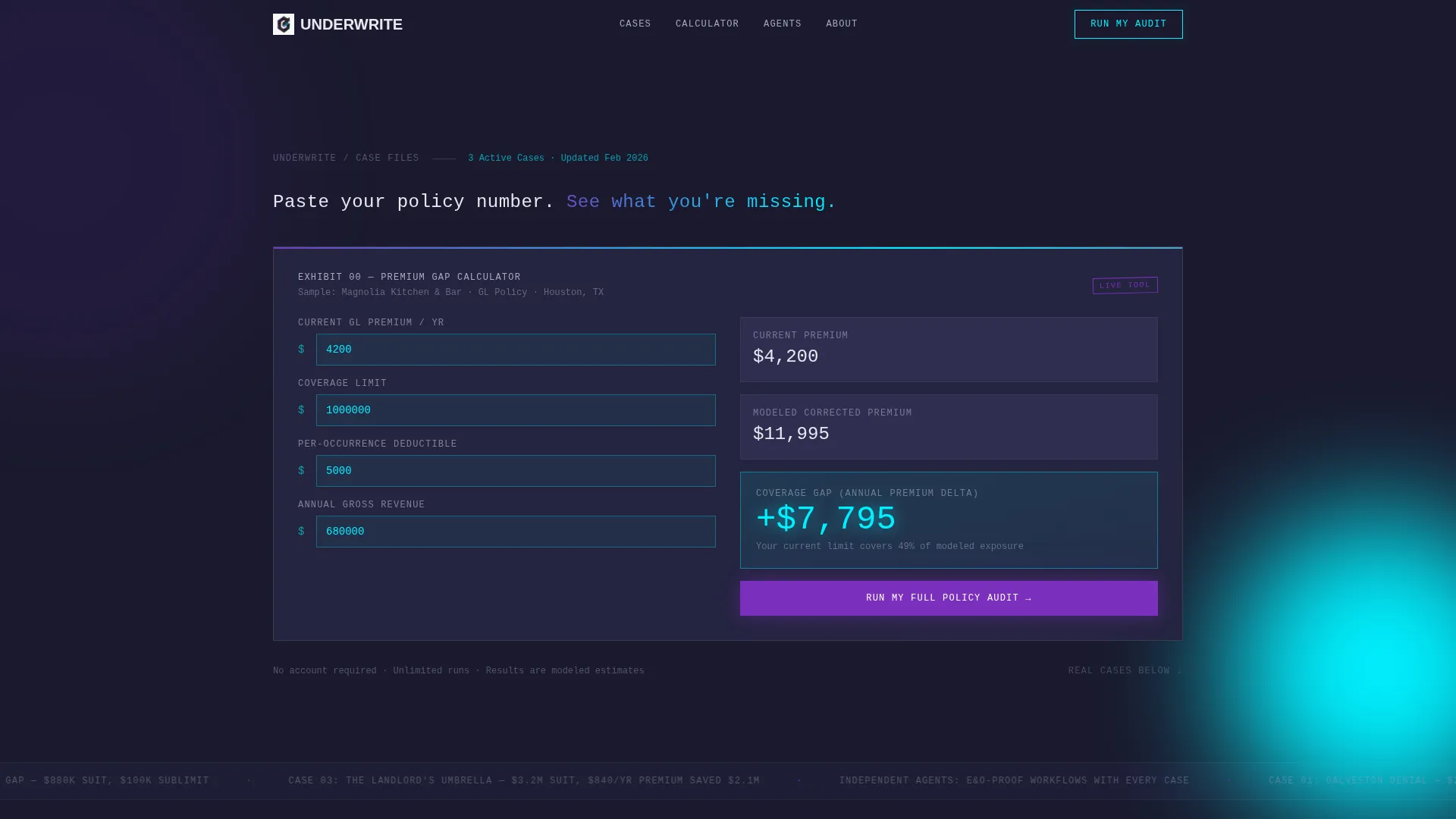
Above-the-Fold Calculator
The header section drops a product screenshot of the premium-gap calculator center stage. Sample data is pre-populated with a restaurant owner's current general liability (GL) premium versus the corrected modeled premium. The delta figure glows in electric cyan and is large enough to read at a distance. Visitors can start entering their own numbers before scrolling.
Hub and Spoke Anchor Navigation
A sticky navigation bar locks to the top of the page after the header. Each spoke is a named case study tab with a brutalist numbered label. Tabs pulse with an iridescent gradient on hover. Clicking any tab smooth-scrolls the visitor to the matching case block without a page reload.
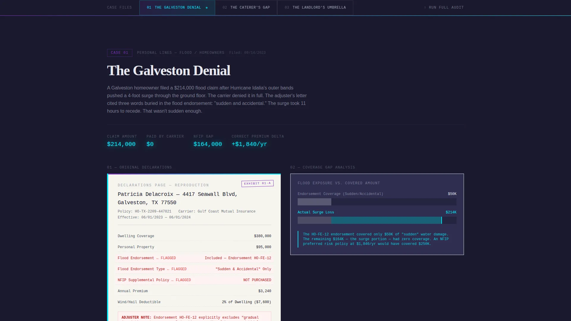
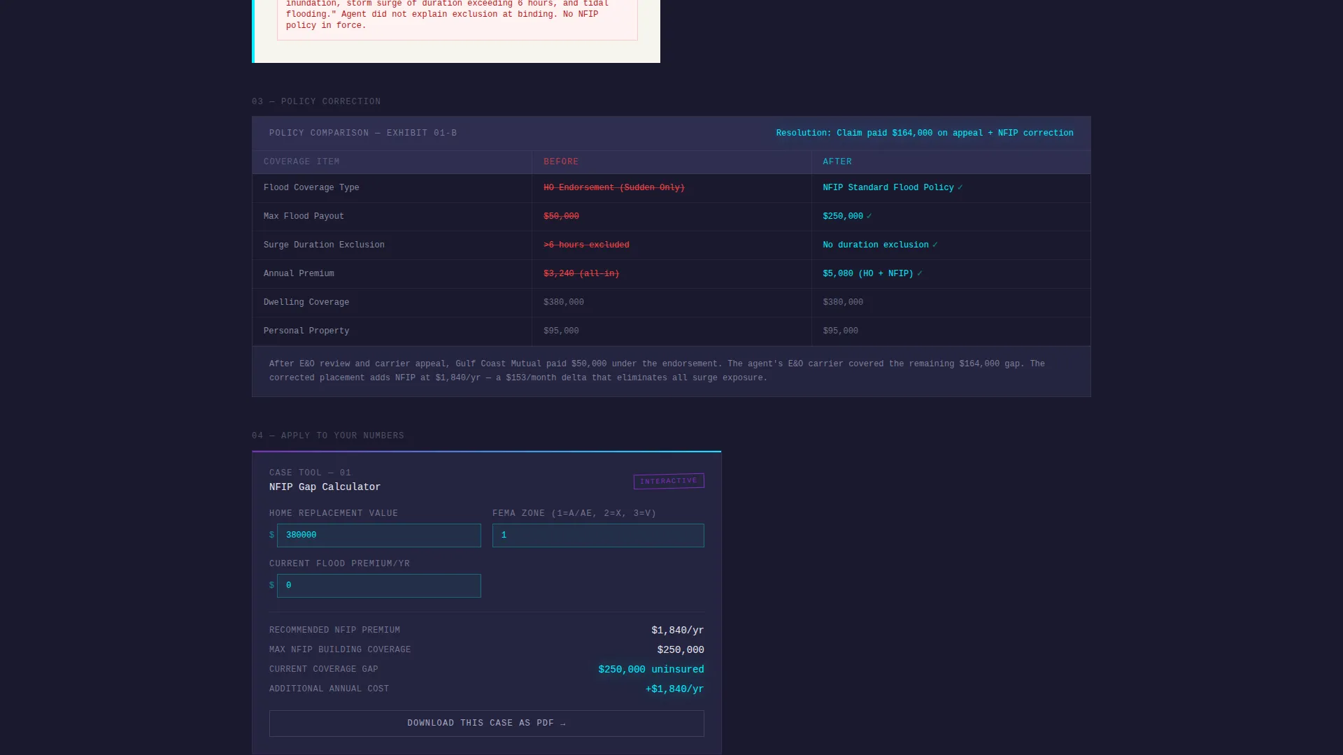
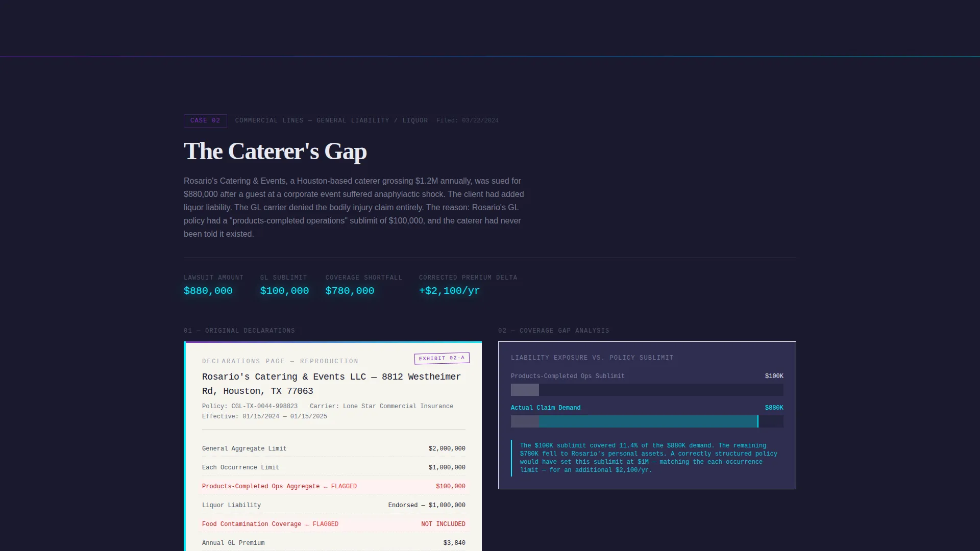
Self-Contained Case Study Blocks
Each case block reproduces the original declarations page as a styled document, diagrams the coverage gap in cyan lines, and presents a side-by-side before-and-after policy comparison. The layout follows a consistent rhythm: proof first, then a micro-calculator pre-loaded with that case's variables so the visitor can substitute their own numbers.
Per-Case Micro-Calculators
Every spoke ends with a small interactive calculator seeded with the variables from that specific case. This keeps the proof-then-tool rhythm going across the full page. Complexity escalates from personal lines to commercial to specialty, so readers stay engaged as the cases build on each other.
Freemium Audit Conversion Path
The primary call to action reads "Run My Full Policy Audit." It gates a deeper diagnostic behind a free-tier signup form that asks for an email address, an agency name or a "I'm a policyholder" toggle, and one policy PDF upload. The calculator above the fold runs without any gate, building trust before the ask appears.
PDF Case Download Path
Each case-study spoke includes a secondary conversion option: "Download This Case as PDF." This requires only an email address, making it a lighter commitment. Both conversion paths feed the same nurture sequence, giving the agency two entry points for different levels of buyer readiness.
Page sections overview
| Section | Purpose |
|---|---|
| Calculator Header | Leads with a functional premium-gap tool pre-loaded with sample data |
| Anchor Nav Bar | Sticky tab row linking to each named case-study spoke |
| The Galveston Denial | Flood claim case block with declarations page, gap diagram, and micro-calculator |
| The Caterer's Gap | Liability gap case block with styled document and before-and-after comparison |
| The Landlord's Umbrella | Umbrella policy case block showing a seven-figure lawsuit resolution |
| Primary Audit call to action | Freemium signup form gating the full policy audit diagnostic |
| PDF Download Spoke | Per-case email capture for case study PDF downloads |
Design & branding system
The visual identity runs on a bold brutalist framework combined with an AI iridescent color system. The result feels like a mainframe terminal lit from inside with prismatic color.
- Deep slab charcoal (#1A1A2E) fills background panels, pearl white (#E8E8F0) carries body text, holographic violet (#7B2FBE) powers anchor-nav highlights and active states, and electric cyan (#00F0FF) marks data callouts and calculator inputs
- Typography is brutalist sans-serif throughout; the single hero line above the calculator reads in pearl white with no competing copy around it
- The overall aesthetic references a thick case binder under fluorescent light: every section labeled, every exhibit numbered, the information presented without decoration
Mobile & speed optimization
The layout is structured so the calculator and anchor nav translate clearly to smaller screens. The hero tool and the sticky nav are the two most important elements for mobile readers, and both are designed to remain functional and readable at reduced widths.
- The sticky anchor nav collapses cleanly so spoke tabs remain tappable without crowding the viewport
- Calculator inputs and data callouts scale to remain legible, with the cyan delta figure staying prominent at any screen size
How this template helps you convert
The conversion strategy is built on a trust-first sequence. Visitors use the tool, read the proof, and then encounter the ask at a moment when they have already found personal relevance in the content.
- The ungated calculator above the fold lets visitors discover their own coverage gap before any form appears, building genuine habit and trust with the tool
- The per-spoke PDF download offers a low-commitment email capture at the exact moment a reader finishes a case that matched their situation
- The primary audit call to action arrives after the visitor has moved through at least one proof-then-tool cycle, so the freemium signup feels like a natural next step rather than an interruption
Other information about this template
This template fits agencies that operate in the insurance case study page niche and want a layout that supports both agent-facing and policyholder-facing audiences from a single page. A few additional details worth noting:
- The template style is hub and spoke with anchor navigation, making it straightforward to add or reorder case spokes as the agency publishes new files
- The freemium and trial conversion model is baked into the layout, so no structural changes are needed to support a gated diagnostic product
- The bold brutalist theme and iridescent palette are distinctive in the insurance agency website templates category, where most designs default to conservative corporate styles
- The escalating complexity order, from personal lines to commercial to specialty, is built into the spoke sequence and can be maintained or adjusted by reordering the case blocks
Theme
Bold Brutalist
Creative direction
Calculator/Tool First
Color system
AI Iridescent
Style
Hub & Spoke (Anchor Nav)
Direction
Freemium/Trial
Page Sections
Above-the-fold Premium-gap Calculator
Hub and Spoke Anchor Navigation
Self-contained Case Study Blocks
Per-spoke Micro-calculators
Freemium Policy Audit Signup
Per-case PDF Download Capture
Related questions
Can visitors use the calculator without signing up?
How many case study spokes does the template include?
What does the PDF download conversion path require from a visitor?
Who is this landing page template designed for?
Can the color palette be changed to match a different brand?


