Insurance Agency Specialist Cost Calculator Website Template
Underwrite is a dark-mode insurance landing page template built for agencies that translate complex coverage into plain language. It opens with a live three-column comparison calculator, flows through life-event frequently asked question sections with side-by-side tables, and closes with a progressive three-step lead form. Every section earns trust through utility before asking for contact details.
by Rocket studio
Quick summary
Underwrite is a single-page insurance landing page template designed for agencies that turn policy fine print into clear, searchable answers. A working coverage comparison calculator greets visitors immediately, organized frequently asked question sections follow by life event, and a progressive lead form captures qualified interest. The Void and Violet color system keeps the experience focused and visually premium at every scroll depth.
Who this template is for
This template is built for insurance agencies that lead with education rather than a sales pitch. It suits teams who already know that potential customers arrive late at night with specific questions, not vague curiosity.
- First-time homebuyers comparing home policy types such as HO-3 and HO-5 coverage
- Small business owners who received a certificate of insurance request they do not understand
- New parents pricing term life insurance after a major family milestone
What problem this template solves
Most insurance websites bury the information that potential customers actually need. Visitors land on a page, scan a hero image and a tagline, and leave before they ever understand their coverage options. The result is lost leads, wasted traffic, and an agency that looks just like every other insurance company online.
- Visitors bounce before seeing the value proposition because the page leads with branding instead of answers
- Industry jargon in coverage descriptions creates friction and reduces confidence
- Generic landing page layouts give potential customers no reason to stay or return
What you get with this template
This template delivers a fully structured, interactive insurance landing page ready to be customized with your agency details and coverage data. Every section is purposefully ordered to move a visitor from confusion to confidence and then to conversion.
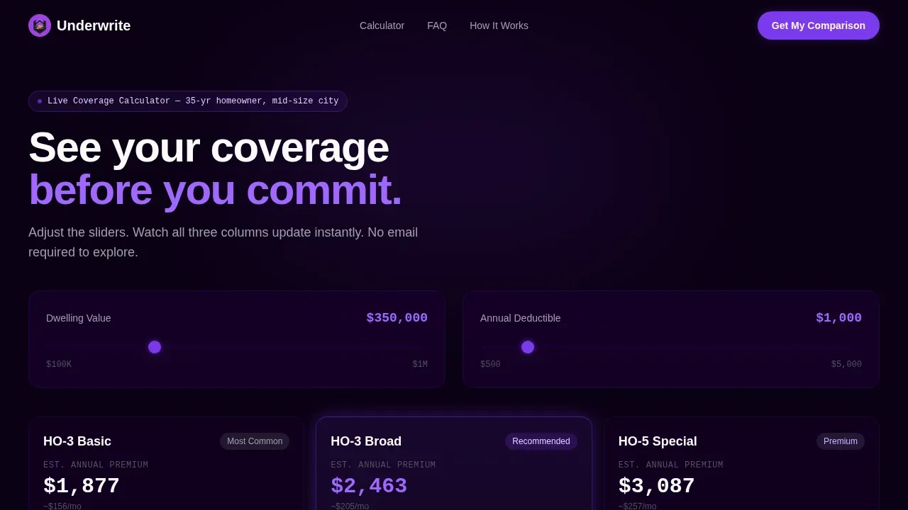
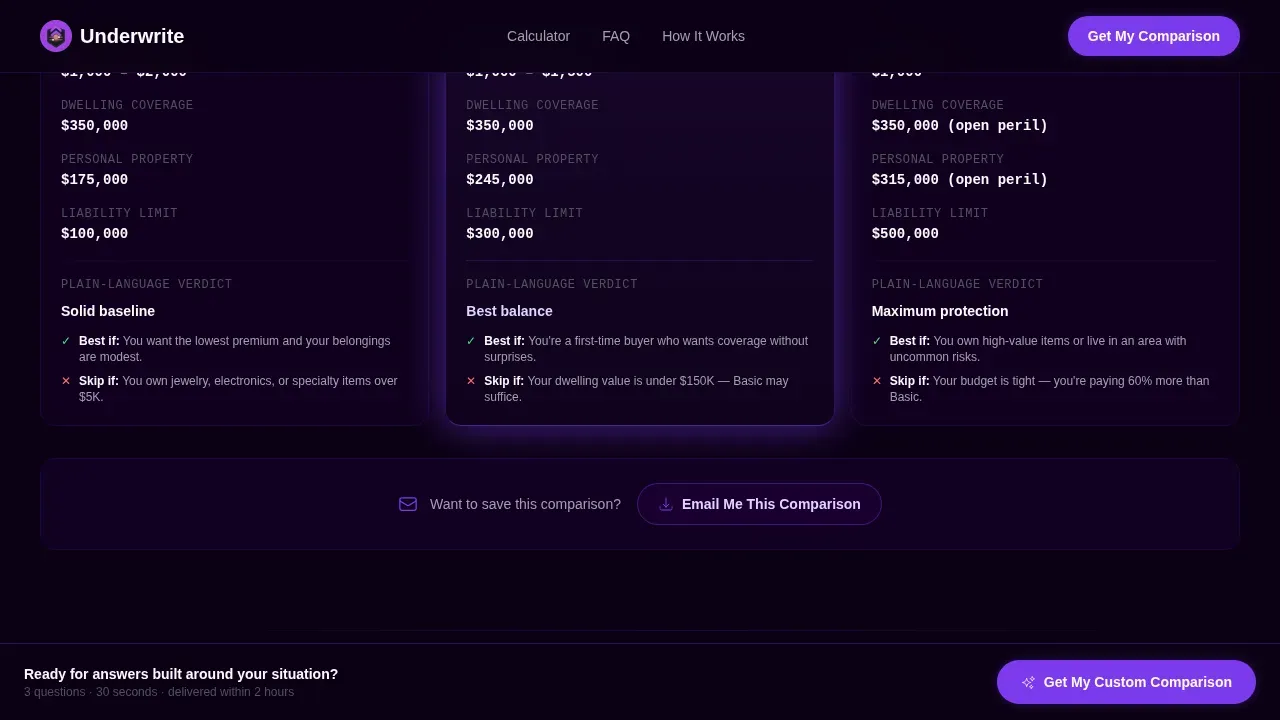
- An interactive three-column coverage comparison calculator with real-time sliders for dwelling value and deductible amount
- Life-event frequently asked question directory sections with accordion-style comparison tables and plain-language verdict rows
- A progressive three-step lead generation form with a sticky bottom call-to-action bar and a secondary low-commitment email capture path
Feature list
This template includes several key features designed to guide visitors through complex insurance decisions without overwhelming visitors or forcing them to read walls of text.
Real-Time Coverage Comparison Calculator
The landing page opens with a working three-column calculator already loaded with a default scenario. Visitors can adjust dwelling value and deductible sliders and watch all three columns update instantly. This approach means visitors interact with real data before they have decided to stay, which is a compelling reason to keep scrolling.
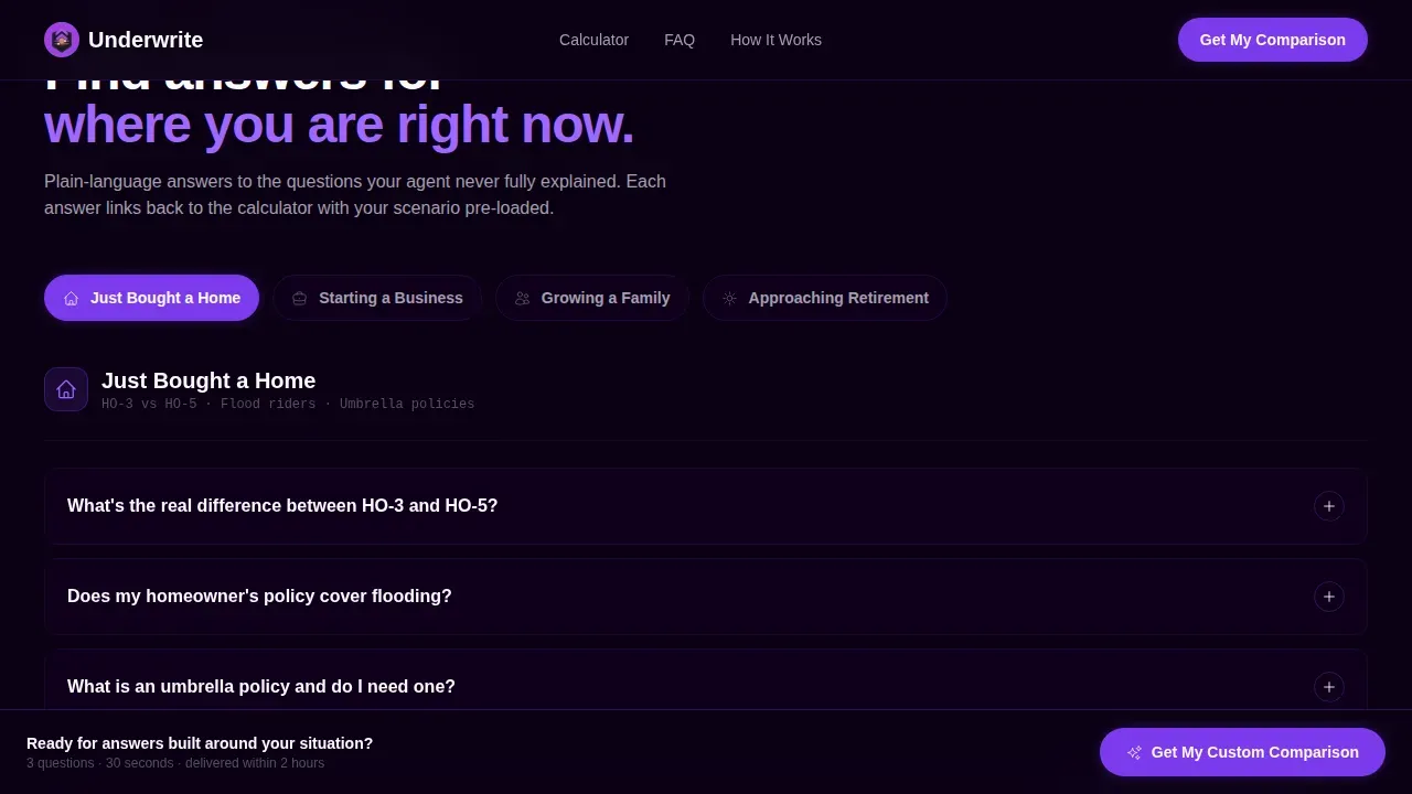
Life-Event frequently asked question Directory with Comparison Tables
Below the calculator, the page shifts into an frequently asked question directory organized by life event. Sections such as "Just Bought a Home," "Starting a Business," "Growing a Family," and "Approaching Retirement" each expand into side-by-side comparison tables. Each table includes plain-language verdict rows that support informed decision making rather than passive reading.
Progressive Three-Step Lead Form
The primary call to action uses a three-step progressive form that collects coverage type first, one key detail second, and contact information third. This structure keeps decision fatigue low and conversion rates high by asking only one question at a time. A simplified form reduces friction significantly compared to long single-page questionnaires.
Sticky Bottom Call-to-Action Bar
A persistent "Get My Custom Comparison" bar stays anchored at the bottom of the screen throughout the scroll. This keeps the primary action visible without interrupting the reading experience. The sticky bar pairs with inline call-to-action placements after each frequently asked question section to guide users toward converting at the moment they feel most informed.
Secondary Email Capture Path
Visitors who use the calculator but are not ready to commit to the full form can choose "Email Me This Comparison" as a lower-commitment lead path. This secondary option captures the lead with less friction and keeps the customer journey moving forward rather than ending at hesitation.
Testimonials Section with Specific Social Proof
A dedicated section surfaces authentic testimonials that include real names, specific policy types, and dollar amounts saved. This level of detail strengthens trust signals far beyond generic quote blocks and answers objections that skeptical visitors raise before sharing contact details.
Page sections overview
| Section | Purpose |
|---|---|
| Coverage Comparison Calculator | Opens with a working three-column interactive tool loaded with a real default scenario |
| Life-Event frequently asked question Directory | Accordion sections organized by life stage, each expanding into side-by-side comparison tables |
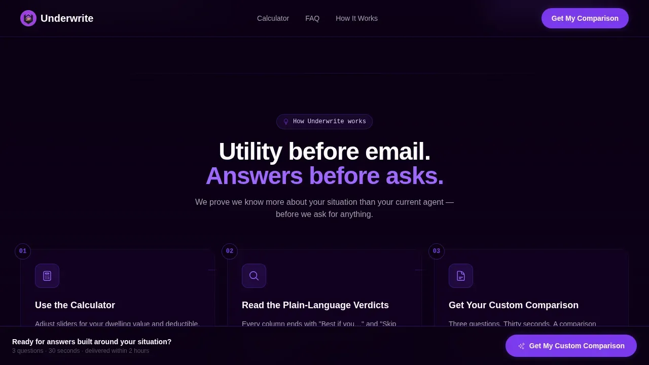
| How It Works | Three-step trust-building sequence that shows the agency process clearly |
| Testimonials Block | Specific social proof with names, policy types, and dollar figures |
| Lead Form and Call to Action | Progressive three-step form with sticky bottom bar and secondary email capture |
| Footer | Horizontal flow footer pattern for navigation and contact links |
Design & branding system
The visual identity follows a Directory and Discovery theme executed in a Void and Violet color system. The palette feels like a premium application in dark mode, where the void background recedes and lets data float forward under violet highlights. Generous white space between sections prevents information from crowding and keeps users engaged throughout a long scroll.
- Deep void black (#0B0014) as the dominant background, electric violet (#7C3AED) on all interactive elements including toggles, hover states, and selected comparison columns
- Lavender mist (#DDD6FE) for alternating table rows and card backgrounds, signal white (#FAFAFA) for all text surfaces
- Manrope for headings and IBM Plex Mono for numerical data, creating a clear visual hierarchy between editorial copy and policy details
Mobile & speed optimization
Significant traffic for insurance websites comes from mobile devices. This template is built mobile-first because most insurance searches now start on a phone, often late at night when a person has a specific question and limited patience. Responsive comparison tables stack gracefully on smaller screens without losing their comparative analysis value.
- The calculator and all slider interactions are designed to function cleanly on touch screens with thumb-friendly controls
- Accordion frequently asked question sections collapse by default on mobile, reducing scroll length and keeping the page focused
- The sticky call-to-action bar and progressive form are optimized for single-thumb use on small screens
How this template helps you convert
Insurance landing pages that prove value before asking for anything generate far more qualified leads than those that open with a form. This template is designed around a Calculator and Tool First creative direction, which means the scroll earns trust through function before it requests contact details. Companies using dedicated landing pages generate significantly more leads than those directing traffic to a general website.
- The working comparison calculator creates immediate utility, giving potential customers a compelling reason to stay and explore rather than bounce back to search results.
- frequently asked question sections organized by life event provide educational content that mirrors how real people search for insurance, with each section linking back to the calculator and ending with a clear inline call to action that drives conversions.
- The progressive three-step form and sticky call-to-action bar reduce friction at the moment of conversion, improving conversion rates by collecting one piece of information at a time instead of presenting a long single-page form.
Other information about this template
This landing page template is a strong fit for any insurance company that wants to position itself as a trusted advisor rather than another sales-first portal. The template structure also works well for agencies covering a wide range of insurance products and insurance offerings beyond just home coverage.
- The comparison table format adapts easily for life insurance, auto insurance, business insurance, health insurance, travel insurance, and pet insurance policy types
- The frequently asked question directory structure supports educational content across coverage lines, making the page useful for potential clients researching term lengths, claims paid timelines, hidden fees, and coverage limits
- The Underwrite smart coverage comparison landing page template is a good example of how a digital insurance agency can use a clean layout, modern design, and clear messaging to turn anonymous insurance searches into named leads
- Trust signals built into the template include authentic testimonials, a visible how-it-works sequence, and transparent policy details in every comparison table, all of which are essential for building credibility on insurance landing pages
- The template supports the kinds of digital experiences that position an insurance company as a deep-understanding resource rather than just another insurance provider
- For agencies running digital marketing campaigns, the landing page structure provides a focused destination that removes navigation distractions and keeps potential customers on a single conversion path
- Social proof integration through the testimonials section helps build confidence with visitors who are skeptical about sharing personal details, which is a recognized best practice for high converting landing pages in the insurance business
- The health insurance landing page use case is supported by the frequently asked question directory structure, where a health insurance landing section can be added as its own life-event accordion, making the template versatile for a health insurance company or a multi-line agency
- The catchy headline slot in the calculator section, the clear messaging throughout, and the visual elements tied to the violet color system all contribute to a strong first impression that sets this template apart from standard insurance websites
- Seo optimized content placement within the frequently asked question sections ensures that each accordion answer targets the plain-language questions that potential customers type into search at night, supporting the agency's broader digital marketing goals
- The template's unique selling points include utility-first design, comparative analysis built into every major section, and a customer experience that feels like a trusted advisor rather than a sales funnel
Theme
Directory & Discovery
Creative direction
Calculator/Tool First
Color system
Void & Violet
Style
Comparison Table
Direction
Lead Generation
Page Sections
Real-time Three-column Comparison Calculator
Life-event Frequently Asked Question Directory with Side-by-side Tables
Progressive Three-step Lead Generation Form
Sticky Bottom Call-to-action Bar
Testimonials Section with Specific Social Proof
Void and Violet Dark-mode Design System
Related questions
Can this template be used for multiple insurance product types?
Does the comparison calculator come pre-loaded with data?
How does the progressive lead form reduce friction for potential customers?
Is this template suited for mobile users searching for insurance at night?
What trust signals does this landing page template include?


