Insurance Agency Advanced Cost Calculator Website Template
Underwrite is a split-screen insurance agency landing page template built for clarity-first positioning. It leads with a live coverage comparison calculator, translates dense policy language into plain English, and guides visitors toward a low-friction comparison form. The dark glassmorphic design communicates precision and trust without relying on stock photography or generic agent imagery.
by Rocket studio
Quick summary
Underwrite is a single-page insurance agency template designed around one idea: make coverage make sense. The 50/50 split-screen layout pairs an interactive policy calculator on the left with real-time plain-language summaries on the right. Every scroll section builds a case for clarity, turning legal jargon into readable terms before visitors ever reach a form.
Who this template is for
This template fits insurance agencies and independent brokers who want to compete on transparency rather than brand recognition. It is especially well-suited for digital-first operations targeting audiences who are tired of confusing policy documents.
- Freelancers comparing general liability or professional liability coverage on their own
- Small business owners who have been caught off guard by exclusions or hidden renewal clauses
- Startup founders who need to understand what they are actually buying before they commit
What problem this template solves
Most insurance landing pages bury the value behind generic headlines and contact forms. Visitors arrive with specific questions and leave without answers. Underwrite flips that sequence entirely.
- Visitors get immediate value from the calculator before they scroll or fill out anything
- Side-by-side policy comparisons remove the friction of decoding legal language alone
- The progressive form structure captures intent at the right moment, not prematurely
What you get with this template
You get a fully structured single-page layout built around the insurance comparison experience. Every section earns attention before asking for it.
- A live interactive coverage calculator in the header with a dynamic plain-language output panel
- Scrolling "What They Wrote versus. What It Actually Means" comparison sections with frosted card data visualizations
- A two-path conversion setup: a primary comparison form and a secondary gated PDF download option
Feature list
This template is built around four core functional and design components drawn directly from the brief.
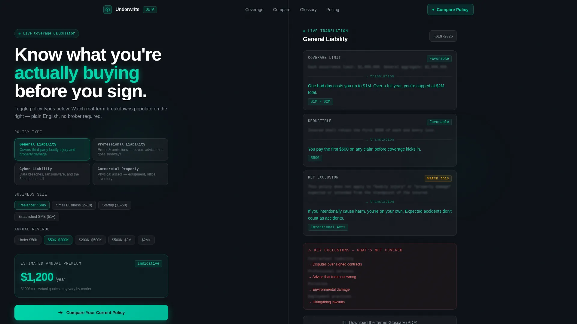
Interactive Coverage Calculator
The header is split 50/50. The left panel holds a toggle-based calculator where visitors select from policy types including general liability, professional liability, cyber, and property coverage. The right panel updates in real time with plain-language breakdowns of exclusions, deductibles, and coverage caps.
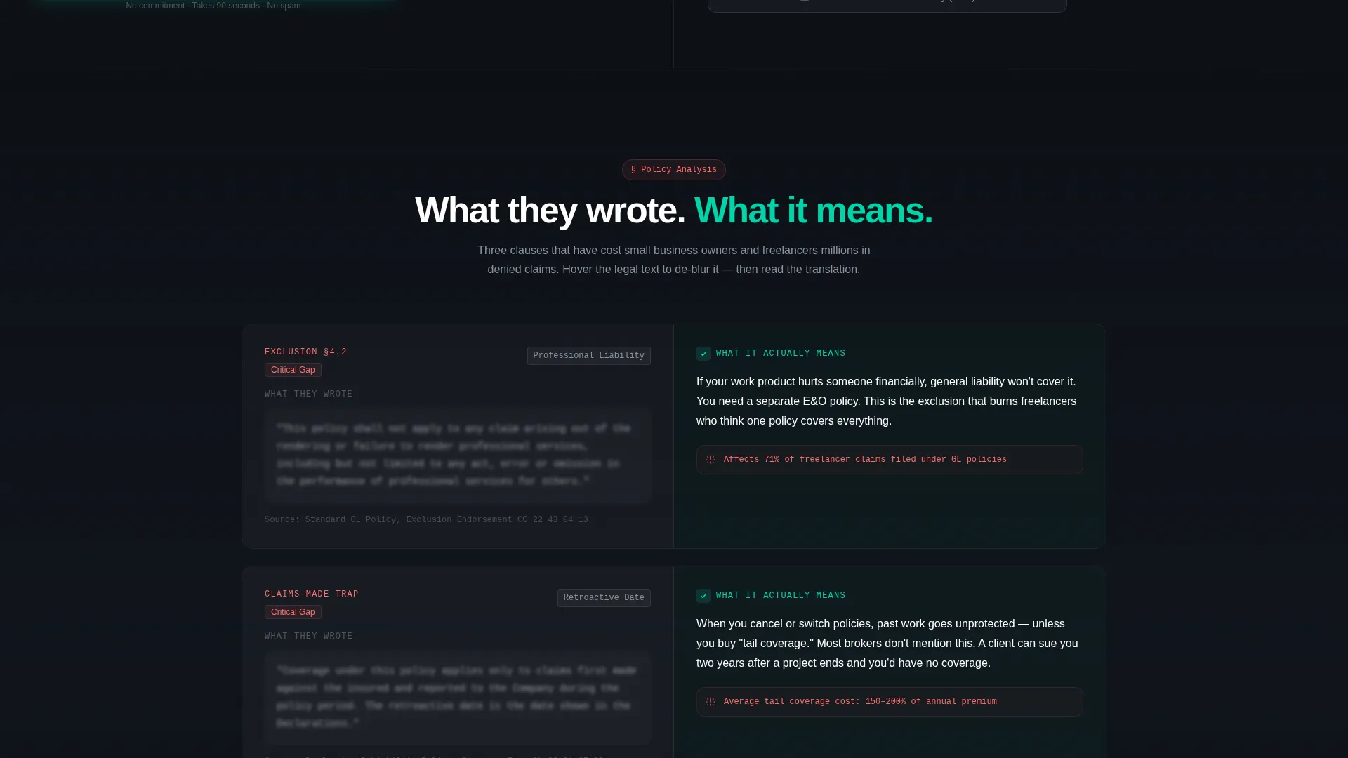
Side-by-Side Policy Comparison Sections
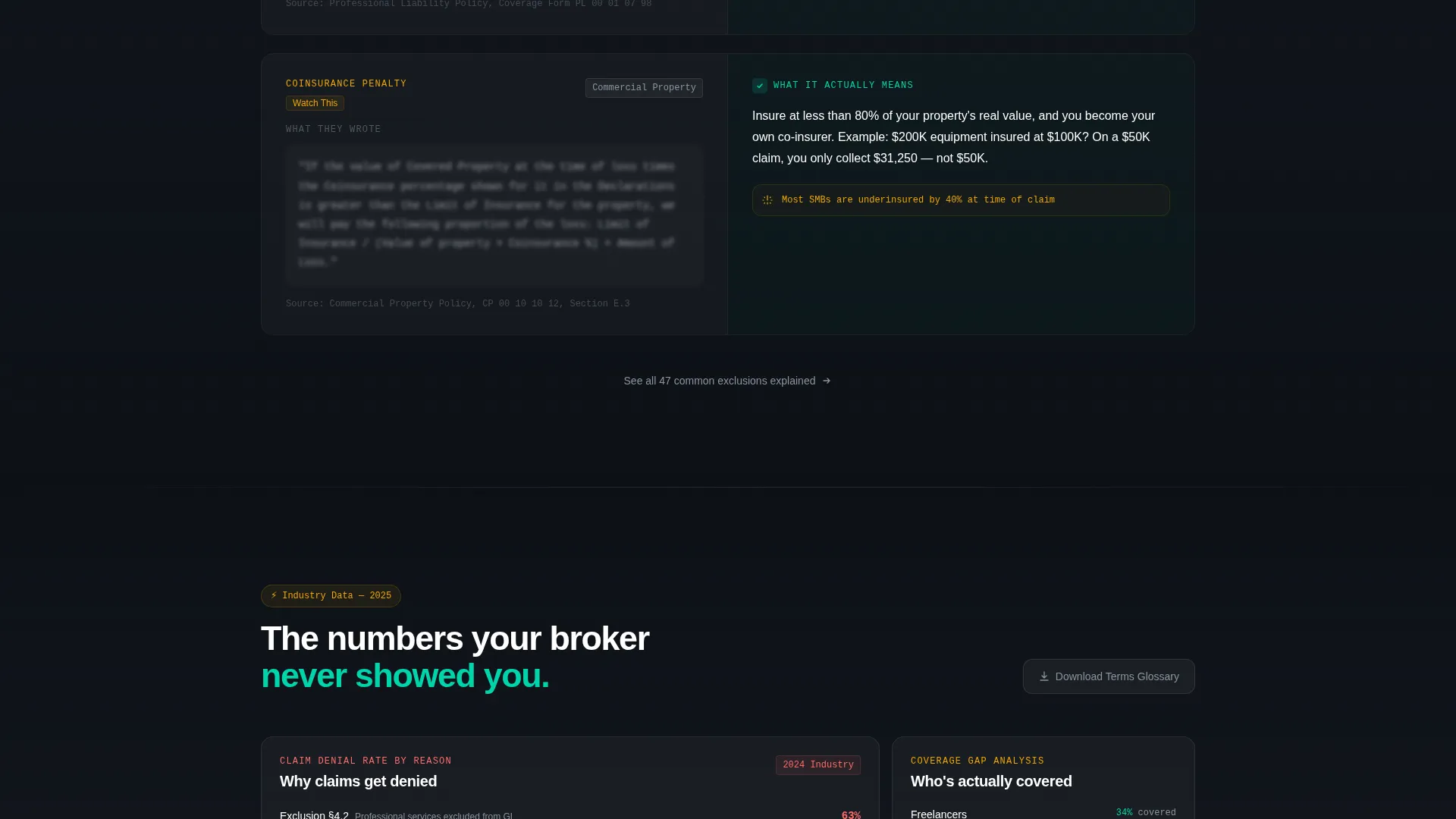
Each scroll section presents a specific policy dimension as a direct comparison. Raw legal language sits on the left, blurred slightly behind a frosted glass layer. A clean human-readable translation appears on the right in teal type. This structure repeats across multiple policy topics, building a persuasive case through evidence rather than claims.
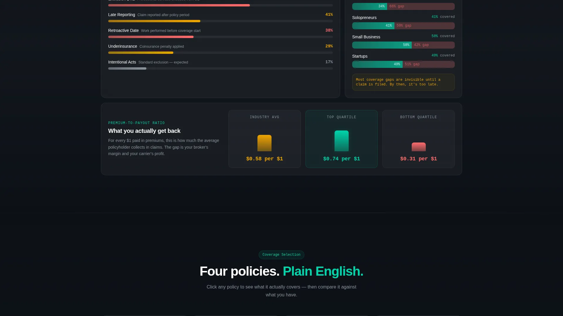
Frosted Card Data Visualizations
Coverage gap charts, claim denial rate benchmarks, and premium-to-payout ratio modules appear as frosted card components. Each one slides into focus on scroll, reinforcing the agency's analytical authority and giving visitors concrete reference points.
Persistent Floating Call to Action
The primary call to action, "Compare Your Current Policy," appears inside the header calculator and again as a persistent floating button throughout the page. Visitors are never more than one click away from starting the comparison process.
Two-Path Conversion Form
The main form opens with the lowest-friction field first: current carrier name. It then steps through coverage type, annual premium, and email. A secondary conversion path offers a gated terms glossary PDF for visitors who are researching but not yet ready to compare.
Glassmorphic Visual System
The entire page uses a dark-field glassmorphic treatment. Frosted panel overlays, deep void backgrounds, and electric teal interactive states create a layered, precise visual language that signals expertise without relying on photography or decorative elements.
Page sections overview
| Section | Purpose |
|---|---|
| Header Calculator Panel | Immediate interactive value; coverage type toggle with live plain-language output |
| Policy Comparison Rows | Side-by-side legal versus. plain-language breakdown for each policy dimension |
| Data Visualization Cards | Frosted modules showing coverage gaps, denial rates, and premium-to-payout ratios |
| Primary Comparison Form | Progressive low-friction form capturing carrier, coverage type, premium, and email |
| Secondary PDF Download | Gated terms glossary for early-stage researchers not ready to submit a comparison |
| Persistent Floating call to action | Floating "Compare Your Current Policy" button visible throughout the scroll |
Design & branding system
The visual identity follows a Startup Velocity theme rendered through a glassmorphic color system. Every layer is intentional: backgrounds are deep and still, interactive elements glow, and text sits cleanly against frosted surfaces.
- Deep void black (#0D1117) as the base background, frosted panel white (#FFFFFF at 12% opacity) for card surfaces, electric teal (#00D4AA) for active states and output text, and soft signal gray (#8B949E) for secondary labels and dividers
- No stock photography, no agent imagery; the calculator and comparison content carry the full visual weight of the page
- The frosted card aesthetic creates a sense of layered depth, like a translucent dashboard working visibly in the visitor's favor
Mobile & speed optimization
The split-screen layout is designed to adapt cleanly to smaller viewports. The 50/50 panels stack vertically on mobile so the calculator and output panel remain fully readable without horizontal scrolling.
- The toggle-based calculator and dynamic output panel retain their core function across screen sizes
- Frosted card modules and comparison rows reflow into single-column layouts on narrow screens
- The persistent floating call-to-action button remains accessible regardless of scroll position or device size
How this template helps you convert
Underwrite earns conversion through demonstrated fluency. By the time a visitor reaches the form, the page has already answered their most pressing questions about coverage, exclusions, and what certain policy terms actually mean.
- The calculator delivers instant, personalized value in the header, so visitors invest attention before they are asked to invest personal information
- The scrolling comparison structure builds credibility progressively, each section adding another layer of evidence that this agency understands policies better than most
- The two-path form design captures both high-intent visitors ready to compare and early-stage researchers who want the glossary first, reducing the number of exits at the decision point
Other information about this template
Underwrite is categorized under insurance agency website templates with a specific focus on the insurance agency terms of service page niche. The template is designed for technology-category storefronts and digital-first service providers.
- The Industry Report creative direction makes this template well-suited for agencies that want to position themselves as analytical and authoritative rather than sales-first
- The Comparison/Versus landing page direction is built into every scroll section, not just the form, making the competitive positioning feel organic
- The template style is Split Screen (50/50) throughout, which is a deliberate structural choice that reinforces the "their language versus. your understanding" narrative at every level
Theme
Startup Velocity
Creative direction
Industry Report
Color system
Glassmorphic
Style
Split Screen (50/50)
Direction
Comparison/Versus
Page Sections
Interactive Split-screen Coverage Calculator
Side-by-side Legal Versus. Plain-language Comparison
Frosted Card Data Visualizations
Two-path Conversion Form Design
Persistent Floating Call to Action
Glassmorphic Dark-field Visual System
Related questions
Can I customize the policy types shown in the calculator?
Does the page work without a developer?
What is the secondary PDF download path for?
Is this template better for a single product or multiple coverage types?


