Underwriter Blog Website Template
Underwrite is a single-page landing page template built for professional underwriting firms. It pairs an editorial split-screen layout with a team-led scroll experience, credential badges, and a gated resource download flow. The design feels authoritative and warm, built to earn trust from CFOs, founders, and contractors before they ever pick up the phone.
by Rocket studio
Quick summary
Underwrite is a landing page template designed for underwriting and risk management firms. It uses a 50/50 split-screen layout, an editorial magazine style, and a people-first scroll sequence to introduce senior underwriters and build trust with high-stakes clients. The primary conversion path is a gated guide download supported by a persistent "Schedule a Risk Review" call to action.
Who this template is for
This template is built for underwriting firms and risk management professionals who need more than a generic service page. It speaks directly to the people handling complex accounts and the clients who bring them.
- Independent underwriters and specialty risk firms presenting senior staff to new prospects
- Professional services teams serving CFOs, startup founders, and construction firms with large or complex coverage needs
- Underwriting practices looking to convert website visitors into consultations or guide downloads
What problem this template solves
Most professional services pages bury their best asset, the people. Prospects evaluating an underwriter want to know who will actually read their file and pick up the phone. A generic layout with headshots and bullet points does not close that gap.
- Visitors cannot quickly identify the right underwriter for their industry or risk type
- Trust signals like awards, carrier appointments, and client endorsements are scattered or absent
- There is no clear first step for a new prospect, so high-intent visitors leave without converting
What you get with this template
This template delivers a fully structured single-page layout with every section mapped to a specific stage of the buyer journey. From credential display to team introductions to a gated resource, each block has a clear job.
- A split-screen header with metallic credential badges and an editorial underwriter portrait
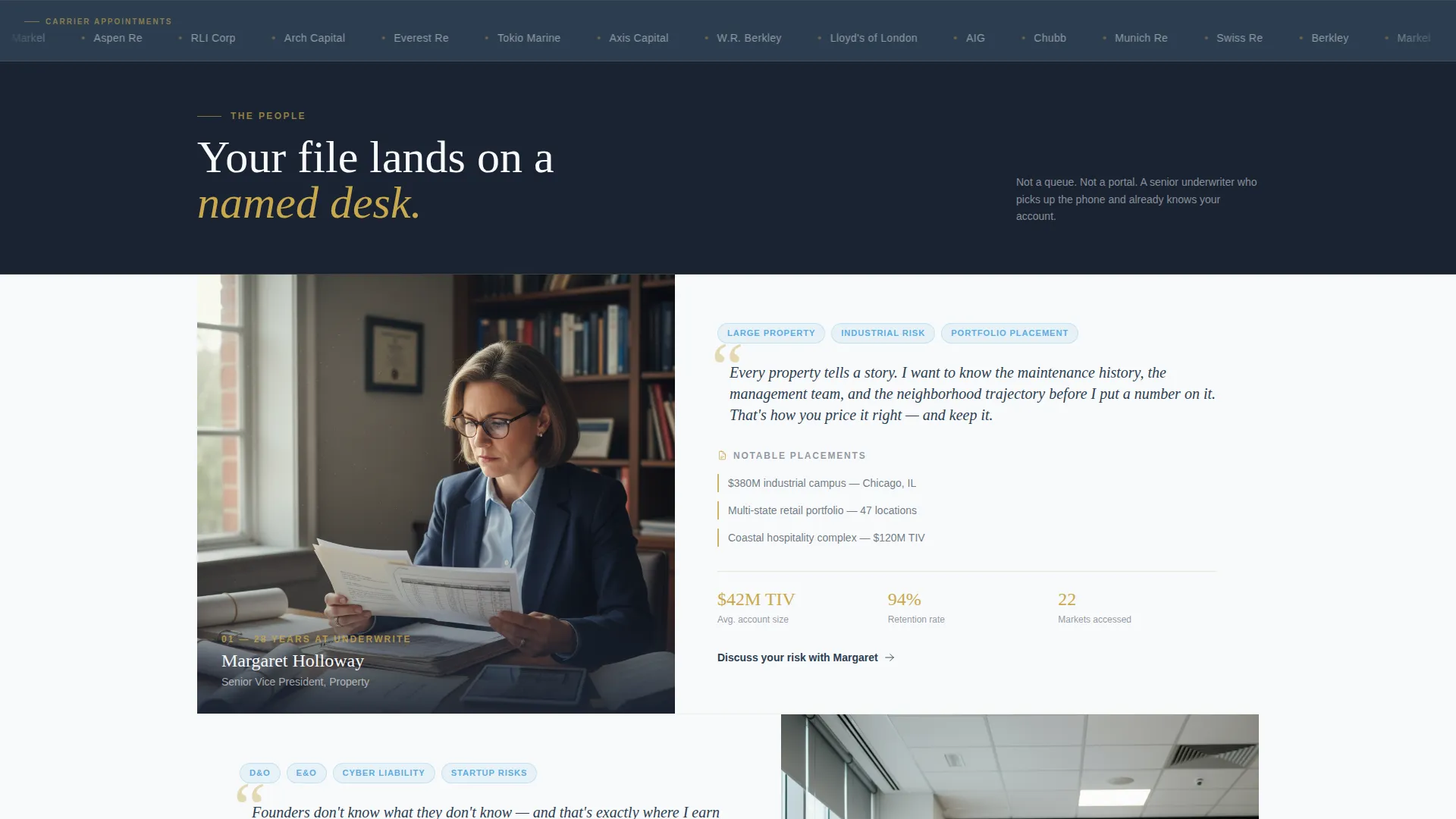
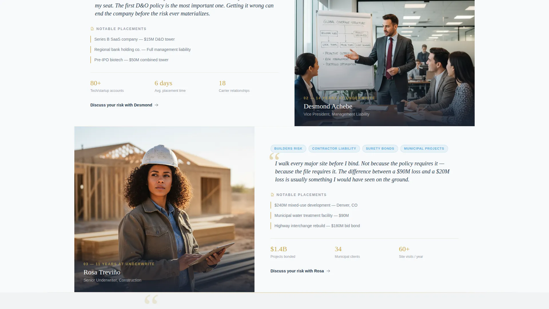
- Alternating team-member panels with specialty, notable placements, and direct quotes
- A lead capture form with a flip-through guide preview, plus a persistent navigation call to action
Feature list
This template ships with a focused set of layout features drawn directly from the brief. Each one serves the goal of moving a skeptical professional buyer toward a conversation.
Split-Screen Header with Credential Display
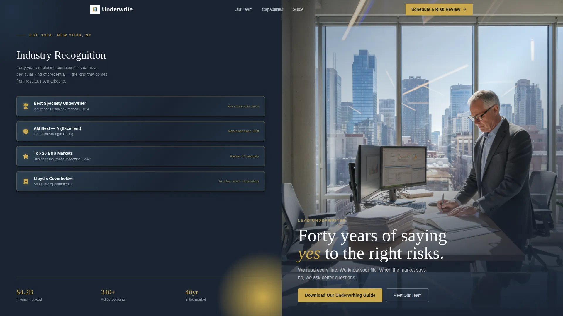
The header divides into two equal panels. The left side stacks industry award badges and carrier appointment seals rendered in metallic brass against deep charcoal slate, each with an emboss shadow that reads as minted and authoritative. The right side holds an editorial portrait of the lead underwriter with a soft-focused city skyline behind glass. A single headline fades in over the portrait.
Alternating Team Member Panels
Each senior underwriter is introduced through a dedicated split frame. The left panel shows a candid portrait in context, reviewing documents, mid-conversation, or walking a project site. The right panel presents their specialty, notable placements, and a direct quote about how they evaluate risk. The sequence creates a hallway-introduction scroll rhythm.
Pull-Quote Interstitials
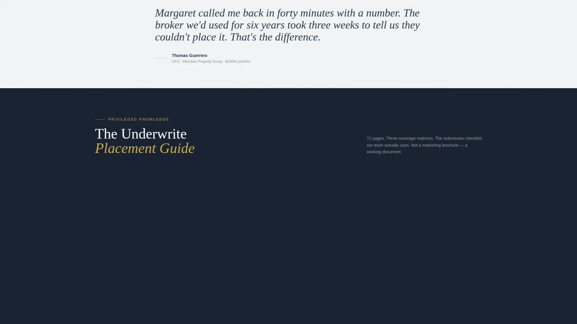
Between team sections, named client pull quotes break the vertical rhythm. These short testimonial blocks add social proof at the exact moment a visitor has just finished reading about a specific underwriter. The pacing feels editorial, not sales-driven.
Gated Guide Download with Form
After the second team member, a lead capture section presents "Download Our Underwriting Guide." The form collects industry vertical via dropdown, company size via radio buttons, and a business email address in that order. The layout keeps the ask clear and the field sequence logical.
Flip-Through Guide Preview
Before the form is submitted, visitors see actual page spreads from the guide in a split-panel flip-through animation. Coverage thresholds and appetite class pages are visible. This preview repositions the download as accessing privileged knowledge rather than filling out a form.
Persistent Secondary Call to Action
A "Schedule a Risk Review" button lives in the navigation bar throughout the entire scroll experience. Visitors who are not ready to download the guide still have a direct path to booking a conversation at any point.
Page sections overview
| Section | Purpose |
|---|---|
| Split-Screen Header | Establish authority with credentials and portrait |
| Headline Fade-In | Anchor the brand promise on first impression |
| Underwriter One Panel | Introduce first senior underwriter with specialty |
| Client Pull Quote | Add social proof after first team introduction |
| Underwriter Two Panel | Introduce second senior underwriter with specialty |
| Guide Download Form | Capture leads with gated resource offer |
| Guide Flip Preview | Earn the submission by showing real content |
| Additional Team Panels | Continue trust-building introductions down the page |
| Client Interstitials | Reinforce credibility between team sections |
| Navigation Bar call to action | Provide persistent path to schedule a review |
Design & branding system
The visual identity follows an Executive Suite theme. Every color and typographic choice reflects the feeling of a top-floor financial district office at dawn: deliberate, earned, and quietly powerful.
- Color palette: deep charcoal slate (#2C3E50), polished gunmetal (#4A5568), open-sky blue (#5DADE2), and cloud white (#F8F9FA) for breathing room, with brass gold (#C9A84C) on hover states, divider lines, and credential icons
- Credential badges and seals use metallic brass rendering with subtle emboss shadows to feel minted rather than designed
- The editorial portrait style avoids stock photography in favor of a warm-lit, composed composition that reads like a trade journal profile
Mobile & speed optimization
The template is structured to translate its desktop split-screen experience cleanly to narrower viewports. Stacked layouts and clear typographic hierarchy keep the page readable and navigable on any screen size.
- Split panels collapse to full-width stacked sections on smaller screens, preserving the portrait and credential display without overlap
- The flip-through guide preview and lead capture form remain accessible and legible at mobile widths
- Navigation bar with persistent call-to-action button stays visible and tappable throughout the scroll on touch devices
How this template helps you convert
Every layout decision in this template serves a conversion goal. The page does not rush visitors; it earns their confidence through sequenced trust-building before asking for anything.
- The credential badge display and editorial header establish authority in the first viewport, reducing the skepticism a high-value prospect typically brings to an unfamiliar firm.
- The team panel sequence and named client pull quotes build personal trust section by section, so that by the time the guide download form appears, the visitor already feels introduced to the firm.
- The flip-through guide preview removes the friction of a blind form submission, making the download feel like a valuable next step rather than a cold data exchange.
Other information about this template
This template is built under the Editorial/Magazine template style, meaning visual storytelling and layout pacing carry as much weight as copy. It is a strong fit for firms whose differentiation lives in the people and track record behind the brand.
- The template follows a Lead Generation landing page direction, with every section oriented toward either a guide download or a risk review booking
- The Educational Guide theme means the gated resource is central to the page strategy, not a sidebar afterthought
- The Expert Panel creative direction shapes the scroll experience: each underwriter introduction is a deliberate trust moment, not a staff directory listing
- This template works well for underwriter booking page use cases where prospects need to self-qualify before reaching out
Theme
Educational Guide
Creative direction
Expert Panel
Color system
Slate & Sky
Style
Editorial/Magazine
Direction
Lead Generation
Page Sections
Split-screen Header with Credential Badges
Alternating Team Introduction Panels
Named Client Pull-quote Interstitials
Gated Guide Download with Ordered Form
Flip-through Guide Preview Animation
Persistent Navigation Call to Action
Related questions
Can I replace the team portraits with my own photos?
How does the flip-through guide preview work?
Is the lead capture form connected to an external delivery tool?
Who is this landing page template best suited for?
Can the template work with only one or two underwriters to feature?



