Assured Newlywed Coverage Landing Page Template
The Vow trusted newlywed life insurance landing page template is a sidebar companion landing page built for couples navigating joint coverage decisions right after marriage. It uses a four-step multi-step form, a persistent quote preview sidebar, and an frequently asked question-driven scroll structure to guide visitors from curiosity to a completed free joint quote with clarity and confidence.
by Rocket studio
Quick summary
Vow is a single-page insurance landing page template designed for newlywed term life insurance. It pairs a four-step multi-step form with a sticky sidebar quote companion, frequently asked question accordion sections, and a downloadable checklist call to action. Every element on this landing page works toward making the process of getting a joint life insurance quote feel calm, intentional, and easy.
Who this template is for
This template is built for insurance businesses, direct-to-consumer life insurance companies, and independent insurance marketers serving a newly married demographic. The design speaks directly to couples aged 25 to 35 who have just signed a lease or taken on a joint mortgage and are asking coverage questions for the first time. It also works well for any insurance company or financial services brand that wants a focused, emotionally resonant landing page in the newlywed life insurance niche.
- Life insurance providers and insurtech companies targeting newlywed couples in the United States market
- Financial services marketers running digital campaigns for term life insurance products aimed at young adults
- Independent insurance agents and brokers who want a polished, high-trust landing page to generate joint quote leads
What problem this template solves
Most people shopping for life insurance after marriage hit a wall of confusing jargon, long application forms, and generic insurance landing page examples that feel cold and corporate. The problem is not a lack of insurance options. It is a lack of a landing page that meets couples where they emotionally and practically are. Building an effective landing page for newlyweds requires balancing emotional resonance with professional credibility, and most generic insurance landing page layouts miss that balance entirely.
- New couples feel overwhelmed by policy complexity and do not know how to compare coverage for two incomes at once
- Standard insurance landing page designs ask for too much information too soon, which increases abandonment before a quote is ever generated
- Generic pages do not address newlywed-specific concerns such as mortgage protection, income replacement, or the question of whether both partners need separate policies
What you get with this template
This landing page template delivers a complete, ready-to-publish sidebar companion page built specifically for joint life insurance quote generation. You get a structured, section-led layout with multiple interactive components, a consistent visual identity, and copy-ready placeholder content that you can adjust to fit your brand. Every section of the page serves a deliberate job in guiding visitors toward the primary call to action.
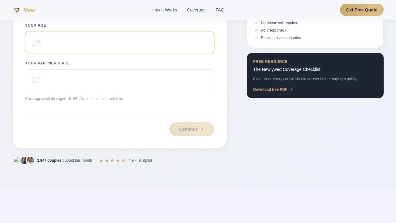
- A four-step multi-step form with a gold progress bar, serif input fields, and a live quote estimate in the persistent sidebar
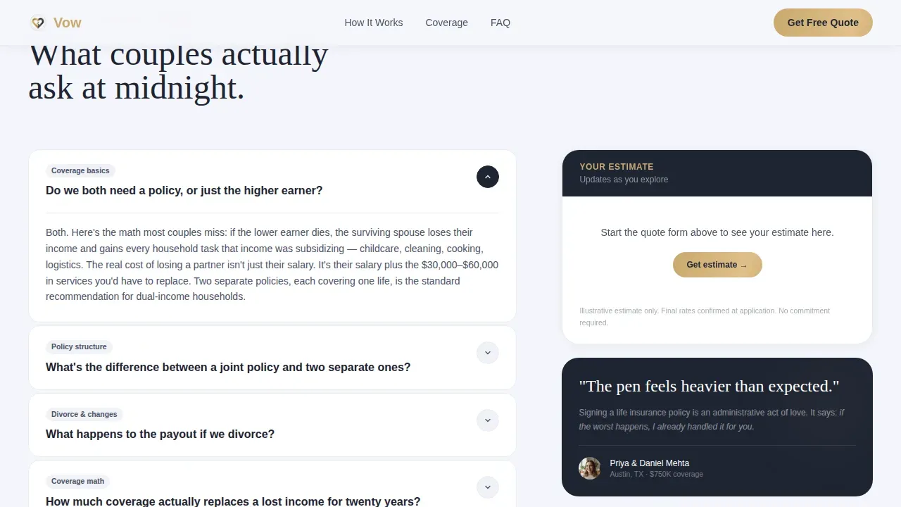
- An frequently asked question accordion structure with emotional and logistical question sections that build confidence as visitors scroll
- A secondary lead capture path: a downloadable PDF checklist gated behind a first name and email for visitors not yet ready to quote
Feature list
This landing page template includes purpose-built features drawn directly from the project brief. Each feature supports the core goal of turning a curious newlywed visitor into a completed joint quote submission.
Four-Step Sidebar Companion Form
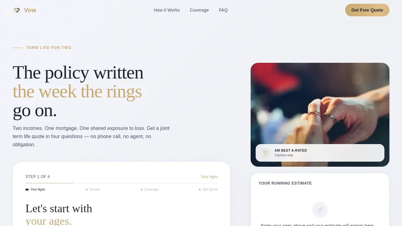
The header occupies sixty percent of the viewport and presents a four-step form: ages, income split, coverage preference, and email. Step one asks only two questions in large serif type with generous input fields. A gold progress bar at the top reads "Step 1 of 4" and advances with each completed step. This step-by-step approach helps reduce the feeling of overwhelming visitors with too many fields at once.
Persistent Live Quote Sidebar
The right-hand sidebar follows visitors down the page as they scroll. It displays a running estimate showing coverage amount, estimated monthly cost, and both partners' names. This keeps the math visible while the frequently asked question sections build understanding. Visitors arrive at the final form step already trusting the number they see, which improves the conversion rate significantly compared to a static page.
frequently asked question Accordion with Emotional Escalation
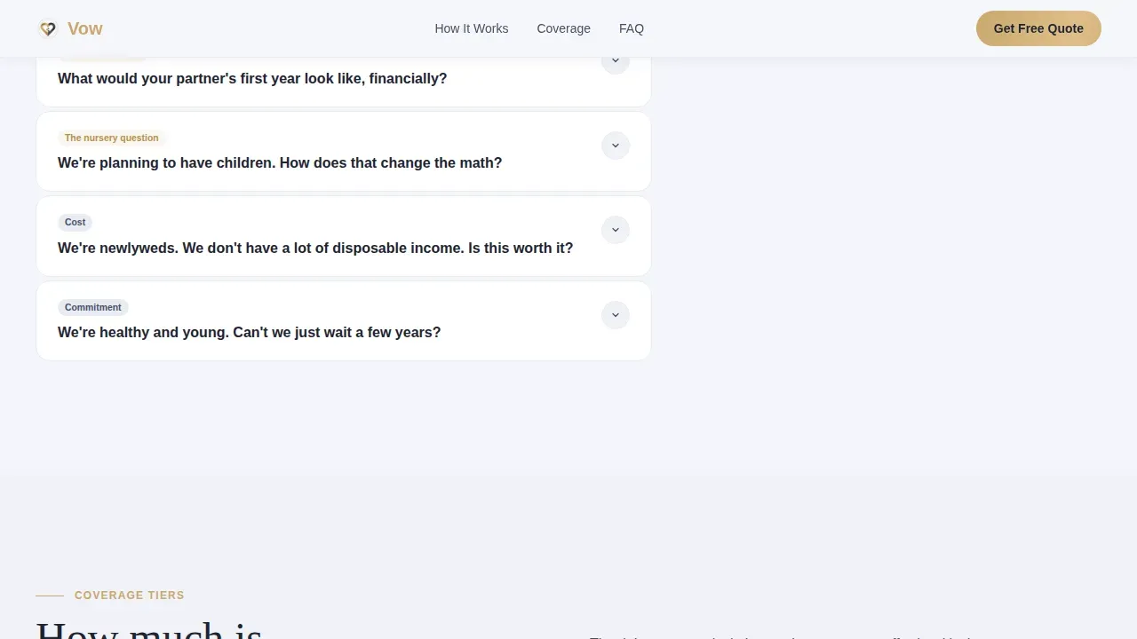
Below the form, every scroll section is anchored by a real question newlyweds ask. Early questions are logistical. Mid-page questions surface emotional stakes. Late-page questions handle cost and commitment objections. The accordion uses a spring animation and sits beside the sticky sidebar so the quote context never disappears while visitors explore answers.
Downloadable Checklist Lead Capture
A secondary call-to-action section offers "The Newlywed Coverage Checklist" as a free PDF download. It is gated behind only a first name and email, making it a low-friction entry point for visitors not yet ready to fill out a full quote form. This secondary path helps capture leads from the segment of visitors who want to learn before they commit.
Couple Testimonials and Trust Signals
A dedicated social proof section displays testimonials from real couples, formatted with first names, home cities, and coverage amounts. Trust signals including recognizable security badges are placed prominently on the page, especially near the lead capture form. Customer reviews, ratings, and security indicators help build trust and reassure visitors that their personal and financial data is handled with care.
Coverage Tier Bento Layout
An asymmetric bento section presents coverage tiers in a scannable visual format. Visitors can compare insurance options across three tiers without leaving the page or navigating elsewhere. This section supports clarity for visitors who are still deciding how much coverage they need before they feel ready to submit their details.
Page sections overview
| Section | Purpose |
|---|---|
| Hero Multi-Step Form | Collects ages and launches four-step quote form with sidebar photo |
| Sticky Quote Sidebar | Displays live running estimate as visitors scroll the page |
| frequently asked question Logistical Questions | Answers practical coverage questions beside the persistent quote preview |
| Emotional Stakes frequently asked question | Surfaces financial impact questions to create mid-page urgency |
| Cost Objection frequently asked question | Handles final concerns about price and commitment near page bottom |
| Coverage Tiers Bento | Compares coverage amounts in an asymmetric visual layout |
| Checklist call to action Section | Offers free PDF download gated by name and email |
| Social Proof Section | Shows couple testimonials with cities and coverage amounts |
| Page Footer | Single-row linear footer with minimal navigation links |
Design & branding system
The visual identity follows an Executive Suite theme built on a Cloud Canvas color system. The palette feels like the interior of a high-floor financial advisor's office on a bright overcast day. Everything is dove-gray and deliberate, with warmth arriving only from a muted gold accent, the way a wedding band catches light on a signing hand. White space is used generously throughout to keep the layout breathable and focused.
- Color palette: soft cumulus white (#F4F6FB) background, brushed platinum (#C2C8D1) for secondary surfaces, deep charcoal suiting (#1E2432) for body text and headlines, and muted gold band (#C9A96E) reserved for call-to-action buttons and the progress bar
- Typography: Fraunces serif for headlines and form labels; DM Sans for body copy and user interface elements, creating a contrast between intimate formality and clean readability
- Hero image: a soft-focus photograph of two hands intertwined over paperwork, cropped tight with no faces, intimate and administrative at the same time
Mobile & speed optimization
The template is designed desktop-first to support the sidebar companion layout, with a mobile stack fallback that reorders the form and sidebar into a single-column flow. Most people today research insurance on their phones, so the mobile experience prioritizes readability, tap-friendly form inputs, and a stacked version of the frequently asked question accordion that stays easy to navigate on smaller screens.
- Desktop layout uses a split-column structure with the form at sixty percent width and the sidebar at forty percent; on mobile, these stack vertically with the quote summary appearing below the form step
- Form inputs, call-to-action buttons, and frequently asked question accordion triggers are sized and spaced for comfortable touch interaction on smartphones
- Static sections use server-side rendering while the form and sticky sidebar use client-side components, keeping the page responsive without slowing the initial load
How this template helps you convert
This landing page is designed as one of the most focused and high converting landing pages available for the newlywed insurance niche. Every design and copy decision guides visitors toward a single action: submitting a free joint quote. The layout avoids unnecessary distractions, endless links, and confusing jargon that typically lower the conversion rate on insurance pages.
- The persistent sidebar quote preview shows a running estimate before the visitor ever submits, so the final form step feels like confirming a number they already trust rather than taking a leap into the unknown
- The frequently asked question accordion escalates from curiosity to urgency, building confidence section by section and using empathetic headlines that focus on benefits and shared security rather than product mechanics
- Trust signals, testimonials, and a gated checklist create two distinct conversion paths so visitors at different levels of readiness both have a relevant next step waiting for them on the page
Other information about this template
This template is part of a Finance and Insurance category focused on the newlywed life insurance niche. It is a great example of how a sidebar companion layout, an frequently asked question-driven creative direction, and a freemium quote model can work together on a single insurance landing page. Marketers and businesses launching newlywed insurance campaigns will find the layout consistent with best practices across the insurance landing page examples that perform well in this category.
- The page is built to support digital marketing campaigns targeting newly married couples in the United States, using USD pricing, MM/DD/YYYY date formatting, and Eastern Standard Time defaults
- The value proposition is direct: an instant ballpark joint life insurance estimate with no phone call, no agent contact, and no commitment required, delivered through a four-step form that takes only minutes to complete
- Companies using dedicated landing pages generate significantly more leads than those that rely on general website pages, and this template is purpose-built to store that lead generation potential in a focused, single-action page
- The template is designed so non-technical users can customize it without extensive coding skills, making it practical for insurance businesses of varying sizes to publish quickly and adjust as campaigns evolve
- Unlike auto insurance or travel insurance pages that focus on short-term coverage decisions, this page addresses the longer emotional and financial arc of a shared life, making the insurance products and the copy feel meaningfully different from commodity comparison pages
- The Vow trusted newlywed life insurance landing page template also serves as a reference for insurance landing page examples in the newlywed and life insurance space, illustrating how industry awards, trust badges, and social proof can be layered into a page without cluttering the layout or distracting visitors from the primary call to action
Theme
Executive Suite
Creative direction
FAQ-Driven
Color system
Cloud Canvas
Style
Sidebar Companion
Direction
Freemium/Trial
Page Sections
Four-step Multi-step Quote Form
Persistent Live Quote Sidebar
Frequently Asked Question Accordion with Escalating Narrative
Downloadable Checklist Lead Capture
Couple Testimonials and Trust Badges
Coverage Tier Bento Comparison
Related questions
What type of insurance landing page is this template designed for?
Can I use this template without a developer?
How does the multi-step form reduce visitor drop-off?
Does the template include a secondary lead capture option?
Where are trust signals placed on this landing page?



