Certified Charity & Fundraiser Profile Professional Website Template
Gather is a community fundraiser landing page built on a bento grid layout. It uses an Obsidian and Gold color system, cursor parallax photography, scroll-triggered card reveals, and a friction-free click-through to an external donation platform. No form fields on-page. Just candid moments, gold progress bars, resident voices, and one clear call to action.
by Rocket studio
Quick summary
Gather turns neighborhood pride into a compelling bento grid landing page that carries visitors straight to a donation platform. Six or seven floating community photos open the page, a gold tagline fades in beneath them, and the bento grid assembles below like an exhibition being hung in real time. Every card holds one clear idea: a project photo, a funding milestone, a resident quote, or a bold vision. No forms, no friction.
Who this template is for
This template is built for grassroots organizers who need a fast, credible fundraising presence without hiring a developer. It fits anyone running a civic or neighborhood project who wants the page to feel personal and already in motion.
- Block captains, church deacons, and community leads sharing links at cookouts or via text
- PTA treasurers and nonprofit volunteers who need a polished landing page quickly
- Local organizations showcasing murals, gardens, lighting projects, or park improvements
What problem this template solves
Most fundraiser pages feel generic. They use stock photos, long paragraphs, and buried calls to action. Donors scroll past the important elements without feeling anything. Gather solves that by arranging content in a bento grid that works like a corkboard of real moments, not a pitch deck.
- Lack of emotional connection between donors and local causes
- Cluttered pages that hide the funding goal and delay the click to donate
- No easy path for supporters to share the project with their own networks
What you get with this template
You get a single-page bento grid landing page designed around community storytelling and donation click-through. Every section is pre-structured so you can swap in your own photos, quotes, and dollar goals without rebuilding anything.
- A floating photo hero with cursor parallax, a bento grid project gallery, a funding progress section, resident quote cards, and a bold vision cell
- A sticky "Fund This Block" button pinned to the viewport and a full-width parchment banner at the end of the grid
- A "Share This Project" secondary path with a pre-written message for text, email, and social sharing
Feature list
The Gather template packs meaningful bento grid functionality into one focused page. Each built-in feature is designed to move a neighbor, a friend, or a stranger from curiosity to commitment.
Floating Photo Hero with Cursor Parallax
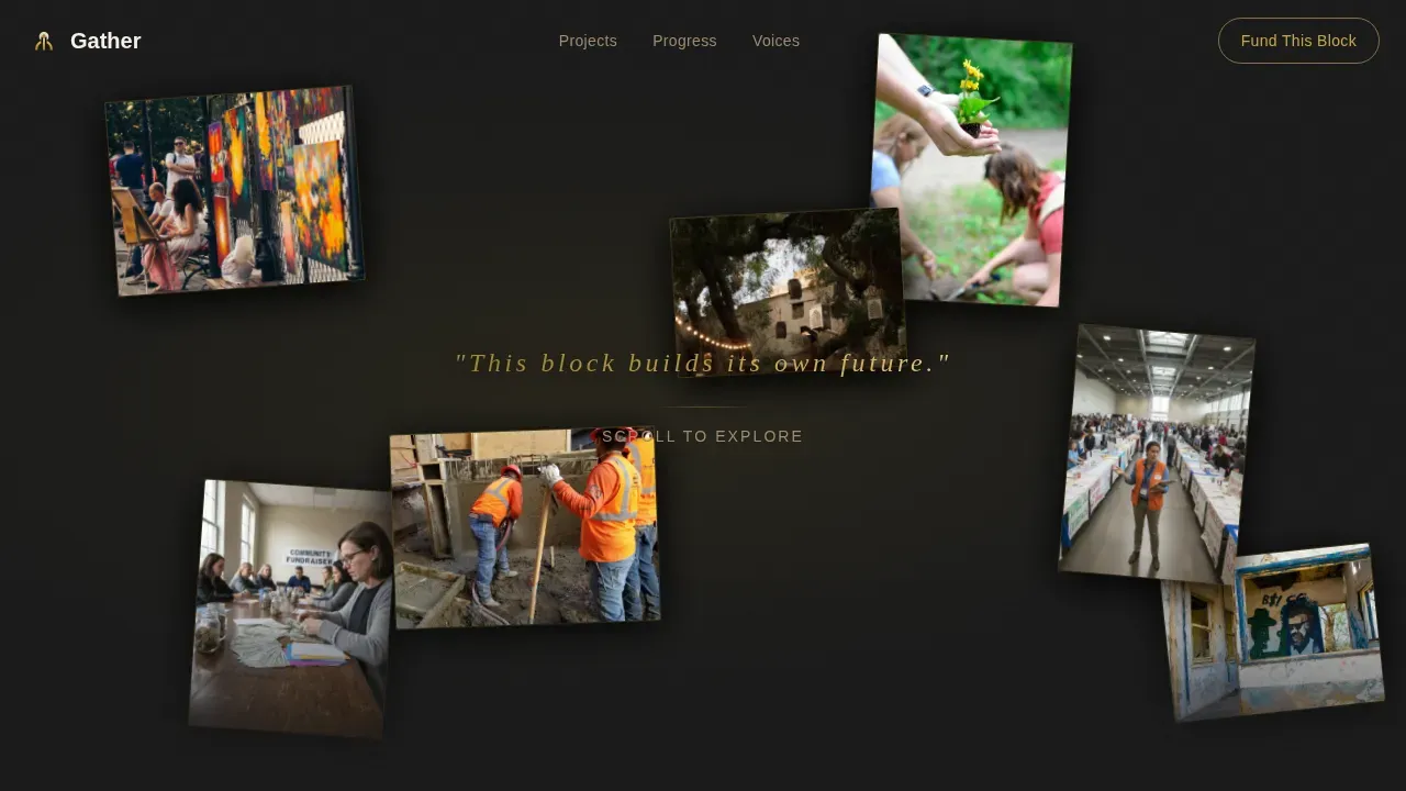
Six or seven candid community snapshots hover at slightly different depths and rotations against the obsidian background. As the cursor moves, the photos drift with a gentle parallax effect. A single gold-foil tagline fades in beneath them. The hero sets the emotional tone before a single word of copy is read.
Scroll-Triggered Bento Grid Gallery
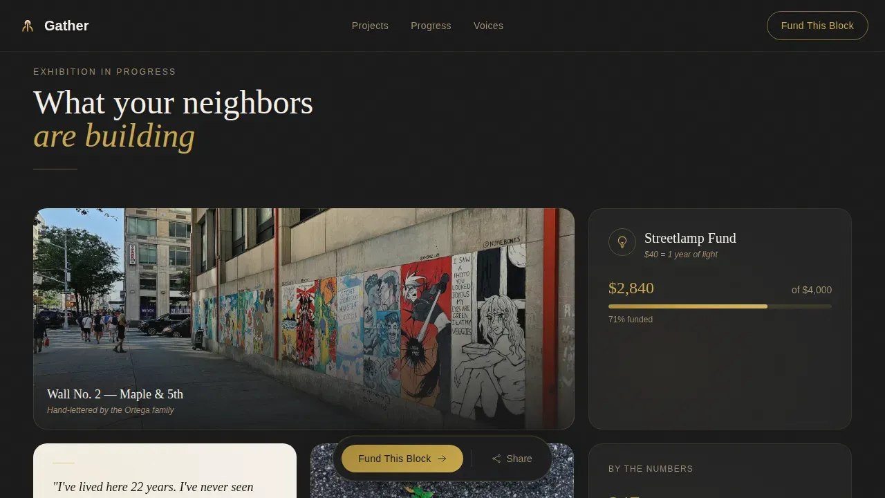
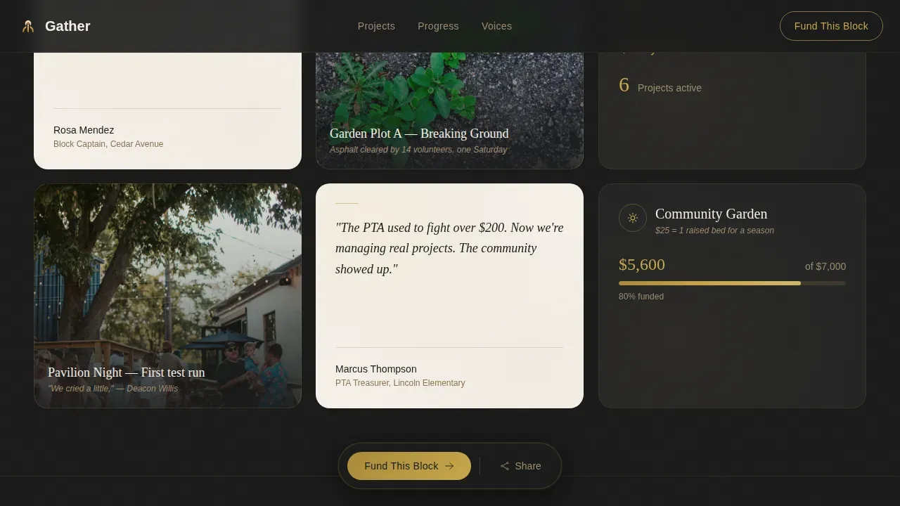
The bento grid assembles as the visitor scrolls, with each card entering on a subtle rise-and-fade animation. Tiles span varied widths across the grid, creating a visually hierarchical manner that naturally guides the eye. Project photos sit beside funding milestones, italic serif quotes over parchment cards fill the gaps, and the pace slows as the grid narrows toward the final row.
Gold Progress Bar and Funding Tracker
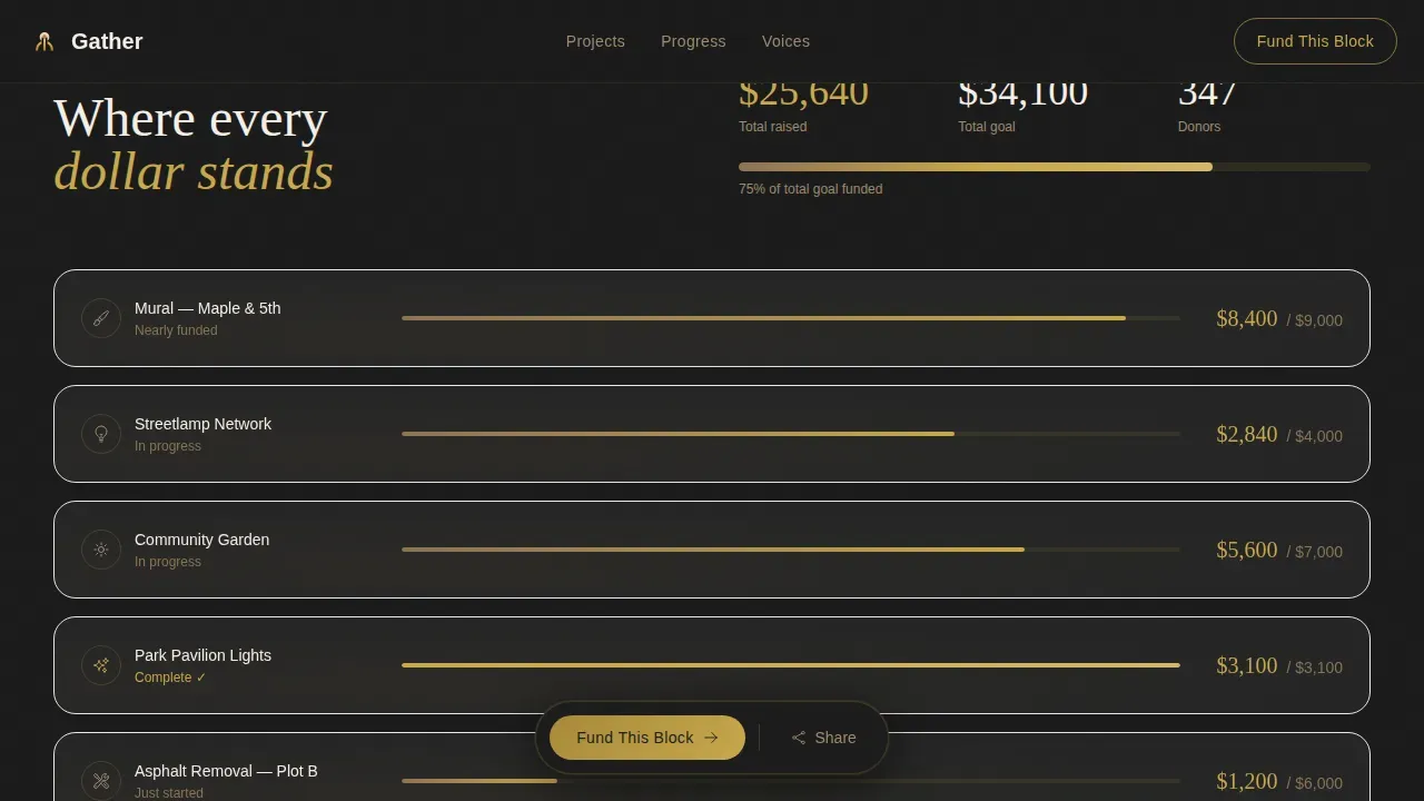
An interactive bento grid tile displays a brushed gold progress bar alongside the total raised and the funding goal. This tile builds urgency without pressure. Visitors see exactly how close the project is to its target, making every dollar feel tangible and local.
Sticky Click-Through Call to Action
The primary "Fund This Block" button is pinned to the bottom of the viewport throughout the scroll. It appears first as a quiet gold-outlined button, then again as a full-width parchment banner after the final gallery cell, paired with a one-line impact statement. No form fields are required on-page. The click itself is the commitment, carrying the visitor to the external donation platform.
Share This Project Modal
A secondary call to action sits beside the primary button. It opens a share modal with a pre-written message and link ready for text, email, or social posting. This turns every visitor into a potential recruiter for the cause.
Bold Vision Cell
The final row of the bento grid collapses to a single wide cell. It holds the project's biggest goal in large type over the obsidian background, framed in gold. This is the emotional peak of the page, the moment before the visitor clicks to give.
Page sections overview
| Section | Purpose |
|---|---|
| Floating Photo Hero | Opens with candid community snapshots and a gold tagline using cursor parallax |
| Projects Bento Grid | Asymmetric bento grid cards holding photos, quotes, milestones, and progress bars |
| Funding Progress Tile | Gold progress bar showing total raised versus goal to build donor urgency |
| Resident Voices Cards | Italic serif quote cards over parchment, positioned as social proof near decision points |
| Bold Vision Cell | Single wide bento grid card carrying the project's biggest goal in large type |
| Sticky Donate Button | Viewport-pinned call to action button persistent across the entire scroll |
| Full-Width call to action Banner | Parchment banner with impact statement appearing after the final gallery cell |
| Share Project Modal | Pre-written shareable message for text, email, and social to extend reach |
| Minimal Footer | Clean horizontal flow footer closing the page without distraction |
Design & branding system
The visual identity follows an Atelier Studio theme built on the Obsidian and Gold color system. Deep charcoal-black makes the brushed gold feel earned rather than decorative. Warm parchment breathes openness into every cell. The overall effect is intimate and earnest, like a warmly lit back room where someone has pinned photographs and goals to a corkboard.
- Colors: obsidian (#1A1A1A) for the primary background, brushed gold (#C9A84C) for accents and progress bars, warm parchment (#F5F0E8) for card backgrounds, and muted clay (#8B7355) for secondary text and dividers
- Typography: Fraunces serif display for headlines and quote cards, DM Sans for body copy, creating a warm contrast between editorial authority and everyday clarity
- Bento grid design details: consistent corner radii and clear boundaries between every tile, keeping the grid-like format clean and scannable without overcrowding
Mobile & speed optimization
This template is built mobile-first because block captains share links on phones at cookouts, not desktops. The bento grid rearranges vertically on smaller screen sizes, collapsing into a clean one-column stack that keeps the call to action prominent. Images are lazy-loaded and all animation runs on CSS transforms only, keeping performance lean across various devices.
- The bento grid tiles stack vertically on mobile, maintaining the logical sequence of the story from hero photo to final vision cell
- The sticky donate button remains pinned at the bottom of the viewport on all screen sizes, so the path to give is always visible
- Fast loading behavior is supported by lazy-loaded images and CSS-only animation, reducing render-blocking across various devices
How this template helps you convert
An effective bento grid landing page combines structured, modular design with emotional storytelling and a frictionless donation path. Gather is built around exactly that combination. It reduces friction by removing form fields entirely, letting the click do the work. A logical flow guides visitors from awareness through emotional connection to action.
- The floating photo hero and scroll-triggered bento grid create an engaging visual experience that holds attention long enough to build trust, with high quality images of real people and real places doing the emotional heavy lifting
- The gold progress bar, resident quote tiles, and impact statement act as social proof and financial transparency, positioned strategically near the decision point so visitors feel confident before clicking "Fund This Block"
- The "Share This Project" modal transforms donors into advocates by making it easy to pass the landing page link along via text, email, or social media, expanding the traffic source beyond the original audience
Other information about this template
The Gather bento grid landing page template belongs to a curated collection of community and charity profile templates. The bento grid design style brings the same organized elegance found in leading ui ux design work across the web to a grassroots fundraiser context. The bento design style brings numerous benefits: it arranges content in a grid like format that is easy to scan, easy to share, and easy to update. Bento style designs incorporate card format designs with clear boundaries and rounded rectangles that draw on the tradition of japanese lunchboxes, where multiple compartments neatly separate diverse content into aesthetically pleasing portions. This bento design is especially well suited to transforming mundane information like a funding tally or a project list into eye catching displays that guide users toward action.
From a ui ux perspective, the bento grid layout divides the interface into diverse functional sections, allowing designers to seamlessly integrate photos, quotes, and progress data. Bento style designs are excellent for present product features, key elements, and impact stats in a visually appealing layout without overwhelming the visitor. The grid style structure makes it straightforward to maintain consistency across the entire website in terms of spacing, color, and type. Bento box layout improves the overall experience by arranging elements in a visually pleasing manner, giving visitors a clean and neat layout they can easily navigate.
This trendy bento box design reflects key best practices from across web design: keep important elements prominent, use varied tile sizes to create a visually hierarchical manner, and reduce the number of form fields to lower the barrier to giving. The bento grid layout features a hero section, donation tracker, story, and resident voices in a modern, compartmentalized design. It can serve as one of the inspirational examples for community organizations looking to quickly release a credible fundraiser page. The gather community fundraiser bento grid landing page template is ready to use out of the box, with no programming skills required. Full screenshot previews of the layout are available on the template marketplace page before you commit.
- The Obsidian and Gold color system works across the entire page as a consistent and functional layout foundation, ensuring cohesion from hero to footer
- A bento box in ui ux draws inspiration from traditional japanese lunchbox design, using multiple compartments to neatly separate content into aesthetically pleasing portions
- Bento grid design tools and templates like this one cater to non-technical users, making it possible to create a visually appealing layout and quickly release a live fundraiser page
- The bento box design here uses two column layouts and wider spanning cells to create clear visual hierarchy, with the final bold vision cell spanning the full width
- Bento grid landing pages like Gather showcase inspirational examples of how a structured layout style can carry emotional storytelling without sacrificing smooth navigation
Theme
Atelier Studio
Creative direction
Gallery Walk
Color system
Obsidian & Gold
Style
Bento Grid
Direction
Click-Through
Page Sections
Floating Photo Hero with Cursor Parallax
Scroll-triggered Bento Grid Gallery
Gold Progress Bar Funding Tracker
Sticky Click-through Call to Action
Share This Project Modal
Bold Vision Cell
Related questions
Does this landing page require coding skills to use?
How does the donation process work if there are no form fields on the page?
Can I update the funding progress bar when donations come in?
Is this template suitable for sharing via mobile and social media?
Can I use this template for a fundraiser that covers multiple neighborhood projects?



