Single Parent Insurance Professional Website Template
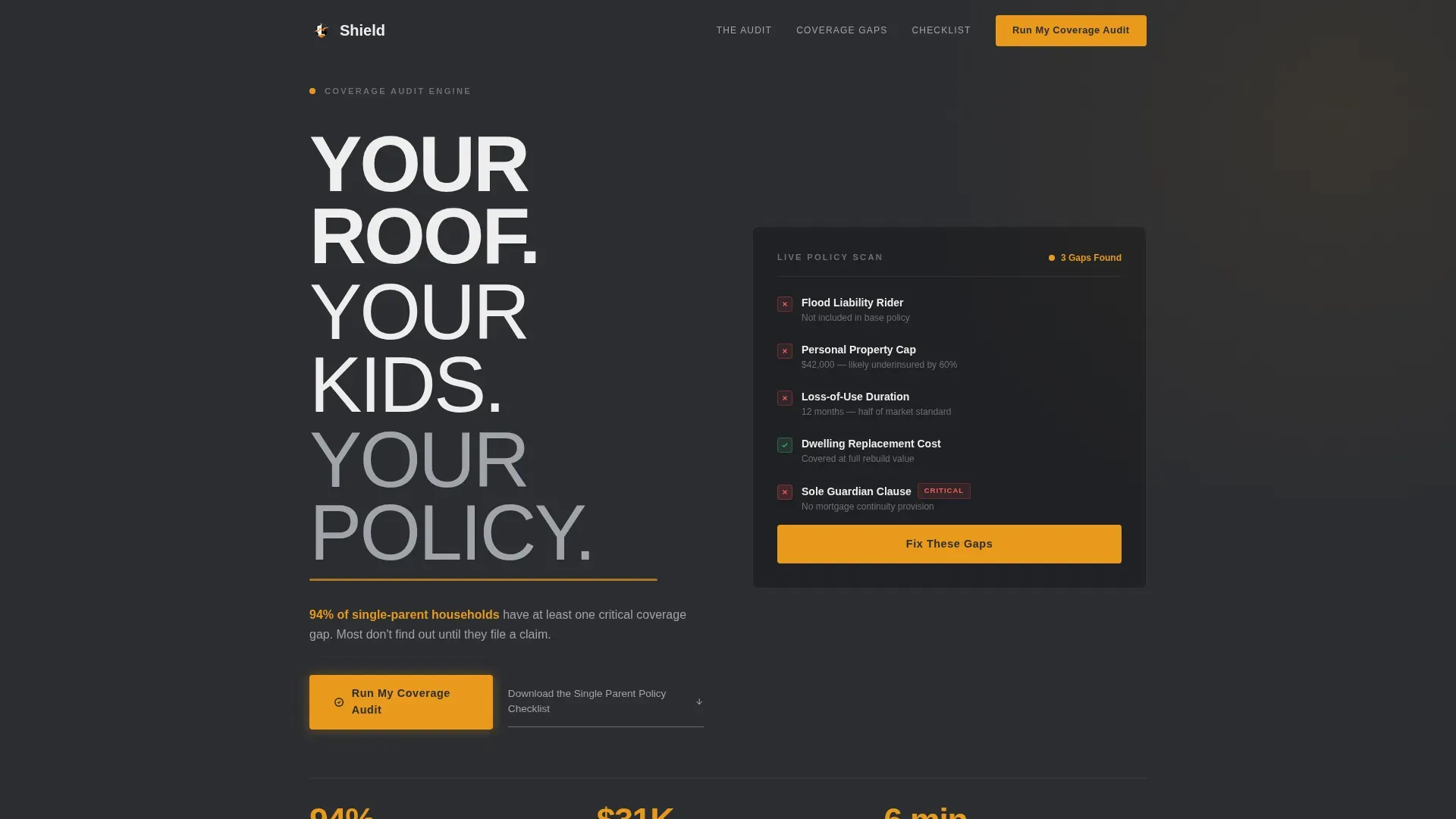
Shield is a single-page landing page template built for single-parent home insurance providers. It uses a zigzag audit layout to walk visitors through real coverage gaps, section by section. The Data Command visual theme pairs deep charcoal with signal amber to create urgency without panic. Every scroll leads toward one clear action: running a personal coverage audit.
by Rocket studio
Quick summary
Shield is an audit-style landing page template for single-parent home insurance. It presents coverage gaps as a live policy review, using a zigzag alternating layout and a Charcoal & Amber color system. The page is built as a click-through flow that ends at a partner quoting engine, with a secondary email capture for visitors not yet ready to quote.
Who this template is for
This template is built for InsurTech providers, insurance brokers, and home coverage brands serving single parents. It speaks directly to people who are navigating coverage alone, often after a major life change.
- Single mothers refinancing after a divorce or separation
- Solo dads securing rental or owned-home coverage post-separation
- Widowed parents who have discovered their joint policy has lapsed
What problem this template solves
Single parents rarely have a second set of eyes on their home insurance policy. Gaps go unnoticed until a claim is denied. This template makes those gaps visible, concrete, and urgent, without feeling alarmist.
- Most single-parent households carry at least one critical coverage gap without knowing it
- Standard policy language around flood liability, personal property caps, and loss-of-use duration is easy to miss
- The sole guardian clause, covering what happens to the mortgage if the only parent is incapacitated, is almost never addressed at purchase
What you get with this template
You get a fully structured single-page layout built around a progressive audit narrative. The design system, copy structure, and call-to-action flow are all included and ready to customize.
- A five-section zigzag landing page covering hero, four audit panels, and a footer
- Primary and secondary call-to-action placements including an email capture modal for the policy checklist
- GSAP ScrollTrigger animation setup, pulsing amber keyframes, marquee elements, and staggered section reveals
Feature list
This template includes a focused set of built-in components that work together to move a visitor from awareness to action.
Stacked Type Tower Header
The hero uses three vertically stacked sans-serif lines at descending weights: black, medium, and light. The words form a typographic column that reads like a structural audit already in progress. A pulsing amber underline sits beneath the final line, drawing the eye to the 94% coverage gap statistic.
Zigzag Audit Panel Layout
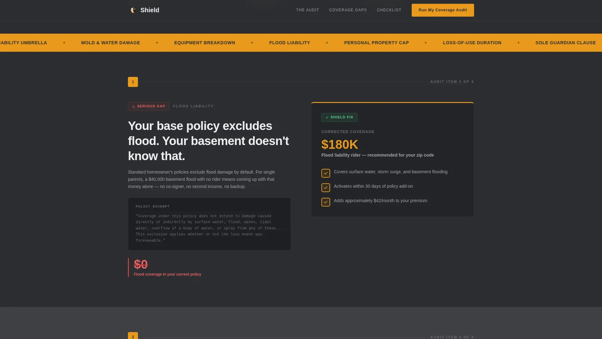
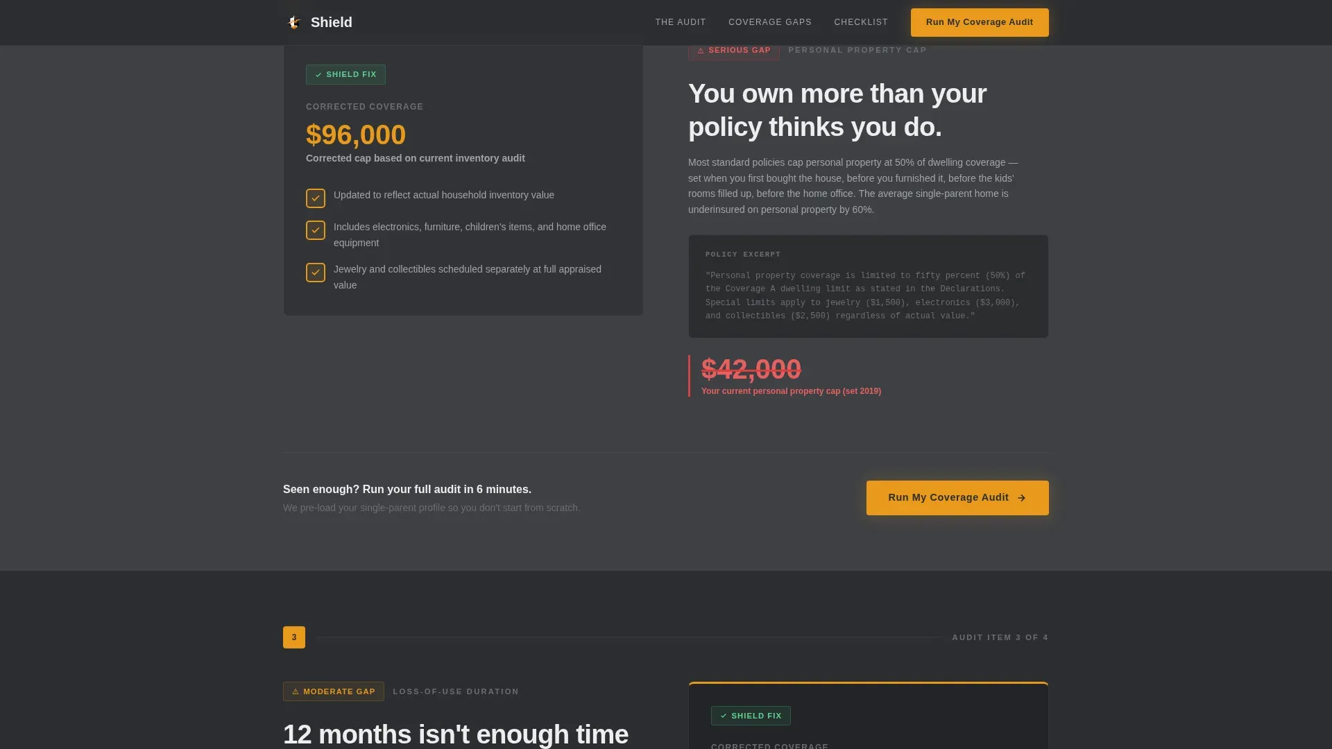
Each of the four audit sections alternates left and right alignment. One panel shows the common gap, rendered as a redlined number, a struck-through clause, or a real excerpt from a standard policy. The opposite panel shows the corrected figure inside a checked amber box.
Progressive Stakes Escalation
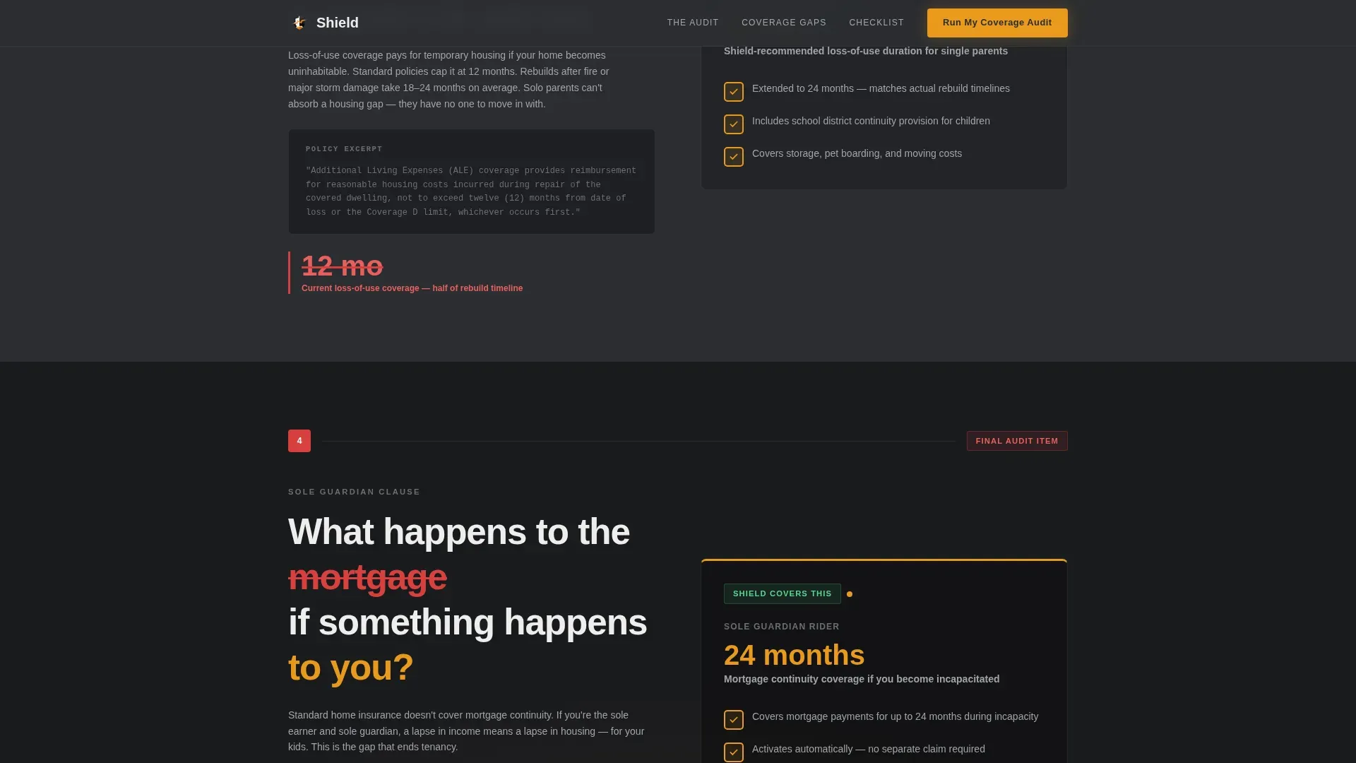
The audit sections are sequenced by severity. They begin with inconvenient gaps like flood liability and personal property caps, then move toward catastrophic ones. The final section addresses the sole guardian clause, making the scroll increasingly difficult to abandon.
Click-Through Call-to-Action System
The primary call-to-action button, labeled "Run My Coverage Audit," appears in the header and repeats after every third section. Each instance is rendered in amber on charcoal. Clicking passes the visitor to a partner quoting engine pre-loaded with a single-parent profile.
Email Capture for Policy Checklist
A secondary text link offers a downloadable single-parent policy checklist. Clicking it opens an email capture modal. This gives visitors who are not ready to quote a lower-commitment entry point that keeps them in the funnel.
Accordion FAQ Component
An interactive accordion-style FAQ section is included in the page structure. It handles common objections and coverage questions without requiring the visitor to leave the page.
Page sections overview
| Section | Purpose |
|---|---|
| Hero: Type Tower | Establish urgency with stacked typographic header and 94% gap statistic |
| Audit: Flood Liability | Show common flood gap on one side, amber-checked fix on the other |
| Audit: Property Cap | Alternate alignment; present corrected personal property coverage figure |
| Audit: Loss-of-Use | Expose loss-of-use duration gap; include mid-page call-to-action repeat |
| Audit: Sole Guardian | Final escalation section covering mortgage risk; closing call-to-action |
| Footer: Horizontal Flow | Vercel-style horizontal flow footer with supporting links and legal text |
Design & branding system
The visual identity follows a Data Command theme. It feels like a matte-black dashboard with one glowing warning light you cannot ignore.
- Color system: deep graphite (#2B2D31) as the primary background, warm charcoal (#3E4044) for alternating bands, signal amber (#E8991C) on all interactive elements and data callouts, and soft ash white (#EDEDED) for body text
- Typography: DM Sans in three weights (black, medium, light) forming a descending typographic tower; amber is used for every number, checkbox, and button state
Mobile & speed optimization
This template is built mobile-first, designed for single parents checking their policy coverage on a phone during a quiet moment at night or between responsibilities.
- Critical path CSS approach and server components for static sections keep initial load lean
- GSAP ScrollTrigger animations are scoped to scroll events, so they do not block the first visible render
- Staggered reveal animations and the pulsing amber keyframe are optimized to run smoothly on mid-range mobile devices
How this template helps you convert
The page earns the click by making the coverage gaps feel personal before the call-to-action ever appears.
- The audit narrative builds emotional stakes section by section, so the visitor arrives at the final call-to-action already convinced the gap is real and urgent, not because a headline told them so.
- The dual call-to-action structure gives every visitor a path forward: the primary button for those ready to quote, and the email capture checklist for those who need more time.
Other information about this template
This template is part of a broader Finance & Insurance category and sits specifically within the single parent home insurance niche. It is designed for the InsurTech and direct-to-consumer insurance market in the United States, with localization set to USD and MM/DD/YYYY date formatting.
- The template style is Zigzag/Alternating, and the landing page direction is Click-Through
- The header concept is Stacked Type Tower, and the creative direction follows a Checklist & Audit framework
- The theme is Data Command, paired with a Charcoal & Amber color system
- Three single-parent testimonial quote placements are included in the social proof layer alongside the stat callouts
- The template is built for the USA market and reflects coverage language and policy structures relevant to US homeowners and renters
Theme
Data Command
Creative direction
Checklist & Audit
Color system
Charcoal & Amber
Style
Zigzag/Alternating
Direction
Click-Through
Page Sections
Stacked Type Tower Header
Zigzag Audit Panel Layout
Progressive Stakes Escalation
Click-through Call-to-action System
Email Capture Modal for Checklist
Accordion FAQ Component
Related questions
What type of insurance business is this template built for?
Can I use this template for a multi-page insurance website?
How does the dual call-to-action structure work?
What animations are included in this template?
Is the content inside this template easy to update?



