Nonprofit Marketing & Agency Specialist Portfolio Website Template
Uplift is a masonry-style landing page template built for nonprofit SEO agencies. It combines a full-viewport photo grid mosaic header, frosted glass case study cards, and a results-first layout to prove credibility before asking for anything. Two conversion paths capture both ready leads and early-stage visitors, making every scroll purposeful.
by Rocket studio
Quick summary
Uplift is a single-page template designed for agencies that help nonprofits compete in organic search. The layout uses a masonry card grid, iridescent Tech Glass visuals, and an award-and-recognition content strategy to build trust fast. Two embedded conversion paths capture leads at different stages of readiness.
Who this template is for
This template is built for search-focused agencies working inside the nonprofit sector. It speaks directly to the people who sell and deliver those services.
- Development directors at mid-size nonprofits exploring SEO partnerships
- Executive directors at grassroots organizations who need a first-ever technical audit
- Foundation communications leads who need impact reports to surface in journalist searches
What problem this template solves
Nonprofit-focused agencies often struggle to show results in a way that feels credible, not corporate. A generic portfolio page fails to communicate the unique stakes of mission-driven search work.
- Visitors leave before reaching the form because there is no proof stacked above it
- Standard lead-gen layouts do not segment early-stage visitors from audit-ready prospects
- The agency's track record stays invisible without a structured, visual case study format
What you get with this template
You get a complete, single-page layout purpose-built to convert nonprofit clients. Every section is designed around evidence first, ask second.
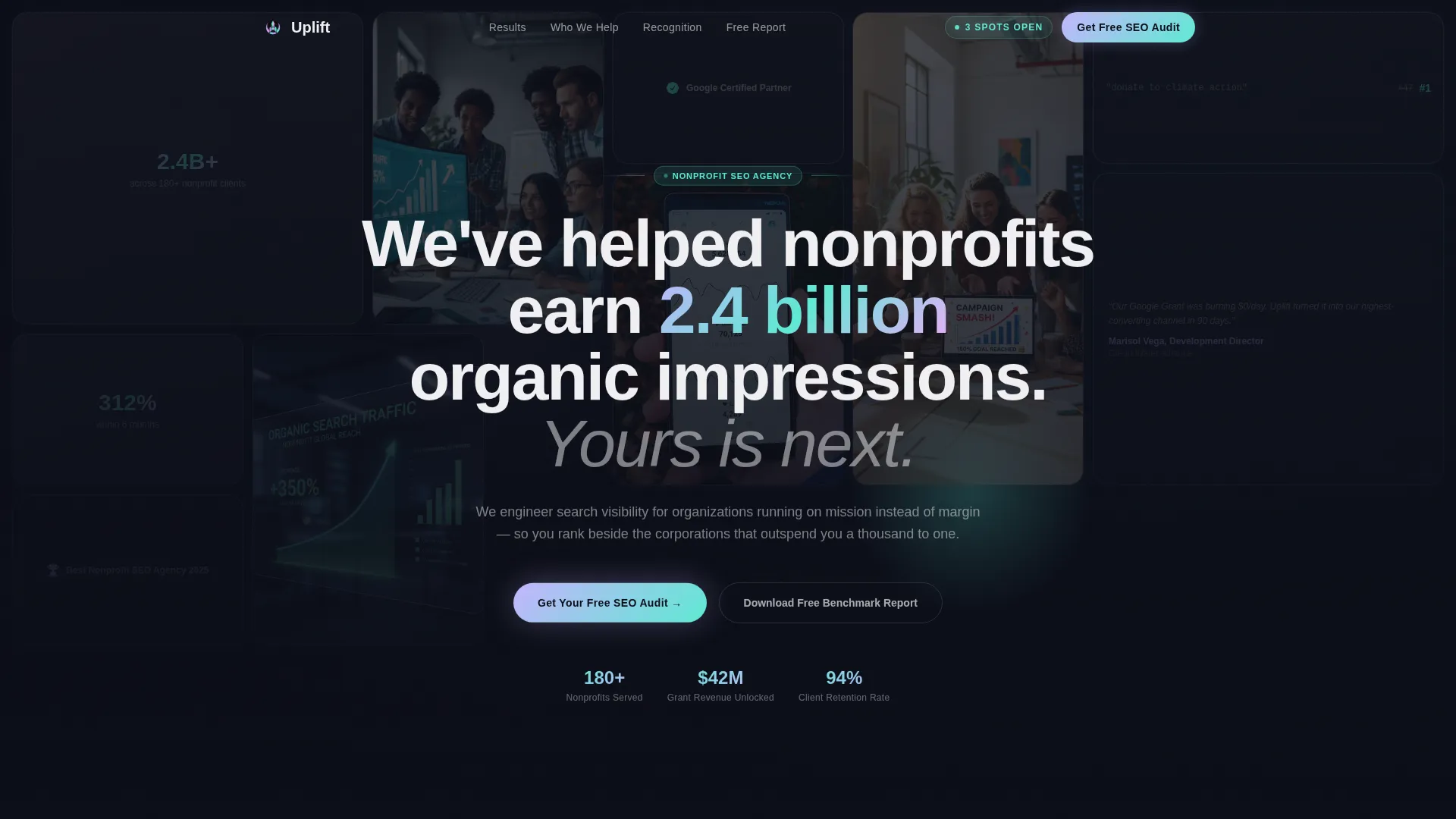
- A full-viewport masonry mosaic header with client logos, campaign screenshots, ranking dashboards, and award badges
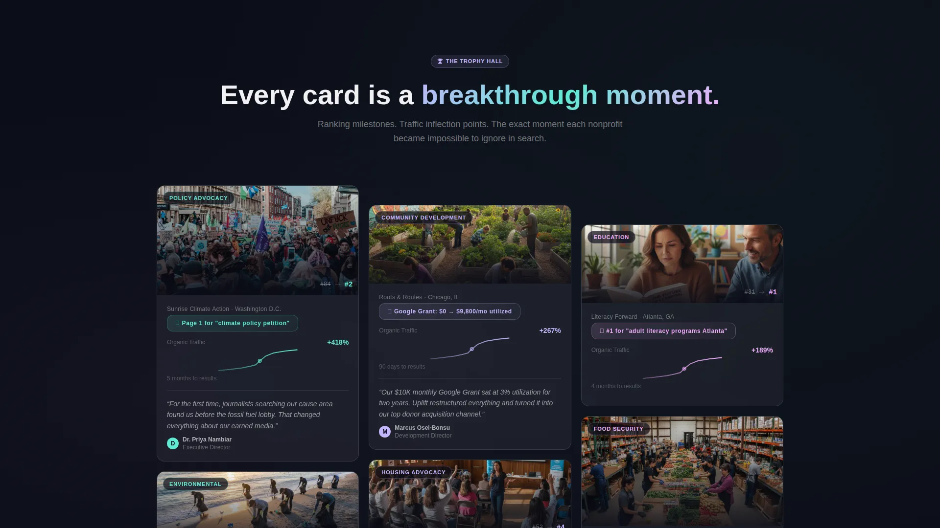
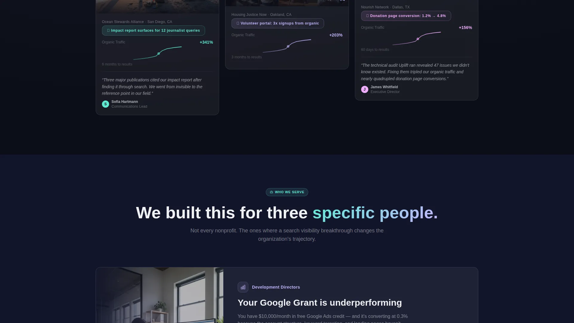
- Frosted glass case study cards framed as achievement milestones, each showing a ranking breakthrough or traffic inflection point
- A sticky navigation button leading to a three-field audit request form and a secondary email-only download path for the Nonprofit SEO Benchmark Report
Feature list
This template delivers a tightly scoped set of visual and structural features, each grounded in the agency's specific pitch.
Full-Viewport Masonry Mosaic Header
The header fills the entire viewport with a photo grid of real client proof points. Logos, SERP screenshots, traffic graphs, and award badges tile together in a parallax-drifting composition. A centered headline floats over the grid: "We've helped nonprofits earn 2.4 billion organic impressions. Yours is next." Tiles glow with iridescent border effects on hover.
Trophy-Hall Case Study Cards
Each masonry card below the header frames a client outcome as an achievement. Cards include ranking milestone badges, before-and-after search results page screenshots, circled traffic inflection graphs, and testimonial pull quotes beside award seals. The scroll experience escalates from local wins to national policy-term breakthroughs.
Ambient Recognition Tiles
Smaller tiles scattered between case study cards display agency-level awards, Google Partner badges, and conference speaking credits. All are rendered in the same frosted glass treatment so recognition feels woven into the narrative rather than displayed for its own sake.
Two-Path Lead Capture System
The primary conversion path is a sticky navigation button that scrolls to a three-field form: organization name, website URL, and a dropdown for the visitor's biggest search challenge. The secondary path offers a free Nonprofit SEO Benchmark Report download in exchange for an email address alone, capturing earlier-stage visitors without friction.
Tech Glass Visual System
Cards float on frosted translucent surfaces with subtle backdrop blur. Iridescent accents in prismatic lilac and holographic teal appear at card edges, borders, and interactive moments. The void black background keeps contrast high while letting the accent palette feel luminous and precise.
Parallax and Interaction Layer
The mosaic header drifts subtly on scroll, creating a sense of depth without distraction. Hover states on grid tiles trigger iridescent border glows using a shifting rose accent. These micro-interactions reinforce the sense that the page is alive with proof, not static.
Page sections overview
| Section | Purpose |
|---|---|
| Mosaic Header Grid | Establish proof volume instantly with a dense visual field of client results and awards |
| Floating Headline Bar | Anchor the agency's core claim over the mosaic without breaking the grid composition |
| Case Study Cards | Walk visitors through client breakthrough moments in an escalating, trophy-hall sequence |
| Recognition Accent Tiles | Surface agency-level credentials between case cards in a low-pressure ambient format |
| Audit Request Form | Capture ready leads with a focused three-field form and segmented dropdown challenge selector |
| Benchmark Report Download | Convert early-stage visitors with a low-friction email-only gated resource offer |
Design & branding system
The visual identity uses a Tech Glass theme with an AI Iridescent color palette. The result feels technological and ethereal at the same time, like light refracting through a prism in a darkened room.
- Core palette: deep void black (#0B0D17) for backgrounds, frosted glass white (#F0F0F3) for card surfaces, prismatic lilac (#C4B5FD) and holographic teal (#5EEAD4) for accents, and shifting rose (#F0ABFC) reserved for hover states, badges, and interactive moments
- Cards use frosted translucency with backdrop blur, and iridescent accents appear at edges and borders as if light is catching a beveled surface
- Typography is clean sans-serif, centered over the mosaic header, letting the headline float above the dense visual proof without competing with it
Mobile & speed optimization
The masonry layout and parallax effects are structured to translate cleanly to smaller screens without losing the density-as-message quality of the design.
- The mosaic grid reflows for mobile viewports so the photo composition remains legible and impactful at smaller sizes
- Frosted glass card treatments maintain visual hierarchy on touch screens where hover states are replaced by tap interactions
- The sticky audit button remains accessible throughout the mobile scroll, keeping the primary conversion path always within reach
How this template helps you convert
The layout is engineered so trust accumulates before any ask appears. By the time a visitor reaches the form, the question is not whether the agency can deliver. It is whether there is still availability.
- The header mosaic stacks visible evidence immediately. Logos, dashboards, and award badges fill the viewport on arrival, creating a proof density that makes the agency's track record impossible to overlook.
- The escalating case study scroll builds emotional momentum. Each card raises the stakes, moving from local traffic wins to national campaign breakthroughs, so visitors feel the agency's range before they reach the form.
- Two conversion paths match two buyer mindsets. The three-field audit form captures decision-ready prospects while the Benchmark Report download pulls in earlier-stage visitors with a single email field, widening the total lead funnel without adding complexity.
Other information about this template
This template sits at the intersection of portfolio and agency presentation, specifically tuned for the nonprofit marketing and agency subcategory. A few additional details worth knowing before you build with it.
- The template style is Masonry/Pinterest, meaning tiles vary in height and the overall composition is intentionally dense and layered
- The creative direction is Award and Recognition, so every card is framed around a client achievement rather than a generic service description
- The header concept is Photo Grid Mosaic, a full-viewport tiled arrangement with parallax drift and glass-morphism treatments on each tile
- The lead generation direction supports two distinct capture moments: a form for audit-ready visitors and a gated report for research-phase visitors
- The template is designed for a single-page flow, making it a focused landing page rather than a multi-section site architecture

Theme
Tech Glass
Creative direction
Award & Recognition
Color system
AI Iridescent
Style
Masonry/Pinterest
Direction
Lead Generation
Page Sections
Full-viewport Masonry Mosaic Header
Trophy-hall Case Study Cards
Ambient Agency Recognition Tiles
Two-path Lead Capture System
Tech Glass Visual System
Parallax and Hover Interaction Layer
Related questions
Who is this template designed for?
Can I customize the case study cards with my own client results?
What are the two lead capture options on this page?
Does the template include form processing or the report file?
What makes the visual design stand out from a standard portfolio template?



