Telecom Consulting Landing Page Template
Uplink is a single-page landing page template built for telecom transformation consultants. It guides VP-level and C-suite visitors through a structured diagnostic framework, layer-by-layer comparison tables, and a progressive booking form. The design uses a deep plum and gold palette that signals boardroom authority, and every section earns trust before asking for a meeting.
by Rocket studio
Quick summary
Uplink is a comparison table landing page template designed for telecommunications consultants who advise regional carriers, enterprise telecom directors, and MVNOs (Mobile Virtual Network Operators) on digital transformation. It combines an authoritative manifesto header, a five-layer diagnostic framework, interactive comparison tables, and a three-step booking form into one focused, conversion-oriented page.
Who this template is for
This template is built for senior consultants and boutique advisory firms working inside the telecom sector. It speaks directly to the sophistication of their clients without dumbing down the conversation.
- Telecommunications consultants advising regional carriers on legacy BSS/OSS modernization
- Independent advisors serving enterprise telecom directors managing multi-vendor infrastructure complexity
- Transformation consultancies working with MVNOs that need to migrate subscribers without service interruption
What problem this template solves
Most consulting landing pages either oversimplify what the firm does or bury the methodology so deep that decision-makers bounce before they trust the offer. This template solves that credibility gap head-on.
- VP-level buyers arrive skeptical and need to see diagnostic depth before they consider booking a call
- Generic service pages fail to communicate the structured, layer-by-layer thinking that distinguishes a specialist consultant
- Without a clear secondary path, visitors who are not yet ready to book simply leave rather than entering a nurture sequence
What you get with this template
You get a fully structured, single-page layout that teaches first and sells second. Every section is sequenced to build authority progressively, so the booking request feels like a natural next step rather than a cold pitch.
- A manifesto-style hero header with a proof line, a five-layer diagnostic section, and two interactive comparison tables
- A three-step progressive booking form capturing role, network scale, and a 45-minute calendar slot
- A gated secondary download path for visitors not yet ready to commit to a call
Feature list
This template is built around a specific set of functional components drawn directly from the brief. Each one serves the goal of converting skeptical senior buyers into booked assessments.
Manifesto Hero Header
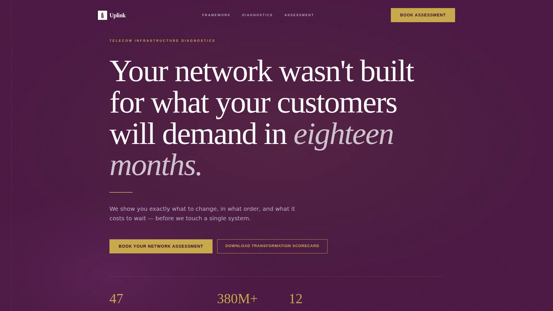
The header opens with a bold, weighted serif statement set against deep plum. A thin gold rule sits beneath the headline, followed by a single proof line showing transformations delivered and aggregate subscriber base migrated. No imagery, no icons, just the argument.
Five-Layer Diagnostic Framework
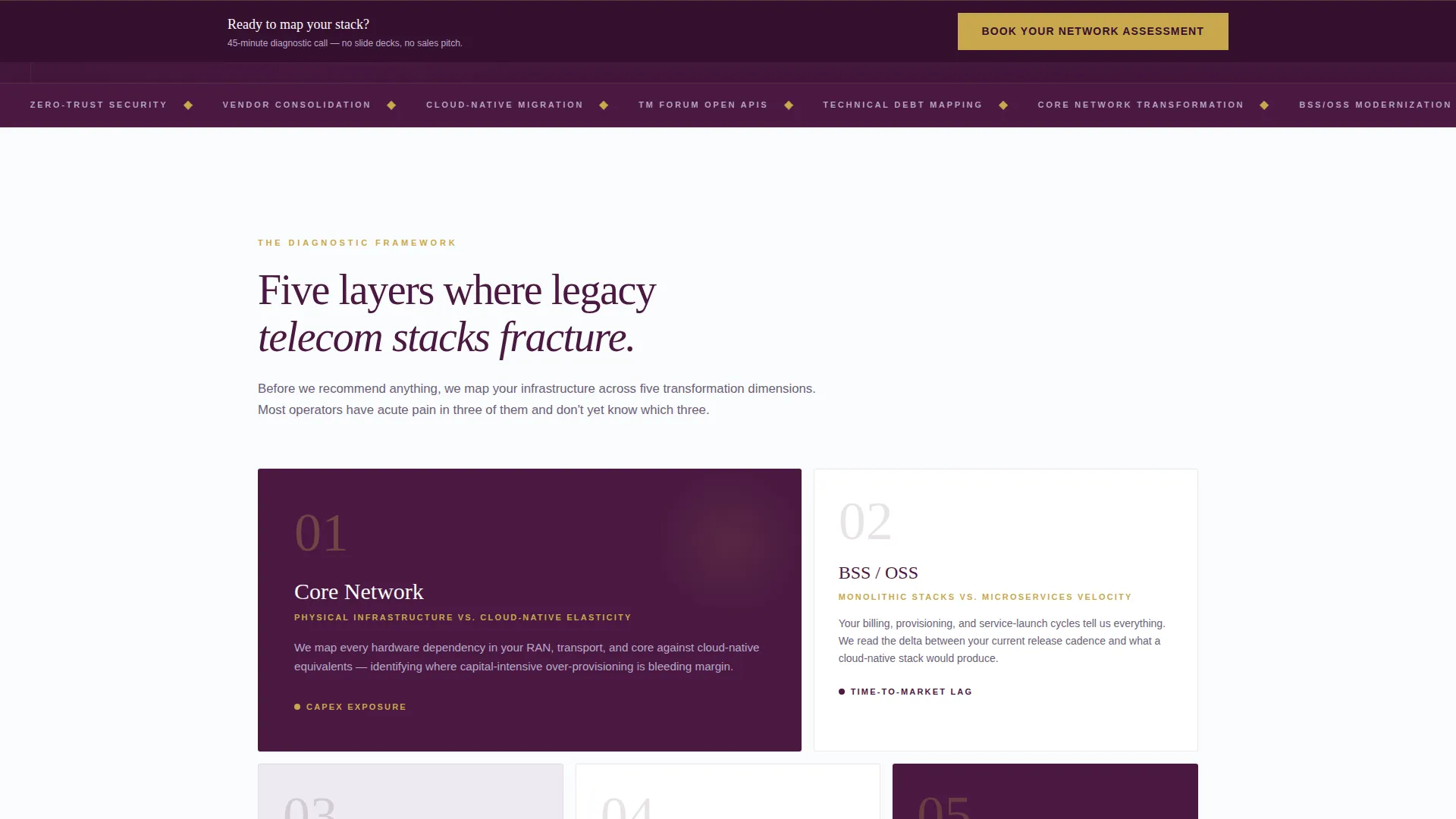
A dedicated section names and explains the five layers of telecom transformation: core network, BSS/OSS (Business Support Systems and Operations Support Systems), API (Application Programming Interface) gateway, security posture, and vendor consolidation. This section positions the consultant as someone who already understands the visitor's operating environment.
Interactive Comparison Tables
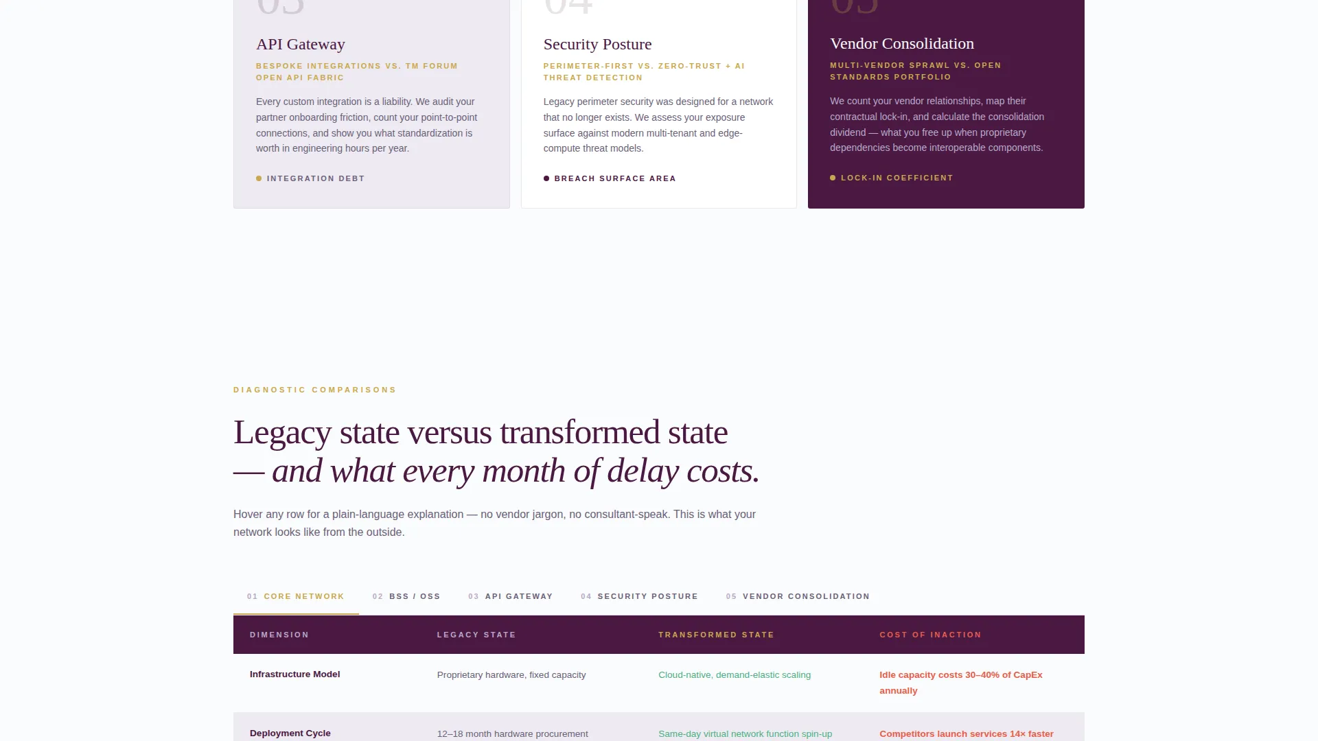
Each of the five layers gets its own comparison table with three columns: legacy state, transformed state, and cost-of-inaction metrics. Hovering over any row reveals a plain-language one-sentence explanation, replacing vendor jargon with clarity that a CTO can share with their board.
Sticky Booking Bar
After the second comparison table, a sticky bar appears at the top of the viewport. It carries the primary call to action "Book Your Network Assessment" and follows the visitor as they continue reading, keeping the conversion path visible without interrupting the educational flow.
Three-Step Progressive Booking Form
The booking form unfolds in three steps. Step one captures name, company, and role title. Step two asks for network scale, including subscriber count range and number of vendor relationships. Step three presents an embedded calendar for a 45-minute diagnostic call.
Gated Scorecard Download
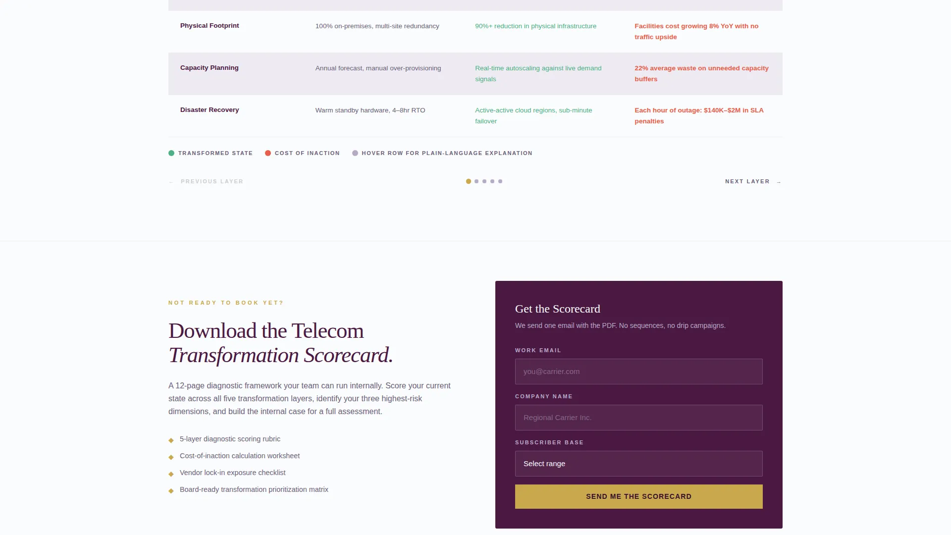
A secondary conversion path offers "Download the Transformation Scorecard" as a gated PDF. Visitors submit their email and company size to access it. This feeds a nurture sequence for decision-makers who are educating themselves before committing to a live assessment.
Page sections overview
| Section | Purpose |
|---|---|
| Manifesto Hero Header | Opens with a bold claim and a proof line to establish authority immediately |
| Diagnostic Framework | Names the five transformation layers to frame the consultant's methodology |
| Layer Comparison Tables | Shows legacy versus transformed state with cost-of-inaction data per layer |
| Primary Booking call to action | Drives assessment bookings directly beneath the manifesto |
| Sticky Booking Bar | Keeps the primary call to action visible after the second comparison table |
| Progressive Booking Form | Qualifies and converts visitors through a three-step intake sequence |
| Scorecard Download | Captures emails from visitors not ready to book via a gated PDF offer |
Design & branding system
The visual identity follows an Educational Guide theme inside a Plum Executive color system. The palette reads like the cover of a strategy report prepared for a board of directors, authoritative without being loud.
- Deep plum (#4A1942) anchors headers and section backgrounds; muted silver-lavender (#B8A9C9) is used for secondary surfaces and alternating table rows; crisp white (#FAFBFC) fills content areas
- Decisive gold (#C9A84C) is reserved exclusively for calls to action and highlighted table cells, giving every conversion element a clear visual signal
- Large, weighted serif typography carries the header and section titles, reinforcing the tone of a senior practitioner presenting to an executive audience
Mobile & speed optimization
The layout is designed to remain readable and navigable on smaller screens, keeping the comparison tables and booking form functional for decision-makers who review content on mobile devices between meetings.
- Comparison tables are structured to reflow or scroll horizontally on narrow viewports so data stays legible without breaking the layout
- The three-step booking form is broken into discrete steps, reducing cognitive load on mobile and keeping each screen focused on a single input task
- The sticky booking bar is positioned to remain unobtrusive on mobile while still keeping the primary call to action within reach
How this template helps you convert
The page is sequenced so that each section earns the next click. By the time a visitor reaches the booking form, they have already been through a structured diagnostic that mirrors what the actual assessment delivers.
- The manifesto header and proof line establish credibility in the first few seconds, giving skeptical VP-level visitors a reason to keep reading rather than bouncing
- The layer-by-layer comparison tables progressively demonstrate diagnostic depth, so the "Book Your Network Assessment" call to action feels like a continuation of the education rather than a sales interruption
- The gated scorecard download captures visitors who are not yet ready to book, turning passive readers into identifiable leads inside a nurture sequence
Other information about this template
This template is categorized under Professional Services with a Telecommunications Consulting focus, and it is built to serve the intersection of transformation advisory and compliance-aware network planning. It works well for consultants whose engagements begin with a structured diagnostic and move toward a scoped statement of work.
- The template style follows a Sidebar Companion and Corporate Precision theme, meaning the layout supports dense, structured content without feeling cluttered
- The Creative Direction draws from a Logo Wall Authority approach, which can be adapted to display client carrier logos or partner certifications in a dedicated social proof row
- The header concept is rooted in Data Storytelling, making it straightforward to swap the proof line metrics as the consultant's portfolio grows
Theme
Corporate Precision
Creative direction
Logo Wall Authority
Color system
Plum Executive
Style
Sidebar Companion
Direction
Content/Resource
Page Sections
Manifesto Hero Header with Proof Line
Five-layer Diagnostic Framework Section
Interactive Layer Comparison Tables
Three-step Progressive Booking Form
Sticky Call-to-action Bar
Gated Scorecard Download Path
Related questions
Who is this landing page template designed for?
Can I customize the comparison table content for my practice area?
What does the three-step booking form collect?
How does the gated scorecard download support lead generation?
When does the sticky booking bar appear on the page?



