Smart Home Office Landing Page Template
Uplink is a single-column landing page template built for home office smart home integration services. It uses a Case Study Narrative structure to guide visitors through three real homeowner stories, a soft sage call-to-action, and a lightweight three-field lead form. The Monochrome Steel palette and full-bleed golden-hour header make the service feel as considered as the spaces it controls.
by Rocket studio
Quick summary
Uplink is a lead generation landing page for home office smart home integration. It tells the story of three real homeowners whose workspaces were transformed by intelligent automation. A restrained Monochrome Steel palette, alternating graphite and warm white sections, and a feather-light three-field form work together to move remote professionals from curiosity to a booked consultation.
Who this template is for
This template speaks directly to the integrator or agency selling smart home automation to remote workers. It is crafted for service providers whose clients have already invested in their home workspace and are ready for a unified control system.
- Remote professionals managing five or more apps to control lights, audio, blinds, and climate
- Dual-income households building accessory dwelling unit workspaces who want one cohesive system from day one
- Smart home integrators and renovation consultants serving the home office renovation niche
What problem this template solves
Most home office smart home integration services lose leads because their pages read like spec sheets. Visitors see a list of devices and feel nothing. The real problem is emotional: the homeowner knows something is wrong with their setup but cannot picture what "right" looks like.
- Too many disconnected apps create daily friction that drains focus before the first meeting
- Generic service pages fail to show the before-and-after transformation that motivates a booking
- Long contact forms add unnecessary commitment pressure at exactly the wrong moment
What you get with this template
The template delivers a complete single-column flow landing page structured around three case study narratives. Each story moves from problem to intervention to result, building trust and desire as the visitor scrolls.
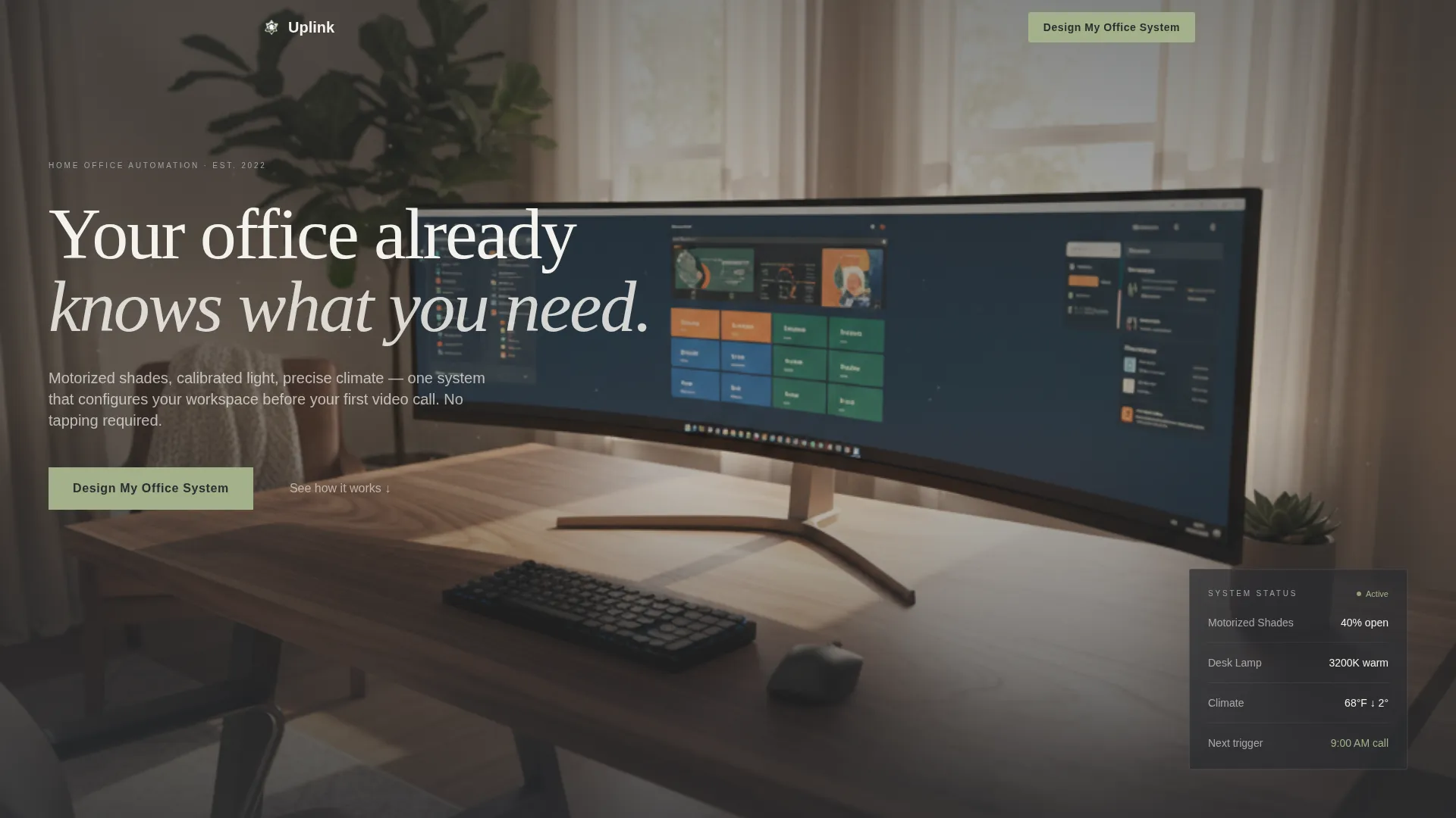
- A full-bleed golden-hour header with a headline that fades in after a beat, establishing mood before a single word is read
- Three narrative case study sections, each followed by a "Design My Office System" call-to-action in soft sage on graphite
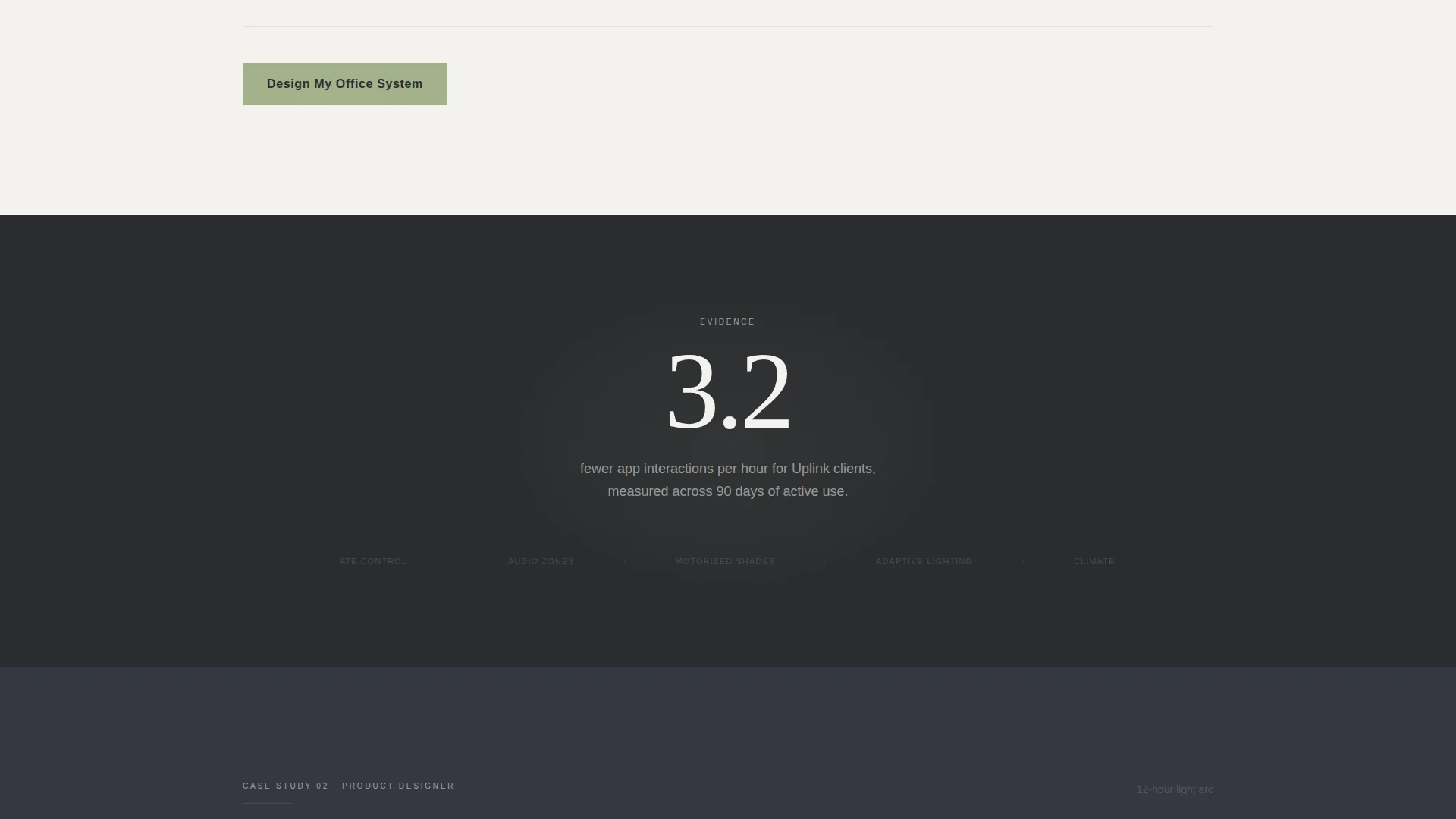
- Floating single-stat callout blocks between stories that ground emotion in evidence
- A three-field lead form collecting workspace type, biggest daily frustration, and email with no phone or budget field
Feature list
A concise paragraph introduces the feature set below. Every component in this template was chosen to reduce friction for the visitor and increase confidence in the service being offered.
Full-Bleed Golden Hour Header
The header opens with a real home office photograph shot at golden hour from the doorway. No person appears in frame. The room itself carries the narrative. A warm white headline fades in after a brief pause, giving visitors a moment to feel the stillness before reading a word.
Case Study Narrative Scroll Flow
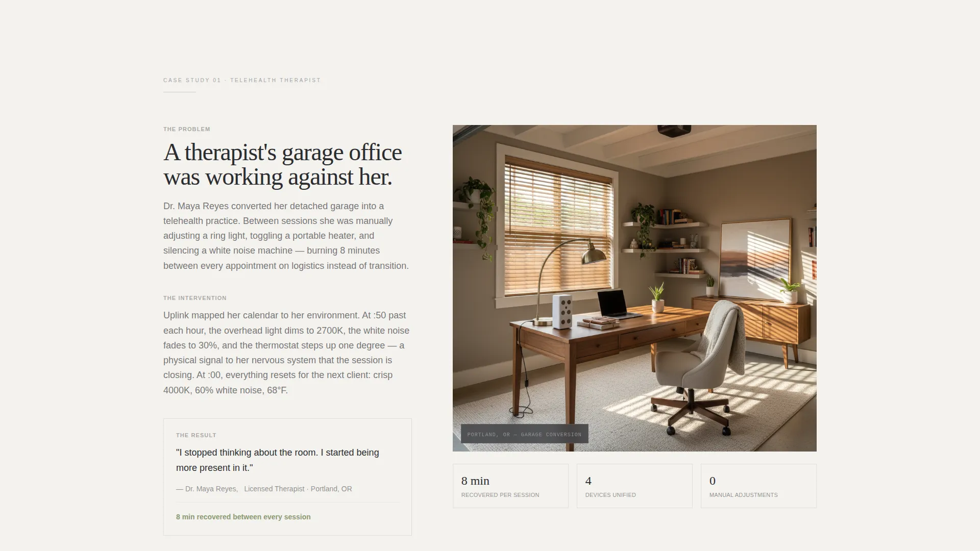
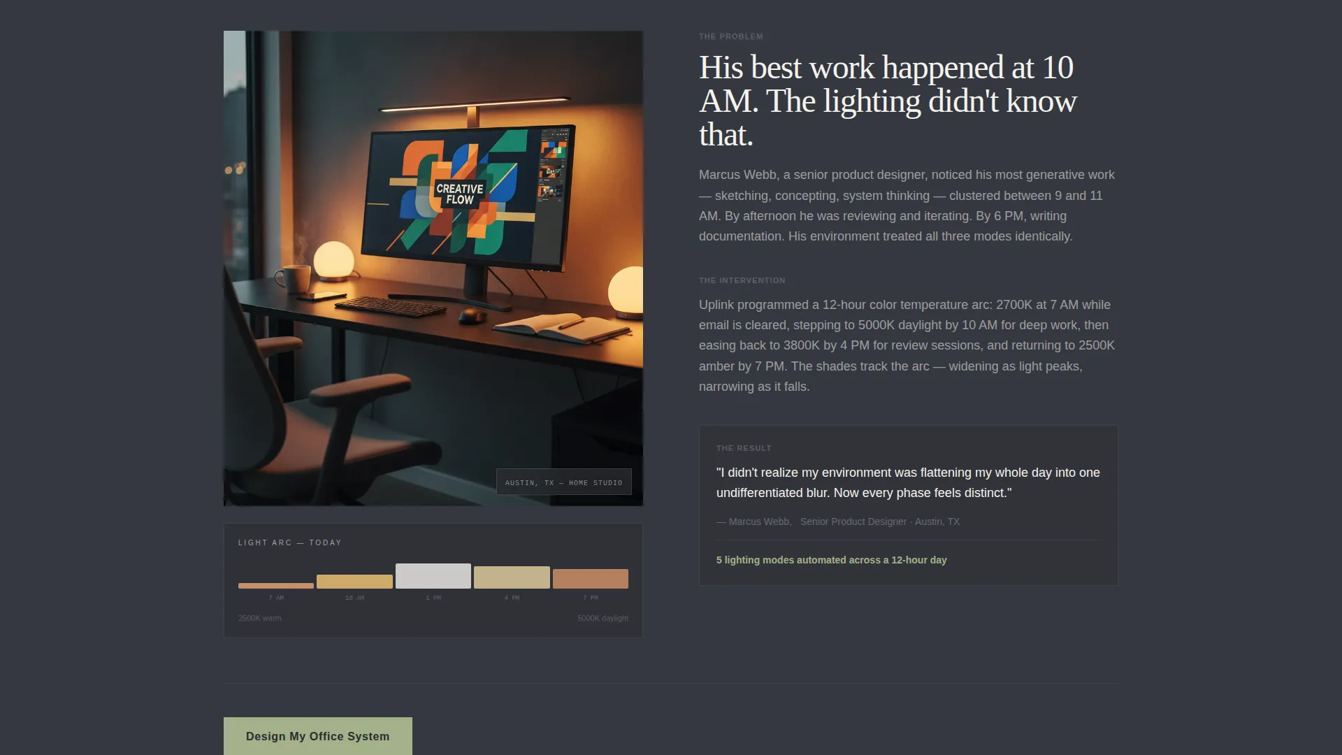
Three homeowner stories unfold as the visitor scrolls. The first follows a therapist running telehealth from a converted garage. The second features a product designer whose lighting shifts color temperature across a twelve-hour day. The third covers a couple sharing a loft office with personalized climate and audio zones. Each story deepens the sense of what is possible.
Floating Stat Callout Blocks
Between each case study, a single-stat block sits on a deep graphite background. Examples include callouts like "3.2 fewer app interactions per hour." These grounding moments convert emotional resonance into rational confidence without interrupting the narrative scroll.
Soft Sage Call-to-Action Placement
The "Design My Office System" call-to-action appears in soft sage on graphite beneath the header and again after each case study. The placement cadence gives visitors multiple low-pressure entry points without repeating the same ask too aggressively.
Feather-Light Lead Form
The three-field form collects workspace type via a selector, biggest daily frustration via a dropdown seeded with real pain points, and an email address. No phone number or budget question appears. The first conversation is framed as a free twenty-minute video walkthrough where the integrator screen-shares a proposed device map.
Alternating Background Rhythm
Sections alternate between deep graphite and warm white backgrounds as the visitor scrolls. This rhythmic contrast creates a visual inhale-exhale effect that keeps the page from feeling flat and signals clear section transitions without needing heavy dividers.
Page sections overview
| Section | Purpose |
|---|---|
| Full-bleed header | Set mood, introduce headline |
| First call-to-action | Early conversion entry point |
| Case study one | Telehealth therapist transformation story |
| Stat callout one | Ground emotion in a single metric |
| Second call-to-action | Mid-page conversion prompt |
| Case study two | Designer lighting shift narrative |
| Stat callout two | Reinforce value with evidence |
| Third call-to-action | Post-story conversion prompt |
| Case study three | Shared loft zone personalization story |
| Stat callout three | Final evidence block before form |
| Lead generation form | Capture workspace type, frustration, email |
Design & branding system
The visual identity follows a Pastoral Calm theme expressed through a Monochrome Steel color system. Every color decision is intentional and restrained, making the page feel as composed as the spaces it promises to create.
- Deep graphite (#2B2D30) for primary section backgrounds, brushed aluminum (#9EA3AB) for secondary surfaces and divider lines, and warm white (#F4F2EE) for all body text and breathing space
- Soft sage (#A3B18A) reserved exclusively for call-to-action buttons and active-state indicators, keeping the accent color meaningful and immediately recognizable
- The palette reads like a Muji desk organizer on polished concrete: tactile, restrained, and calming on first glance
Mobile & speed optimization
The single-column flow structure translates naturally to smaller screens without requiring a separate mobile layout. Scrolling is the primary interaction on both desktop and mobile, which makes this template format inherently well-suited to touch navigation.
- The alternating section rhythm and full-width stat callouts remain legible and impactful at any viewport width
- The three-field form stays minimal and thumb-friendly, with no complex multi-column input rows to reflow
How this template helps you convert
The page is engineered around a simple insight: visitors book when they feel understood, not when they read a feature list. Every layout decision serves that goal.
- The Case Study Narrative structure positions the integrator as a trusted guide rather than a vendor, building credibility before any ask is made
- The soft sage call-to-action appears at four natural decision points, each preceded by a story or a proof stat that primes the visitor to act
- The three-field form removes commitment anxiety by asking only for context and an email, then immediately frames the next step as a free, value-first video walkthrough
Other information about this template
This template is built for a specific type of service business: one that sells high-consideration home office smart home integration at the intersection of home office renovation and lifestyle-driven design. It is not a general home services template.
- The creative direction is Case Study Narrative, meaning the page works best when real client stories are available to populate each section
- The template style is Single Column Flow, which keeps the visitor on a guided path with no navigational distractions
- The header concept is Full-Bleed Photo, so the impact of the opening section depends on a high-quality real-space photograph, not a rendered mockup
- The lead generation direction means the page is optimized for form submissions, not e-commerce checkouts or direct booking calendars
- The Pastoral Calm theme and Monochrome Steel color system are consistent design decisions that should be preserved when customizing to maintain the emotional tone the template was built around
Theme
Pastoral Calm
Creative direction
Case Study Narrative
Color system
Monochrome Steel
Style
Single Column Flow
Direction
Lead Generation
Page Sections
Full-bleed Golden Hour Header
Case Study Narrative Scroll Flow
Floating Stat Callout Blocks
Soft Sage Call-to-action Placement
Feather-light Three-field Lead Form
Alternating Section Background Rhythm
Related questions
Can I use this template for a general smart home service, not just home offices?
How many fields does the lead form include?
What happens after a visitor submits the form?
Do I need a real photograph for the header section?
Can I change the call-to-action text and color?



