HR Software & Platform Specialist Booking Website Template
Upskill is a single-column landing page template built for learning and development platforms targeting mid-market and enterprise buyers. It opens with three animated metric counters, then walks visitors through three escalating case studies. The page is designed to build conviction through real data, so every scroll section moves a skeptical L&D director or VP of People closer to booking a demo.
by Rocket studio
Quick summary
Upskill is a click-through landing page template for learning and development platforms. It leads with a live metrics wall, then builds an evidence wall through three escalating case studies. The layout is single-column, desktop-first, and built to turn L&D directors and People leaders into demo bookings without asking them to fill out a form.
Who this template is for
This template is designed for B2B SaaS companies selling learning and development software to mid-market and enterprise buyers. It speaks directly to the people who carry the weight of proving training return on investment.
- Learning and development directors managing manual audit cycles at companies with 200 to 2,000 employees
- Startup VPs of People who need to justify onboarding spend to a skeptical board
- Operations leads who know a single certification gap could cost their team a contract
What problem this template solves
Most training platform landing pages look like feature lists. They describe the product but never show the proof. Decision-makers in this space are data-driven and time-poor. They need to see outcomes, not promises.
- L&D buyers want evidence before they engage, not a form that asks for their details first
- Scattered testimonials and generic copy fail to build the layered trust that enterprise buyers need
- A page without escalating proof leaves mid-market buyers wondering whether the platform scales to their size
What you get with this template
This template delivers a fully structured, single-column landing page flow ready to customize for any learning and development platform. Every section is purposeful and sequenced to build conviction from first scroll to final click.
- A hero section with three animated metric counters and a single primary call-to-action button
- Three case study sections that escalate from a 40-person startup through a 400-person scaleup to a 4,000-person enterprise
- A sticky bottom call-to-action bar and a closing section with a primary and secondary action link
Feature list
This template ships with a focused set of components, each earning its place in the conversion flow.
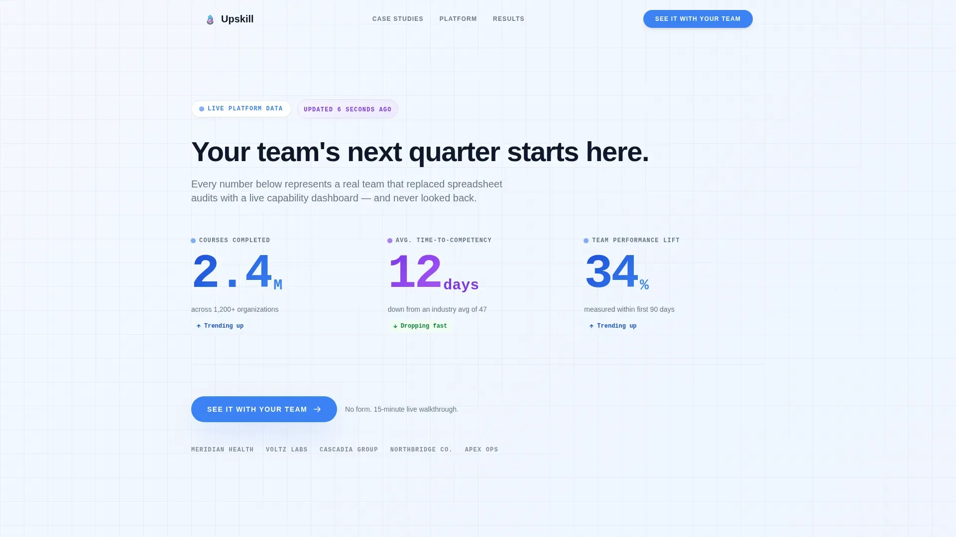
Animated Metrics Counter Wall
Three oversized stat counters animate upward on page load using a staggered timing sequence. Numbers are set in a bold monospace typeface against a cloud white background. The counters display courses completed, average time-to-competency, and team performance lift.
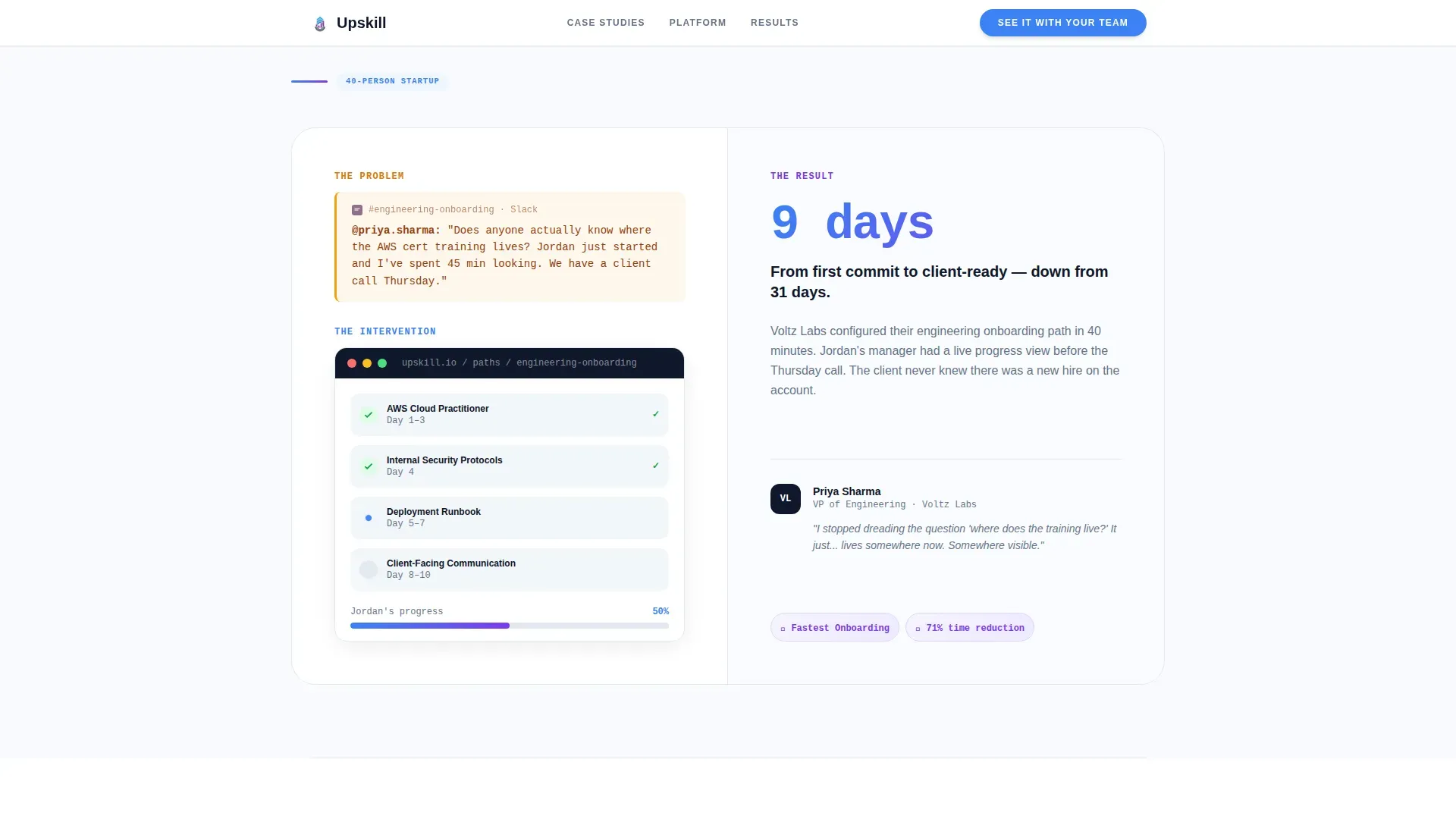
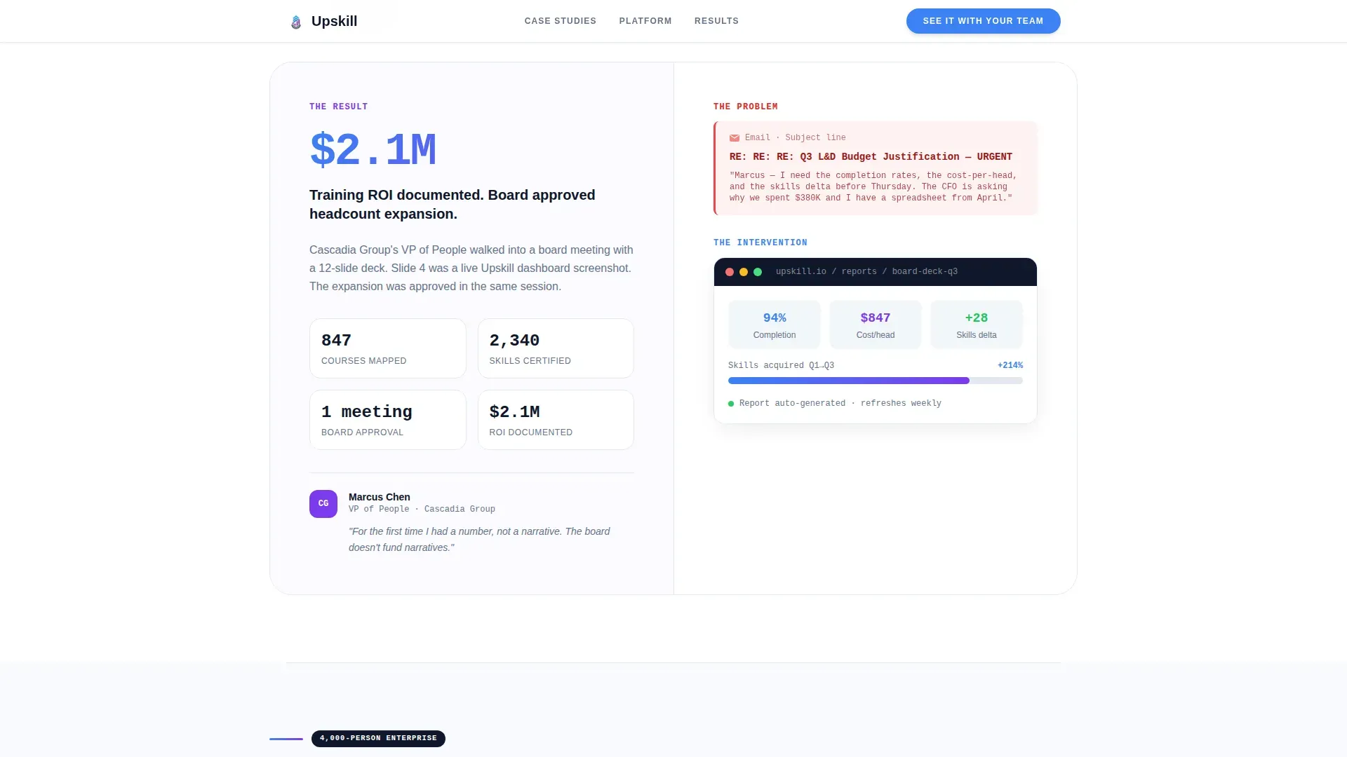
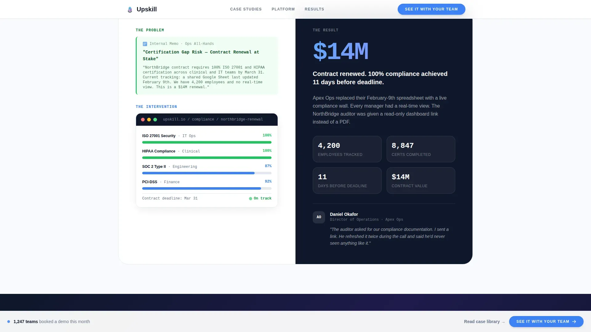
Escalating Case Study Sections
Each of the three case study blocks follows a three-beat structure: a quoted problem signal, a visual of the learning path configuration, and a single bold result metric with a company logo. The scale increases with each section, so visitors at any company size can see themselves in the story.
Sticky Click-Through Bar
A sticky bottom bar surfaces the primary call-to-action after the second case study and stays visible during the final scroll. It keeps the demo booking prompt in view without interrupting the reading flow.
Scroll-Triggered Section Reveals
Each content section animates into view as the visitor scrolls down the page. This creates a sense of forward momentum that matches the platform's data-velocity narrative.
Single-Column Flow Layout
The layout uses a disciplined single-column structure that keeps the visitor's eye moving in one direction. There are no sidebars or competing visual tracks to distract from the evidence wall.
Closing Dual Call-to-Action Block
The final section anchors two options side by side: a primary "See It With Your Team" demo link and a secondary "Read the Full Case Library" link. This gives high-intent visitors a direct path and curious visitors a lower-commitment next step.
Page sections overview
| Section | Purpose |
|---|---|
| Hero metrics wall | Opens with three animated counters and primary call-to-action |
| Case Study One | 40-person startup story: problem quote, learning path, result metric |
| Case Study Two | 400-person scaleup story: email subject, intervention, bold metric |
| Case Study Three | 4,000-person enterprise story: ops risk quote, certification path, contract win |
| Closing call to action block | Dual action links anchoring the demo booking and case library |
| Footer row | Linear single-row footer pattern |
Design & branding system
The visual identity follows a Startup Velocity theme built on the Cloud Canvas color system. The palette is clean and data-forward, designed to feel like a freshly provisioned dashboard rather than a marketing brochure.
- Background: open-sky white (#F8FAFE) with soft vapor gray (#E2E8F0) for surface variation; signal blue (#3B82F6) on primary actions and data highlights; launchpad violet (#7C3AED) reserved for progress indicators and achievement badges
- Typography: JetBrains Mono for all counters and numeric displays; Plus Jakarta Sans for headings and body copy
- No illustrations or stock photography; data and quoted communications do all the persuasive work
Mobile & speed optimization
The template is desktop-first because L&D directors and People leaders typically review vendor pages on laptops during working hours. It is also built to render cleanly on tablets and mobile devices.
- Static sections use Server Components to keep initial load fast and avoid unnecessary client-side rendering
- Animated counter components are isolated as Client Components so they do not block the rest of the page
- Scroll-triggered reveals use lightweight animation logic that does not degrade performance on slower connections
How this template helps you convert
The page is engineered as a click-through landing page. Its entire job is to build enough conviction that the demo booking feels like the visitor's own decision.
- The metrics wall creates immediate credibility before the visitor reads a single line of marketing copy, anchoring the session in real outcomes rather than feature descriptions.
- The three escalating case studies mirror the visitor's company size somewhere in the sequence, making the evidence feel personally relevant rather than abstract.
- The sticky call-to-action bar and no-form approach reduce friction at every stage, keeping the path from interest to demo booking as short as possible.
Other information about this template
This template sits inside the HR Software and Platform category, specifically within the learning and development platform niche. It is a strong fit for teams building or relaunching a product page in the HR technology space.
- The creative direction is Case Study Narrative, which means social proof is structural rather than decorative
- The header concept is Stats and Metrics, making data the first visual impression rather than a headline claim
- The landing page direction is Click-Through, so there is intentionally no embedded form; the page drives outbound to a demo booking flow
- Template style is Single Column Flow under the Startup Velocity theme, keeping the layout focused and momentum-driven
Theme
Startup Velocity
Creative direction
Case Study Narrative
Color system
Cloud Canvas
Style
Single Column Flow
Direction
Click-Through
Page Sections
Animated Metrics Counter Wall
Escalating Case Study Blocks
Sticky Click-through Bar
Scroll-triggered Section Reveals
Closing Dual Call-to-action Block
Single-column Flow Structure
Related questions
Does this template include a contact form?
Can I use my own case study data in the three story sections?
Is the counter animation connected to live platform data?
Who is this landing page template designed for?
Can the sticky call-to-action bar be repositioned or removed?


