Education Department Careers Website Template
Upskill is a split-screen adult education landing page template built for professional development programs. It leads with hard enrollment metrics, walks visitors through a before-and-after career narrative, and gates a downloadable Career Shift Guide behind a two-field form. The design is Corporate Precision: clinical white, charcoal type, and glacier-blue accents that signal authority at every scroll.
by Rocket studio
Quick summary
Upskill is a single-page template designed for adult education divisions serving mid-career professionals, HR directors, and credential-seeking immigrants. It opens with an oversized metrics wall, unfolds a scroll-linked before-and-after career story, previews three guide data points to earn trust, then gates a downloadable resource behind a minimal form. Every section is built to move hesitant adults closer to enrollment.
Who this template is for
This template fits teams running adult education or professional development programs that need to speak to busy, skeptical working adults. It balances a business-to-business (B2B) pitch for institutional buyers with a direct consumer offer for individual learners.
- Adult education departments and workforce development offices launching credential programs
- HR directors and learning-and-development managers seeking tuition reimbursement partners
- Program marketers targeting mid-career professionals, credential-gap immigrants, and career changers
What problem this template solves
Working adults are a hard audience to convert. They distrust brochure-language, they research slowly, and they need proof before they commit. Generic education templates lack the narrative structure and social proof density to move this audience.
- No clear before-and-after story to show the real cost of credential stagnation
- No mechanism to preview resource value before asking for contact information
- No filterable program catalog for visitors who already know their industry but need guidance on the right credential path
What you get with this template
You get a fully structured, single-page layout that covers every stage of the adult learner decision journey. The template ships with distinct sections, a defined visual system, and scroll-linked interaction logic baked into the brief.
- A stats-driven hero section, a scroll-animated split-screen narrative, a gated guide download form, and a filterable program catalog
- A Corporate Precision color system with Arctic White, Charcoal Graphite, Glacier Blue, and Pale Frost applied consistently across all sections
- Typography pairing of DM Sans for body and interface copy with Fraunces for editorial moments that add warmth and authority
Feature list
This template is built around a set of functional components that work together to carry a visitor from first impression to form submission or program exploration.
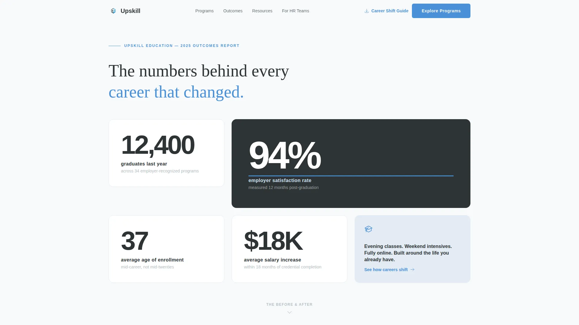
Staggered Metrics Hero Wall
The hero section renders oversized enrollment and satisfaction figures in charcoal type against an Arctic White field. Numbers stagger in on page load using a count-up animation. A thin Glacier Blue underline draws beneath the most impactful figure, giving the section the authority of a financial report without relying on photography.
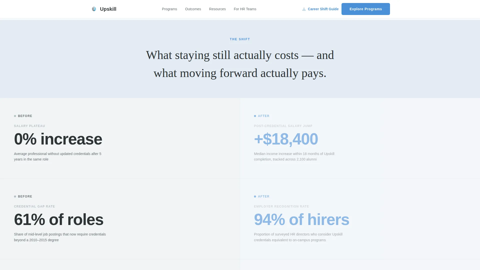
Scroll-Linked Split-Screen Panel
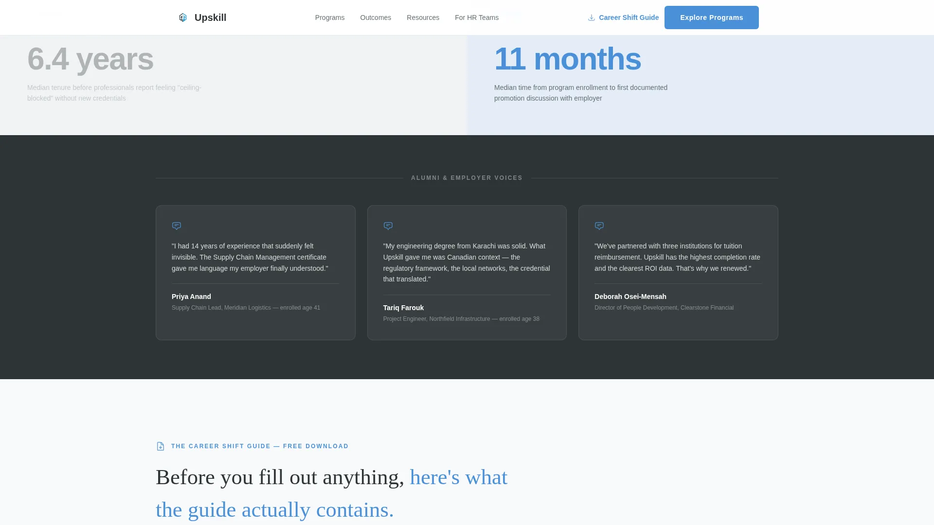
A 50/50 split layout anchors the core narrative. The left panel holds career stagnation data and salary plateau statistics. The right panel holds program outcomes and employer testimony. As the visitor scrolls, the left side darkens slightly while the right brightens, making the shift from "before" to "after" a physical experience on screen.
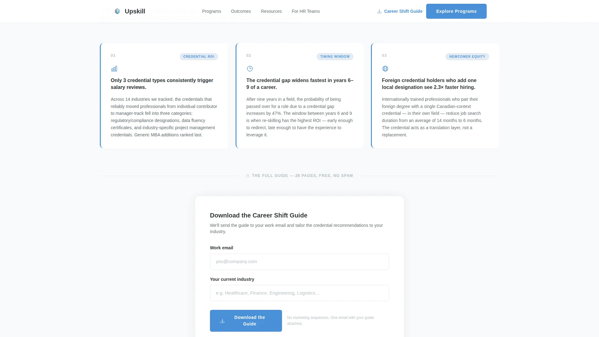
Gated Career Shift Guide Form
A two-field form captures work email and current industry in exchange for the Career Shift Guide download. The guide is framed as a diagnostic tool rather than a brochure, positioned to find which credentials move the needle in a specific field. Three concrete data points from the guide appear before the form gate to prove value first.
Filterable Program Catalog
A secondary, ungated section presents the full program offering as a filterable grid organized by industry. Visitors who are not ready to download can still explore specific credential paths. This section carries its own call-to-action path labeled "Explore Programs by Industry."
Escalating Narrative Scroll
The page structure follows a deliberate stakes escalation: personal cost of inaction, then institutional proof of transformation, then broader workforce and equity context. Each scroll depth increases urgency without resorting to pressure tactics, keeping the tone authoritative and respectful of the adult learner's intelligence.
Page sections overview
| Section | Purpose |
|---|---|
| Hero Metrics Wall | Opens with hard enrollment data to establish credibility immediately |
| Split Scroll Narrative | Contrasts career stagnation with program outcomes as the visitor scrolls |
| Guide Value Preview | Displays three guide data points to earn the download before the form appears |
| Gated Download Form | Captures work email and current industry in exchange for the Career Shift Guide |
| Program Catalog Grid | Offers an ungated, filterable view of credential programs organized by industry |
| Linear Single-Row Footer | Closes the page with a compact, single-row footer layout |
Design & branding system
The visual identity follows a Corporate Precision theme. Every color choice and typographic decision is calibrated to feel like a freshly printed official document: authoritative, exact, and free of visual clutter.
- Arctic White (#F8F9FB) dominates as the primary background field, with Pale Frost (#E3EBF3) used for alternating section backgrounds to create subtle rhythm without adding noise
- Charcoal Graphite (#2D3436) handles all primary text, while Glacier Blue (#4A90D9) is reserved for interactive elements, progress indicators, and the hero underline accent
- DM Sans carries body copy and interface labels for clarity; Fraunces appears in editorial headline moments to introduce warmth and contrast
Mobile & speed optimization
The 50/50 split-screen layout is designed desktop-first, since the split panel mechanic is the core visual experience. On smaller viewports, the layout adapts gracefully so the narrative remains intact.
- The split panels stack vertically on mobile so the before-and-after story reads in natural top-to-bottom order
- Static sections are structured for Server Component rendering, while scroll-linked split panels and the form gate are handled as Client Components to keep interactivity scoped and efficient
- Intersection Observer-based reveals control when animated elements enter the viewport, avoiding unnecessary rendering work on load
How this template helps you convert
Every section of this template is sequenced to reduce resistance and build commitment progressively, rather than asking for enrollment at first glance.
- The metrics hero builds instant institutional credibility with hard numbers, so the visitor trusts the source before reading a single line of marketing copy.
- The scroll narrative personalizes the stakes by moving from abstract statistics to recognizable career situations, making the visitor feel seen rather than targeted.
- The guide preview model proves value before the form gate, lowering the friction of sharing contact details and increasing the quality of leads captured.
Other information about this template
This template is purpose-built for the adult education niche within government and public education contexts. It suits organizations that serve the full spectrum of credential-seeking adults, from salary-ceiling professionals to recent immigrants navigating equivalency requirements.
- The page uses a linear single-row footer pattern to keep the close of the page clean and uncluttered
- Fraunces serif headlines can be swapped for alternate editorial typefaces if brand guidelines require a different voice
- The program catalog section supports a secondary conversion path, meaning visitors who skip the guide download still have a low-friction way to engage with the program offering
- Animation intensity is set to medium: count-up numbers on load and scroll-linked brightness shifts add motion without overwhelming users who prefer a calmer reading experience
Theme
Corporate Precision
Creative direction
Movement & Cause
Color system
Arctic White
Style
Split Screen (50/50)
Direction
Content/Resource
Page Sections
Staggered Metrics Hero Wall
Scroll-linked Split-screen Panels
Gated Career Shift Guide Form
Filterable Program Catalog
Escalating Narrative Structure
Related questions
Who is the primary audience for this template?
How does the gated form section work?
Can the program catalog be customized for different industries?
Is this template suitable for a government education department?
Does the split-screen layout adapt to mobile devices?