Professional Certification Training | Free Website Template | Rocket
The Upskill professional certification training landing page template is built for education and training providers targeting mid-career professionals. A live learner count ticker opens the hero section, three scroll-linked phases guide visitors through the full learning journey, and a frictionless three-field sign-up form drives free trial conversions. The Cloud Canvas color system and Startup Velocity theme keep every section clean, focused, and fast to navigate.
by Rocket studio
Quick summary
The Upskill template is a single-column flow landing page designed for professional certification and training providers. It opens with a live user count ticker in the hero section, walks visitors through three sequential learning phases, and closes with a dual call to action covering both individual and team sign-ups. The result is a course landing page that lets potential students experience the product before they ever click register.
Who this template is for
This template is built for training businesses that serve working professionals chasing career-critical credentials. It fits equally well for individual course sellers and learning and development teams managing bulk enrollments. If your audience measures time in sprint cycles and performance review windows, this landing page was shaped for them.
- Mid-career professionals such as project managers, developers, and designers seeking certifications and micro-credentials before annual review season
- Human resources and learning and development directors bulk-enrolling teams into compliance or skills training courses against hard deadlines
- EdTech founders and online course creators who need a polished, conversion-ready course landing page without starting from scratch
What problem this template solves
Most course landing pages fail because they tell visitors what a training program offers rather than showing them. Potential students arrive, skim a wall of bullet points, and leave without signing up. The page never earns the click because it never creates momentum. A well-structured landing page should address the audience's pain points and communicate a clear value proposition from the very first scroll.
- Visitors leave before converting because the page gives no sense of what the learning experience actually feels like
- Lead generation stalls when sign-up forms ask for too much information too early, raising friction before trust is established
- Training providers struggle to build trust with both individual learners and bulk buyers using a single page layout
What you get with this template
This template delivers a complete, ready-to-deploy course landing page with five structured sections and a footer. Every section is built around a specific job: attract, engage, demonstrate, credential, and convert. You get all the information a potential student or a team buyer needs to feel confident enough to register, laid out in a clean design that is easy to navigate from top to bottom.
- A hero section with a live incrementing user count ticker, a strong headline in oversized electric indigo, and a primary "Start Learning Free" call to action
- Three scroll-linked learning phases covering course exploration, an interactive lesson preview with a progress bar, and a rotating digital badge showcase with credential card highlights
- A dual conversion section featuring an individual freemium sign-up modal and a separate team enrollment form, each designed to reduce friction and capture leads quickly
Feature list
This template packs a focused set of interactive and visual elements that work together to guide visitors from curiosity to commitment. Each feature serves the landing page's core purpose: to convert visitors who are qualified, motivated, and ready to take action.
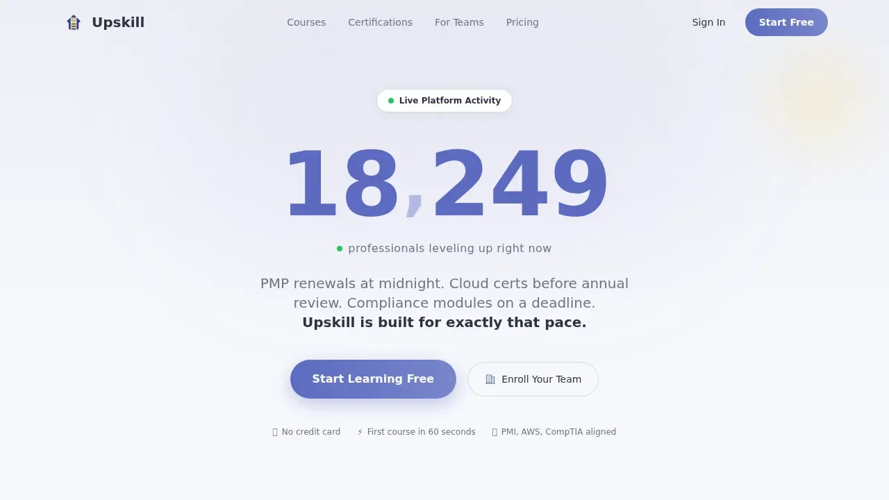
Live User Count Ticker Hero
The hero section opens with a large, smoothly incrementing number rendered in electric indigo against a soft cumulus white background. The counter ticks upward in real time with a subtle easing animation, expressing social proof as living arithmetic. Below the number, a single line of micro-copy reads "professionals leveling up right now," making every visitor feel they are watching a movement they have not yet joined. A "Start Learning Free" call to action sits directly beneath the ticker.
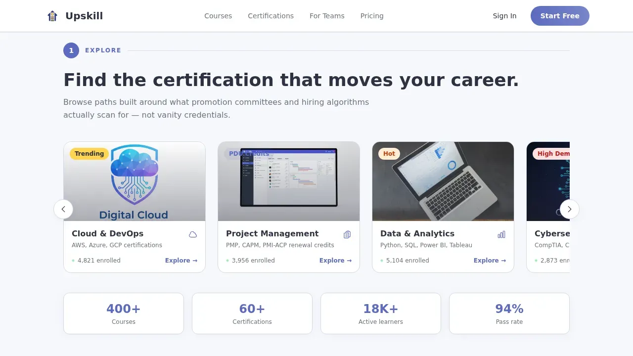
Scroll-Linked Three-Phase Learning Journey
Three numbered phases unfold as the visitor scrolls: Explore, Learn, and Certify. Each phase slides in sequentially after the previous one completes, so scrolling the landing page rehearses the act of finishing a course. This creative direction turns the page itself into a product demo, giving potential students a genuine sense of the value they will receive before they ever reach the sign-up form.
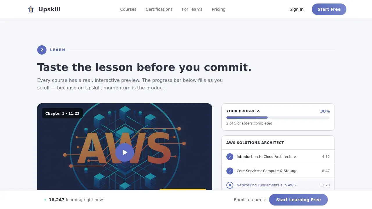
Interactive Lesson Preview with Progress Bar
The Learn phase features an embedded lesson preview that is real and interactive. A progress bar fills as the visitor scrolls, providing a tangible reward for engagement. The preview is intentionally incomplete, using curiosity to carry visitors naturally toward the conversion section. This approach addresses a core best practice: benefit-driven copy in the hero section and mid-page interaction significantly enhance engagement on a course landing page.
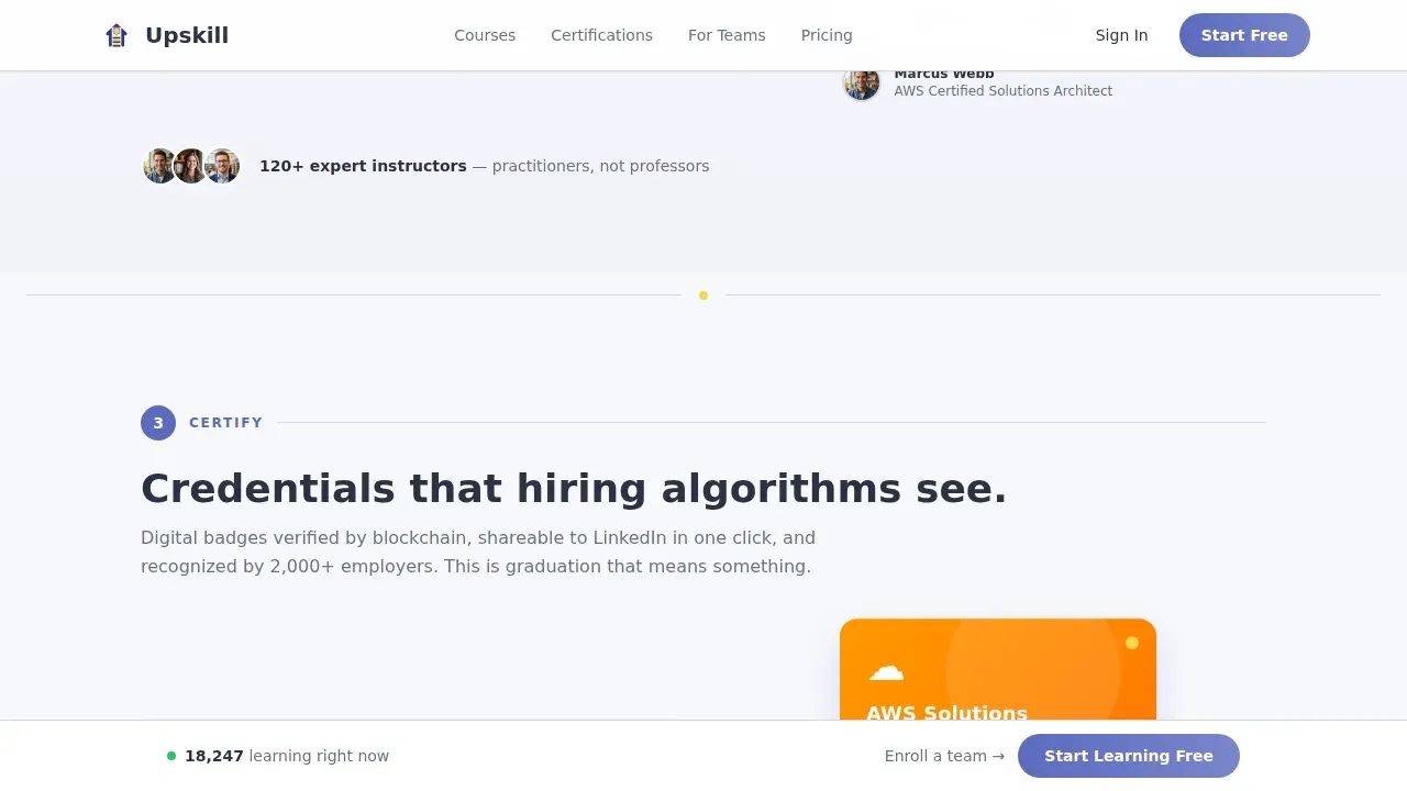
Rotating Digital Badge Showcase
The Certify phase presents a rotating carousel of digital badges and credential cards paired with LinkedIn-share mockup layouts. Acceleration yellow accents appear more frequently here, building visual momentum as the visitor approaches the end of the page. This section communicates the aspirational outcome of course completion and strengthens the value proposition for professionals motivated by career advancement.
Dual Conversion Section with Frictionless Sign-Up
The Convert section serves two distinct audiences on one landing page. Individual learners see a streamlined modal asking only for email, role, and one skill interest auto-suggested from the course catalog. No credit card is required. Team buyers see a secondary path below the section with a short qualification form covering company size and training budget range. Both flows are designed to reduce friction and move leads toward a decision quickly.
Fixed Viewport Call to Action Button
After the first scroll phase, a "Start Learning Free" call to action button locks to the bottom of the viewport. This persistent element keeps the primary conversion goal visible at all times without interrupting the learning journey flow. It is a proven layout pattern for training provider landing pages: clear call to action buttons guide users toward course registration at every point in the scroll.
Page sections overview
| Section | Purpose |
|---|---|
| Hero Ticker | Display live learner count and primary "Start Learning Free" call to action |
| Explore Phase | Horizontal course category carousel with live enrollment counts per category |
| Learn Phase | Interactive lesson preview with scroll-linked progress bar fill |
| Certify Phase | Rotating digital badge and credential card showcase with LinkedIn-share mockups |
| Convert Section | Dual call to action: individual freemium sign-up modal and team enrollment form |
| Footer | Linear single-row footer with essential navigation and brand links |
Design & branding system
The Cloud Canvas color system gives this landing page a distinctly airy, SaaS-quality professional appearance. The palette feels like a freshly provisioned dashboard: open, focused, and quietly energetic. Every color in the scheme carries a specific role, so the visual hierarchy always points toward the next action.
- Color scheme built on four values: cumulus white (#F7F8FC) for backgrounds, graphite (#2D3142) for body text, electric indigo (#5C6BC0) for buttons, progress indicators, and the ticker, and acceleration yellow (#FFD54F) reserved for badges, completion markers, and notification pings
- Typography pairing of Plus Jakarta Sans for headings and DM Sans for body text delivers a premium, editorial feel that is visually appealing without feeling heavy or corporate
- The Startup Velocity theme drives the overall layout: sections get visually denser as the visitor scrolls deeper, accent yellow appears more frequently toward the end, and the cumulus white base keeps every section easy to navigate regardless of content density
Mobile & speed optimization
The template is built desktop-first with a strong mobile experience for learners who access training content late at night on a phone. The layout reflows cleanly at smaller breakpoints so every section remains readable and interactive. A training course landing page that fails on mobile loses a large portion of its most motivated audience.
- Scroll behavior is driven by native CSS scroll properties and IntersectionObserver-based reveal animations, keeping the experience smooth without heavy JavaScript dependencies
- The fixed viewport call to action adapts to mobile screen dimensions so the primary sign-up entry point is always accessible as visitors scroll through the page
- The course category carousel, lesson preview, and badge showcase are all touch-friendly, allowing mobile users to browse, interact, and complete the learning journey flow on any device
How this template helps you convert
Landing pages are among the most effective tools for education providers to increase conversions and enroll more students. The average conversion rate for course landing pages sits around 13 percent, and this template is structured to approach that benchmark by removing every unnecessary barrier between a visitor and a sign-up. The page earns the click rather than demanding it.
- The live ticker creates immediate social proof in the hero section, making visitors feel the platform is active and trusted before they read a single word of marketing copy. A strong headline reinforces the clear value proposition, and the primary call to action appears within the first viewport with no scrolling required.
- The three-phase scroll journey lets potential students taste the product mid-page through a real, interactive lesson preview. Curiosity and momentum replace hesitation. By the time visitors reach the Convert section, they have mentally rehearsed course completion, making the decision to sign up feel like the obvious next step.
- The dual conversion section separates individual and team buyer paths cleanly, so each person sees the most relevant form. The individual modal asks for three fields only. The team form qualifies bulk buyers without overwhelming them. Both paths reflect the best practice of focusing a landing page on a single action per audience segment.
Other information about this template
This template is the Upskill professional certification training landing page template, designed to give training providers a complete, ready-to-launch starting point that combines clean design, interactive elements, and focused lead generation strategy in one cohesive layout. Using pre-built templates can significantly speed up the design process for creating a course landing page, letting you start designing and customizing rather than building from a blank canvas.
- This template supports instructor profiles as a content area you can populate to build trust with potential students and establish educator expertise and credibility
- A video trailer slot can be incorporated into the lesson preview phase to give visitors a richer preview of course content before they register
- The page layout follows best practices for distraction-free design: different sections each carry one clear job, and the scroll sequence focuses visitors on a single conversion action at each point
- Positive testimonials from past students can be added to the course category or convert sections to enhance credibility, since including testimonials on a landing page is a proven way to encourage new sign-ups among potential customers
- The clean design makes it straightforward to adapt the color scheme and brand typography to your own course landing page identity without rebuilding the layout
- This template offers inspiration for any online course provider looking to create a user friendly, professional appearance that converts visitors and builds a sustainable lead pipeline for their training business
- The page is built to be web-ready without requiring coding skills, so anyone can launch their own course landing page quickly and begin capturing leads from day one
Theme
Startup Velocity
Creative direction
Step-by-Step Guide
Color system
Cloud Canvas
Style
Single Column Flow
Direction
Freemium/Trial
Page Sections
Live User Count Ticker Hero Section
Scroll-linked Three-phase Learning Journey
Interactive Lesson Preview with Progress Fill
Rotating Badge and Credential Showcase
Dual Conversion Section with Minimal Form Fields
Fixed Viewport Call to Action Button
Related questions
Can I use this template for a free course or trial offer?
Does the template support both individual learners and team buyers?
Can I customize the course categories in the Explore phase?
Is this template suitable for compliance training programs?
What makes this a landing page rather than a full training website?


