Fitness Studio Maintenance Website Template
Uptime is a hub-and-spoke landing page template built for commercial gym maintenance services. It opens with a live-styled dashboard header, then guides visitors through data-driven spoke sections covering downtime costs, preventive versus reactive repair curves, and fleet-wide failure patterns. Comparison tables, a fleet audit form, and a gated cost report capture leads at every intent level.
by Rocket studio
Quick summary
Uptime is a single-page maintenance service template designed around a persistent anchor navigation system. It uses a dark Tech Glass visual identity to present hard maintenance data as editorial content. The template suits fitness facility service providers who want to position themselves as the operational command center their clients never knew they needed.
Who this template is for
This template is built for maintenance businesses that serve commercial fitness facilities at scale. It speaks directly to the kind of operator who manages machines across multiple sites and cannot afford unplanned downtime.
- Commercial gym maintenance providers targeting multi-location franchise owners
- Service teams working with boutique studio operators and university recreation centers
- Facility management consultants pitching preventive care programs to asset-heavy clients
What problem this template solves
Most maintenance service pages look like service directories. They list what a company does but never show why inaction is costly. This template flips that approach by leading with data and letting the numbers close the argument.
- Facility managers have no easy way to see what reactive maintenance is actually costing them per machine per month
- Owners juggling 200 or more machines across sites lack a single view of fleet health and service status
- Prospective clients researching maintenance options need side-by-side proof before they consider switching providers
What you get with this template
You get a fully structured hub-and-spoke landing page where every spoke section feels like a chapter in an industry report. The anchor navigation keeps visitors oriented across a long-scroll page packed with charts, comparison tables, and editorial pull-quotes.
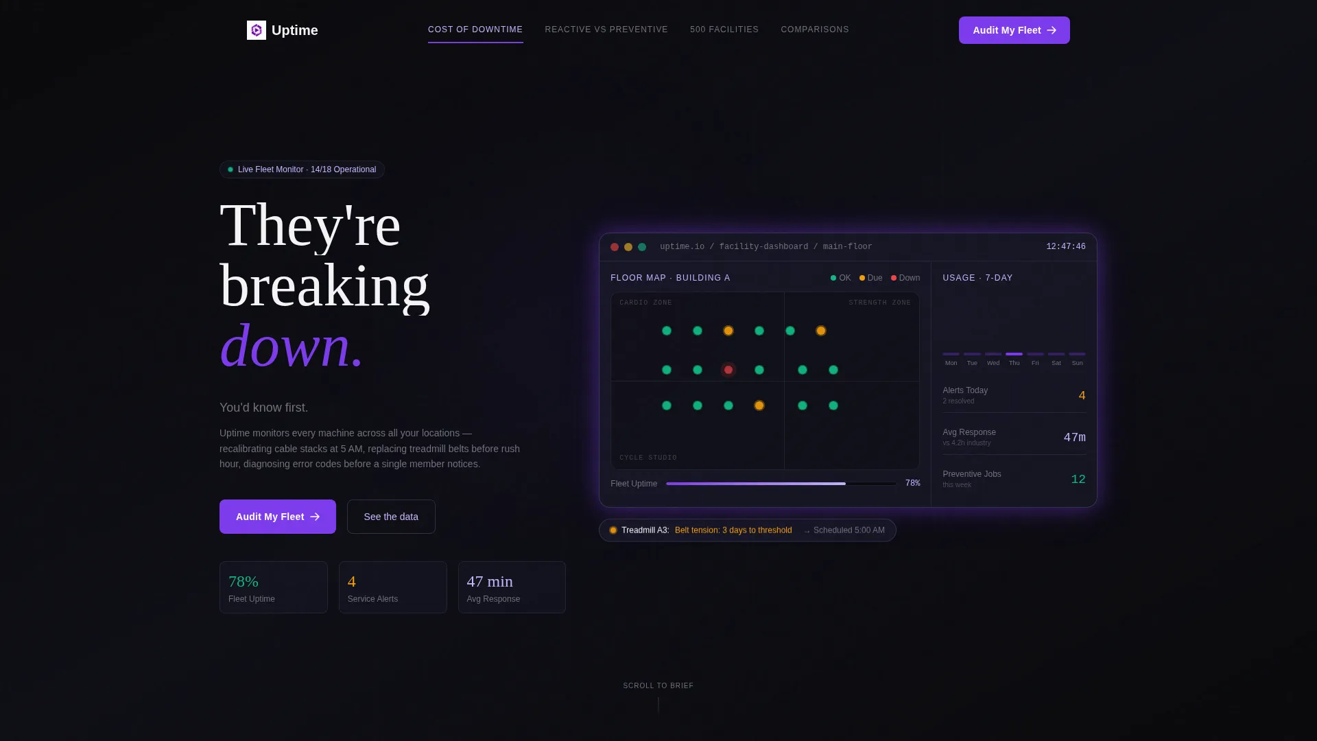
- A dashboard-style header with a live-styled facility map showing equipment nodes in operational, service-due, and offline states
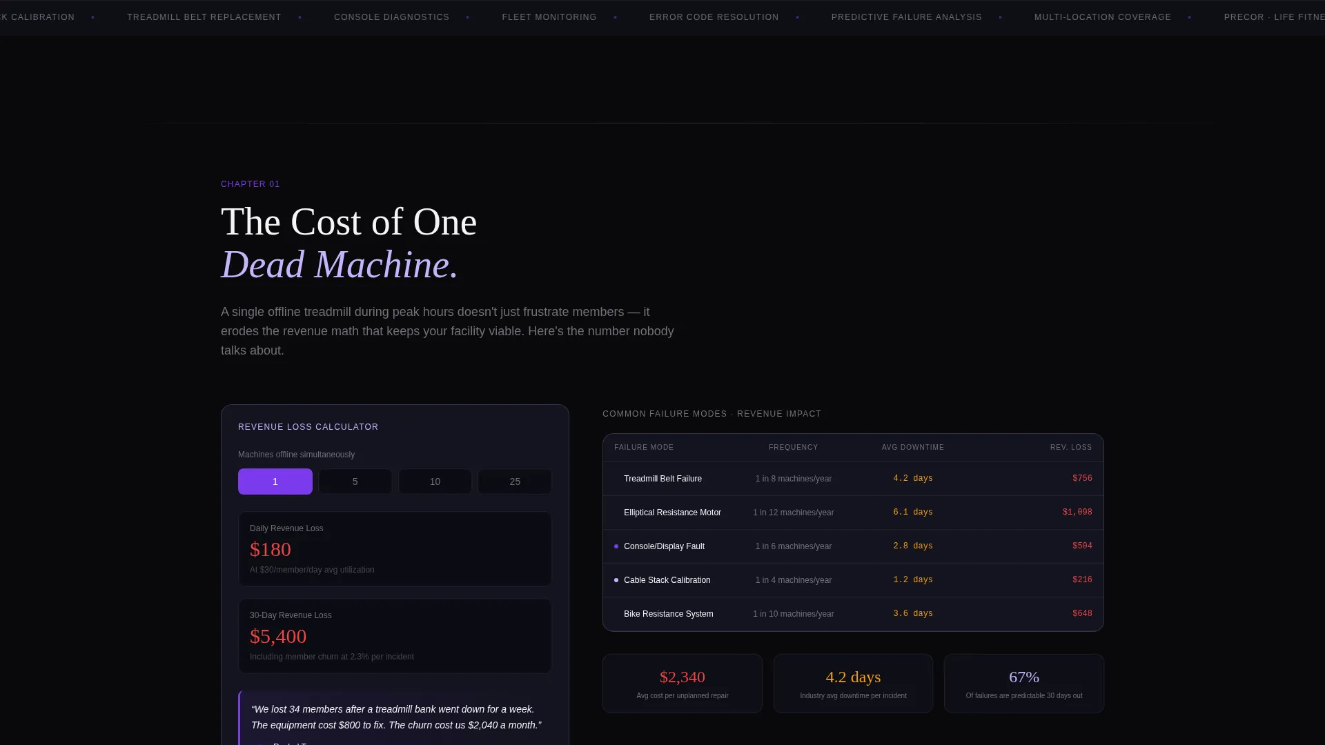
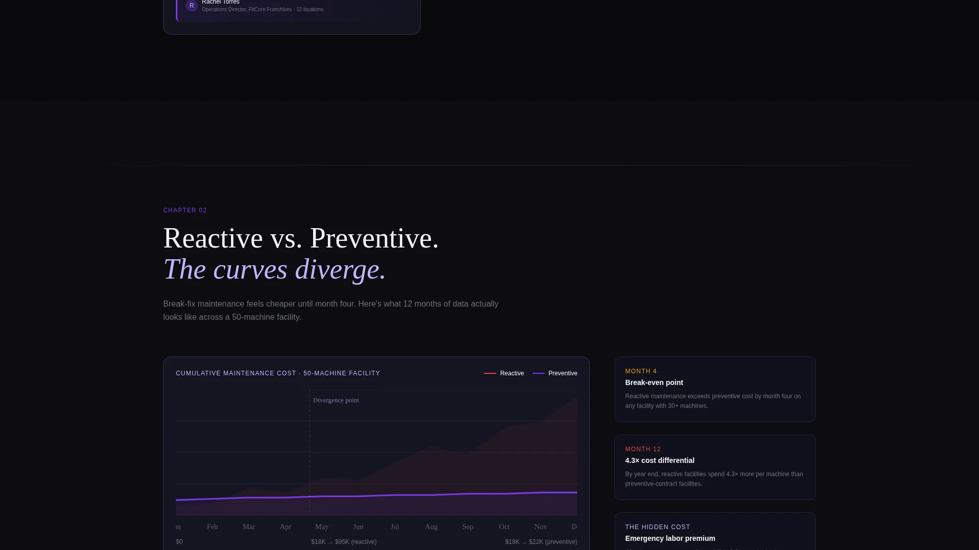
- Three data-driven spoke sections covering downtime revenue loss, repair cost curves over 12 months, and fleet failure pattern findings
- Two vendor comparison tables, a primary fleet audit form, and a secondary gated lead capture for a downloadable maintenance cost report
Feature list
This section covers the core built-in components that make the template functional right out of the box.
Dashboard Preview Header
The header opens with a live-styled interface panel showing a facility map. Equipment nodes pulse in real-time status colors: green for operational, amber for service-due, and red for offline. A tooltip on an amber treadmill cluster reads "Belt tension: 3 days to threshold." Usage graphs cascade down the right rail and uptime percentages glow in electric violet. The headline materializes over the glass panel.
Hub-and-Spoke Anchor Navigation
A persistent anchor navigation bar sits at the top of the page. It lets visitors jump directly to any spoke section without losing context. This structure keeps long-scroll, data-heavy pages navigable and reduces bounce from overwhelmed readers.
Industry Report Spoke Sections
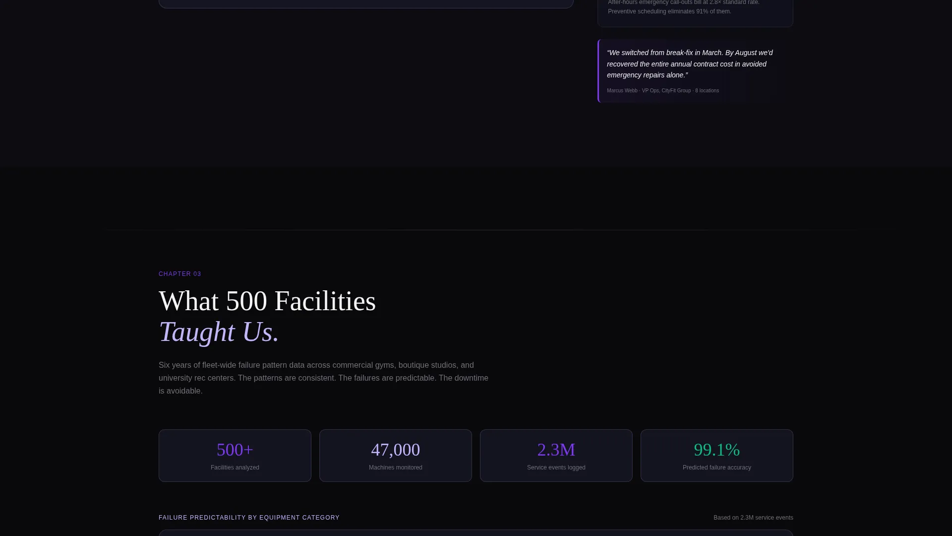
Three spoke sections present maintenance data as editorial content. The first covers downtime revenue-loss calculations. The second shows repair cost curves for reactive versus preventive approaches over a 12-month period. The third presents fleet-wide failure pattern findings drawn from 500 facilities. Charts animate on entry and pull-quotes from facility managers break up the data.
Comparison Tables
Two persistent comparison tables let visitors evaluate the service head-to-head. One table compares in-house technicians against the Uptime service model. The other compares break-fix vendors against the Uptime model. Each table shows response time, cost per machine per month, and uptime guarantees side by side.
Fleet Audit Primary call to action Form
The primary call to action is a short form titled "Audit My Fleet." It requests the number of locations, total machine count, and current maintenance arrangement via a dropdown with options for in-house, vendor, or none. The form is built for high-intent visitors who are ready to act.
Gated Cost Report Download
A secondary lead capture path offers a downloadable maintenance cost report. It requires only an email address, making it low-friction for top-of-funnel visitors who are still doing the math before committing to a service change.
Page sections overview
| Section | Purpose |
|---|---|
| Dashboard Header | Opens with live-styled facility map and status nodes |
| Anchor Navigation Bar | Persistent hub linking all spoke sections |
| Downtime Cost Spoke | Revenue-loss data for one offline machine |
| Reactive versus. Preventive Spoke | 12-month repair cost curve comparison |
| 500 Facilities Spoke | Fleet-wide failure pattern research findings |
| In-House versus. Service Table | Side-by-side technician model comparison |
| Break-Fix versus. Service Table | Vendor model head-to-head comparison |
| Audit My Fleet Form | Primary call to action for high-intent fleet owners |
| Cost Report Download | Gated secondary lead capture via email |
Design & branding system
The template uses a Tech Glass theme built on the Void and Violet color system. Every color has a specific functional role, which gives the page the credibility of a real monitoring interface rather than a marketing brochure.
- Absolute void black (#09090B) for the base background, frosted glass panel (#1A1A2E) for card surfaces, and electric violet (#7C3AED) for active states and data highlights
- Cool interface lilac (#C4B5FD) for secondary text, chart lines, and supporting labels throughout the data sections
- The overall aesthetic reads like a monitoring dashboard running in a dark server room, where every color is tied to a data meaning rather than a decorative choice
Mobile & speed optimization
The template is structured to stay readable and navigable on smaller screens without losing the dashboard character that makes it credible on desktop.
- The persistent anchor navigation collapses cleanly so mobile visitors can still jump between spoke sections without excessive scrolling
- Comparison tables are built to reflow on narrow viewports, keeping the side-by-side data readable rather than clipped
How this template helps you convert
The page is designed around a Comparison and Versus conversion model. Visitors are not pushed toward a sale; they are given enough data to reach their own conclusion, which makes the conversion feel earned.
- The dashboard header creates immediate desire by showing visitors a tool they want to own, then ties that feeling to the service offer through the headline "They're breaking down. You'd know first."
- The spoke sections build progressive trust by presenting maintenance economics as researched editorial content, moving the visitor from awareness to conviction before they reach either call to action.
Other information about this template
This template is purpose-built for fitness facility maintenance service providers who compete on credibility and data transparency. It is a strong fit for operators in the commercial gym maintenance niche who need to displace incumbent vendors.
- The page architecture follows an industry report cadence, making it effective for service providers whose clients are analytical buyers such as facility managers and franchise operations directors
- The dual lead capture strategy, a high-intent audit form alongside a low-friction report download, means the template serves prospects at two different stages of the buying decision
- The template style is hub and spoke with anchor navigation, making it suitable for service pages that need to present multiple proof categories without fragmenting into separate pages
- The creative direction is Industry Report, which positions the service provider as a subject-matter authority rather than just another vendor
Theme
Tech Glass
Creative direction
Industry Report
Color system
Void & Violet
Style
Hub & Spoke (Anchor Nav)
Direction
Comparison/Versus
Page Sections
Dashboard Preview Header with Status Nodes
Persistent Hub-and-spoke Anchor Navigation
Industry Report Spoke Sections
Side-by-side Comparison Tables
Fleet Audit Primary Call to Action Form
Gated Maintenance Cost Report Download
Related questions
Who is this landing page template designed for?
What are the two conversion paths built into this template?
What does the hub-and-spoke anchor navigation do?
How does the dashboard header work visually?
Can this template work if my service focuses on one facility type?