Provider Directory Landing Page Template
A split-screen landing page template built for urologist provider directories. It presents board-certified specialists with credentials, fellowship details, and real-time availability in a clean 50/50 layout. Designed for patients who arrive with urgency and specific conditions, the template guides every visitor from a condition-specific search toward a provider profile click and appointment booking.
by Rocket studio
Quick summary
This template is a single-page urology provider directory built on a 50/50 split-screen layout. It leads with a bold centered headline and a condition-specific search bar, then scrolls into credentialed provider cards. Each card shows a specialist portrait on the left and specialty focus, patient ratings, and availability on the right. Every design decision moves visitors toward booking a consultation.
Who this template is for
This template is built for anyone publishing or managing a patient-facing urology directory. It works equally well for healthcare marketing teams, solo practitioners building a referral-friendly online presence, and directory publishers who need to present multiple specialists with clarity and institutional credibility.
- Urology practices and group clinics presenting multiple board-certified providers
- Healthcare directory publishers connecting patients with credentialed specialists
- General practitioners looking for a trusted, linkable referral destination for urology patients
What problem this template solves
Patients searching for a urologist rarely arrive calm. They arrive at midnight with a diagnosis they barely understand, or between school pickups, or after being turned away by a generalist. Generic doctor-finder pages fail them because credentials are buried, specialties are vague, and appointment paths require too many clicks. This template removes every one of those friction points.
- Credentials, fellowships, and hospital affiliations are visible before the visitor clicks anything
- Condition-specific search narrows results immediately so patients find the right specialist faster
- A clear primary call to action on every provider card removes guesswork about the next step
What you get with this template
The template delivers a fully structured, single-page layout with distinct, purposeful sections. Every section has a defined role in the patient journey, from first search to profile click. Mock data is included throughout so the layout is immediately usable for review, demonstration, or customization.
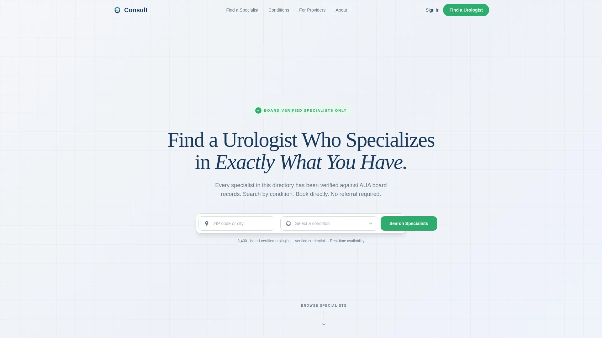
- A hero section with a giant centered headline, zip code field, and condition dropdown covering kidney stones, prostate, incontinence, pediatric urology, and oncology
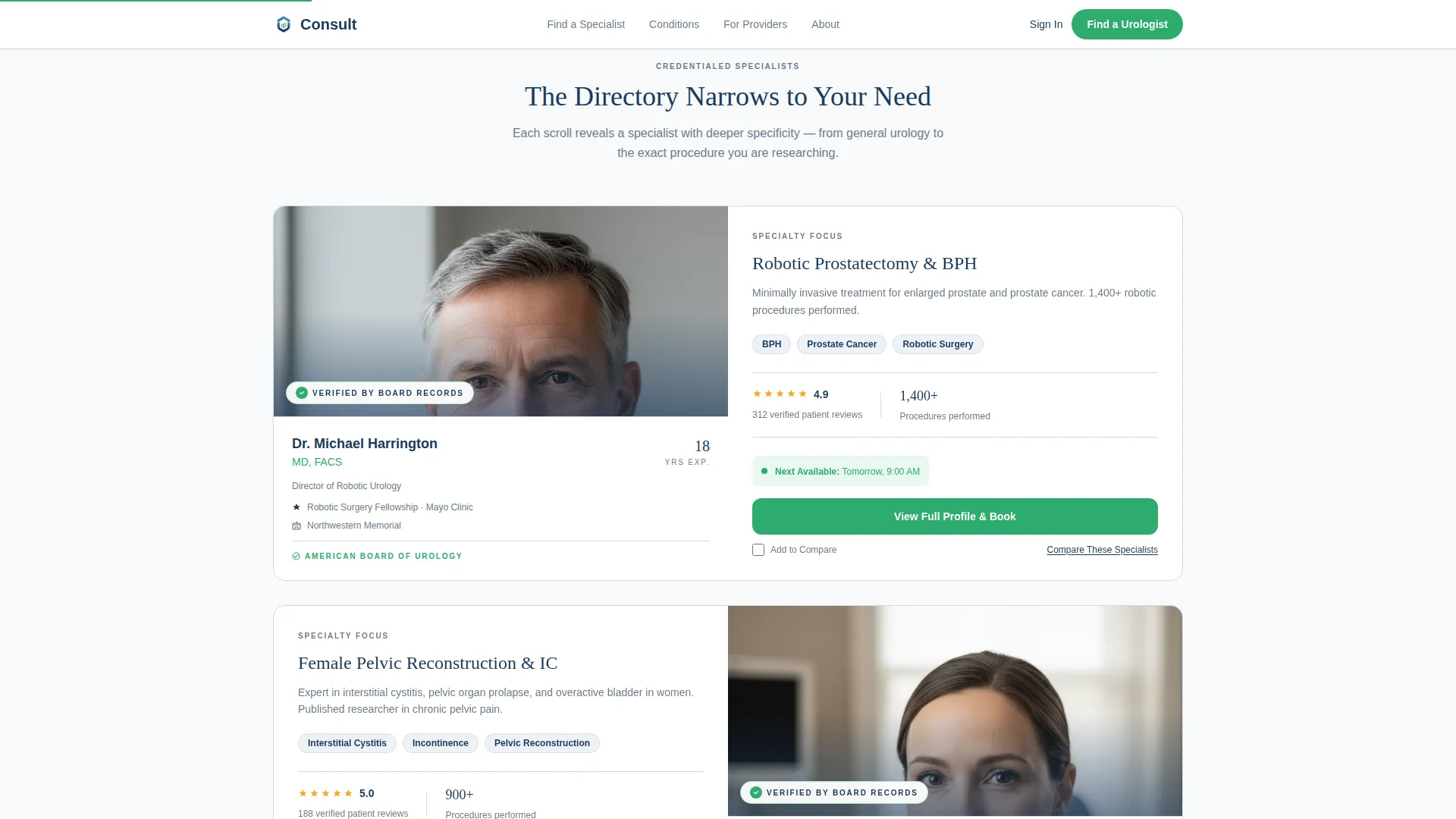
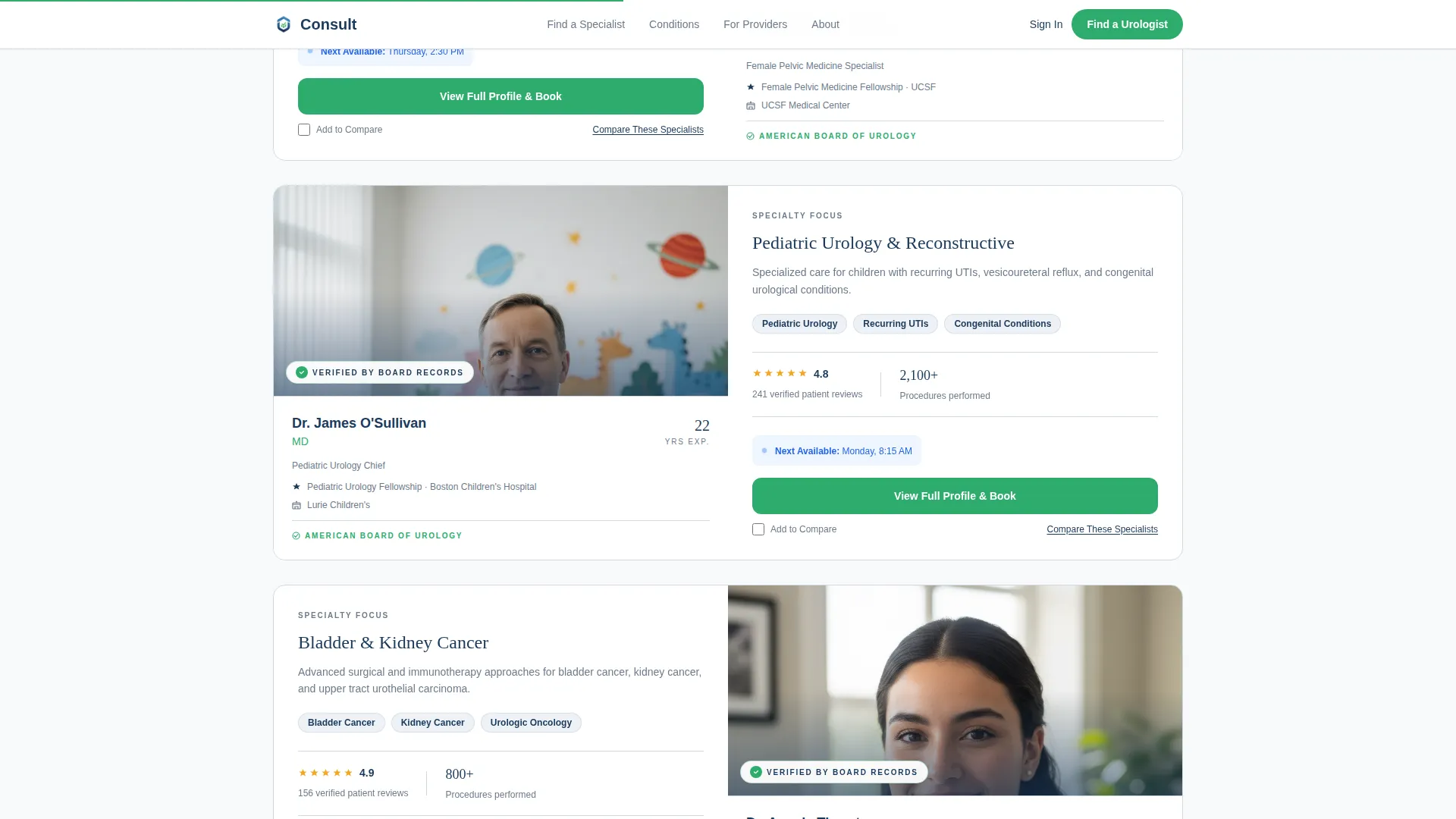
- A scrolling split-screen provider panel with portrait, credentials, specialty focus, patient rating summary, and a real-time availability indicator on each card
- A specialty focus strip, social proof section with named patient testimonials, a trust architecture section showing the board-verification process, a hospital affiliations marquee, and a footer
Feature list
This template's capabilities are drawn directly from its source design brief. Each feature below reflects a built component or interaction included in the layout.
Giant Headline Hero with Condition Search
The hero opens on a stark white viewport with a single high-contrast headline set in a tight sans-serif. Directly below, a slim search bar offers two fields: a zip code input and a condition dropdown. The minimal layout signals seriousness and focus from the first second on the page.
50/50 Split-Screen Provider Cards
Each provider card splits the screen evenly. The left panel holds a provider portrait, credentials, fellowship details, and hospital affiliations. The right panel displays specialty focus, a patient rating summary, and a real-time availability indicator. Visitors scroll through specialists as the directory narrows from general urology toward specific sub-specialties.
Credential Badge Micro-Interactions
A credential badge pulses once on entry for each provider card. A "Verified by Board Records" stamp appears with a soft fade. Spotlight hover effects activate on card interaction. These animations build institutional trust without interrupting the reading flow.
Condition-Specific Specialty Strip
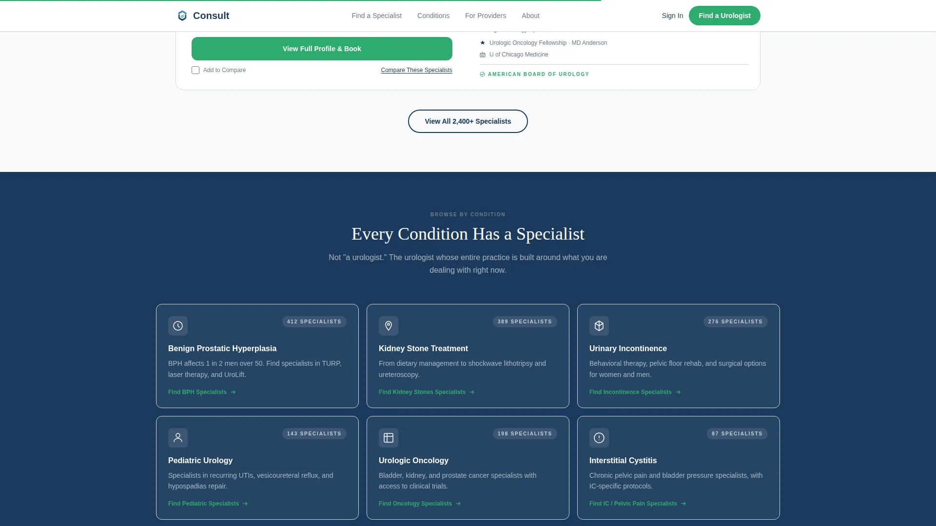
Below the provider panel, a dedicated strip organizes pathways by condition. Verification green accents mark each specialty link. This section lets visitors who skipped the search bar find their condition quickly and move toward relevant providers without backtracking.
Social Proof with Named Patient Testimonials
The social proof section presents patient testimonials that name the condition and state the outcome. Star ratings appear on individual provider cards. Together, these elements give hesitant visitors the peer confirmation they need before clicking through to a profile.
Provider Compare Interaction
A secondary text link beneath each provider pair invites visitors to compare specialists side by side. Checked providers collect into a comparison view. This feature serves patients who are weighing two or three specialists before committing to a profile click.
Page sections overview
| Section | Purpose |
|---|---|
| Hero Search Bar | Anchor attention, capture condition and location intent |
| Split-Screen Providers | Present credentialed specialists in a scrollable, layered panel |
| Specialty Focus Strip | Guide visitors to condition-specific provider pathways |
| Patient Social Proof | Build confidence with named, condition-specific testimonials |
| Trust Architecture | Display board-verification process and hospital affiliations |
| Site Footer | Close with structured navigation in a horizontal flow layout |
Design & branding system
The template follows a Corporate Precision visual theme built around an Arctic White color system. The palette is clinical without feeling cold, and every color plays a defined role. Typography pairs DM Sans for interface precision with Fraunces for headline weight.
- Clinical white (#F8F9FB) dominates all backgrounds; instrument-grade steel (#6B7B8D) carries body text and dividers; deep scrub blue (#1B3A5C) anchors headlines and navigation
- Verification green (#2EAC6D) appears only on credentialed badges and primary call-to-action buttons, reserving its visual weight for moments where trust is being established
- DM Sans handles all interface labels, search fields, and body copy; Fraunces sets headline weight in the hero and section titles
Mobile & speed optimization
The template is designed desktop-first to serve late-night laptop researchers, but full mobile support is built in. The static-first build approach means no database calls are made on page load, and all interactive components use mock data.
- The split-screen layout adapts to a stacked single-column view on smaller screens so provider cards remain readable without horizontal scrolling
- Animations such as badge pulse, fade-in reveals, and availability indicator pulse are medium-weight and designed to run without blocking the layout on mobile connections
How this template helps you convert
Every structural decision in this template is oriented toward a single outcome: moving a hesitant patient into a provider profile click and, from there, into a booked appointment.
- The hero search bar captures condition intent immediately, so visitors feel the directory is already working for their specific situation before they scroll past the first section.
- The split-screen provider panel reveals just enough information per specialist, which creates informed curiosity rather than decision fatigue, making the "View Full Profile & Book" button feel like the natural next step rather than a commitment.
- The compare specialists interaction gives undecided visitors a structured path forward instead of letting them leave, keeping them engaged in the directory rather than bouncing to a search engine.
Other information about this template
This template is categorized under Health and Medical, with a specific focus on the urologist provider directory niche. It is built for US-based audiences and follows US medical credential conventions, English language copy, and standard American date formatting throughout the mock data.
- The footer uses a Vercel Horizontal Flow pattern, providing a clean, structured close to the single-page layout
- All interactive components, including the condition dropdown, provider compare checkbox, and availability toggle, are included in the layout as high-interactivity mock elements
- The template is suitable for use as a standalone patient-facing landing page or as a demonstration and pitch asset for healthcare directory products
Theme
Corporate Precision
Creative direction
Expert Panel
Color system
Arctic White
Style
Split Screen (50/50)
Direction
Click-Through
Page Sections
Giant Headline Hero with Condition Search
50/50 Split-screen Provider Panel
Credential Badge Micro-interactions
Condition-specific Specialty Strip
Named Patient Social Proof
Provider Compare Interaction
Related questions
Can I customize the conditions listed in the search dropdown?
Does this template include real provider data or live booking functionality?
Is this template suitable for a single urology practice or only for large directories?
What does the Provider Compare feature do?
What happens when a visitor clicks the primary call-to-action button?



