Rapid Business Insurance Landing Page Template
The Underwrite instant business coverage audit landing page template is a single-page, zigzag-layout insurance landing page built for B2B InsurTech platforms. It walks startup founders, operations directors, and CFOs through an animated coverage audit that turns anxiety into resolution. The Executive Suite design, scroll-triggered checklists, and a persistent call to action drive visitors straight to the quote engine.
by Rocket studio
Quick summary
The Underwrite template is a focused, high-converting insurance landing page designed for on-demand business insurance platforms. It uses a zigzag alternating layout, animated audit checklists, and a cool Executive Suite visual identity to move potential customers from coverage anxiety to confident action. Every section is built to reduce friction and earn the click through to the quote engine.
Who this template is for
This template is built for insurance business operators and InsurTech founders who need a landing page that does real conversion work. The target audience spans three clear buyer profiles: startup founders securing their first commercial lease, operations directors managing fleet coverage and liability gaps, and CFOs who have experienced a painful claim denial. The page speaks directly to each of them without overwhelming visitors with options or jargon.
- Startup founders who need property and liability coverage fast
- Operations directors juggling fleet, workers' compensation, and cyber exposure
- CFOs and risk managers at mid-market firms who want transparent, no-surprise insurance products
What problem this template solves
Getting a business insurance quote through a traditional insurance company takes weeks. Brokers, paper applications, and buried fine print are the default experience. This insurance landing page template removes every one of those obstacles and replaces the wait with a four-minute audit process that feels immediate and credible.
- Eliminates the six-week broker quote cycle with a direct, action oriented page flow
- Removes the fear of fine print by showing a sample policy in a lightbox modal
- Converts coverage anxiety into resolved confidence through scroll-triggered visual storytelling
What you get with this template
You get a fully structured, single-page insurance landing page ready to be customized for any on-demand business insurance platform. The layout, copy scaffolding, animation hooks, and call to action placements are all pre-built so your team can focus on brand fit and content rather than page architecture. No heavy coding skills are required to launch.
- A zigzag alternating page layout with five distinct risk-category sections
- Scroll-triggered animated audit checklists for property, liability, cyber, fleet, and workers' compensation
- A sticky bottom call to action bar, a lightbox modal for sample policy viewing, and a live policy counter in the hero section
Feature list
This template ships with a focused set of components designed to turn an insurance landing page into a genuine lead capture engine. Each feature earns its place by solving a specific conversion problem for the insurance business.
Giant Centered Hero Section with Live Counter
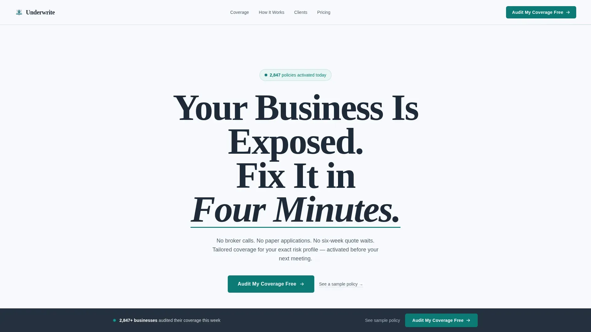
The hero section opens with a heavyweight serif headline set at roughly 8vw on a field of glacial white. A teal underline animates beneath "Four Minutes" on page load, drawing the eye immediately. A sub headline beneath the headline explains the platform's value proposition and displays a live counter of policies activated today, giving visitors an instant social proof signal and a compelling reason to keep reading. There is no hero image competing for attention; the negative white space is the statement.
Scroll-Triggered Animated Audit Checklists
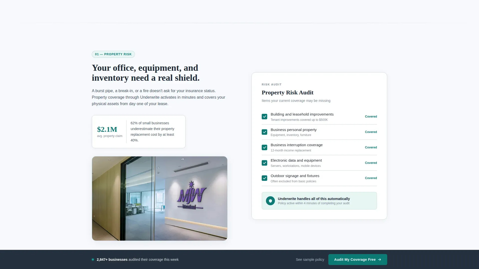
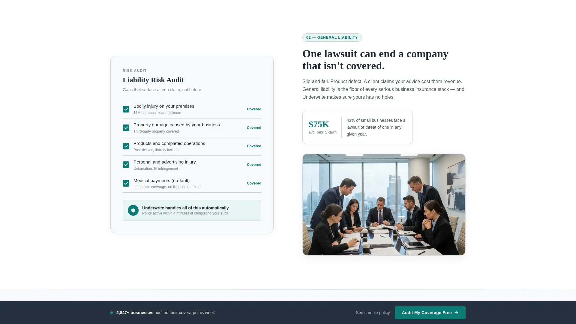
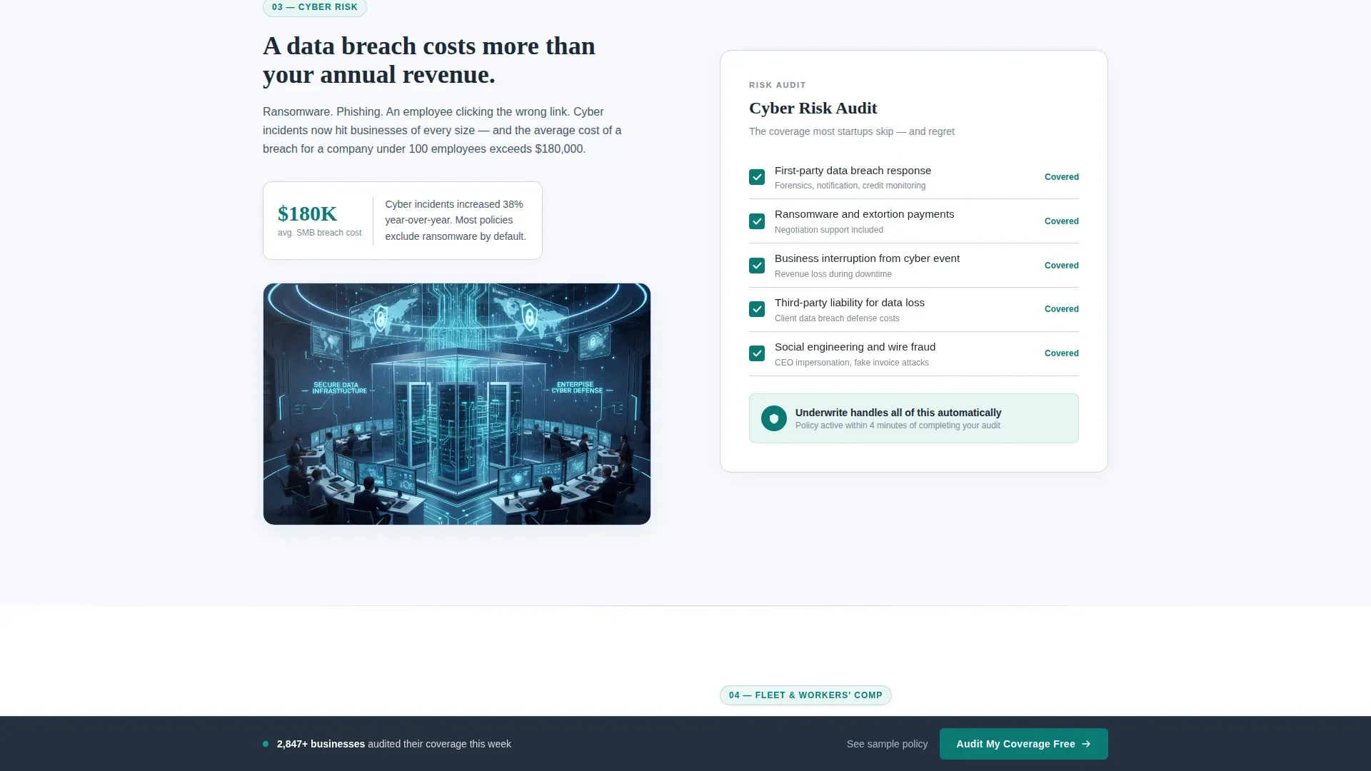
Each zigzag section presents one category of business risk with a visual audit checklist panel. Unchecked items appear in silver-blue mist and check themselves off in deep teal as the visitor scrolls into view. This micro-animation sequence transforms a list of pain points into a resolved list, creating an emotional arc across the entire page. The scroll becomes the audit process itself, and visitors leave each section feeling one step lighter.
Sticky Call to Action Bar
After the second section, a persistent call to action bar locks to the bottom of the viewport on scroll. The call to action button stays visible without overwhelming visitors or causing unnecessary distractions as they read through the coverage categories. This placement follows established visual hierarchy principles: the call to action is always present but never intrusive, keeping click through rates consistent across the full page experience.
Lightbox Sample Policy Modal
A secondary text link beneath the primary call to action button opens a lightbox displaying a redacted but realistic policy document. This single component addresses one of the biggest pain points in insurance sales: fear of the unknown. Visitors can review what a real policy looks like before committing, which builds trust factors that most insurance landing pages never address. Pairing this with strong social proof from the testimonials section makes the template a great example of friction reduction in practice.
Trust and Testimonials Section
A dedicated section displays specific customer testimonials with names and job titles. These are not placeholder text quotes. They are written from the perspective of the three core buyer profiles: a startup founder, an operations director, and a CFO. Customer testimonials of this specificity function as powerful trust signals. Pairing trust signals with compelling social proof is a proven combination for improving conversion rate on insurance landing pages.
Single-Row Linear Footer
The footer follows a Pattern 1 linear single-row layout. It keeps the entire page focused on one outcome without routing visitors to other pages or creating unnecessary distractions. Basic contact information, policy count statistics, and any relevant trust badges sit in a clean horizontal row that closes the page without disrupting the forward momentum.
Page sections overview
| Section | Purpose |
|---|---|
| Hero Headline Area | Introduces platform value with animated headline, live policy counter, and primary call to action button |
| Property and Liability | Zigzag left-visual audit checklist animates coverage gaps into resolved items on scroll |
| Cyber and Fleet | Zigzag right-visual audit checklist covers digital and vehicle risk categories |
| Workers' Comp Resolution | Final all-green audit summary delivers emotional payoff and reinforces the value proposition |
| Trust and Testimonials | Displays specific customer testimonials from founders, ops directors, and CFOs |
| Linear Single Footer | Closes the page with stats, basic contact information, and trust badges |
Design & branding system
The design language is Executive Suite: cool, authoritative, and precise. Every color decision follows a strict hierarchy that reinforces the visual hierarchy of the page and ensures the call to action button always reads as the most important element on screen. The result is a landing page design that feels like the top floor of a glass tower at seven in the morning.
- Glacial white (#F7F9FC) covers every background surface, making white space the dominant design element and keeping the page clean and fast loading in appearance
- Boardroom charcoal (#1E2A38) carries all body text with authority; silver-blue mist (#C8D6E5) separates sections like a quiet visual breath between risk categories
- Deep teal (#0B7A75) is reserved strictly for the call to action button, toggle states, active checklist marks, and the animated underline, ensuring every action oriented element stands apart
Mobile & speed optimization
Over 60 percent of web traffic arrives from mobile devices, and insurance buyers who discover a platform through search or paid channels expect a fast, readable experience on their phones. This template is built desktop-first with full mobile responsiveness, ensuring the page layout adapts cleanly to smaller screens without sacrificing the animated checklist sequence or the sticky call to action bar. Fast loading behavior and mobile-friendly form fields are essential to protecting conversion rate, since every additional second of load time can cost around 7 percent of conversions.
- The sticky call to action bar and checklist animations are preserved on smaller screens, with tap targets sized for comfortable mobile interaction
- Form fields are kept to 3 to 4 essential inputs to reduce friction and support completion on mobile, following best-practice guidance for frictionless lead capture
- Server Components handle all static rendering while Client Components manage animations, keeping the page fast loading and responsive across devices
How this template helps you convert
This insurance landing page template is designed specifically to drive high conversions for instant business coverage audits. It combines pain-driven copy, benefit-oriented visual storytelling, and friction-reducing components into a single natural flow that guides visitors from first impression to click through without a detour. High-performing lead generation pages in the finance and insurance sectors can achieve conversion rates between 9 and 15 percent when every element works together as a system.
- The hero section creates an immediate first impression with an attention-grabbing headline that explains the core value proposition in seconds, supported by live social proof from the policy counter and a prominent call to action button that invites a free audit with no commitment
- The animated audit checklist sections do the heavy lifting emotionally by turning each risk category into a resolved checklist, reducing visitor hesitation and keeping users engaged through the full page scroll
- The testimonials section and lightbox modal remove the final trust barriers by combining specific customer testimonials with transparent policy documentation, giving potential customers a compelling offer backed by real evidence before they click through to the quote engine
Other information about this template
This template is a solid landing page for any on-demand insurance platform entering the B2B market. It is equally effective as a foundation for marketing campaigns targeting startup ecosystems, mid-market operations teams, or risk managers at growing companies. The page layout and visual hierarchy principles applied here reflect insurance landing page best practices that apply across many insurance verticals.
- The template's audit tool concept translates well beyond standard commercial coverage. Platforms offering travel insurance, auto insurance, or health insurance landing page experiences can adapt the checklist sections to reflect their own risk categories. Health insurance landing pages and auto insurance quote pages share the same core conversion challenges: build trust fast, reduce form friction, and eliminate unnecessary distractions.
- This is a solid landing page foundation for pay-per-click (PPC) campaigns where a high conversion rate is essential. The page removes navigation menus and limits form fields to basic contact information, which is consistent with best practices for PPC campaigns and paid lead capture flows.
- The page design deliberately avoids overwhelming visitors with too many insurance options. A focused single-action page generates more conversions than a cluttered multi-product page. Companies using dedicated landing pages generate 55 percent more leads than those that route paid traffic to general other pages.
- The unique selling points of this template are its animated audit process and its emotional arc. No other standard insurance landing page template turns a coverage checklist into a scroll-driven storytelling experience that resolves tension section by section.
- For teams running a competitive analysis of InsurTech landing pages, this template represents a target market standard for design quality and conversion architecture. It uses the target market's language, avoids jargon, and presents insurance products in plain terms.
- The template supports multi step forms if the quote engine flow requires breaking the audit into stages. Using multi step forms can reduce perceived friction and improve completion rates by breaking down the process into manageable steps.
- Displaying relevant accreditations, industry awards, or carrier certifications in the footer trust zone can further enhance credibility. Trust badges near the call to action button and near form fields follow established trust factors guidance for insurance landing pages.
- A sense of urgency created through the live policy counter and social proof elements can encourage visitors to take action. Highlighting the number of active policies functions as supporting content that validates the platform's scale and keeps more visitors moving forward toward the quote engine.
- The headline explains the core benefit in plain language. Attention-grabbing headlines are crucial for insurance landing page success because they communicate the value proposition before the visitor decides whether to scroll. Expert advice from conversion specialists consistently confirms that a headline that explains a clear outcome outperforms vague brand slogans.
- The user behavior pattern on this page is designed to follow a natural flow: read the headline, feel the gap, watch the audit resolve, and click. This mirrors how real insurance buyers process risk. They acknowledge the problem, see the solution demonstrated, and act when trust is established.
- The template can be adapted for lead capture through follow up email sequences. After a visitor submits basic contact information, the follow up workflow can deliver a personalized audit report, keeping potential customers warm and moving through the funnel.
- For teams without deep technical resources, the template requires no significant coding skills to customize. The page design uses a clear, consistent brand colors system and standard component structure that any designer or developer can adapt quickly.
Theme
Executive Suite
Creative direction
Checklist & Audit
Color system
Arctic White
Style
Zigzag/Alternating
Direction
Click-Through
Page Sections
Animated Hero Section with Policy Counter
Zigzag Scroll-triggered Audit Checklists
Sticky Bottom Call to Action Bar
Lightbox Sample Policy Viewer
Testimonials with Named Buyer Profiles
Linear Single-row Footer with Trust Zone
Related questions
What types of insurance businesses can use this template?
Does the template include the animated checklist behavior out of the box?
How many form fields does the template use?
Can I adapt the audit sections for health insurance or auto insurance?
What makes this different from a generic insurance landing page template?



