Self-Storage & Mini-Storage Specialist Professional Website Template
Vault is a gallery-and-detail landing page template built for commercial and business self-storage facilities. It walks visitors through a curated unit gallery, lets them browse by size, and guides them toward a reservation with almost no friction. The design feels like a high-end real estate presentation, clean, spacious, and confident.
by Rocket studio
Quick summary
Vault is a single-page template designed for business and commercial self-storage facilities. It opens with a location search field, flows into a visual unit gallery, and closes the sale through detail panels with a direct reservation call to action. The layout is architectural, unhurried, and built to convert browsers into tenants.
Who this template is for
This template is built for storage facility operators who serve business clients rather than residential movers. It speaks directly to the commercial tenant's mindset, practical, time-pressed, and already past the browsing stage.
- Operations managers dealing with overflow inventory between seasons or office relocations
- Attorneys and professional service firms archiving case files, contracts, or equipment by the pallet
- E-commerce founders who have outgrown their garage but are not ready to commit to a warehouse lease
What problem this template solves
Most storage facility pages feel like utility forms, a price list, a phone number, and a generic photo of a hallway. That approach loses commercial tenants quickly. Business clients want to qualify a unit visually before filling out anything.
- Visitors cannot gauge real unit scale from flat spec tables alone
- Standard inquiry forms create friction before the visitor has made a decision
- A generic page design fails to signal that the facility is a professional, well-run operation
What you get with this template
You get a complete, single-page layout that moves a visitor from location discovery through visual browsing to a confirmed reservation click. Every section is purpose-built, and nothing is decorative without reason.
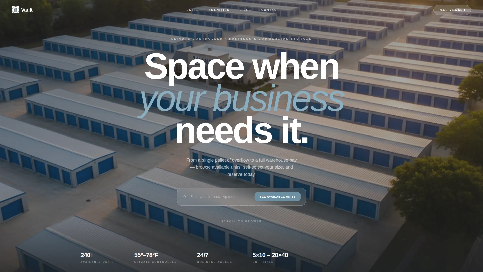
- A minimal location search header with a drone-shot aerial background and a single action button
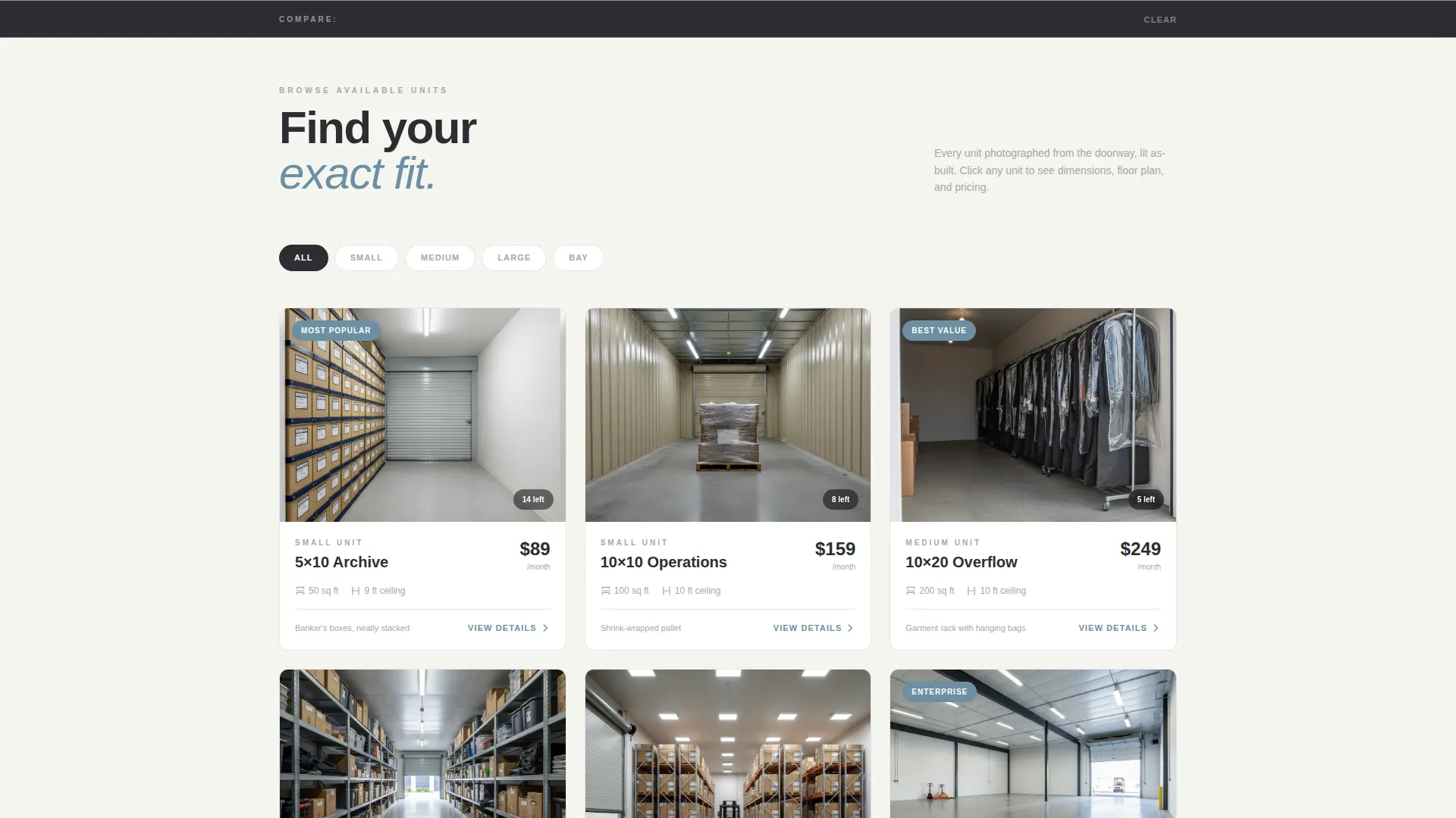
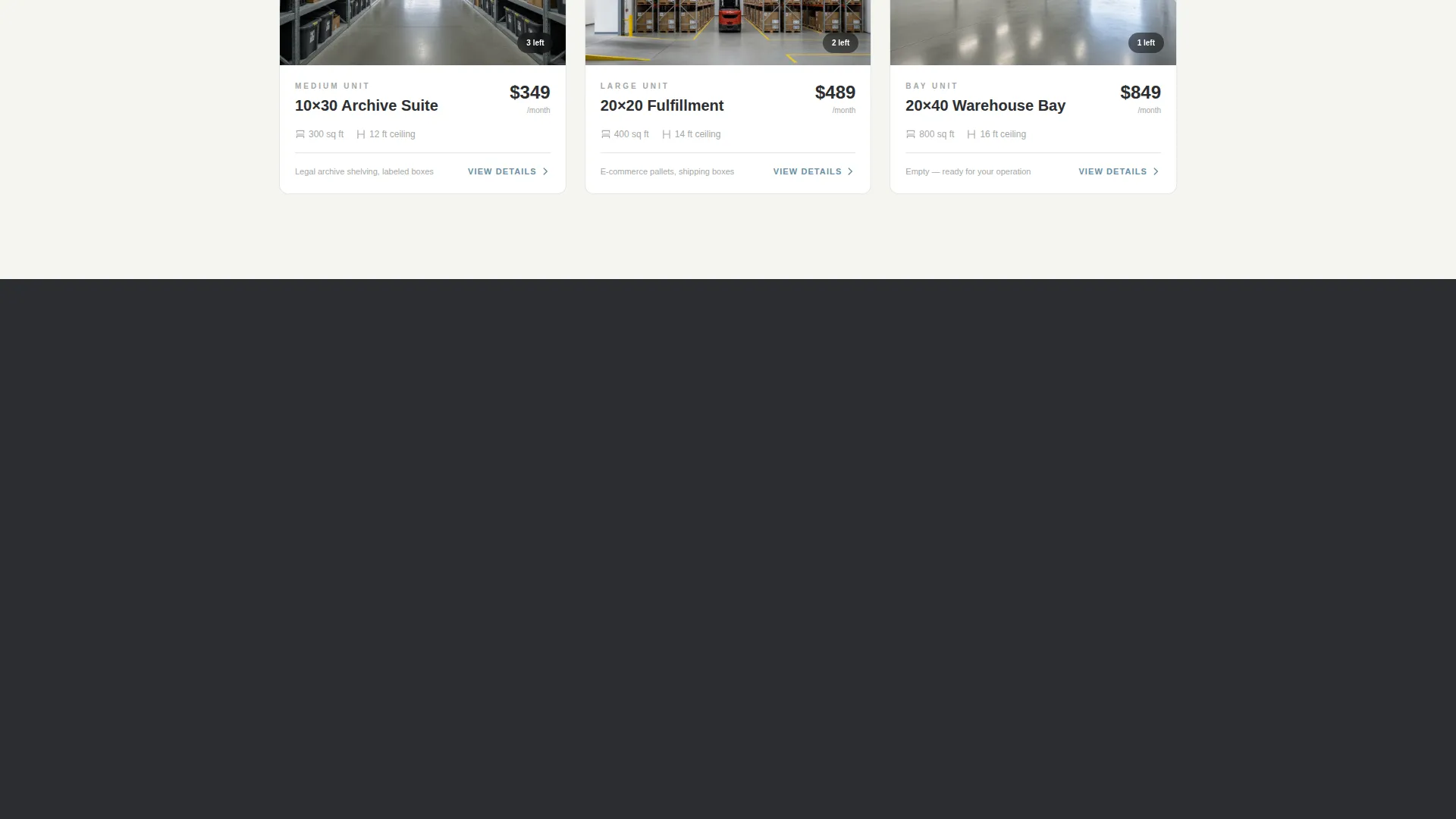
- A wide-angle unit gallery that scales visually from a 5-by-10 closet up to a 20-by-40 warehouse bay
- Slide-in detail panels showing unit dimensions, ceiling height, access hours, and a floor-plan diagram
- A persistent bottom bar carrying a secondary "Compare Sizes Side by Side" call to action
Feature list
This template includes a focused set of purpose-built components. Each one earns its place by moving the visitor one step closer to a reservation.
Location-Based Entry Header
The page opens with a centered zip code search field layered over a softly blurred aerial photograph of the facility campus. The field prompt reads "Enter your business zip code" and the only button reads "See Available Units." The composition is almost entirely sky and structure, communicating scale before a single word is read.
Visual Unit Gallery
Units are presented as a scrolling gallery of wide-angle interior photographs. Each shot is taken from the doorway looking inward, lit with cool overhead LEDs, and staged with one contextual prop such as banker's boxes, a shrink-wrapped pallet, or a rack of garment bags. The scroll sequence builds from smallest to largest, so visitors feel the facility growing around them.
Slide-In Unit Detail Panel
Clicking any unit card opens a detail panel that slides in from the right side of the screen. The panel displays unit dimensions, ceiling height, access hours, and a floor-plan diagram. The primary call to action, "Reserve This Unit," is anchored inside this panel and links to a dedicated reservation page.
Persistent Comparison Bar
A fixed bottom bar stays visible as visitors scroll through the gallery. It carries the secondary call to action: "Compare Sizes Side by Side." This keeps the decision process active without interrupting the browsing experience.
Spatial Scale Progression
The gallery layout is deliberately sequenced from the smallest available unit to the largest warehouse bay. This progression builds a felt sense of scale, nudging visitors toward a larger unit than they initially considered.
Page sections overview
| Section | Purpose |
|---|---|
| Location Search Header | Entry point with zip code field and aerial background |
| Unit Gallery Grid | Visual browsing of all available unit types |
| Unit Detail Panel | Specs, floor plan, and reservation call to action |
| Persistent Bottom Bar | Secondary comparison call to action, always visible |
Design & branding system
The visual identity follows an Executive Suite theme built on a Cloud Canvas color palette. Every color choice is deliberate, nothing competes with the unit photography, and the interface recedes so the space itself does the selling.
- Core palette: soft architectural white (#F4F5F0), polished concrete gray (#A3A8A5), boardroom charcoal (#2C2E31), and muted steel-blue (#6B8FA3) for interactive elements and hover states
- Typography and spacing lean toward a Class A commercial real estate presentation rather than a traditional storage brochure
- Negative space is used as a design element throughout, reinforcing the idea that every square foot has been considered
Mobile & speed optimization
The template is structured for clean rendering across screen sizes. The gallery grid and detail panels are designed to reflow naturally on smaller viewports without losing the spatial quality of the layout.
- The slide-in detail panel adapts to a full-screen overlay on mobile devices, keeping all unit information readable without horizontal scrolling
- The persistent bottom bar remains fixed on mobile so the comparison call to action is never out of reach
How this template helps you convert
Vault converts by removing the biggest friction point in storage rentals: forcing a business client to fill out a form before they have made a decision. The layout lets visitors self-select their unit visually, which means they arrive at the reservation step already committed.
- The zip code entry header filters intent immediately, so only relevant visitors proceed past the fold
- The gallery-to-detail-panel flow turns the decision into a shopping experience rather than an inquiry, reducing drop-off before the call to action
Other information about this template
This template sits at the intersection of commercial real estate presentation and self-storage marketing. It is particularly well-suited for facilities that serve business tenants alongside or instead of residential clients.
- The template supports a direct sales landing page direction, with every design choice oriented toward a single reservation conversion
- The panoramic header concept and wide creative framing make the facility feel like a planned commercial district, not a warehouse park
- Unit photography styled as commercial real estate listings helps the facility compete on perceived quality, not just price per square foot
- The template can support art and collectibles storage positioning with minimal copy adjustments, since the climate-controlled and secure storage messaging is already embedded in the spatial identity

Theme
Pastoral Calm
Creative direction
Calculator/Tool First
Color system
Sunset Mesa
Style
Split Screen (50/50)
Direction
Direct Sales
Page Sections
Location Search Entry Header
Wide-angle Unit Gallery
Slide-in Detail Panel
Persistent Comparison Bottom Bar
Spatial Scale Progression Layout
Related questions
What types of storage businesses fit this template best?
How does the unit detail panel work for visitors?
Does the template include pricing information?
Can I use this template for a climate-controlled storage facility?
Is this template designed for a single facility or a multi-location operator?



