Financial Advisor Retirement Gap Feature Matrix Website Template
Ledger is a bold brutalist financial advisor landing page template built around a live retirement gap calculator, a comparative feature matrix, and a two-step lead capture form. It targets high-complexity clients and converts through organized data, not polished imagery. The monochrome steel palette and monospaced typography make every number feel consequential.
by Rocket studio
Quick summary
Ledger is a dashboard-style financial advisor landing page that opens with an interactive retirement gap calculator. It uses a bold brutalist design system, monochrome steel colors, and a comparative feature matrix to convert complex financial prospects into qualified leads. The primary call to action is "Run My Full Analysis," with a secondary path to download a fee comparison grid.
Who this template is for
This template is built for financial advisors who serve clients with real complexity. If your practice handles tax-loss harvesting, estate structuring, or retirement drawdown sequencing, this page communicates that precision from the first scroll.
- Independent financial advisors and registered investment advisers working with high-net-worth or mid-market clients
- Advisory practices targeting dual-income households, recently widowed retirees, or small business owners with S-corp distribution needs
- Advisors who want to qualify leads by portfolio size and primary concern before the first call
What problem this template solves
Most financial advisor pages rely on stock photography and vague reassurance. That approach fails to earn trust from analytically minded clients who need proof, not polish.
- Prospects arrive with scattered accounts and no clear picture of where they stand, so the calculator immediately surfaces their retirement gap
- Clients comparing advisors to robo-advisors or DIY strategies need a side-by-side breakdown, not a testimonials carousel
- High-intent visitors who are not yet ready to book a call need an alternative conversion path so they are not lost
What you get with this template
You get a single-page layout structured like a control panel, where every section adds a heavier layer of evidence. The design eliminates decorative elements and keeps the focus entirely on financial data and decision-making.
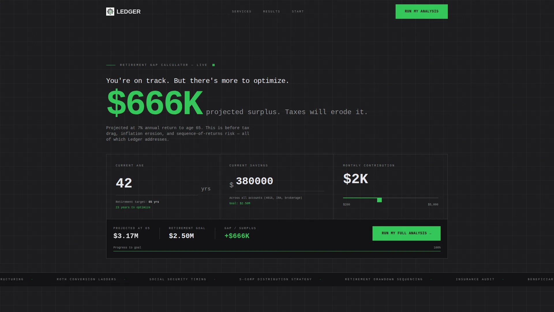
- An interactive retirement gap calculator in the header with real-time output as the user adjusts inputs
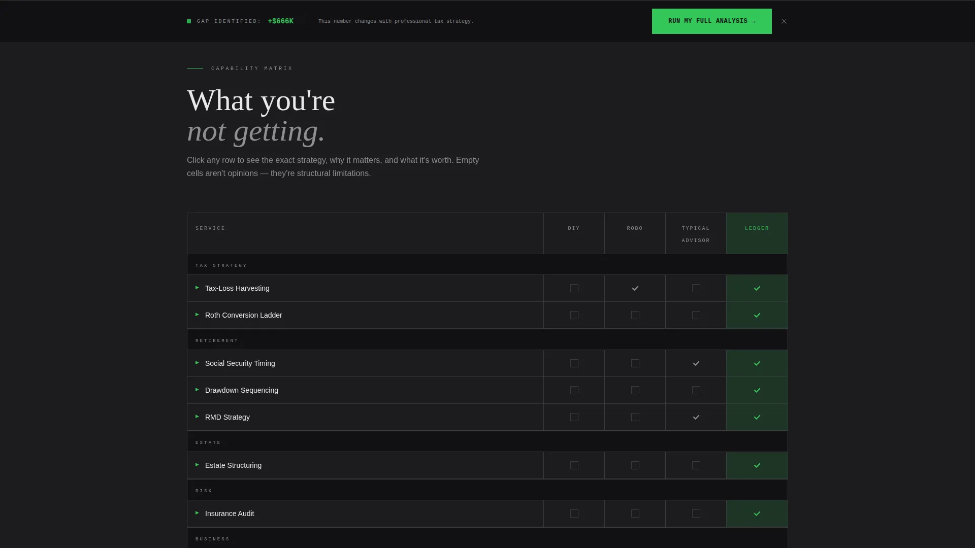
- A full feature matrix comparing your firm against do-it-yourself approaches, robo-advisors, and typical advisors across services like tax optimization, estate planning, insurance auditing, and Social Security timing
- A two-step progressive lead capture form and a secondary gated download for a fee comparison grid
Feature list
This template is built around several interconnected components, each engineered to move a cautious financial prospect toward a qualified conversation.
Interactive Retirement Gap Calculator
The header replaces a hero image with a functioning estimator. Visitors enter their current age and current savings, then drag a brutalist slider for monthly contribution. A real-time projection number updates instantly, and the headline above reads "You're $______ short. Let's fix that." The calculator does the persuasion work before any copy is read.
Comparative Feature Matrix
Every advisory service becomes a row in a structured data grid. Columns score each service across four options: do-it-yourself, robo-advisor, typical advisor, and this firm. Signal green checkmarks and empty gunmetal cells communicate capability gaps at a glance. Each grid block is clickable and expands into a brutalist card with one paragraph and one key metric.
Progressive Two-Step Lead Form
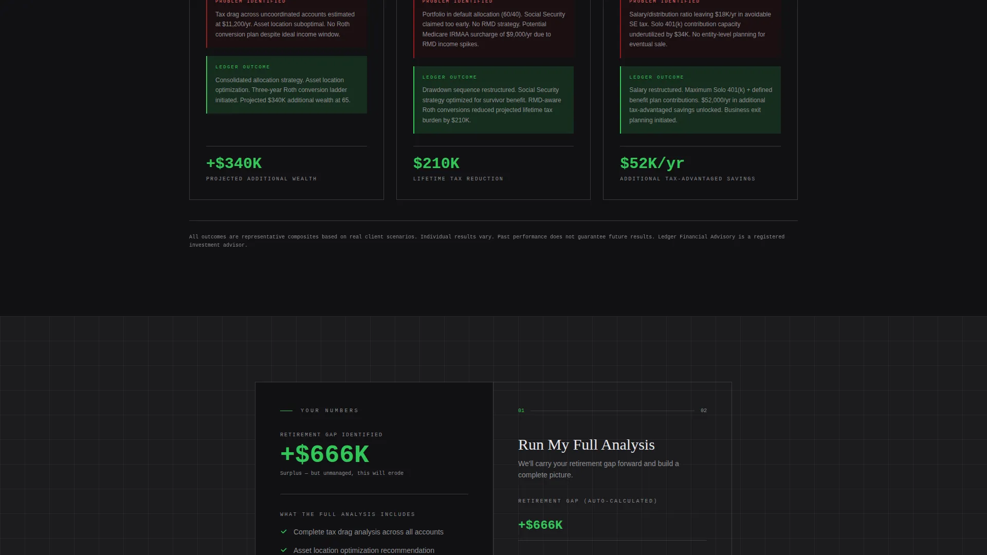
The primary lead form is designed to reduce friction by splitting the process into two screens. The first screen captures only email and the retirement gap number carried over from the calculator. The second screen asks for portfolio size range and primary concern via dropdowns, filtering leads before they reach your inbox.
Persistent "Run My Full Analysis" call to action Bar
The primary call to action is locked to the bottom of the viewport as a persistent bar throughout the scroll. It also appears embedded directly after the feature matrix. This dual placement means the conversion trigger is always within reach, no matter how deep into the page the visitor scrolls.
Secondary Gated Download Path
A second conversion option, "Download the Fee Comparison Grid," captures leads who want data before committing to a conversation. This path requires only a name and email, lowering the barrier for early-stage prospects and keeping them in your pipeline.
Bold Brutalist Dashboard Layout
The overall page is structured as a dashboard or data grid, not a narrative scroll. Sections stack like load-bearing slabs, each one adding proof weight. Backgrounds alternate between structural charcoal and near-black. Divider lines are 1px gunmetal. The layout feels like a Bloomberg terminal built for client acquisition.
Page sections overview
| Section | Purpose |
|---|---|
| Retirement Gap Calculator | Immediate, interactive hook that quantifies the visitor's financial shortfall in real time |
| Headline Statement | Small typographic prompt above the calculator that frames urgency without hyperbole |
| Feature Matrix Grid | Side-by-side capability comparison that positions the firm against DIY and robo alternatives |
| Expandable Service Cards | Brutalist detail cards triggered by clicking a matrix block, each showing one paragraph and one metric |
| Embedded call to action Form | Two-step lead capture placed after the feature matrix for high-intent visitors |
| Persistent call to action Bar | Viewport-locked "Run My Full Analysis" bar that follows the visitor down the page |
| Fee Comparison Download | Secondary gated asset for prospects who want data before booking a call |
Design & branding system
The visual identity is built on a monochrome steel palette that references the interior of a bank vault crossed with a financial data terminal. There is no warmth, no decorative imagery, and no gradient softening. Every visual decision carries structural weight.
- Color system: structural charcoal (#1C1C1E) and near-black backgrounds, brushed gunmetal (#3A3A3C) for divider lines and inactive states, cold titanium white (#E8E8ED) for all body text, and signal green (#34C759) used exclusively for positive indicators and call-to-action states
- Typography: monospaced fonts throughout, with calculator output numbers rendered at 96px in titanium white to create a control-panel feel rather than a marketing aesthetic
- Visual rhythm: sections alternate between charcoal and near-black backgrounds, 1px gunmetal dividers separate content blocks, and decorative elements are entirely absent
Mobile & speed optimization
The dashboard layout is designed to translate its data-heavy structure cleanly to smaller screens without sacrificing the functional components that drive conversions.
- The retirement gap calculator inputs and slider are sized for comfortable touch interaction on mobile viewports
- The feature matrix adapts from a full grid to a scrollable format so capability comparisons remain legible on narrow screens
- The persistent call to action bar maintains its viewport-locked position on mobile, keeping the primary conversion trigger accessible at every scroll depth
How this template helps you convert
The conversion architecture is built on a simple idea: let the math make the case, then collect the contact. Every section is arranged to increase perceived complexity and guide the visitor toward requesting help.
- The calculator opens the page by giving the visitor a personal, real number tied to their own retirement gap, making the problem concrete before any advisory service is mentioned.
- The feature matrix then shows exactly where typical advisors, robo-advisors, and do-it-yourself approaches fall short, positioning the firm as the only option with a full row of signal green checkmarks.
- The two-step form and the fee comparison download provide two friction-calibrated exit points, capturing both high-intent leads ready to book and research-stage prospects who need more data first.
Other information about this template
Ledger is a single landing page template categorized under financial advisor website templates. It is designed specifically for advisory practices that want to lead with data and earn trust through transparency rather than lifestyle imagery.
- Template style: dashboard and data grid layout within a single-page structure
- Theme: bold brutalist with a monochrome steel color system
- Intended niche: financial advisor maintenance page use cases, including ongoing client communication and new prospect acquisition
- The template supports lead generation as its primary direction, with the calculator acting as the top-of-funnel qualifier and the progressive form acting as the mid-funnel filter
- Built for advisors whose client base includes people managing inherited portfolios, consolidating scattered retirement accounts, or planning S-corp distribution strategies
Theme
Bold Brutalist
Creative direction
Feature Matrix
Color system
Monochrome Steel
Style
Dashboard/Data Grid
Direction
Lead Generation
Page Sections
Interactive Retirement Gap Calculator
Comparative Feature Matrix
Progressive Two-step Lead Form
Persistent Viewport-locked Call to Action Bar
Secondary Gated Fee Comparison Download
Bold Brutalist Dashboard Layout
Related questions
Can I customize the calculator inputs for my specific client profile?
Does the feature matrix work if my practice has a narrower service list?
How does the two-step lead form sequence work?
Is the persistent call to action bar visible on mobile devices?
Who is the secondary download path designed for?



