High Net Worth Finance Booking Website Template
Vault is a precision-built landing page template for high net worth savings accounts. It pairs a live metrics dashboard header with a fixed scroll-tracking sidebar checklist, guiding serious depositors through APY comparisons, FDIC sweep network details, fee schedules, and liquidity terms. The result is a confident, data-first click-through page that earns trust before asking for action.
by Rocket studio
Quick summary
Vault is a single-page, sidebar companion landing page template built for high net worth savings products. It opens with a live metrics dashboard showing current APY, a compound interest calculator, and a Federal Deposit Insurance Corporation (FDIC) coverage meter. A fixed audit checklist in the sidebar checks off in real time as visitors scroll, so every serious depositor arrives at the call to action already fully informed.
Who this template is for
This template is designed for fintech teams and private banking brands that need to speak directly to sophisticated, high-balance depositors. It fits products where data and transparency close the deal faster than lifestyle imagery ever could.
- Exited founders and liquidity event recipients managing $500,000 or more in idle cash
- Dual-income professionals whose checking account balances have outgrown standard savings options
- Family office managers parking dry powder between allocations and needing a credible, zero-fee holding product
What problem this template solves
High net worth depositors do not respond to generic bank marketing. They arrive with specific questions about yield, insurance coverage, fees, and liquidity. Most landing pages answer those questions poorly or not at all, causing qualified visitors to leave before converting.
- Visitors want hard numbers, not vague benefit statements, and this template leads with live yield data from the very first screen
- Sophisticated depositors need to feel they have done their due diligence before committing to an application
- The scroll-audit model replaces passive reading with an active checklist experience that mirrors how careful buyers actually research financial products
What you get with this template
Vault delivers a complete, desktop-first landing page layout organized around a two-column structure. The left column holds the main content flow. The right column holds the persistent audit sidebar. Together they create a guided, sequential reading experience that systematically addresses every concern a high-balance depositor would raise.
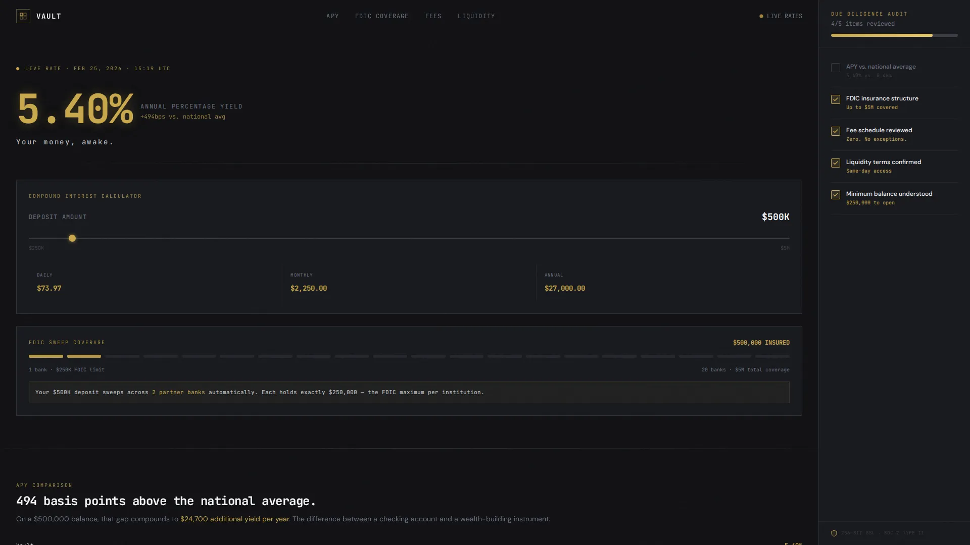
- A live APY dashboard header with count-up animations, a compound interest calculator, and an FDIC coverage meter
- Five structured content sections covering APY comparison, FDIC sweep network explanation, fee schedule, liquidity terms, and minimum balance onboarding
- A scroll-triggered sidebar checklist that marks items complete in liquid-gold as the visitor progresses, culminating in a "Open Your Vault" call-to-action button
Feature list
This template is built around a small set of high-impact, purpose-driven components. Each one serves the single goal of making a cautious, high net worth depositor feel certain enough to click through to the account application.
Live APY Dashboard Header
The header displays current annual percentage yield (APY) at 72 pixels in liquid-gold with no hero image. A real-time compound interest calculator shows daily, monthly, and annual yield on a $500,000 deposit. Count-up number animations make the data feel alive rather than static.
Scroll-Triggered Audit Sidebar
A fixed sidebar on the right side of the page tracks visitor progress through five checklist items. Each item corresponds to a main content section. Items check off in liquid-gold as the visitor scrolls past the matching section, turning the reading experience into a structured product audit.
FDIC Coverage Meter
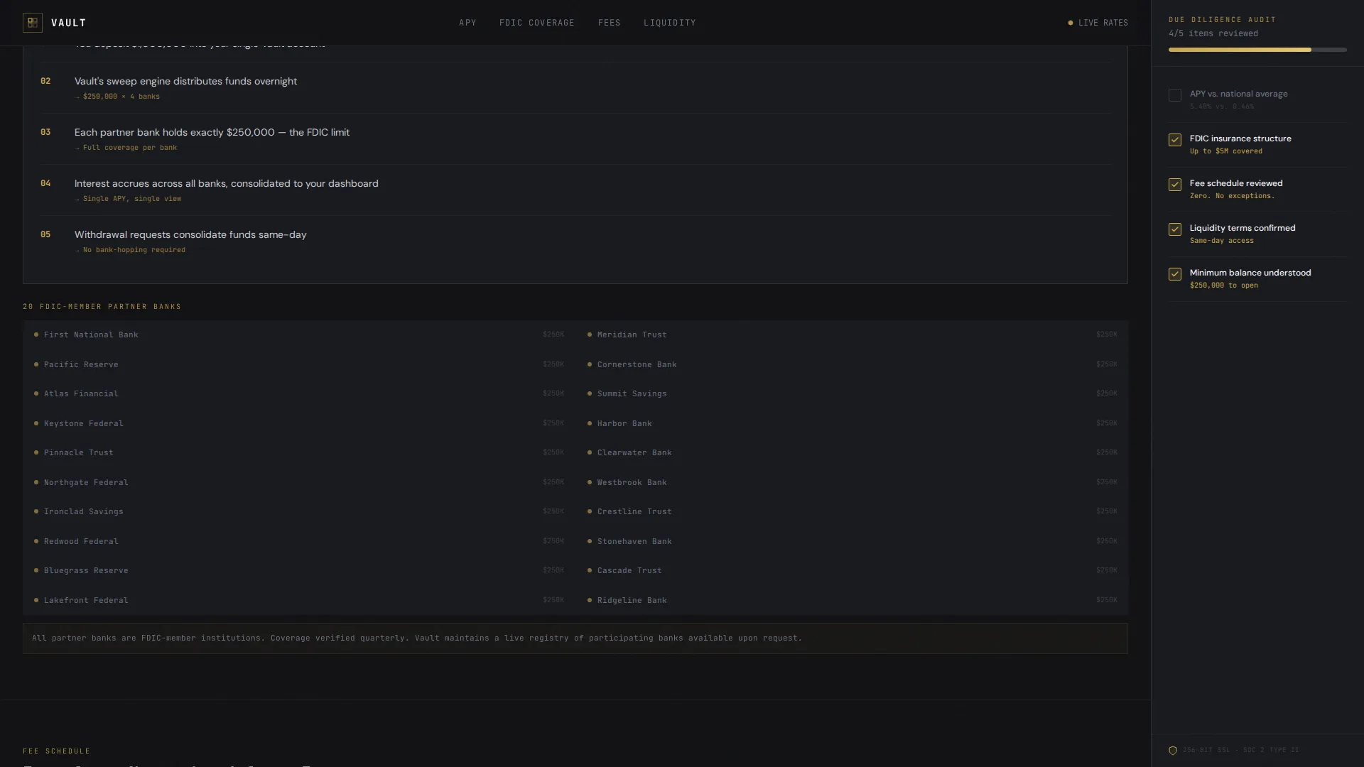
A dedicated visual component illustrates how funds are distributed across partner banks within the FDIC sweep network. It shows how balances up to $5 million can be covered under this structure, giving depositors a clear and reassuring picture of their insurance position.
APY Comparison Data Table
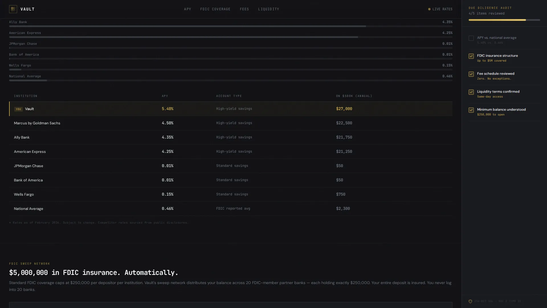
A structured competitor comparison table places Vault's yield against the national average, major consumer banks, and high-yield savings accounts (HYSAs). The table uses hard numbers rather than subjective claims, letting the data make the argument.
Zero-Fee and Liquidity Section
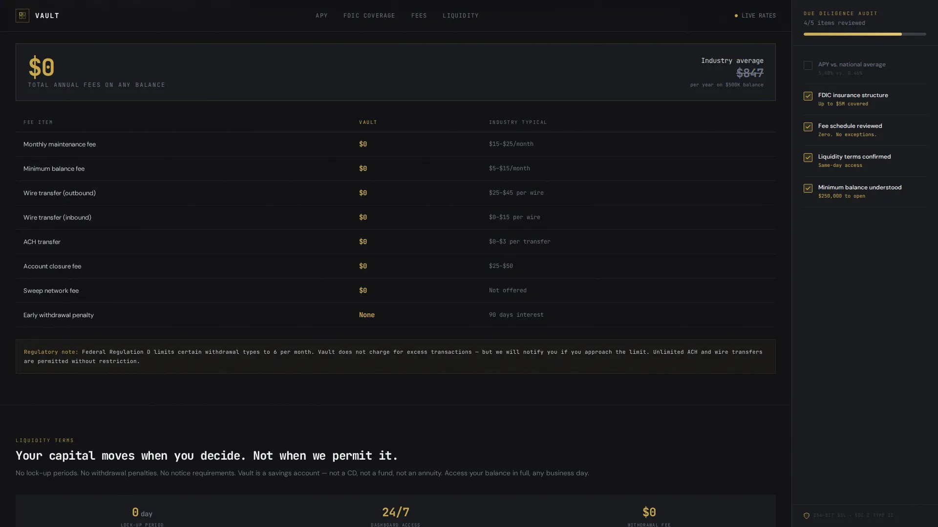
A dedicated section presents the fee schedule as a clean table confirming zero fees. Same-day liquidity terms are stated clearly. This section handles two of the most common objections from high-balance depositors in a single, scannable block.
Dual Call-to-Action System
The primary call to action, "Open Your Vault," appears first inside the sidebar once all checklist items are satisfied. It then repeats as a full-width bar at the base of the page. A secondary text link, "Schedule a Private Call," sits beneath for depositors above $1 million who expect a personal conversation before committing.
Page sections overview
| Section | Purpose |
|---|---|
| Hero Dashboard | Display live APY, compound calculator, and FDIC meter |
| APY Comparison | Data table versus national average, big-4 banks, and HYSAs |
| FDIC Sweep Network | Explain $5M protection structure with partner bank visualization |
| Fee Schedule & Liquidity | Zero-fee table and same-day liquidity confirmation |
| Minimum Balance & Onboarding | $250K minimum detail and 3-step application process |
| Full-Width call to action Bar | Final "Open Your Vault" bar and secondary call link |
Design & branding system
The visual identity follows a Data Command theme built on a Monochrome Steel color palette. The aesthetic deliberately removes warmth, decoration, and lifestyle imagery. Every visual choice communicates certainty, precision, and institutional trust.
- Color palette: forge-black (#111114) for backgrounds, gunmetal mid-tone (#3A3D44) for structural layers, polished chromium (#C8CCD0) for body text, vault-white (#F4F5F6) for card surfaces, and liquid-gold (#C9A84C) reserved exclusively for APY figures, checklist completions, and primary buttons
- Typography: JetBrains Mono for all numerical and data displays, DM Sans for body copy and labels, creating a clear visual separation between data and prose
Mobile & speed optimization
The template is designed desktop-first, requiring a minimum viewport of 1,200 pixels to display the full two-column sidebar layout correctly. On smaller screens, the layout collapses gracefully so the content remains accessible without breaking the reading flow.
- The sidebar checklist stacks below the main content column on mobile, preserving the audit logic in a linear format
- Animations including count-up numbers, scroll-triggered checklist fills, and staggered data reveals are implemented using client-side components only where interactivity is genuinely needed, keeping the rest of the page as lightweight static markup
How this template helps you convert
Vault is structured around the insight that high net worth depositors convert when they feel informed, not when they feel sold to. The page earns the click by making the visitor feel the decision was already obvious before the button appeared.
- The sidebar checklist reframes scrolling as active due diligence. Each completed item reduces hesitation and builds cumulative confidence, so the call to action arrives after trust is already established rather than before it.
- The click-through model keeps no form fields on the landing page itself. The visitor clicks "Open Your Vault" only after every checklist item is satisfied, carrying pre-qualified context into the secure application flow and reducing drop-off at the form stage.
Other information about this template
Vault is built specifically for the United States market, using USD formatting and the MM/DD/YYYY date convention throughout. The footer follows a minimal developer-style pattern suited to a data-forward brand that does not need ornamental design to signal credibility.
- The template localization is set for USA, USD, and standard American date formatting
- The footer uses a minimal, GitHub-style developer pattern (Pattern 8) consistent with the Data Command aesthetic
- The page type is a click-through landing page with no inline form fields; the application lives on the bank's secure external page
- A secondary contact option, "Schedule a Private Call," is included for depositors with balances above $1 million who prefer a human conversation before submitting an application
Theme
Data Command
Creative direction
Checklist & Audit
Color system
Monochrome Steel
Style
Sidebar Companion
Direction
Click-Through
Page Sections
Live APY Dashboard Header
Scroll-triggered Audit Sidebar
FDIC Sweep Network Visualizer
APY Competitor Comparison Table
Zero-fee and Liquidity Disclosure Block
Dual Call-to-action System
Related questions
Does this template include form fields for the account application?
What minimum balance is this template designed around?
How does the scroll-triggered sidebar checklist work?
What screen size does the full layout require?
Is there an option for depositors who want to speak with someone before applying?



