Premium Payment Gateway Landing Page Template
The Ledger Executive Suite payment infrastructure landing page template is built for fintech teams who move money at scale. It opens with a live cost-savings calculator, walks visitors through a Problem-to-Solution zigzag layout, and closes with a friction-light free-trial signup form. Everything from color to copy signals institutional authority, no fluff, just results.
by Rocket studio
Quick summary
The Ledger Executive Suite payment infrastructure landing page template gives B2B fintech teams a boardroom-grade single-page layout to present cross-border payment solutions with confidence. A live calculator opens the page, four zigzag Problem-to-Solution pairs build the case, and a streamlined three-field form captures signups. The visual system stays restrained, precise, and built for trust.
Who this template is for
This landing page is designed for teams whose business lives and dies by payment reliability. It speaks directly to the decision-makers who evaluate payment infrastructure at a technical and financial level, the people who feel every failed charge personally.
- CTOs at Series B fintechs wiring together their first cross-border payout systems and needing to demonstrate reliability to stakeholders
- Finance ops leads at SaaS companies drowning in failed subscription charges and manual reconciliation errors
- Marketplace founders who need to split payments across thousands of seller accounts without touching a spreadsheet
What problem this template solves
Payment infrastructure is genuinely hard to communicate. The technical depth intimidates non-engineers, while surface-level marketing copy bores the CTOs who actually sign contracts. Most landing pages in this space either overwhelm visitors with jargon or undersell the real complexity they solve.
This landing page template solves the communication gap with structure and proof. It lets the data do the persuading before a single sales word appears.
- Visitors leave too soon because the page does not surface cost savings or reliability metrics early enough to hold attention
- Finance teams cannot quickly assess whether a platform meets their compliance and regulatory requirements without hunting through documentation
- Generic layouts fail to reflect the institutional credibility that banking and fintech accounts demand from a vendor page
What you get with this template
This template delivers a complete, single-page layout ready for a payment infrastructure platform. Every section has a defined role, and the overall flow guides a busy executive from initial curiosity to active signup without friction.
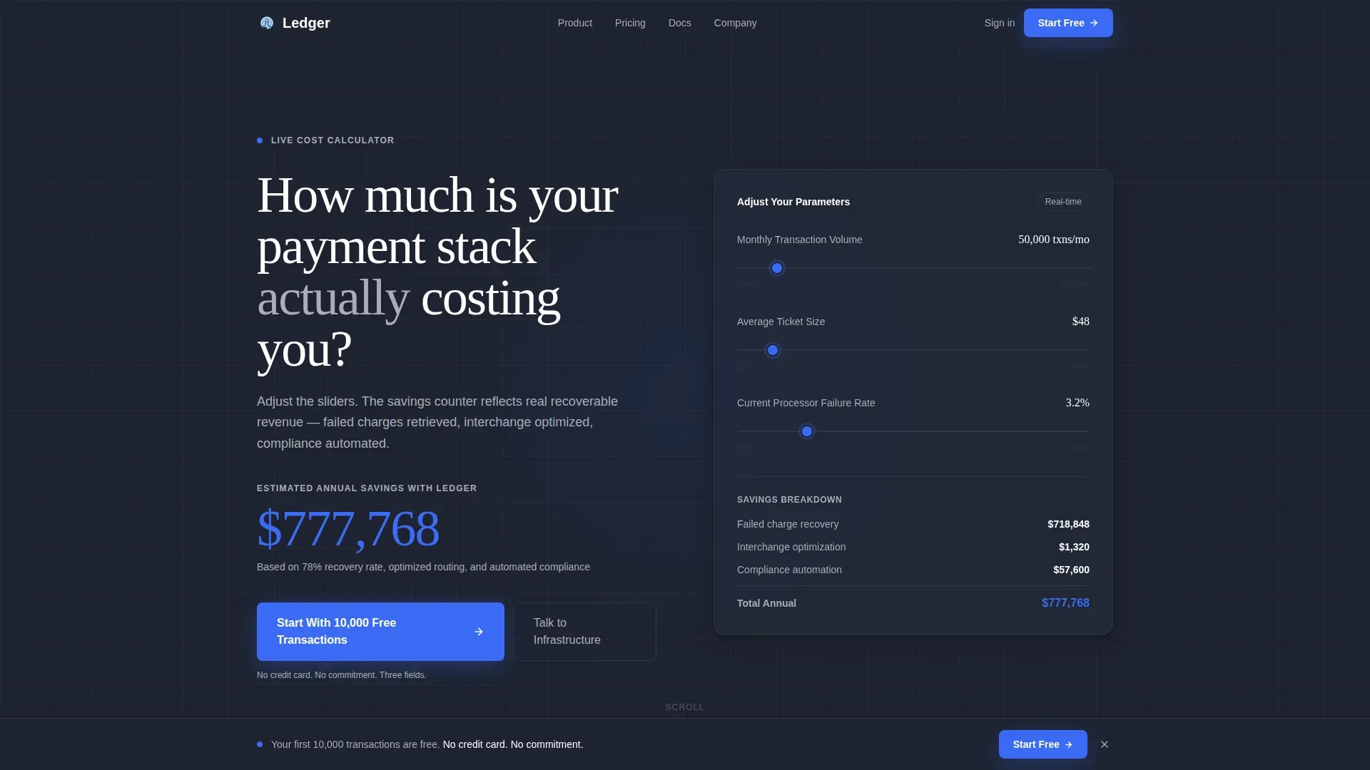
- A header-mounted live cost-savings calculator with adjustable sliders for transaction volume, average ticket size, and current processor failure rate, so visitors can track estimated annual savings in real time
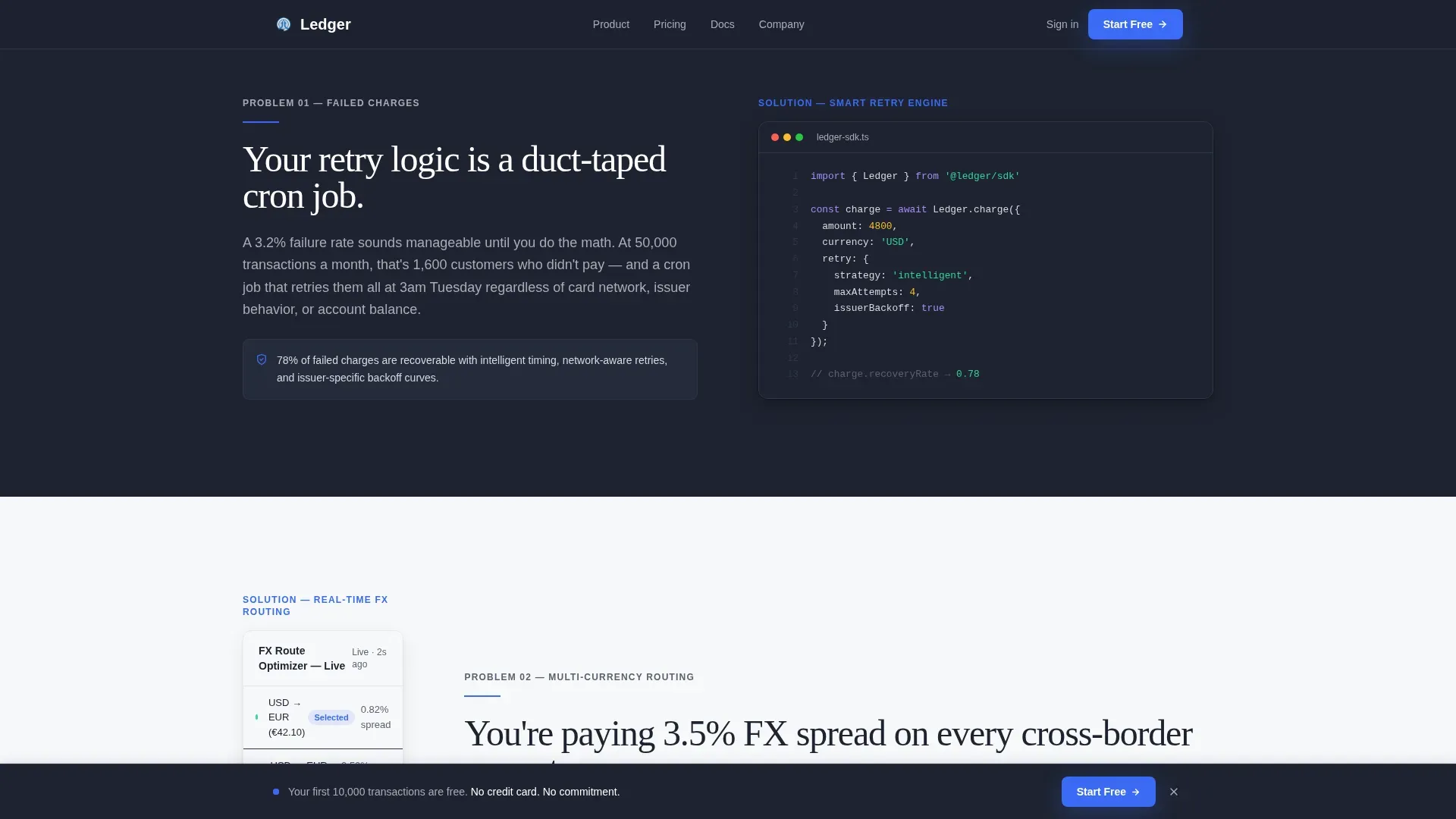
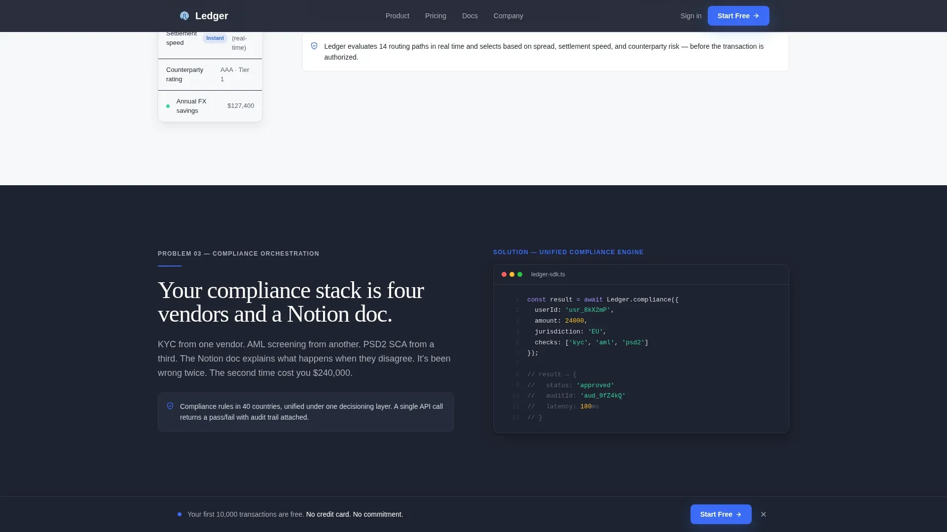
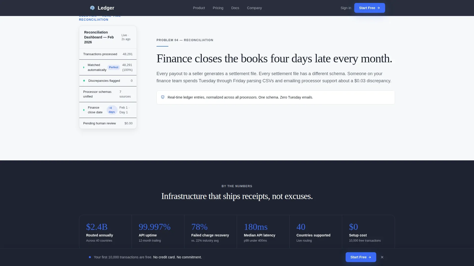
- Four alternating zigzag Problem-to-Solution section pairs covering failed charges, multi-currency routing, compliance orchestration, and real-time reconciliation, each designed to display a pain point beside its resolution
- A persistent bottom call-to-action bar, a stats and trust section, a testimonials block, and a final enterprise call-to-action section with partner logo display and a secondary "Talk to Infrastructure" path
Feature list
This landing page template is purpose-built for payment infrastructure platforms. Every feature below is grounded in the brief and serves either conversion, comprehension, or credibility.
Live Cost-Savings Calculator Header
The page opens with an interactive calculator already populated with realistic defaults: 50,000 monthly transactions, an average ticket of $48, and a 3.2% processor failure rate. As users adjust each slider, an authority-blue savings counter ticks upward in real time. The math is the hero. This approach mirrors best practices in fintech landing page design, where real-time tools demonstrate transparency and tangible value before a single marketing claim is made.
Problem-to-Solution Zigzag Layout
Four alternating left-right section pairs walk visitors through the full payment stack. Each left-aligned panel names a specific infrastructure pain point in plain language. The matching right-aligned panel answers it with a clean code snippet or dashboard fragment. The pairs escalate in complexity, failed charges, multi-currency routing, compliance orchestration, then real-time reconciliation, creating a rhythm that feels like a conversation between what the visitor has today and what they could have tomorrow.
Freemium-First Conversion Flow
The primary call-to-action, "Start With 10,000 Free Transactions," appears inside the calculator results and again in a persistent bottom bar that activates after the second zigzag pair. The signup form collects only three fields: work email, company name, and estimated monthly volume via dropdown. No credit card is required. Simplified lead capture forms that gather only essential information reduce friction and keep conversion rates high among busy executive users.
Compliance and Trust Section
The landing page showcases quick compliance onboarding processes, including Know Your Business and Know Your Customer flows, as well as multi-signature approval workflows for multi-party governance. Compliance badges and security messaging are displayed prominently, because high-converting fintech landing pages communicate safety before value and proof before promises. Trust indicators including partner network logos and named testimonials with company context reinforce institutional credibility.
Stats and Social Proof Bar
A dedicated stats section on a cloud-white background presents key metrics that quantify platform performance. Specific figures like "$2.4B routed" give visitors an accurate, immediate sense of scale. Fintech landing pages should quantify social proof in terms of financial metrics, and this section does exactly that. Two enterprise testimonials from named fintech contacts add a human layer of proof that data alone cannot provide.
Enterprise Conversion Section
The final section surfaces the secondary conversion path for enterprise prospects. Partner logos from recognizable payment networks are displayed alongside a "Talk to Infrastructure" call-to-action reserved for teams who need custom routing discussions. This section is action-oriented and benefit-driven, following best practices for engaging executive decision-makers who need a higher-touch entry point than the self-serve free tier.
Page sections overview
| Section | Purpose |
|---|---|
| Calculator Hero | Opens with live savings estimator on charcoal background |
| Zigzag Pair One | Failed charges pain point paired with platform solution |
| Zigzag Pair Two | Multi-currency routing problem and API-driven answer |
| Zigzag Pair Three | Compliance orchestration challenge with built-in response |
| Zigzag Pair Four | Real-time reconciliation problem and dashboard solution |
| Stats Trust Bar | Key metrics and scale proof on cloud-white background |
| Testimonials Block | Two enterprise quotes with company and role context |
| Enterprise Call to Action | Partner logos, custom routing path, and free-tier form |
| Linear Footer | Single-row footer following Pattern 1 layout |
Design & branding system
The visual identity follows an Executive Suite theme using a Cloud Canvas color palette. The system is restrained by design: roughly ninety percent of the canvas stays empty, and every element earns its place. Backgrounds alternate between cloud-white (#F7F8FA) and boardroom charcoal (#1E2330), with text color flipping accordingly to maintain readability on both surfaces.
- Brushed platinum (#D6DAE0) handles secondary text and dividers, while authority blue (#3B6BF5) is reserved exclusively for interactive elements, live data highlights, and the savings counter
- Typography pairs Fraunces for display headlines and DM Sans for body and user interface text, creating a contrast between editorial weight and functional clarity
- The overall structure follows a visual hierarchy built on ample negative space, guiding the eye to critical information without clutter or competing elements
Mobile & speed optimization
The template is built desktop-first, which matches where CTOs and finance teams most often evaluate infrastructure vendors. Full mobile support is included so that any person reviewing the page on a phone or tablet gets the same clear, scannable experience across every device.
- Scroll-triggered reveals and staggered zigzag entries use medium animation weight, keeping motion purposeful without adding unnecessary load overhead
- The calculator runs as a client component while static sections are structured as server components, separating interactive and static rendering for practical performance
- The layout adapts cleanly across screen sizes, maintaining the visual hierarchy and ensuring the savings counter, compliance details, and call-to-action elements remain accessible on any device
How this template helps you convert
This landing page is built around a conversion logic that removes every common objection before the visitor reaches the signup form. The flow moves from proof to persuasion to action in a sequence that respects how technical executives actually evaluate vendors.
- The live calculator surfaces personalized savings data immediately, so visitors understand the financial case for switching before they read a single feature claim, this is the template's primary persuasion engine, and it runs the moment the page loads
- The zigzag Problem-to-Solution pairs build credibility section by section, addressing failed charges, routing complexity, compliance burden, and reconciliation errors in the exact order that a finance or engineering leader would mentally rank them as operational risks
- The three-field signup form and the persistent bottom bar reduce the decision to a single low-stakes action, while the secondary "Talk to Infrastructure" path gives enterprise accounts a route that matches their evaluation process
Other information about this template
This template was developed as part of the broader Finance and Insurance category, sitting within the Payment and Fintech subcategory and targeting the Payment Infrastructure niche specifically. It is relevant context that ledger systems, as a category, are specialized data stores designed to provide an immutable and verifiable record of transactions over time. Every change to data is recorded and cannot be tampered with, making ledger-based architecture ideal for financial operations where data integrity and accuracy are non-negotiable.
A general ledger, by definition, is a document used to record all financial transactions over time. It is essential for ensuring transparency between all business operations and helps generate insights into a company's financial health. A well-structured ledger approach can optimize tasks, save time, and maintain accuracy across accounts. This context is why the Ledger Executive Suite payment infrastructure landing page template leads with data integrity signals rather than marketing language.
The ledger executive suite payment infrastructure landing page template is also relevant for teams exploring supporting infrastructure for both fiat and digital assets, including contexts where platforms securely store and transfer assets across banking systems and card networks. Finance teams at companies of varying sizes, including small businesses entering cross-border payments for the first time, can use this template to present their services with institutional-grade credibility.
- The template is structured for single-page deployment with no multi-page routing required, keeping the site footprint minimal and the visitor journey focused
- Resources such as the three-field signup form, the partner logo display, and the enterprise call-to-action section can be updated independently without restructuring the overall landing page
- The template supports pages aimed at both technical and financial audiences, with sections that speak to engineering concerns (code snippets, API references) and business concerns (cost savings, compliance) in equal measure
- Teams implementing this template can A/B test different headline and call-to-action styles across the zigzag pairs and the bottom bar to improve conversion rates over time
- The color system, typography, and section structure are all designed to maintain accuracy and consistency with the Executive Suite theme regardless of the underlying payment platform it represents
Theme
Executive Suite
Creative direction
Problem→Solution Arc
Color system
Cloud Canvas
Style
Zigzag/Alternating
Direction
Freemium/Trial
Page Sections
Live Cost-savings Calculator
Zigzag Problem-to-solution Layout
Compliance and Trust Signals
Persistent Bottom Conversion Bar
Enterprise Secondary Conversion Path
Executive Suite Visual System
Related questions
Who is the primary audience for this landing page template?
Does the template include the live calculator functionality?
How many fields does the signup form collect?
Can the template support both a self-serve and an enterprise conversion path?
What compliance signals does the landing page template include?



