Dental Office Real-Time Availability Website Template
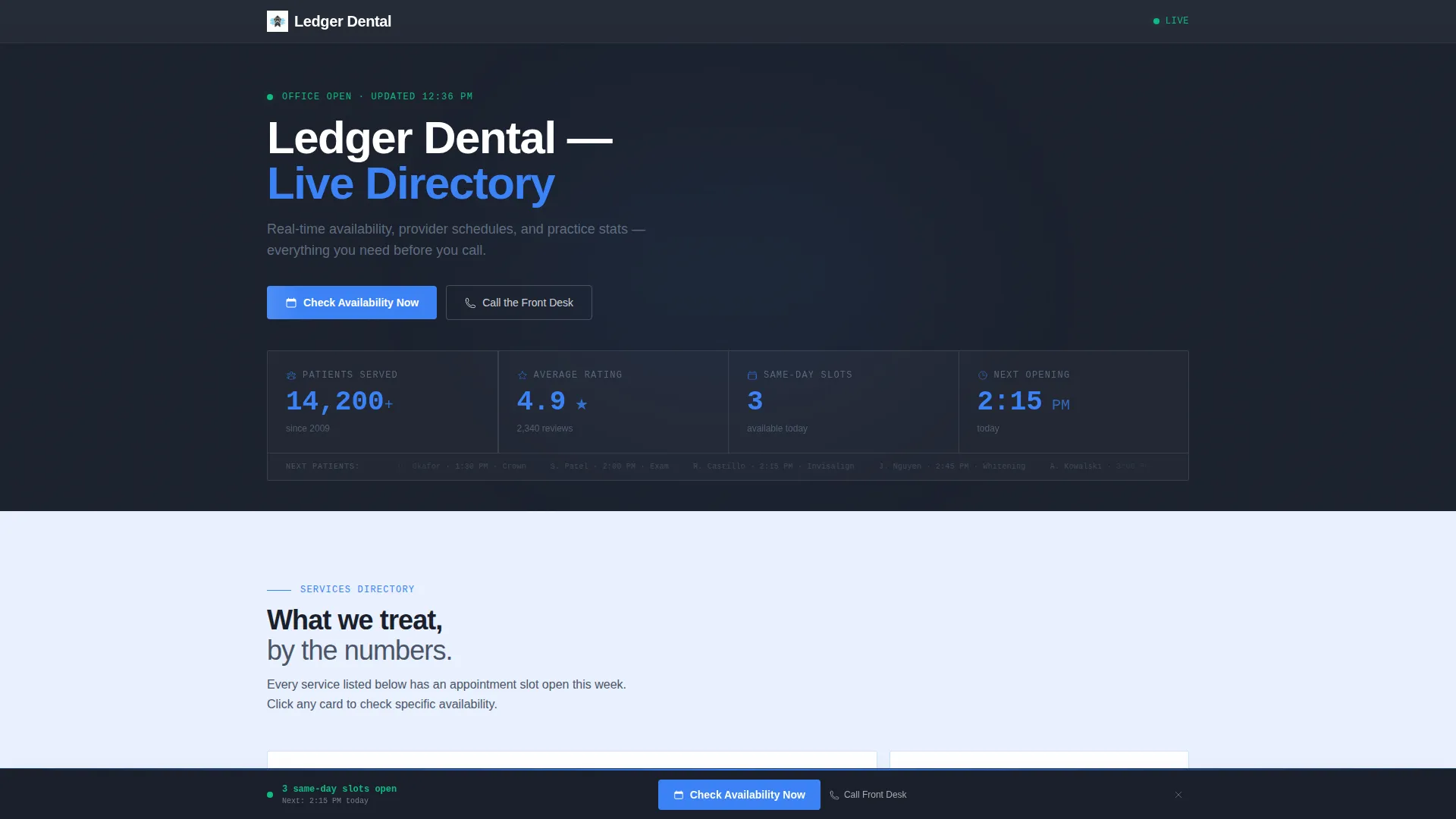
Ledger is a scroll-reveal dental practice landing page built around live office stats and appointment availability. It replaces a static placeholder with an animated metrics dashboard, a progressive service directory, and provider availability cards. Existing patients, new residents, and office managers all get the information they need in one confident, data-forward view.
by Rocket studio
Quick summary
Ledger turns a dental practice maintenance page into a working information hub. Animated counters display real volume figures the moment the page loads. Each scroll tick reveals another layer of detail, from service cards to provider availability, so visitors never feel stuck on a dead page.
Who this template is for
This landing page fits dental practices that want their online presence to feel as organized as the front desk. It is built for practices that already have patient volume worth showing off.
- Dental offices looking to replace a static "coming soon" page with something genuinely useful
- Office managers at nearby employers researching group dental plan options
- New residents searching for a local practice and needing quick proof of quality
What problem this template solves
Most maintenance pages do nothing. They hold a space, lose a visitor, and add nothing to the practice's reputation. Ledger fixes that by making every visit purposeful.
- Existing patients cannot find basic answers like which hygienist is available today
- New patients have no reason to trust or stay on a blank holding page
- Practices miss booking opportunities when live availability is hidden or absent
What you get with this template
You get a single, fully structured landing page that functions like a live office directory. Every section is pre-built and ready for your real data.
- An animated stats dashboard header with four key metrics and staggered counter reveals
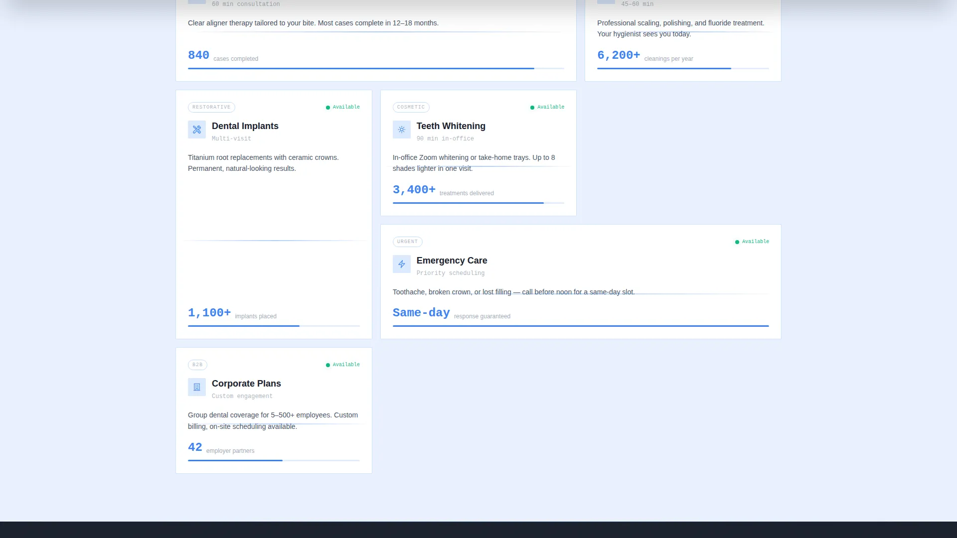
- A progressive service directory with per-service case volume figures attached to each card
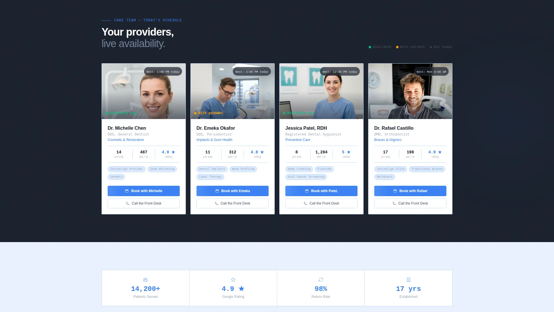
- Provider profile blocks with individual availability status indicators and direct contact links
Feature list
This landing page is built around a clear creative direction: show evidence first, then earn the action. Every feature below serves that sequence.
Animated Stats Dashboard Header
Four oversized metric counters load on arrival and tick upward in sequence, each staggered by 200 milliseconds. Figures like total patients served, average star rating, same-day slots, and next available time render in cerulean type against deep charcoal for maximum visual weight.
Scroll-Reveal Service Directory
Service cards slide up from zero opacity as the visitor scrolls. Each card carries a single attached stat, such as the number of completed cases, giving new and returning patients a concrete reason to trust each offering.
Provider Availability Cards
Individual provider profiles appear progressively and display a real-time availability status using green or amber color indicators. A secondary "Call the Front Desk" text link sits alongside each card for patients who prefer a phone call.
Sticky Click-Through call to action Bar
A "Check Availability Now" call-to-action button appears first inside the header metrics bar. After the second scroll reveal, a sticky bottom bar locks it into view, keeping the booking path accessible at every stage of the page.
Stats-First Visual Rhythm
The page follows a deliberate sequence: metrics first, service detail second, provider proof third, then action. This rhythm uses each section to answer the question raised by the one before it, reducing hesitation before the click.
Page sections overview
| Section | Purpose |
|---|---|
| Stats Dashboard Header | Displays animated counters for patients, rating, same-day slots, and next opening |
| Service Directory Cards | Reveals each dental service progressively with an attached case-volume stat |
| Provider Profile Blocks | Shows individual providers with live availability status and contact links |
| Sticky call to action Bar | Keeps the booking call-to-action visible after the second scroll trigger |
Design & branding system
The visual identity uses a Slate and Sky palette that feels clinical without feeling cold. Colors are drawn from the world of a clean dental office: precise, calm, and professional.
- Clinical slate (#4A5568) for primary text and navigation, deep charcoal (#1A202C) anchoring all headers
- Soft sky (#E8F0FE) washing the page background, recalling the calm of a patient gown under good lighting
- Cerulean accent (#3B82F6) used exclusively on interactive elements, live-status indicators, and primary call-to-action buttons
Mobile & speed optimization
The scroll-reveal animation sequence is designed to work across screen sizes, so the progressive disclosure effect reads just as clearly on a phone as on a desktop monitor.
- Staggered counter animations use timed entrance delays rather than heavy asset loads
- Provider cards and service tiles are structured for clean vertical stacking on smaller viewports
- The sticky call to action bar is built to remain usable and visible on mobile screens throughout the scroll
How this template helps you convert
Ledger earns the click before it asks for one. The page presents hard evidence of demand and availability, which reduces the hesitation a new or returning patient would otherwise feel.
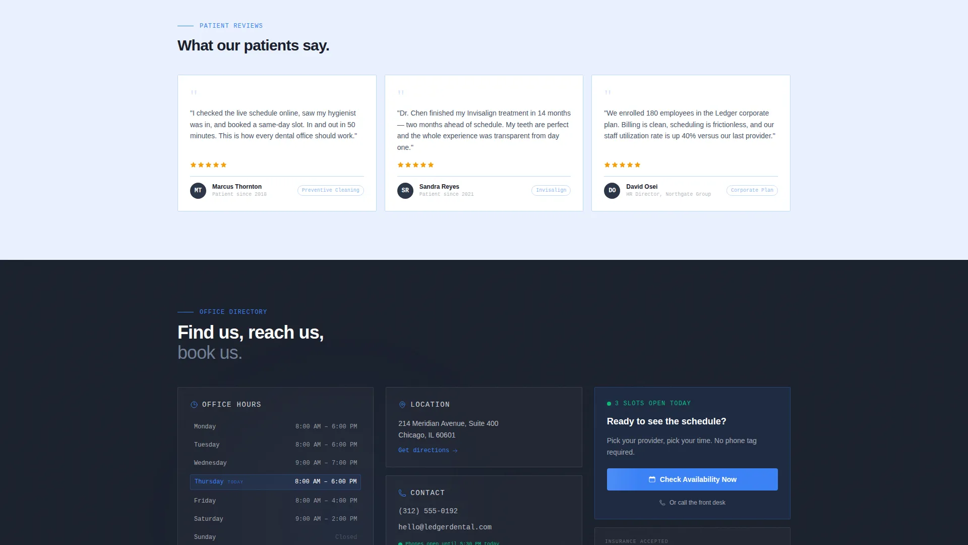
- Live volume figures and a visible next-available time slot remove the two biggest doubts a visitor has: "Is this practice any good?" and "Can I actually get in?"
- The sticky "Check Availability Now" bar keeps the booking path present without interrupting the information flow, so action feels like a natural next step rather than a hard sell.
Other information about this template
Ledger is categorized under dental practice website templates in the Technology section of the marketplace. It is purpose-built for the dental practice maintenance page niche, where most competing templates offer nothing actionable.
- The template style is Scroll Reveal (Progressive), meaning each section enters the viewport through a deliberate animation rather than loading all at once
- The Directory and Discovery theme makes it suitable beyond pure maintenance use; it works as a permanent practice information hub
- The Stats-First Impact creative direction is especially effective for practices with verifiable numbers to display
- No stock photography of smiling families is used; the design relies entirely on data, color, and layout for credibility
Theme
Directory & Discovery
Creative direction
Stats-First Impact
Color system
Slate & Sky
Style
Scroll Reveal (Progressive)
Direction
Click-Through
Page Sections
Animated Stats Dashboard Header
Scroll-reveal Service Directory
Provider Availability Cards
Sticky Click-through Call to Action Bar
Stats-first Page Rhythm
Related questions
Can I use this template as a permanent practice page, not just a maintenance page?
How does the scroll-reveal animation work?
What is the sticky call to action bar and when does it appear?
Is this landing page suitable for practices offering multiple services?
Do the provider availability status indicators update in real time?



