Senior Checking Account Landing Page Template
The Ledger template is a split-screen landing page built for senior checking account offers. It leads with a live-styled account dashboard, bold guarantee statements, a competitor fee comparison table, and a clear "Open Your Account in 8 Minutes" call to action. Every section removes a specific financial worry with a visible number before asking for anything.
by Rocket studio
Quick summary
The Ledger template is a single-page, click-through landing page designed for senior checking account campaigns. It uses a 50/50 split-screen hero, a guarantee-led content flow, and an institutional navy and gold color system. The page is built to reduce financial anxiety and earn the application click by presenting real data at every scroll step.
Who this template is for
This template serves financial marketers, bank product teams, and credit union designers who need to convert retirement-age visitors into checking account applicants. The tone and layout match the expectations of people who read every line of a bank statement and reject anything that feels unclear.
- Recently retired couples aged 60 to 75 comparing bank account options at home
- Adult children aged 40 to 55 helping a parent simplify finances after a life change
- Bank marketing teams building a trust-first landing page for a zero-fee senior product
What problem this template solves
Seniors are often wary of surprise fees, fine print, and vague promises on banking websites. Most landing pages for checking accounts bury the important numbers and lead with stock photography instead of facts. This template takes the opposite approach.
- It surfaces the fee data immediately so visitors do not have to search for what matters
- It removes complexity by organizing every guarantee into its own section with supporting evidence
- It eliminates the waiting game by routing to the application in one clear click, with no form on the page
What you get with this template
You get a fully structured, ready-to-customize landing page that follows a guarantee-led content system. The layout is desktop-first with full mobile support, and every section is designed to let the data do the persuading.
- A 50/50 split hero with a live-styled account dashboard and oversized guarantee statements
- A fee comparison table, an access section, a security section, and a final call-to-action anchor
- A linear single-row footer and two distinct calls to action that serve different buyer readiness levels
Feature list
Split-Screen Hero with Live Dashboard Data
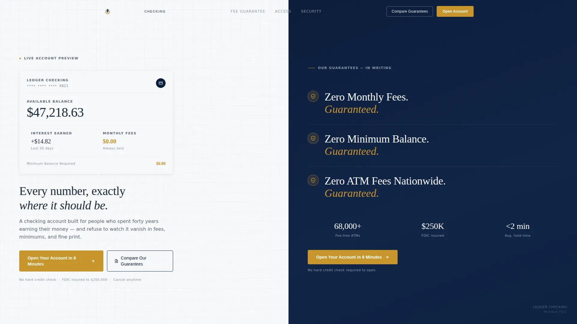
The hero divides the page down the center. The left panel displays a styled checking account balance of $47,218.63, last month's interest earned, and a gold-highlighted $0.00 in monthly fees. The right panel stacks three guarantee statements in oversized serif type, each paired with a shield icon. This ledger-style layout helps users read the most important data before scrolling.
Guarantee-Led Section Architecture
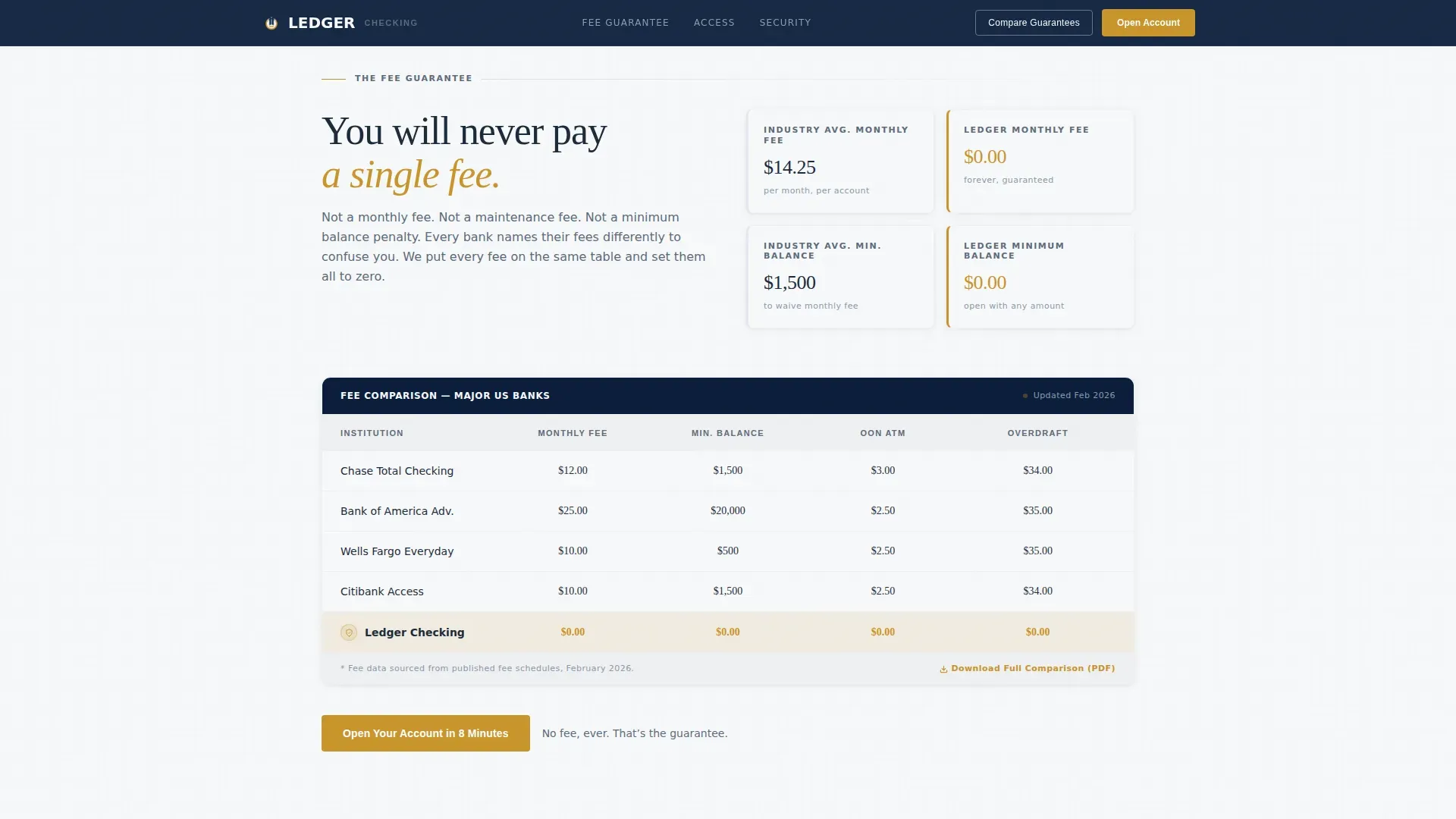
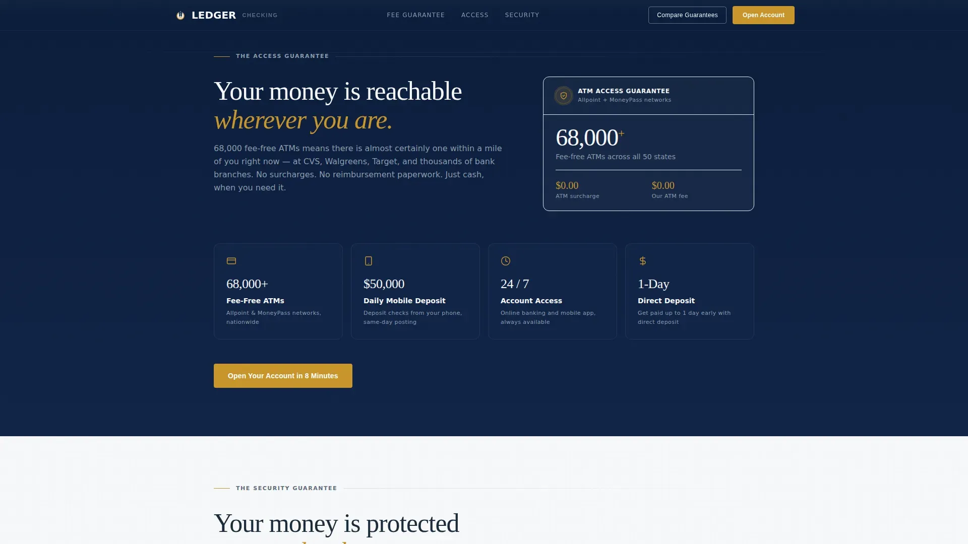
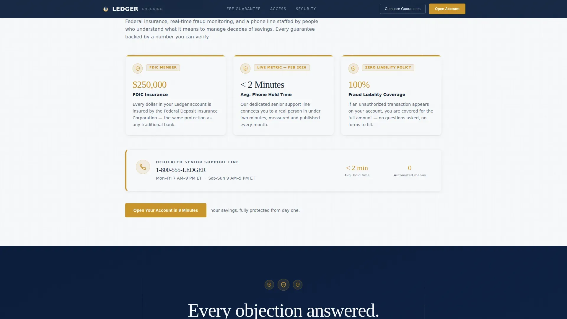
Every section after the hero opens with a bold guarantee statement before presenting its supporting evidence. The fee section shows a competitor comparison table. The access section presents ATM network data, mobile deposit limits, and branch count. The security section covers FDIC insurance coverage, fraud monitoring metrics, and phone support hold times displayed as a real metric. This structure ensures anxiety decreases with each scroll.
Competitor Fee Comparison Table
The fee guarantee section includes a structured table comparing competitor monthly fee averages against this account's zero charges. The table uses hover states for interactivity and row-level scroll reveals for a measured, document-like reading experience. It gives visitors the data they need to determine that this account is the better choice without requiring them to leave the page.
Dual Call-to-Action System
The primary call to action reads "Open Your Account in 8 Minutes" and appears first in the hero's left panel beside the dashboard, then anchors every guarantee section. A secondary call to action, "Compare Our Guarantees," links to a downloadable PDF comparison chart. This two-track system captures both ready applicants and visitors who need more time before they sign up.
Scroll-Reveal Animation System
The template uses medium-intensity scroll reveals and staggered stat card animations throughout. Table rows animate in one at a time. Shield badges include a subtle pulse. Loading states after button clicks provide a clear visual cue so users know the system responded. Physics-heavy effects are intentionally excluded to respect older users and keep the page feeling stable.
Institutional Typography and Color System
Headlines and guarantee statements use a serif typeface to communicate authority and permanence. Body text, data labels, and table content use a clean sans-serif typeface for readability at any size. The high-contrast color palette, deep navy backgrounds against ledger white content panels, helps senior users read every number clearly without strain.
Page sections overview
| Section | Purpose |
|---|---|
| Split-Screen Hero | Display dashboard data and guarantee statements side by side |
| Fee Guarantee | Compare competitor fees against zero charges with a table |
| Access Guarantee | Present ATM network, deposit limits, and branch data |
| Security Guarantee | Show FDIC coverage, fraud monitoring, and support hold times |
| Final call to action Anchor | Close with primary application button and trust signals |
| Linear Footer | Provide single-row footer links and legal context |
Design & branding system
The design follows a Data Command theme using a Navy Authority color system. Every color choice carries a specific role, and nothing is decorative without purpose. The overall aesthetic recalls the inside of a well-run bank branch, precise and trustworthy.
- Deep institutional navy (#0B1D3A) as the primary background, ledger white (#F7F8FA) for content panels, and trust-weight slate (#5C6B7A) for secondary text
- Decisive gold (#C9952B) reserved exclusively for calls to action and guarantee badges, never used as decoration
- Fraunces serif for guarantee headlines and Fraunces-paired DM Sans for body text, data labels, and table content
Mobile & speed optimization
The template is designed desktop-first to match the kitchen-table comparison behavior of its primary audience, with full mobile support built in. The animation system avoids heavy scripts so the page remains responsive across devices.
- Scroll reveals and stagger animations use minimal JavaScript, keeping the page light on any device
- Server components handle static content sections, reducing unnecessary client-side work
- Table rows and stat cards are structured to reflow cleanly on smaller screens without losing data clarity
How this template helps you convert
The page earns its clicks by systematically removing every reason a senior visitor might hesitate. It never asks for information before providing proof. Each section builds on the last, moving the reader from curiosity to confidence.
- The hero leads with visible account data and three written guarantees, establishing credibility before the visitor reads a single paragraph of body copy
- The guarantee sections answer fee, access, and security objections in that order, each backed by a real number so no claim goes unverified
- The dual call-to-action system captures applicants at every readiness level, the primary button routes to the application and the secondary PDF link captures comparison-stage visitors
Other information about this template
This template is part of a broader ledger-themed design system built around financial clarity. General ledgers are the backbone of any reliable banking record, and the design takes direct inspiration from how general ledgers organize data into clean, scannable categories. A general ledger provides a systematic record of every transaction organized into distinct accounts, and this template visually mirrors that structure across its sections. General ledgers are structured on the double-entry accounting method, where each transaction has a journal entry on both the debit and credit sides. That same sense of balance is reflected in the 50/50 split layout.
The template can be customized to match a specific company's brand while preserving the data-first hierarchy. Teams building a senior banking website will find the content categories and section order easy to read and adapt. The description of each section is written to scale with any financial institution offering similar zero-fee services.
This project draws design inspiration from institutional banking documentation and structured ledger account systems. Platforms like Dribbble host a wide array of ledger account designs that confirm the visual language used here resonates with financial audiences. General ledger templates offer standardized accounting frameworks without the complexity of enterprise accounting software, and this landing page template applies that same philosophy to the conversion page level.
The template works well for any accountant-reviewed financial product that needs to record trust clearly. It supports a business that wants to provide a transparent, no-hidden-charge message to retirement-age users. Templates like this one can automate the visual logic of a fee comparison, helping visitors quickly check whether the account meets their needs without requiring them to enter data into a form.
- Suitable for bank marketing teams, fintech companies, and credit union design projects
- Documentation for section layout and color tokens is straightforward to review and follow
- The PDF download call to action supports visitors who want to save and share the guarantee details before they agree to apply
- Designed with high-contrast colors and large readable type to help senior users across every article of content on the page
Theme
Data Command
Creative direction
Guarantee-Led
Color system
Navy Authority
Style
Split Screen (50/50)
Direction
Click-Through
Page Sections
Split-screen Hero with Account Dashboard
Guarantee-led Section Flow
Competitor Fee Comparison Table
Dual Call-to-action System
Scroll-reveal and Badge Animation
Institutional Typography Pairing
Related questions
Can I customize the dashboard numbers and guarantee text?
Does the page include a form for collecting applicant information?
What is the secondary call to action and how does it work?
Is the fee comparison table editable with my own competitor data?
Who is this template built for?



