Radiant Skincare | Free Website Template | Rocket
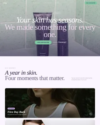
Veil is a masonry-style landing page template built for menopausal skincare brands. It pairs a hand-drawn SVG illustration header with staggered before-and-after transformation tiles, a five-question skin assessment quiz modal, and a personalized three-product protocol display. The Atelier Studio aesthetic uses plaster white, warm stone, muted blush, and deep walnut to create an unhurried, editorial feel that earns the trust of an informed, discerning audience.
by Rocket studio
Quick summary
Veil is a single-page landing page template designed for premium menopausal skincare brands. It opens with an animated SVG line-illustration header, moves through a staggered masonry before-and-after gallery, and leads visitors into an illustrated skin assessment quiz that delivers a personalized three-product protocol. Every section is built around one goal: turning a skeptical, research-minded visitor into a confident first customer.
Who this template is for
This template is built for founders and brand teams launching or refreshing a direct-to-consumer skincare line aimed at perimenopausal and menopausal women. It suits brands that want clinical credibility presented in an editorial, atelier-style package rather than a clinical or pharmaceutical one.
- Skincare brands formulating specifically for hormonal skin shifts, such as thinning, dryness, and reactive sensitivity
- Founders who want a quiz-led conversion path to personalize the purchase journey
- Creative teams that need a polished, high-animation template without building from scratch
What problem this template solves
Generic skincare landing pages do not speak to the specific biology of menopausal skin. Women in their late forties and fifties are intelligent, skeptical of broad beauty claims, and frustrated by products that stopped working. A standard template cannot hold their attention or earn their trust.
- No way to communicate ingredient rationale or clinical context without looking like a medical brochure
- No interactive path that acknowledges each visitor's unique hormonal skin stage
- No visual language that feels warm, considered, and peer-level rather than patronizing
What you get with this template
You get a fully structured single-page layout with five distinct content sections, high-interactivity components, and a complete visual identity system ready to apply to your brand. Every section is purpose-built and sequenced to guide a considered buyer from curiosity to commitment.
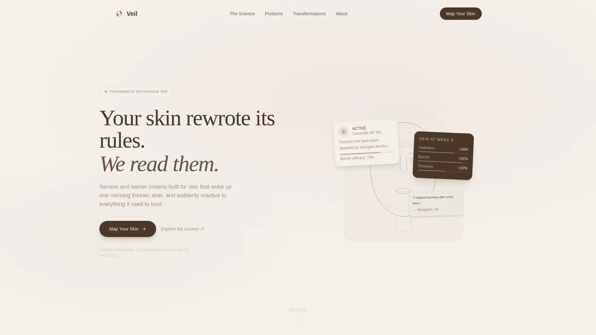
- An animated SVG hero with a line-drawn illustration, a floating headline, and a primary call-to-action button
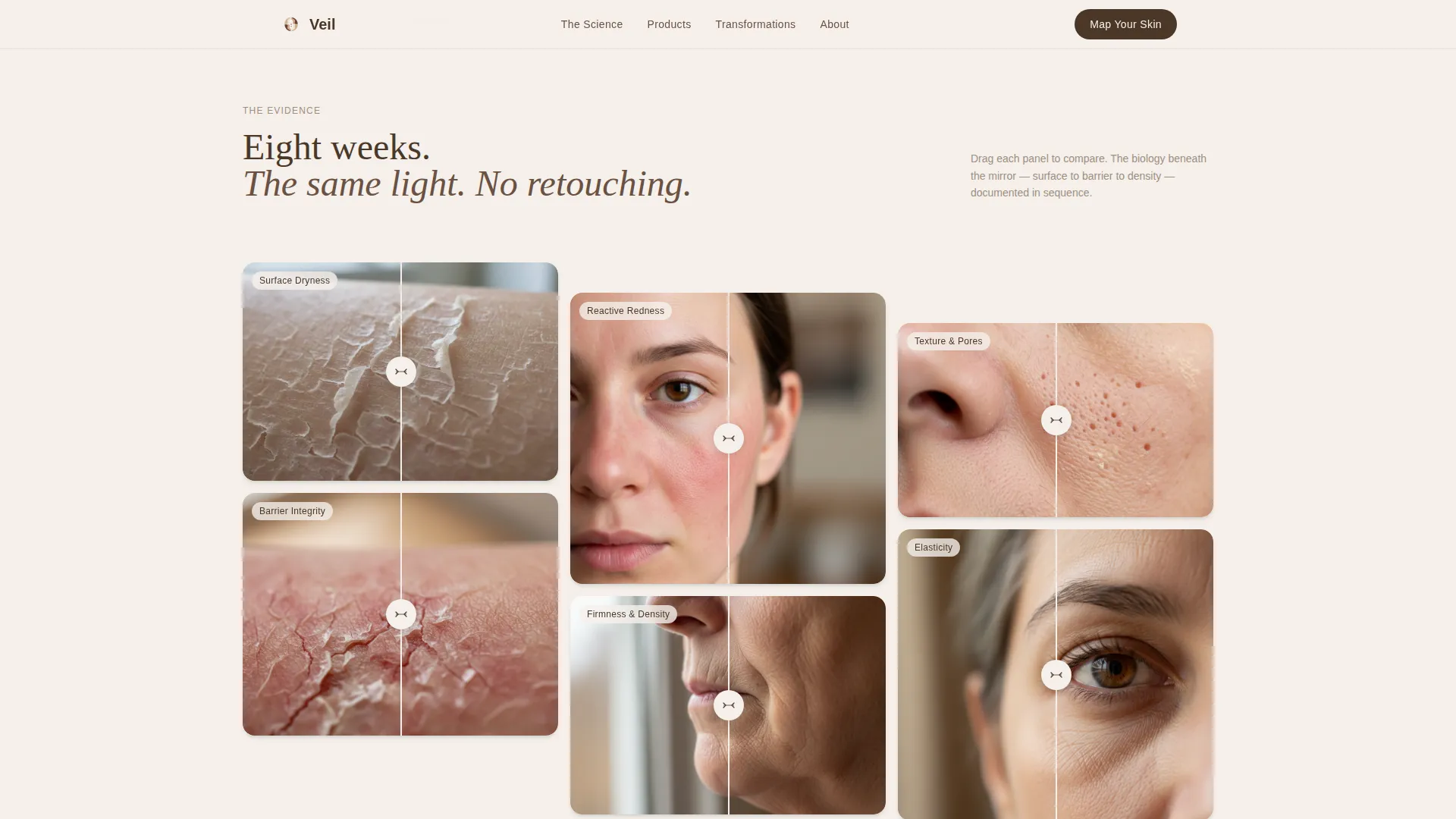
- A masonry before-and-after gallery with draggable reveal sliders and staggered scroll-load behavior
- A five-question illustrated skin assessment quiz modal with tappable cards and personalized results output
Feature list
This template ships with six purpose-built features that work together to support discovery, trust-building, and conversion for a menopausal skincare brand.
Animated SVG Illustration Header
The hero section uses a custom line-drawn woman's face rendered in walnut ink on a plaster-white ground. Topographic contour lines animate subtly as the page loads, and a single hand-lettered headline fades in beneath the illustration. No photograph, no product shot, only considered, editorial craft.
Masonry Before-and-After Gallery
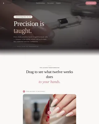
Transformation tiles are arranged in a staggered masonry grid that loads progressively as the visitor scrolls. Each tile pairs a macro-photography close-up of reactive or dehydrated skin with the same skin eight weeks later, shot in identical light. A draggable slider on each tile lets visitors reveal the difference at their own pace.
Five-Question Skin Assessment Quiz Modal
The quiz opens in an elegant modal overlay and walks through five illustrated questions covering current skin feel, time since perimenopause began, top concern, routine complexity, and hormonal replacement therapy status. Every answer is a tappable illustrated card, not a radio button. Results deliver a personalized three-product protocol instantly.
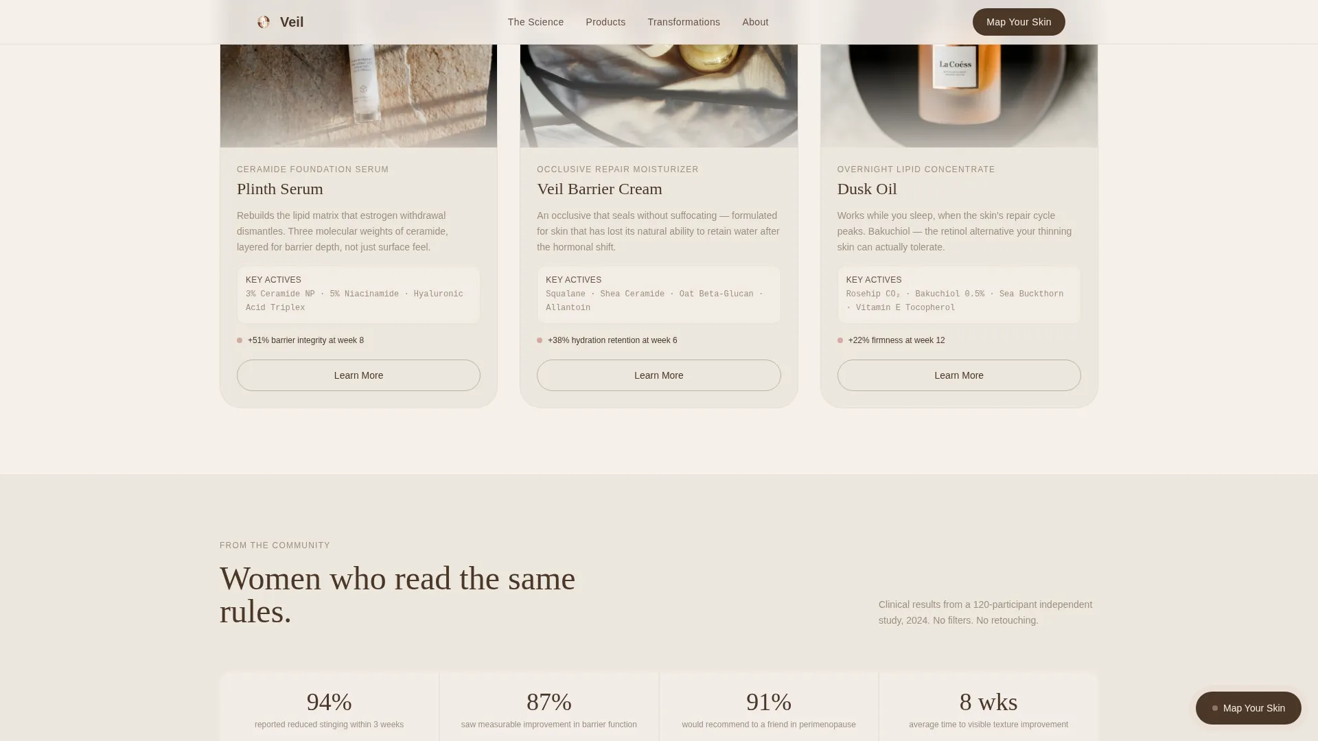
Personalized Three-Product Protocol Display
Quiz results surface a curated set of three products with ingredient callouts relevant to the visitor's answers. This section turns a general browsing session into a specific, actionable recommendation, reducing the decision fatigue that often prevents first-time purchases.
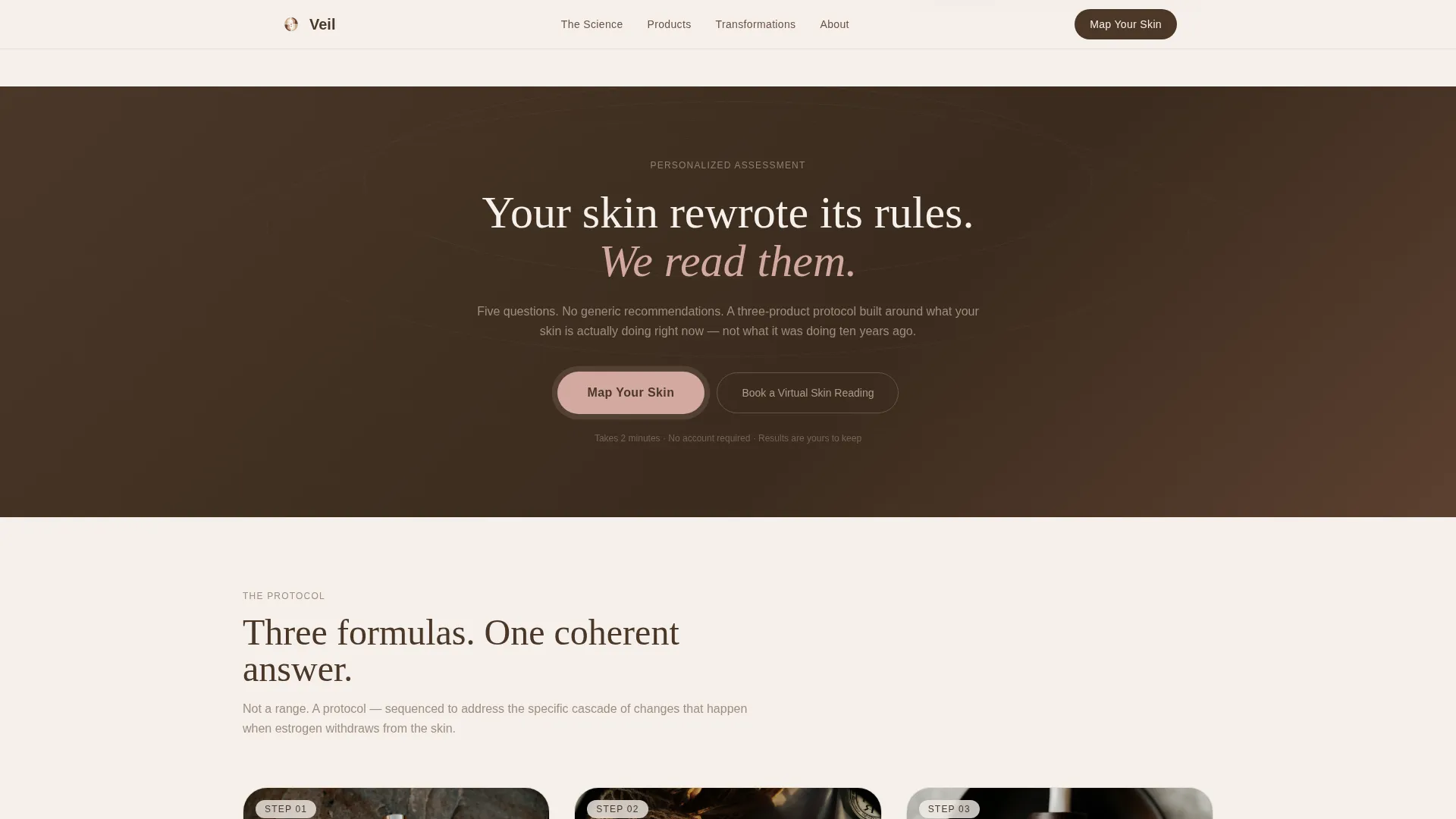
Full-Width Quiz Interstitial Call to Action
After the third masonry row, a floating "Map Your Skin" button appears. The same call to action is repeated as a full-width interstitial section further down the page, ensuring the quiz entry point is visible at multiple scroll depths without feeling aggressive.
Testimonials Section with Clinical Anchoring
Real transformation stories are displayed with timelines and ingredient callouts, grounding social proof in clinical context. This section sits between the protocol display and the footer, reinforcing trust at the point where a visitor is closest to committing.
Page sections overview
| Section | Purpose |
|---|---|
| Hero Illustration | Introduce brand voice and primary call to action |
| Masonry Gallery | Show before-and-after skin transformations |
| Quiz Interstitial | Prompt visitors to begin the skin assessment |
| Three-Product Protocol | Display personalized product recommendations |
| Testimonials | Anchor trust with real stories and timelines |
| Footer | Provide navigation, tagline, and social links |
Design & branding system
The template uses an Atelier Studio theme with a Cloud Canvas color system. The palette references a ceramicist's worktable at golden hour: chalky surfaces, natural pigments, and materials touched by hand. Typography pairs Fraunces serif headlines with DM Sans for body text and interface elements.
- Colors: plaster white (#F5F0EB) for backgrounds, warm stone (#C4B5A4) for secondary surfaces, muted blush (#D4A9A1) for hover states and product callouts, and deep walnut (#4A3728) for headlines and anchoring elements
- Typography: Fraunces serif for all headline weights to convey warmth and editorial authority, DM Sans for body copy and interactive interface elements to keep readability high
- Visual tone: quiet, unhurried, and editorial, no bold gradients, no loud promotions, no photography in the hero section
Mobile & speed optimization
The template is designed desktop-first to match the considered, research-led purchase behavior of its primary audience. Mobile adaptation is built in carefully, ensuring the quiz modal, masonry gallery, and draggable sliders remain usable on smaller screens without losing the atelier aesthetic.
- Interactive components such as the quiz modal and before-and-after sliders use client-side rendering while static sections use server component architecture for efficient delivery
- The masonry grid adapts its column count and stagger timing for mobile viewports so the scroll reveal still feels intentional rather than jarring
How this template helps you convert
The conversion architecture is layered and respectful of the visitor's pace. Nothing forces or rushes. Instead, each section builds quiet confidence that earns the click.
- The animated hero establishes brand authority and surfaces the "Map Your Skin" call to action early, capturing visitors who are ready to act without scrolling further.
- The masonry before-and-after gallery builds a visual, evidence-led case across multiple skin concerns, so visitors who need more convincing find it naturally as they scroll.
- The quiz modal personalizes the outcome, replacing a generic shop page with a protocol that feels written for the individual visitor, which lowers purchase hesitation significantly.
Other information about this template
This template is built to support a direct-to-consumer premium skincare brand in the menopausal skin beauty category. It includes a secondary conversion path inside the quiz results: a "Book a Virtual Skin Reading" option for visitors who want a one-on-one consultation before purchasing. The footer follows an Arc Browser Split layout with the logo and tagline on the left, navigation links on the right, and social links along the bottom.
- Localization is set for English (United States) with USD pricing format and MM/DD/YYYY date formatting
- The template is designed for the Beauty and Personal Care category with a specific niche focus on menopausal skin skincare brands
- Animation complexity is high: the topographic SVG line animation, staggered masonry scroll reveal, draggable sliders, and modal quiz all require client-side interactivity
Theme
Atelier Studio
Creative direction
Before/After Reveal
Color system
Cloud Canvas
Style
Masonry/Pinterest
Direction
Quiz/Assessment
Page Sections
Animated SVG Illustration Header
Masonry Before-and-after Gallery
Five-question Skin Assessment Quiz
Personalized Protocol Display
Multi-point Quiz Call to Action
Testimonials with Clinical Context
Related questions
Can I use this template without running a skin quiz?
Is the before-and-after gallery easy to update with my own images?
Does the template include the illustrated quiz questions?
Who sets up the "Book a Virtual Skin Reading" booking flow?
Can the color palette be changed to match a different brand?