Fitness Studio Professional Website Template
Pulse is a high-performance fitness studio landing page built around a comparison table layout. It targets data-driven professionals who want transparent membership tiers, real performance metrics, and a frictionless trial sign-up. The Tech Glass visual identity, terminal-style header, and spec-sheet scroll logic combine to make the free trial feel like the only logical next step.
by Rocket studio
Quick summary
Pulse is a single-page fitness studio landing page template designed for performance-focused studios. It leads with a terminal-style workout log header, rolls into a SaaS-style membership comparison table, and closes with a 7-day free trial form. The layout is built to convert data-obsessed professionals who want proof before they commit.
Who this template is for
This template is built for boutique fitness studios that compete on metrics, not atmosphere. If your studio tracks biometric data, offers tiered memberships, and attracts clients who think in dashboards, this layout speaks their language directly.
- Performance studios and training labs targeting analytical professionals
- Fitness operators launching a freemium or trial-first acquisition funnel
- Studio owners who want a transparent, spec-driven membership presentation
What problem this template solves
Most fitness studio landing pages rely on lifestyle photography and vague benefit claims. That approach loses the data-driven prospect who needs real numbers and clear tier breakdowns before clicking anything.
- Visitors leave without understanding what each membership tier actually includes
- Studios struggle to communicate technical differentiators like biometric integrations and coach-to-member ratios
- Generic layouts fail to justify a free trial when the value isn't immediately obvious
What you get with this template
You get a fully structured, single-page layout built around a three-column membership comparison table and a conversion-focused trial form. Every section is purposeful and ordered to reduce friction.
- A terminal-style code snippet header with a stylized member workout log display
- A three-tier membership comparison table with expandable feature rows and micro-animations
- A pinned mobile call to action bar, a mid-page trial form, and a slot-picker for class time selection
Feature list
This template ships with purpose-built components designed specifically for performance studio lead capture.
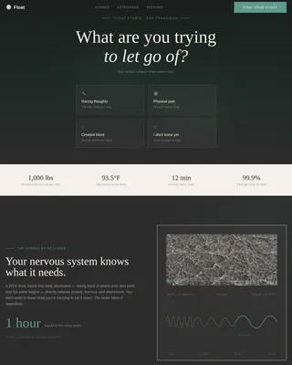
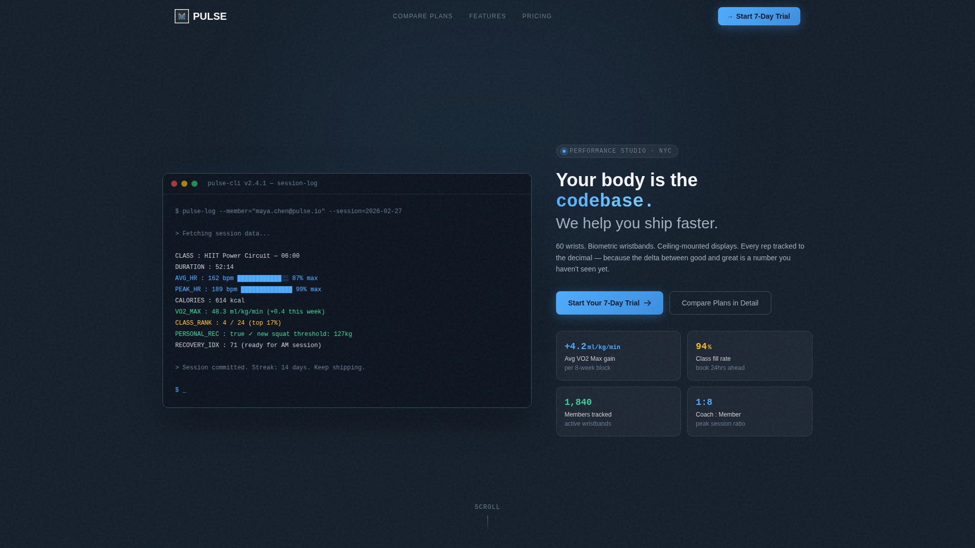
Terminal-Style Code Snippet Header
The header renders a real member's workout log as software output on a dark, monospaced terminal background. It displays class name, timestamp, average heart rate, calories, class rank, and a personal record flag. A single headline fades in below it: no stock photography, just data that implies excellence.
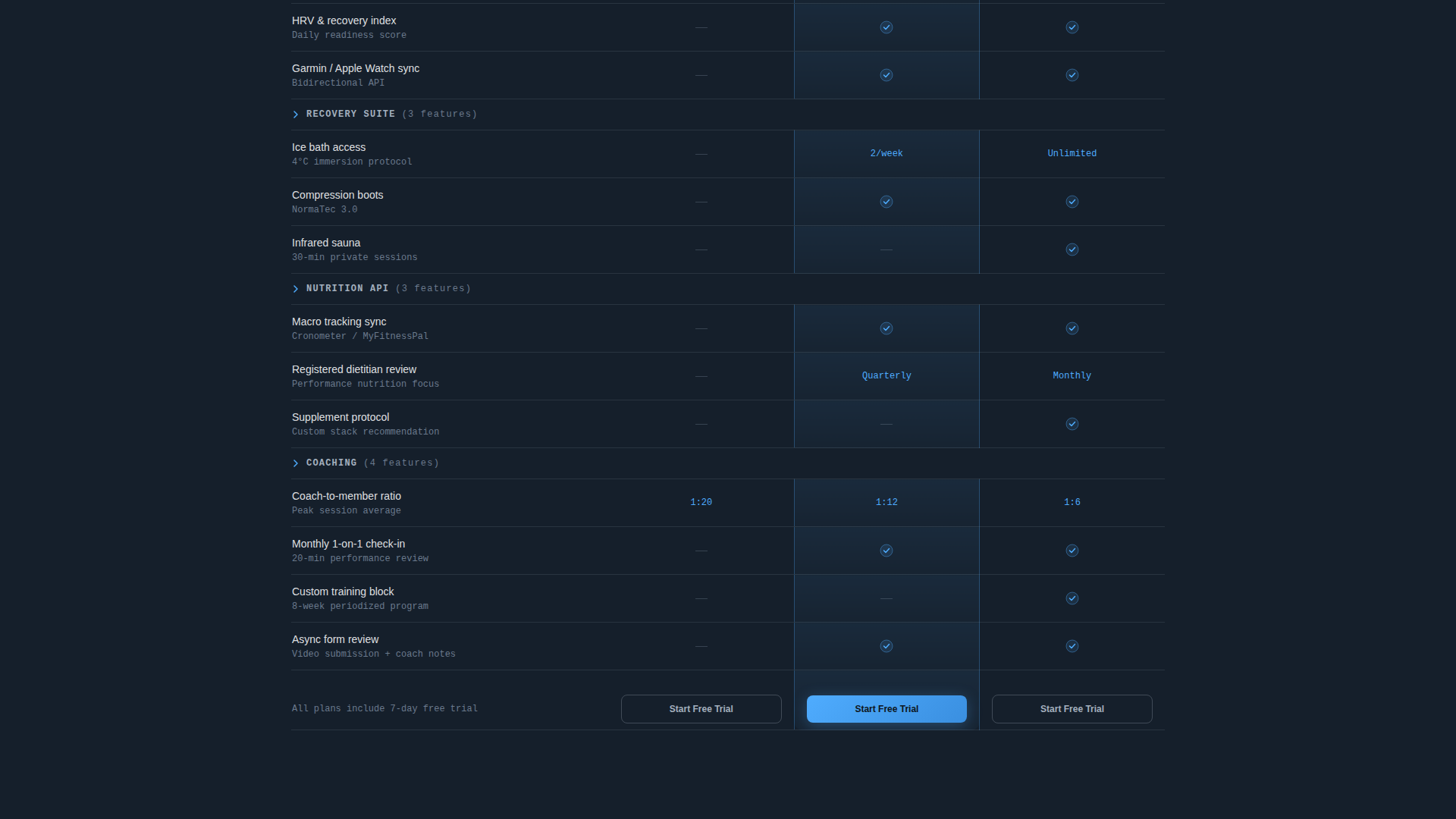
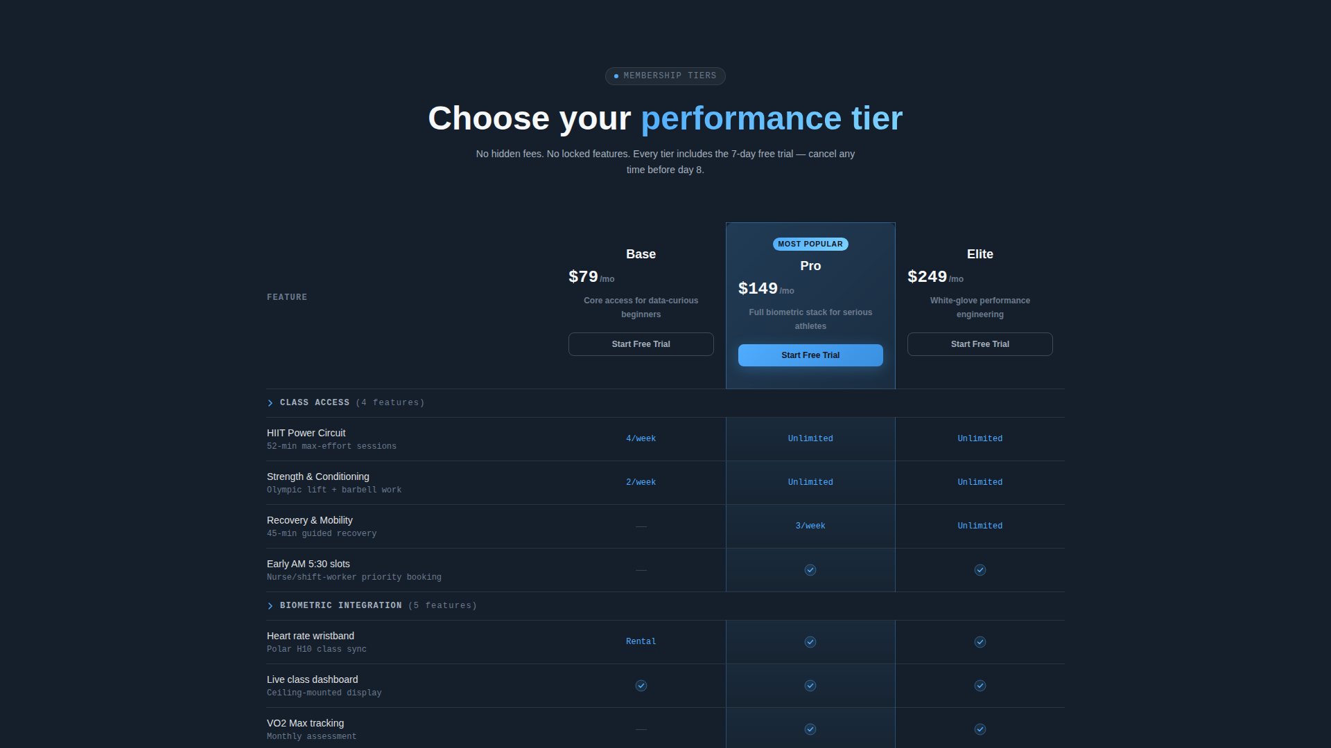
Three-Tier Membership Comparison Table
The comparison table presents three membership columns side by side, growing in feature density from left to right like a SaaS pricing grid. Rows cover class types, biometric integrations, recovery suite access, nutrition API sync, and coach-to-member ratio. Highlighted cells use the sky blue accent to direct the eye toward the recommended tier.
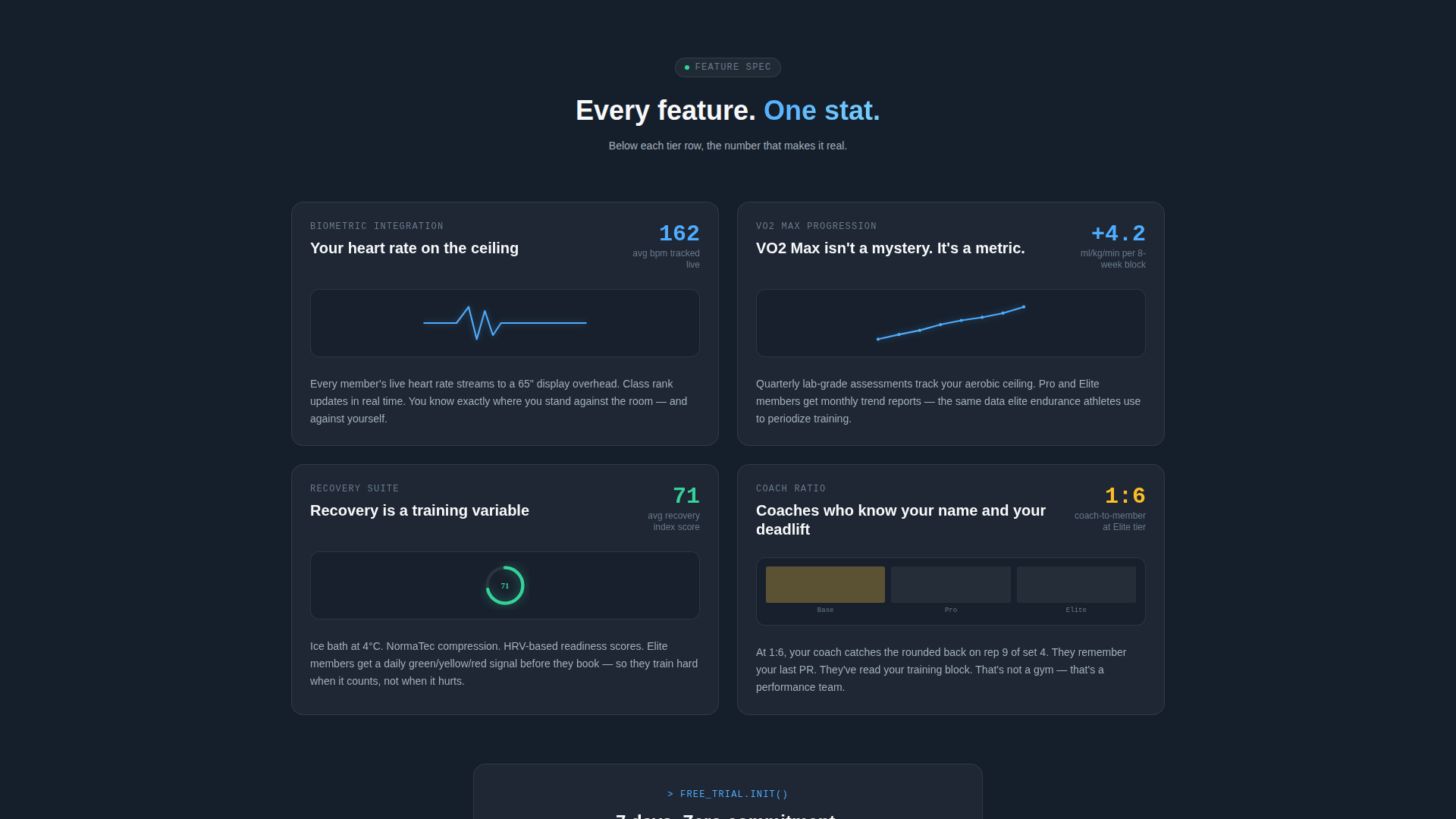
Expandable Feature Row Sections
Below the main table, each feature row expands into its own mini-section. Each mini-section shows a single stat, a one-sentence explanation, and a micro-animation of the metric in motion. The scroll creates a rising sense of value that leads naturally to the trial call to action.
Pinned Trial Conversion Form
The primary call-to-action reads "Start Your 7-Day Trial" and is pinned to the bottom of the viewport on mobile. The form captures first name, email, and preferred first-class time through a real-time availability slot picker. The call to action repeats at the header, mid-table, and final section to catch visitors at every decision point.
Secondary Anchor Navigation
A secondary path labeled "Compare Plans in Detail" anchors the visitor directly to the full comparison table. This gives analytical visitors a low-pressure way to gather more information before committing. It reduces bounce by matching the template to two distinct visitor intents.
Tech Glass Visual System
The design uses a deep graphite slate background, polished aluminum surfaces, sky blue accent elements, and clinical white card typography. The palette feels cool, backlit, and engineered. Every color choice reinforces the performance lab identity rather than a lifestyle brand.
Page sections overview
| Section | Purpose |
|---|---|
| Code Snippet Header | Opens with a terminal-style workout log and a single fading headline |
| Comparison Table | Presents three membership tiers side by side in a spec-sheet grid |
| Mid-Table call to action | Repeats the trial sign-up prompt for visitors scanning the table |
| Expandable Feature Rows | Breaks each table row into a stat, explanation, and micro-animation |
| Trial Sign-Up Form | Captures name, email, and preferred class time with slot availability |
| Final call to action Section | Closes the page with a last push toward the 7-day trial |
Design & branding system
The template follows a Tech Glass theme built on the Slate and Sky color system. Every visual decision reinforces a performance lab identity rather than a traditional gym aesthetic.
- Deep graphite slate (#1E2A38) for primary backgrounds, open-sky blue (#4FACFE) for calls to action and highlighted table cells, polished aluminum (#A4B0BE) for secondary surfaces and table borders, and clinical white (#F7F8FA) for card surfaces and body text
- Monospaced terminal typography in the header, paired with clean sans-serif body text for contrast and readability
- No stock photography anywhere on the page; data visualization and metric displays replace lifestyle imagery throughout
Mobile & speed optimization
The page is structured for fast loading and smooth mobile interaction. The most critical conversion element, the trial call to action, is always within thumb reach on smaller screens.
- The primary "Start Your 7-Day Trial" button is pinned to the bottom of the viewport on mobile so it never scrolls out of reach
- The comparison table is designed to reflow for narrower screens without losing tier differentiation
- Micro-animations in the expandable feature rows are designed to enhance the scroll experience without adding unnecessary load weight
How this template helps you convert
The entire page is sequenced to move a skeptical, data-driven visitor from curiosity to trial sign-up without pressure or ambiguity.
- The terminal header front-loads real performance numbers, establishing credibility before asking for anything from the visitor.
- The comparison table gives analytical visitors the transparent tier breakdown they need, and the secondary anchor link lets them jump straight to it from the top of the page.
- The pinned call to action, repeated form placements, and slot picker with real-time availability remove every remaining barrier between interest and action.
Other information about this template
This template is categorized under fitness studio website templates with a specific focus on lead capture for performance-oriented studios. It is a strong fit for studios running freemium or trial-first acquisition models.
- The template style is a comparison table layout, making it particularly effective for studios offering multiple membership or class-pack options
- The creative direction follows a spec sheet logic, which mirrors the mental model of the target audience: analytical professionals who evaluate options like software products
- The header concept is a code snippet display, a design choice that signals technical sophistication and resonates with the software engineers, product managers, and data-driven professionals in the target audience
- This template is built as a single landing page, not a multi-page website, so it is best used as a dedicated acquisition or campaign page alongside an existing studio site or booking system
Theme
Tech Glass
Creative direction
Spec Sheet
Color system
Slate & Sky
Style
Comparison Table
Direction
Freemium/Trial
Page Sections
Terminal-style Workout Log Header
Three-tier Membership Comparison Table
Expandable Feature Row Sections
Pinned Mobile Trial Call to Action
Real-time Class Slot Picker Form
Secondary Anchor Navigation Path
Related questions
Can I customize the membership tier names and row content in the comparison table?
Does the slot picker for class time selection connect to a live booking system?
Is this template suitable for a studio that does not use biometric tracking?
What does the secondary 'Compare Plans in Detail' link do?
Can I update the terminal-style header to show my studio's actual performance numbers?