Supply Chain & Procurement Booking Website Template
Vendara is a single-page procurement landing page template built for vendor management firms and supply chain consultancies. It pairs a provocative editorial headline with an alternating zigzag layout, team-led storytelling, and a dual conversion path, a direct meeting booking form and a gated PDF download, designed to turn overwhelmed procurement leaders into qualified leads.
by Rocket studio
Quick summary
Vendara is a bold, editorial-style landing page template for vendor management and procurement services. It opens with a headline that stings just enough to be memorable, walks prospects through a team-driven zigzag narrative, and closes with two conversion options. The design feels authoritative without being cold, sharp enough for a CFO, readable enough for anyone.
Who this template is for
This template is built for firms that sit between large organizations and the suppliers those organizations struggle to manage. It speaks directly to the professionals selling that kind of order.
- Vendor management consultancies and procurement service providers
- Supply chain strategists and sourcing advisors targeting enterprise clients
- Category management consultants pitching to procurement directors, COOs, and CFOs
What problem this template solves
Procurement service providers often lose deals not because their work is weak, but because their positioning looks generic. A template that looks like every other agency page fails to earn trust from buyers who manage complexity for a living.
- Prospects cannot quickly identify whether the team has real operator experience
- There is no clear visual proof of discipline depth across contracts, compliance, and sourcing
- Most pages offer a single call to action, losing leads who are not yet ready to book a call
What you get with this template
You get a fully structured single-page layout that moves a prospect from skeptical to convinced through editorial storytelling and layered conversion design. Every section serves a specific role in the buyer journey.
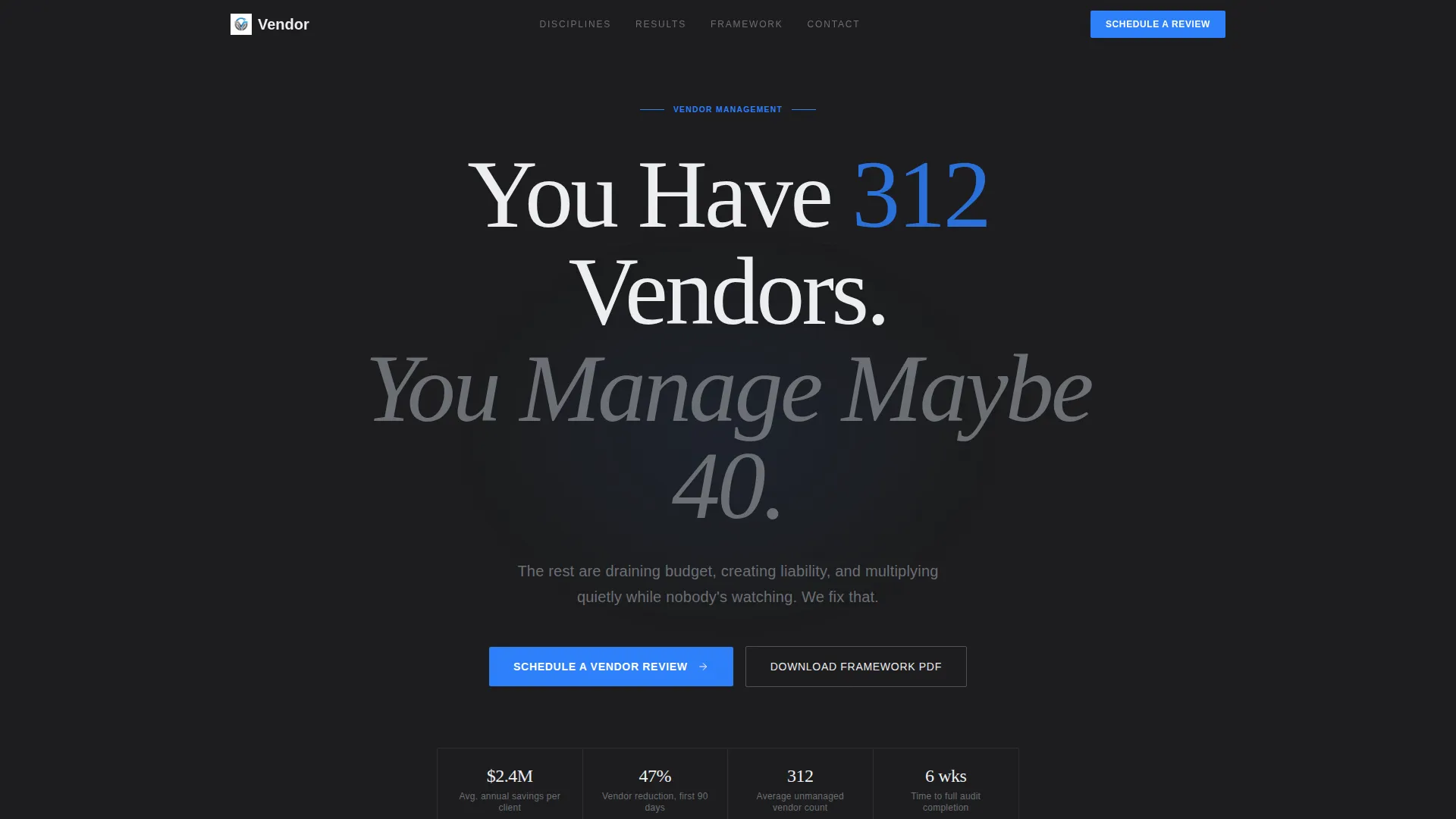
- A centered giant headline section with a signal-blue call-to-action button on deep graphite
- Alternating zigzag content sections pairing black-and-white team portraits with discipline-specific copy and bold key metrics
- A primary booking form and a secondary gated PDF download path, each capturing different stages of buyer readiness
Feature list
A summary of the template's built-in capabilities as defined in the design brief.
Provocative Hero Headline
The header uses oversized editorial serif type, white on deep graphite, to deliver a pointed, data-driven statement that makes procurement leaders feel personally addressed. A single subline in steel gray sits below, and one signal-blue call-to-action button floats in negative space beneath it. No imagery, no illustration. The typography carries all the weight.
Zigzag Team Narrative Layout
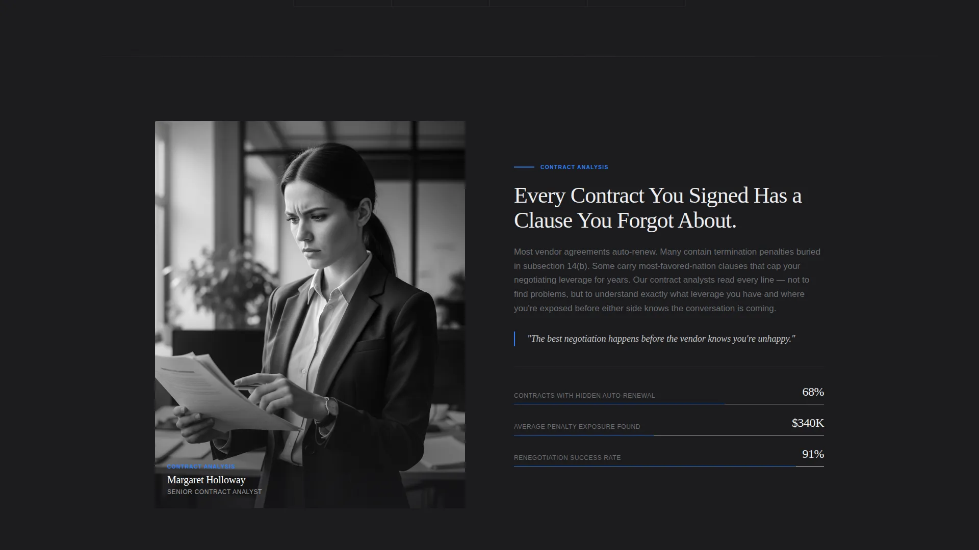
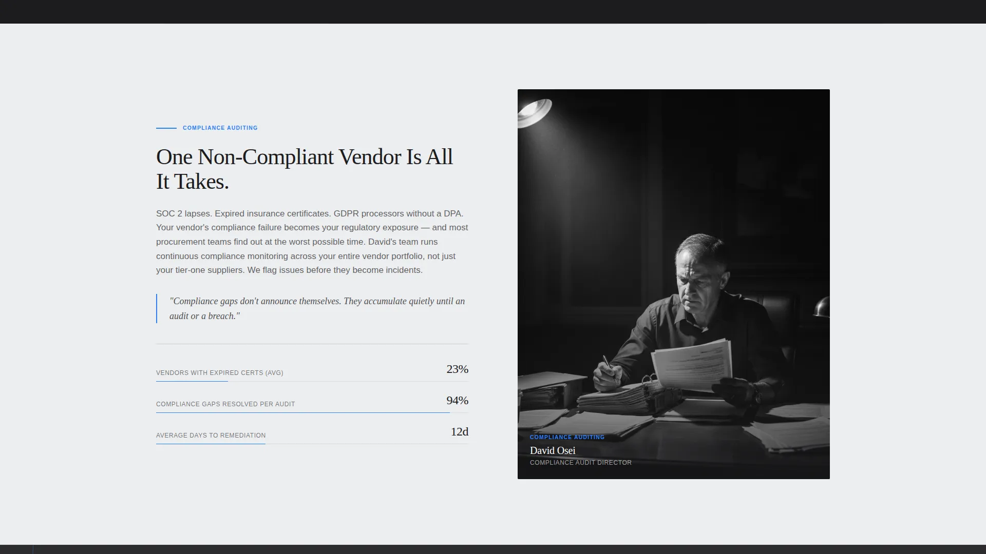
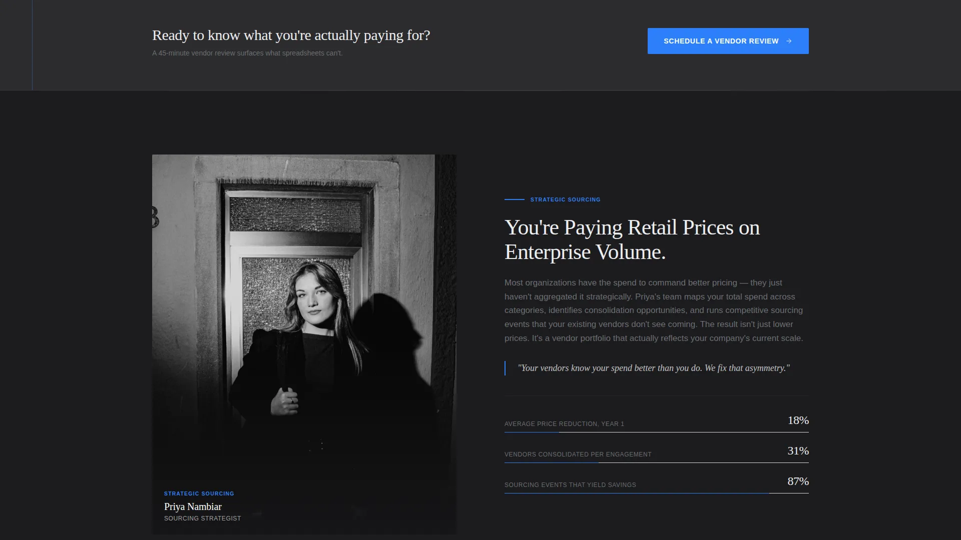
Each alternating section introduces a specific vendor management discipline by pairing a black-and-white editorial portrait with structured copy. The portrait sits on one side, the discipline detail on the other, switching sides with each section. This rhythm creates a feature-story feel that builds confidence with every scroll.
Dual Conversion Path Design
The template includes two conversion options. The primary path is a "Schedule a Vendor Review" form collecting company name, vendor count range, primary pain point, and work email. The secondary path offers a downloadable "Vendor Rationalization Framework" PDF gated behind email only, capturing leads who are not yet ready to schedule a meeting.
Repeating Call-to-Action Placement
The primary call-to-action is placed in the header and repeated after every third content section. This pattern keeps conversion opportunities visible throughout the scroll without interrupting the editorial flow.
Monochrome Portrait Photography Style
The template's creative direction calls for tight, dramatically side-lit black-and-white editorial portraits, one per discipline section. This visual system gives every team role equal visual gravity and keeps the palette strictly controlled.
Structured Pain-Point Form Fields
The vendor review form uses a vendor count range selector (50 to 150, 150 to 500, 500 and above) and a single pain-point dropdown (cost leakage, compliance risk, consolidation, or visibility). This structure qualifies leads at the moment of capture without adding friction.
Page sections overview
| Section | Purpose |
|---|---|
| Hero Headline Section | Hooks the reader with a provocative vendor-count statement and primary call to action |
| Contract Analyst Profile | Introduces contract negotiation discipline with portrait and key metrics |
| Compliance Auditor Profile | Covers compliance tracking with editorial portrait and pull-quote copy |
| Sourcing Strategist Profile | Details supplier sourcing work with side-lit portrait and bold outcomes |
| Vendor Review Form | Captures qualified leads via company name, vendor count, pain point, and email |
| PDF Download Gate | Converts early-stage leads with a gated Vendor Rationalization Framework offer |
| Repeating call to action Block | Reinforces the primary call-to-action after every third content section |
Design & branding system
The template uses an Editorial Magazine theme with a Monochrome Steel color palette. The visual language is restrained, typographic, and intentionally allergic to decoration.
- Colors: deep graphite (#1C1C1E) for header and alternate section backgrounds, brushed steel mid-tone (#6B6E73) for sublines and secondary text, cool paper white (#EDEEF0) for light-background sections, and signal blue (#2D7FF9) reserved exclusively for call-to-action buttons and data highlights
- Typography: large-format editorial serif for headlines and section titles, clean sans-serif for body text and form labels, with generous whitespace replacing decorative elements
- Sections alternate between graphite and white backgrounds, and all photography is black-and-white with dramatic side-lighting to maintain strict palette control
Mobile & speed optimization
The layout is built to stay readable and functional on smaller screens without losing its editorial weight. Structural choices keep the page light and purposeful.
- The zigzag columns stack vertically on mobile, keeping portrait and copy in clear reading order
- Large serif headlines scale down proportionally to maintain visual hierarchy without crowding
- The lean, image-light design (monochrome photography, no illustrations) keeps asset weight low and load performance practical
How this template helps you convert
The page earns conversion by making the prospect feel understood early, then systematically proving team depth before the ask arrives.
- The headline names the exact problem, too many vendors, not enough real management, so the right buyer self-selects within seconds of landing on the page.
- The zigzag team sections build trust incrementally, showing specific disciplines and real human faces rather than generic service bullets.
- The dual conversion path captures both high-intent leads ready to book and research-stage leads willing to share an email for a practical framework document.
Other information about this template
This template is designed for the supply chain and procurement professional services category. It suits firms positioning themselves as operators rather than advisors, teams that have held the roles they now consult on.
- The template style follows a comparison-table-adjacent editorial structure, with clear discipline-by-discipline breakdowns that let buyers benchmark service depth at a glance
- The theme draws from Corporate Precision principles: structured, data-confident, and written for readers who value directness over decoration
- The header concept uses a dark full-bleed approach with a centered typographic focal point, consistent with high-authority professional services positioning
- The creative direction is rooted in an expert-panel framing, where each section introduces a named discipline and the human responsible for it, creating a roster of credibility rather than a list of features
- This template is well suited for category management consulting firms looking to differentiate on operational depth rather than service breadth
Theme
Corporate Precision
Creative direction
Expert Panel
Color system
Navy Authority
Style
Comparison Table
Direction
Click-Through
Page Sections
Provocative Editorial Hero Headline
Alternating Zigzag Team Sections
Dual Conversion Path
Structured Lead Qualification Form
Repeating Call-to-action Blocks
Related questions
Who is this landing page template designed for?
What conversion options does this template include?
Can I use my own team photography with this template?
Does the form help qualify leads before they book a call?
Can I edit the headline numbers and copy to match my firm?



