Venture — Elite Camping Landing Page Template
Basecamp is a bento grid landing page built for a premium quarterly camping cookware and gear subscription box. It guides backcountry minimalists, thru-hikers, and thoughtful gift-givers from a striking black-void header through a layered unboxing experience, ending at a clear "Choose Your Box" call to action that drives visitors to a plan comparison page.
by Rocket studio
Quick summary
Basecamp is a single-page, click-through landing page designed for a premium camping cookware and gear subscription box. The layout uses a dark bento grid structure to simulate an unboxing experience. Each scroll beat reveals another layer of gear, building desire until the visitor clicks through to a plan selector.
Who this template is for
This template suits brands that sell curated, high-quality outdoor gear through a subscription model. It works equally well for founders launching a new box service and for established stores looking to elevate their landing page presence.
- Subscription box brands in the outdoor and camping cookware space
- Gift-focused retailers selling premium gear to hikers and campers
- Creators and side-project founders building a premium outdoor product brand
What problem this template solves
Most subscription box pages lead with a form or a price list too early. Visitors leave before they feel the product's value. Basecamp flips that sequence by letting the visual unboxing do the persuasion first and saving the click for when desire peaks.
- Generic box pages fail to communicate the physical quality and curation behind each item
- Visitors need to feel the premium before they commit to a recurring charge
- No-form, click-through layouts reduce friction and keep the conversion path clean
What you get with this template
You get a fully structured single-page layout built around a bento grid system. Every section is designed to deepen product desire as the visitor scrolls, ending with a pinned call-to-action bar that stays visible after the second scroll.
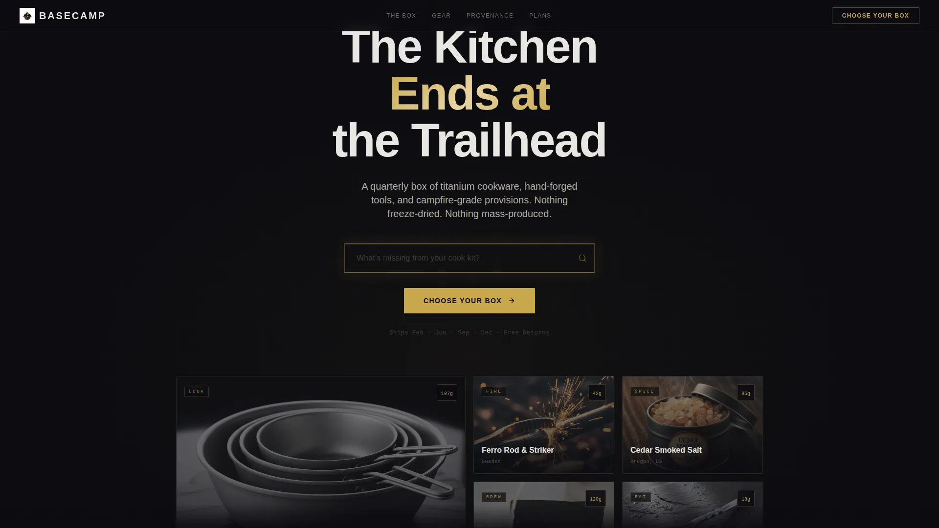
- A black-void header with a gold-bordered search input and a ghost-text prompt
- Three layered bento grid rows that simulate peeling open the subscription box
- A pinned bottom call-to-action bar reading "Choose Your Box" in gold on black
Feature list
This section covers the core built-in components that make Basecamp distinctive and ready to use.
Gold-Bordered Header Search Input
The header opens on a pure black void. A single centered input field with a gold border and ghost text reading "What's missing from your cook kit?" greets the visitor. The field is surrounded by deliberate negative space, making the first impression feel editorial and intentional.
Bento Grid Unboxing Layout
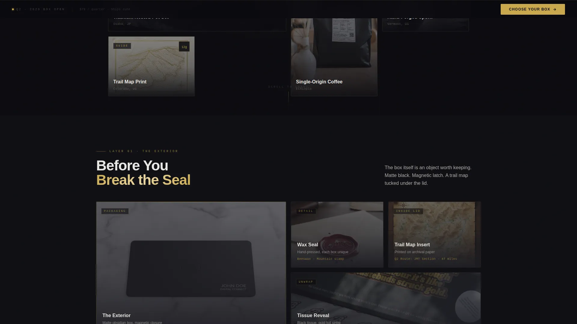
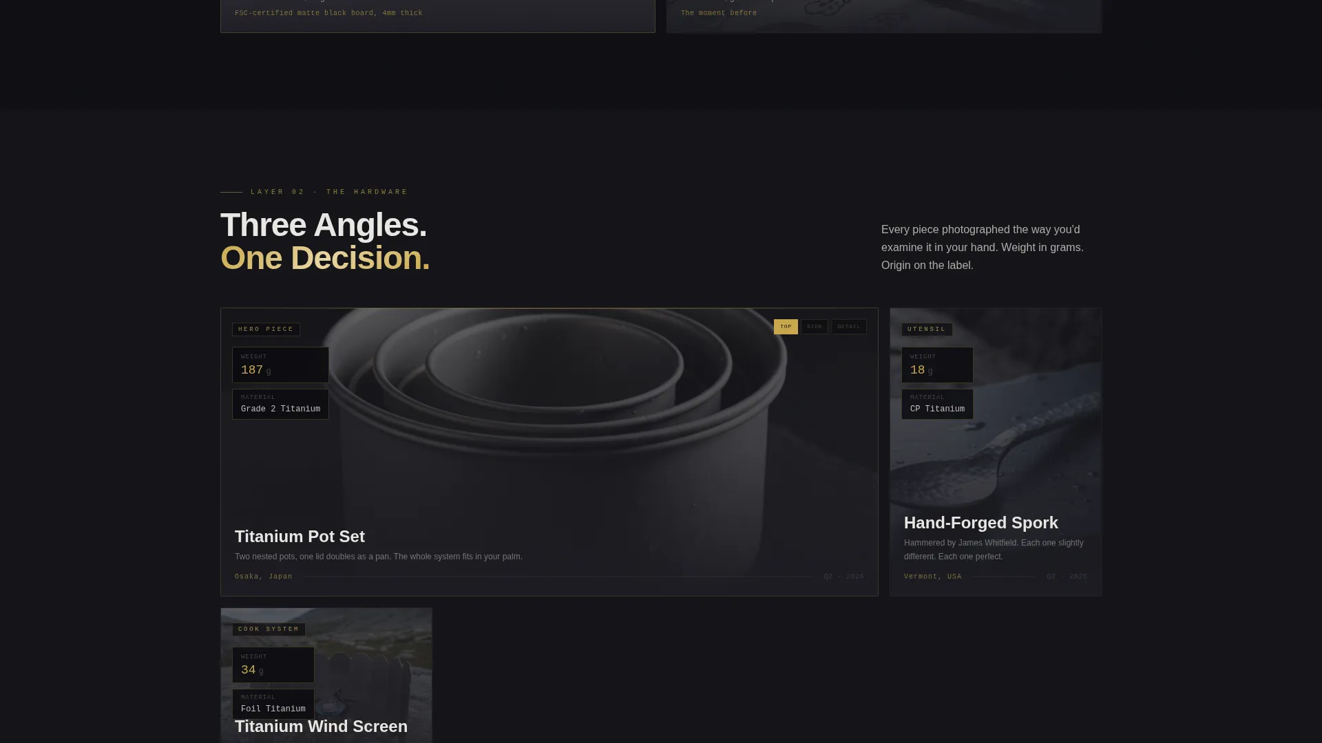
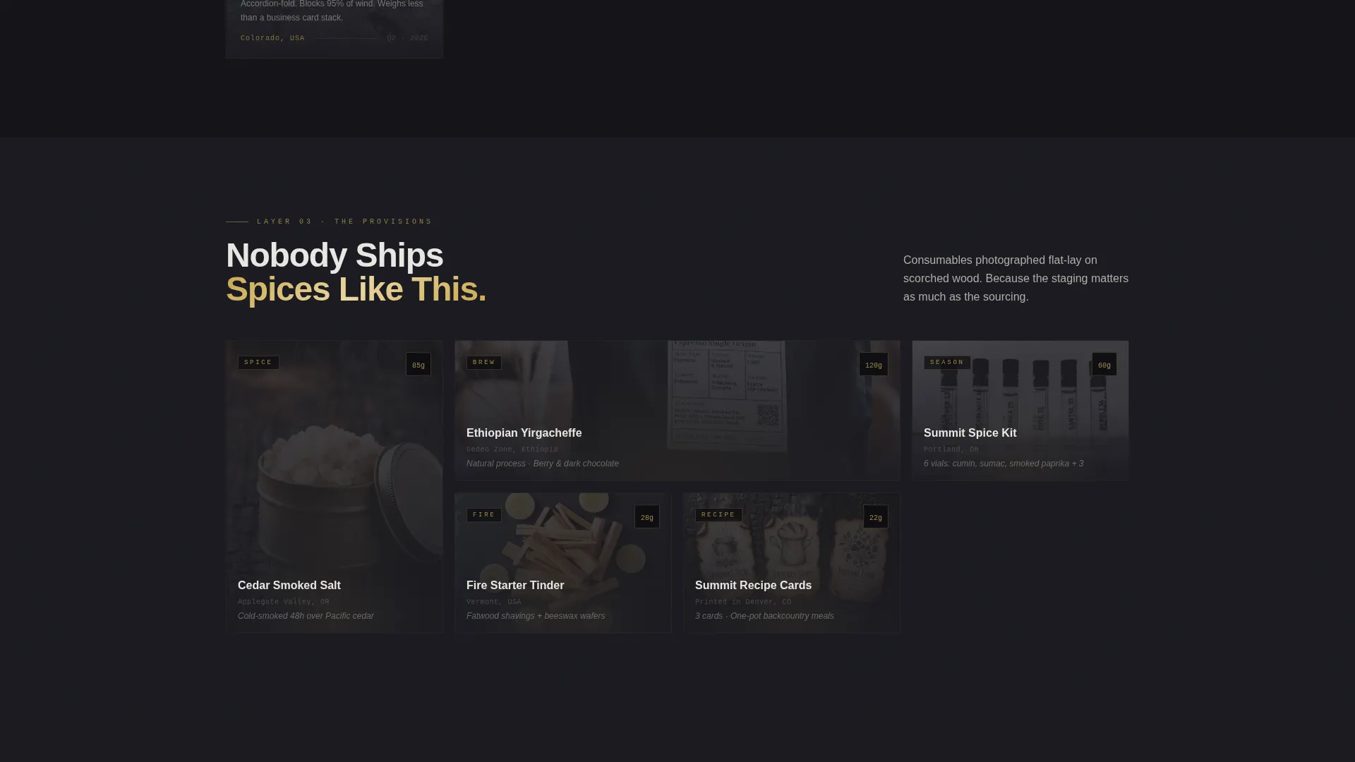
The page body is structured as three bento grid rows, each representing a deeper layer inside the subscription box. The top row shows exterior packaging details, the middle row highlights hero gear from multiple angles with stat overlays, and the bottom row features consumables laid out flat on scorched wood backgrounds.
Stat Overlay Product Tiles
Each hero product tile in the middle grid carries a single stat overlay. Weight in grams and material origin appear directly on the image. This keeps the layout minimal while communicating the kind of detail that premium gear buyers care about.
Retail Value Callout Grid
The final bento grid cell displays every included item laid out together with individual retail-value callouts. The combined total is shown to be roughly three times the box price. This section closes the value case visually without needing long body copy.
Pinned "Choose Your Box" Bar
After the visitor scrolls past the second section, a slim bottom bar locks to the viewport. It shows the primary call to action in warm bullion gold text on a deep black background. The bar stays present without blocking content, keeping the click one tap away at all times.
Progressive Brightness Scroll Effect
Each bento grid row is designed to be slightly brighter than the one above it. The page transitions from deep obsidian darkness toward golden warmth as the visitor scrolls. This visual metaphor mirrors eyes adjusting to a campfire, creating a sensory pull through the page.
Page sections overview
| Section | Purpose |
|---|---|
| Black Void Header | Opens with gold-bordered search input and breathing room |
| Top Bento Row | Reveals exterior packaging, wax seal, and trail map |
| Middle Bento Row | Showcases hero gear with stat overlays from three angles |
| Bottom Bento Row | Displays consumables flat-lay on scorched wood |
| Value Callout Grid | Lays out all items with retail prices totaling box value |
| Pinned call to action Bar | Keeps "Choose Your Box" click visible after second scroll |
Design & branding system
The visual identity follows a Luxe Minimal theme built around an Obsidian and Gold color system. The palette is restrained and deliberate, designed to feel like premium outdoor equipment rather than a typical e-commerce page.
- Deep volcanic black (#0B0B0F) as the primary background, brushed charcoal (#1C1C22) for card surfaces, warm bullion gold (#C9A84C) on accent lines and hover states, and alpine fog (#E8E6E1) for body text
- Matte-black packaging aesthetic carried through every grid tile, with product photography shot on obsidian linen surfaces
- Gold borders, gold call-to-action text, and gold hover states create a consistent precious-metal accent thread across the entire page
Mobile & speed optimization
The bento grid layout is structured to adapt cleanly across screen sizes. Product tiles restack without losing the unboxing narrative sequence, so mobile visitors move through the same layered reveal as desktop users.
- Grid cells reflow to single-column stacks on small screens while preserving section order
- The pinned bottom call-to-action bar remains anchored on mobile, keeping the click accessible throughout the scroll
- Product stat overlays remain readable at smaller tile sizes without requiring additional layout changes
How this template helps you convert
Basecamp is built as a click-through page, meaning every design decision points toward a single action. There is no form, no distraction, and no competing path.
- The black-void header and gold-bordered input create immediate premium brand perception before any product is shown, setting the right expectations for the price point.
- The three-row unboxing grid builds desire progressively, holding the visitor's attention through each scroll beat until the value callout grid makes the subscription feel like an obvious decision.
- The pinned "Choose Your Box" bar means the call to action is always one tap away, reducing the effort required to convert at the exact moment desire peaks.
Other information about this template
This template is categorized under Retail and E-Commerce, specifically within the camping cookware and gear store subcategory. It is a strong fit for dropshipping store models in the outdoor niche as well as direct-to-consumer subscription brands.
- The page is designed to link out to a separate plan comparison page rather than hosting pricing or a checkout form itself
- The Masonry and Pinterest-style bento grid approach is adapted here into a structured three-row narrative rather than a freeform feed
- The template's Luxe Minimal theme and Obsidian and Gold palette can be adapted to other premium outdoor or lifestyle subscription concepts beyond camping cookware
Theme
Luxe Minimal
Creative direction
Unboxing Experience
Color system
Lavender Dream
Style
Masonry/Pinterest
Direction
Upsell/Upgrade
Page Sections
Gold-bordered Header Search Input
Bento Grid Unboxing Layout
Stat Overlay Product Tiles
Retail Value Callout Grid
Pinned Call-to-action Bar
Progressive Brightness Scroll Effect
Related questions
Does this template include a pricing or checkout section?
Can I use this template for a different type of subscription box?
What makes this layout different from a standard product landing page?
Is the 'Choose Your Box' call to action the only conversion element?
How does the retail value callout work?



