Trekking & Hiking Tour Company Website Template
Trail is a cinematic horizontal-scroll landing page built for trekking and hiking tour companies. It guides visitors through four atmospheric acts, from dense jungle canopy to summit dawn, using scroll-linked parallax, a full-screen video header, and a Rainforest color system. By the final panel, visitors feel ready to book before they have even seen a form.
by Rocket studio
Quick summary
Trail is a single-page, horizontal-scroll landing page template designed for adventure travel and hiking tour operators. It uses a film-reel scroll structure, cinematic video header, and a deep Rainforest palette to put visitors inside the trek before they commit to booking. The design earns the click through immersive storytelling, not form pressure.
Who this template is for
This landing page is built for tour operators, guides, and small travel agency teams who lead groups into terrain that standard booking platforms cannot describe. It fits businesses that sell the experience first and the logistics second.
- Trekking and hiking tour companies running small-group expeditions through cloud forests, volcanic ridges, or river valleys
- Adventure travel operators who need a hiking landing page that communicates route difficulty, group size, and atmosphere at a glance
- Independent guides replacing a generic hiking website with something that matches the quality of their trails
What problem this template solves
Most hiking landing page designs fail at the hardest part: making someone feel the trail before they buy. A flat grid of photos and a booking form cannot answer the emotional question, "Is this worth leaving my desk for?" The Trail template solves that by replacing the standard travel landing page pattern with a scroll experience that mirrors the journey itself.
- First-time trekkers need emotional permission and logistics confidence before they sign up
- Seasoned hikers chasing off-map routes need route credibility, elevation data, and a clear description of what sets these adventures apart
- Both audiences abandon a hiking landing page that feels generic; this design holds attention by making the scroll feel like walking
What you get with this template
The template ships as a complete, ready-to-adapt hiking landing page. Every section is pre-structured so you can get started with real content immediately, without rebuilding the layout from scratch.
- A full-screen video header with a single cinematic reveal line and a compass call-to-action icon that transitions into the main button
- Four horizontal scroll panels covering jungle approach, valley route stats, camp life, and summit dawn, each with scroll-linked parallax foliage layers
- A warm tree-frog orange call-to-action button and a secondary route map text link placed at the end of the horizontal sequence
Feature list
The Trail landing page template is built around a set of interconnected design and interaction tools that work together to move visitors from curiosity to commitment.
Full-Screen Cinematic Video Header
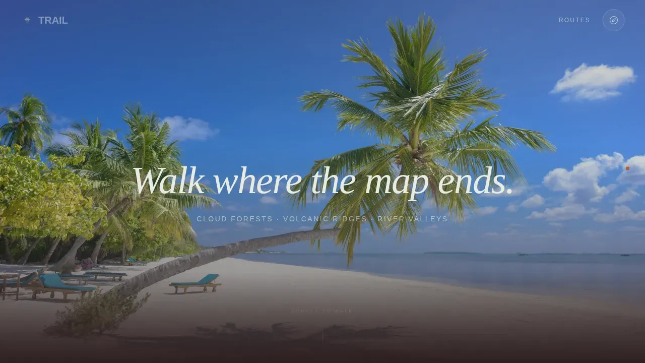
A continuous drone-shot video rises from a hiker's boots on a narrow ridge, pulls back across emerald mountains, and breaks above low clouds into golden light. Text appears only after the clouds break, letting the visual earn its moment. The compass call-to-action icon sits quietly in the header, ready for visitors who decide early.
Four-Act Horizontal Scroll Sequence
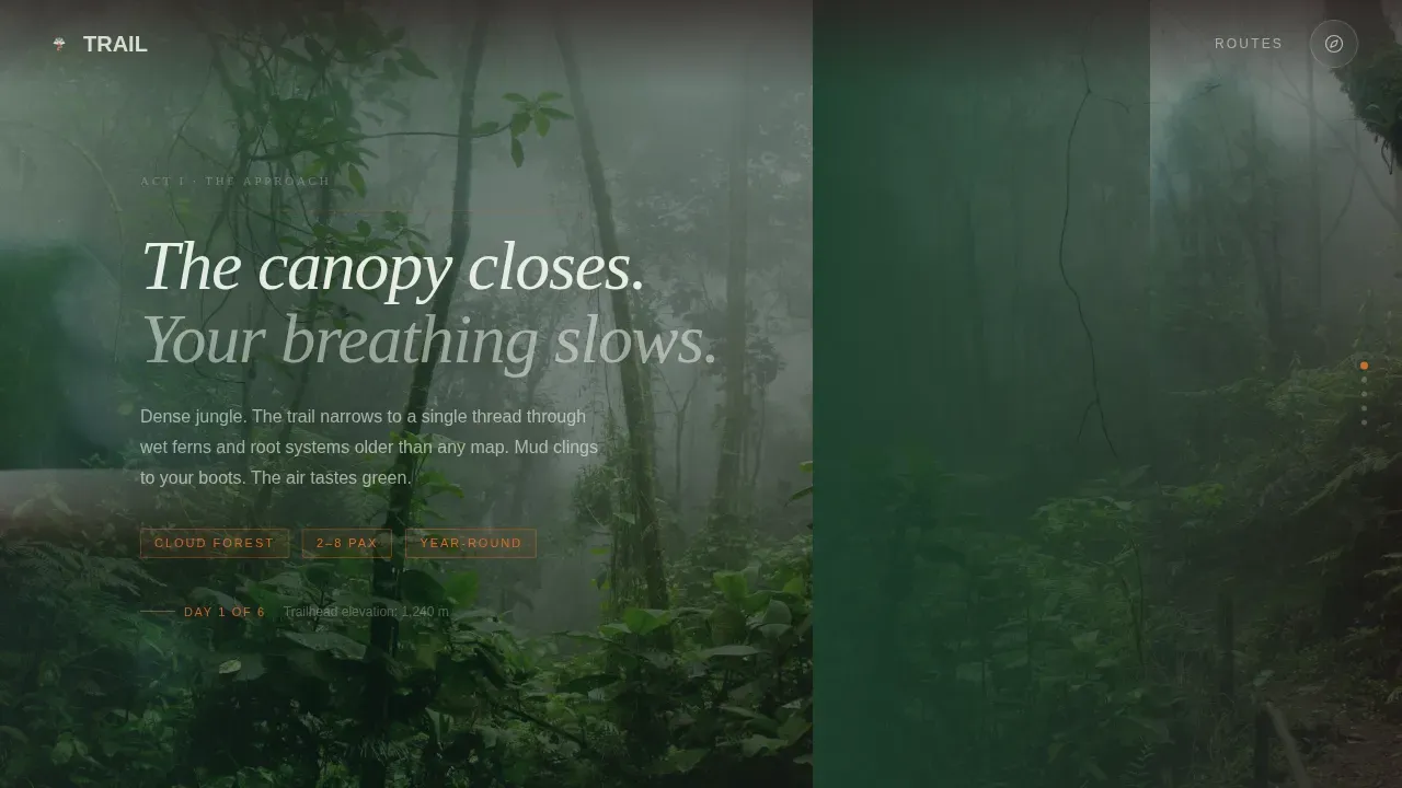
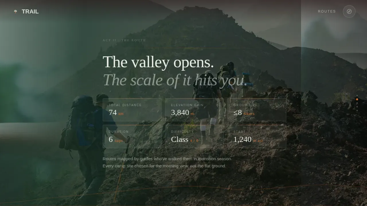
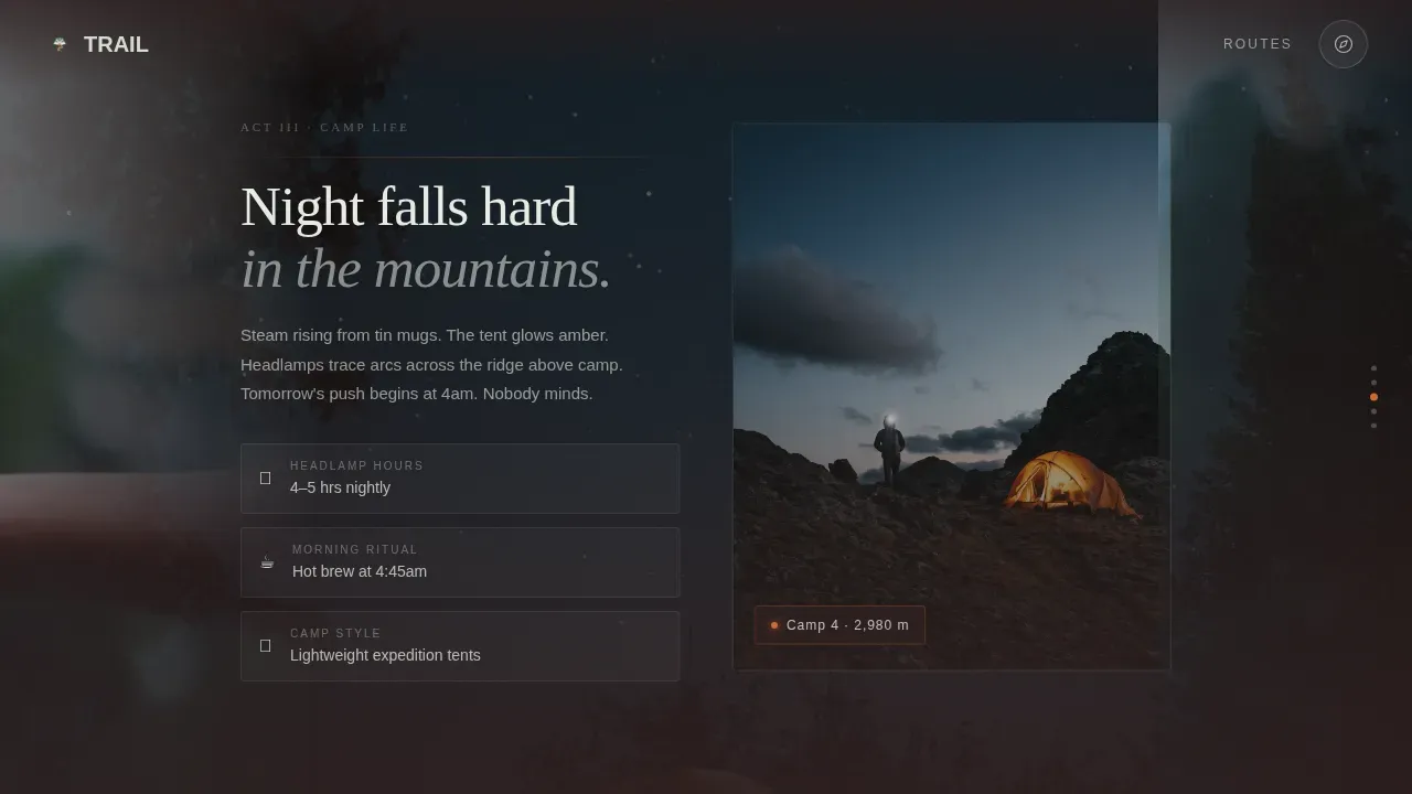
Each lateral swipe advances a new act of the trek. Act one is dense jungle close and humid. Act two opens a wide valley with topographic route stats displayed as a heads-up display overlay. Act three drops into camp life with headlamps and amber tent glow. Act four delivers the summit dawn push with a blue-to-gold color shift. This design makes the scroll feel like forward motion through landscape.
Scroll-Linked Parallax Layers
Parallax foliage and terrain layers are built into every horizontal panel transition. As visitors scroll, foreground leaves, mid-ground ridgelines, and background sky move at different speeds, giving genuine depth. The effect is achieved with GPU-accelerated transforms and CSS animation timeline so the motion stays smooth.
Topographic HUD Badges
Route distance markers, elevation figures, and group size indicators appear as floating heads-up display badges over the valley panorama panel. These design elements serve as social proof and practical information at the same time, giving detail-driven hikers the climbing stats they need to trust the route.
Tree-Frog Orange Call-to-Action System
The primary call-to-action, "Choose Your Trail," starts as a subtle compass icon in the header and grows into a large, warm button in tree-frog orange at the end of the scroll sequence. A secondary text link, "See the Full Route Map," sits beneath it for visitors who want elevation profiles before they sign. No form appears on this page; the scroll earns the click.
Rainforest Palette and Organic Typography
The Rainforest color system shifts backgrounds from volcanic soil to deep canopy to morning fog as the visitor travels through the page. Display headings use a serif weight that reads like a trail journal. Body text lives in light clearings of fog white, keeping readability high even against dark, atmospheric backgrounds.
Page sections overview
| Section | Purpose |
|---|---|
| Video Hero Header | Cinematic drone reveal with single text line and compass icon call-to-action |
| Act One: Jungle Approach | Dense canopy atmosphere sets the immersive tone for the trek |
| Act Two: Valley Panorama | Wide landscape with topographic route stats and HUD elevation badges |
| Act Three: Camp Life | Headlamp and tent visuals show the human side of the expedition |
| Act Four: Summit Dawn | Blue-to-gold color shift delivers the emotional peak of the journey |
| Call-to-Action Panel | Primary orange button plus secondary route map text link, no form |
| Minimal Footer | Vercel horizontal flow pattern, unobtrusive close to the experience |
Design & branding system
The visual identity follows an Organic Flow theme built entirely around the Rainforest color system. Every color choice comes from the landscape itself, not from convention.
- Deep canopy green (#1A3C2A), wet volcanic soil (#2C1E1E), morning fog white (#E8EDE4), and tree-frog orange (#D46A2D) form the complete palette; orange is reserved for call-to-action elements and distance markers
- Fraunces serif is used for display headings to create a trail-journal feel; DM Sans handles body text for clarity and modern legibility
- Backgrounds shift from soil to canopy to fog across the horizontal scroll, with interactive elements styled to glow like something alive on the forest floor
Mobile & speed optimization
The horizontal scroll experience is designed desktop-first, with a vertical fallback built in for smaller screens. Both layouts are structured to load quickly and feel responsive.
- The video header is lazy-loaded to avoid slowing the initial page render, keeping the experience fast on the first device contact
- CSS-only parallax layers and GPU-accelerated transforms keep animation smooth without heavy JavaScript overhead
- The mobile vertical layout keeps buttons touch-friendly and the scroll easy, so the hiking landing page works well for users arriving from social links on a phone
How this template helps you convert
This hiking landing page is built around a single conversion idea: let the visitor walk the trail before you ask them to book it. Every design decision supports that goal.
- The scroll sequence earns trust gradually, moving from atmosphere through logistics through emotion before the call-to-action appears; by the summit panel, visitors have already decided
- HUD badges display practical details like route distance, elevation gain, and group size so detail-driven hikers get the information they need without leaving the page
- The "Choose Your Trail" button appears only after the full sequence, positioned as an open door rather than a demand, while the secondary route map link catches visitors who need one more data point before they sign
Other information about this template
Trail is a no-code-ready template, meaning it is set up so users can adapt it to their brand and get started without needing to write code from scratch. No-code templates like this simplify the process of building a polished hiking website, making professional adventure travel design accessible to small operators and independent guides who need a strong online presence without a large development budget.
- The template structure supports adding booking system links and travel agency details; a hiking website built on this template can display tour duration, difficulty level, and group size in the logistics sections
- AI-powered tools and natural language prompts can be used alongside templates like this one to help users quickly launch production-ready websites; AI tools can handle aspects like deployment, allowing non-technical operators to go live faster
- Creating a compelling hiking adventures website starts with graphics and visuals that match the quality of the experience; this template provides the visual scaffolding so operators can look credible from day one
- The trail cinematic trekking and hiking tour landing page template is well suited for travel agency teams in adventure tourism and eco-tourism niches who want their hiking landing page to stand apart from generic travel directory listings
Theme
Organic Flow
Creative direction
Cinematic Sequence
Color system
Rainforest
Style
Horizontal Scroll
Direction
Click-Through
Page Sections
Full-screen Cinematic Video Header
Four-act Horizontal Scroll Sequence
Scroll-linked Parallax Terrain Layers
Topographic HUD Badge Overlays
Tree-frog Orange Call-to-action System
Rainforest Palette and Organic Typography
Related questions
Does this template include a booking form?
Can I update the route stats and HUD badges for my own trails?
Is this template suitable for a small travel agency or independent guide?
How does the horizontal scroll experience work on mobile?
What makes this different from a standard hiking website template?