Background Check & Screening Reviews Website Template
A focused identity verification landing page built for B2B SaaS teams. It combines a split hero, a three-column comparison table with embedded customer testimonials, and a progressive lead generation form. The design runs on a dark indigo palette with a terminal-code aesthetic, and every section is structured to move fintech decision-makers toward a free trial signup.
by Rocket studio
Quick summary
This landing page template is built for an identity verification platform targeting fintech CTOs, compliance officers, and marketplace founders. It pairs a bold split-screen hero with a comparison table driven by real customer quotes, a growing social proof mosaic wall, and a sticky three-field lead generation form that captures signups without friction.
Who this template is for
This template is designed for B2B SaaS teams that need to convert informed, skeptical buyers. It works best when the product sells itself through proof, not persuasion.
- Fintech CTOs and compliance officers evaluating fraud prevention tools before a major onboarding push
- Marketplace founders and developer teams who need API access details and speed benchmarks before committing
- Product marketers building a direct-response page that must outperform a competitor comparison
What problem this template solves
Enterprise buyers in fintech and compliance do not convert on general marketing pages. They need to see direct comparisons, named evidence, and a clear path to trying the product. Generic templates skip all three.
- No side-by-side structure to show how the platform beats manual review and legacy providers on speed, accuracy, and compliance
- No social proof architecture that ties specific metrics to named customers rather than anonymous quotes
- No developer-specific conversion path that captures technical evaluators separately from business buyers
What you get with this template
You get a complete single-page layout with every section ready to populate with your platform's data and customer proof. The structure flows logically from hero claim to table evidence to form capture.
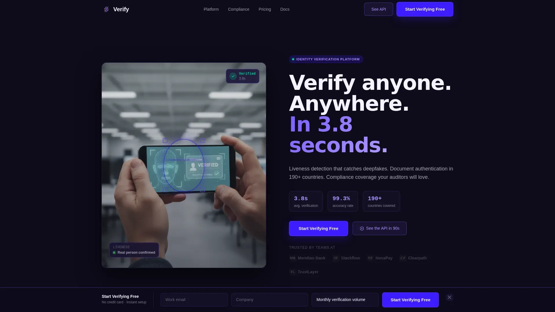
- A half-page photo and text split hero with an oversized headline, three proof points, a call-to-action button, and a five-logo client row
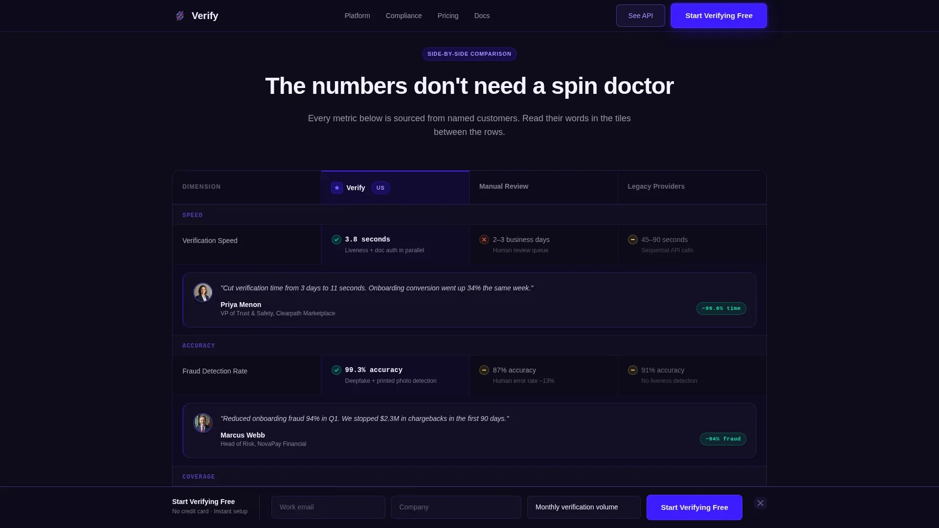
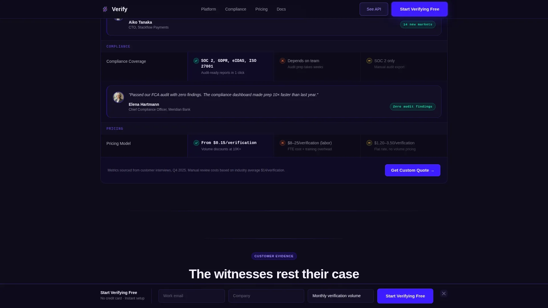
- A three-column comparison table covering speed, accuracy, compliance, and pricing, with mosaic testimonial tiles built into each row
- A progressive three-field lead generation form, a sticky bottom bar, a social proof mosaic wall, and an API sandbox demo call-to-action section
Feature list
This section covers the core functional components included in the template as described in the source brief.
Split Hero with Lead Capture Form
The hero divides the viewport into a close-cropped photo panel on the left and a headline block on the right. The right side carries an oversized headline, a single-line subhead naming three proof points, a glowing call-to-action button, and a row of five muted client logos below it.
Three-Column Comparison Table
The table places the platform against manual review and legacy providers across four dimensions: speed, accuracy, compliance coverage, and pricing transparency. Each row includes a mosaic tile with a portrait, a company logo, and a one-sentence customer quote. Cells reference specific named-customer metrics to ground every claim.
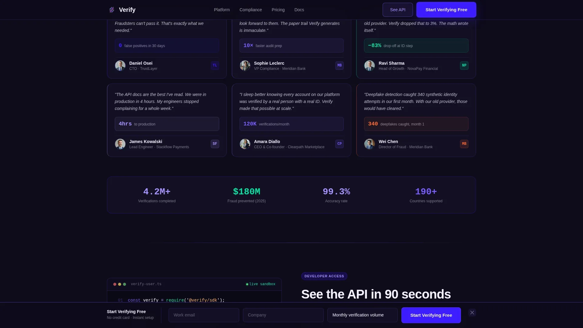
Testimonial Mosaic Wall
As the visitor scrolls, portrait tiles, company logos, and short customer quotes accumulate along the page margins. The effect builds a growing wall of named evidence rather than a static quote carousel. Scroll-linked animations reveal tiles in sequence for a courtroom-closing-argument feel.
Sticky Lead Generation Bar
After the first comparison section, a persistent bottom bar appears with the three-field progressive form. The form collects work email first, then company name, then monthly verification volume via a dropdown. The bar stays visible without blocking the comparison content above it.
API Sandbox Demo Path
A secondary conversion section targets developer and technical evaluators separately. The call-to-action reads "See the API in 90 Seconds" and links to a sandbox preview that captures developer emails, keeping the technical buyer on a different path from the business buyer form.
Scroll-Linked Animations
The template includes staggered table row reveals, mosaic tile accumulation animations, a glowing call-to-action pulse, and a liveness scan animation in the hero panel. These are built as client-side components while static sections use server-rendered markup.
Page sections overview
| Section | Purpose |
|---|---|
| Hero split panel | Deliver headline, proof points, call to action, and client logos |
| Comparison table | Benchmark speed, accuracy, compliance, and pricing |
| Mosaic testimonial wall | Accumulate named customer evidence as visitor scrolls |
| API demo call to action | Capture developer emails via sandbox preview path |
| Sticky lead gen bar | Keep the three-field form visible after first scroll |
| Footer linear row | Close the page with a single-row minimal footer |
Design & branding system
The visual identity follows a terminal-code aesthetic called Startup Velocity, built entirely on an Electric Indigo color system. The palette feels intentional and technical without being cold.
- Deep terminal indigo (#3D1DFF) anchors headers and primary buttons; charged violet (#7B5EFF) activates hover states and progress indicators; near-black ink (#0E0B1A) fills comparison row backgrounds
- Reactive white (#F4F2FF) with a faint lavender tint covers open background surfaces, keeping text legible against the dark table rows
- Typography uses DM Sans for headlines and JetBrains Mono for metrics and code snippets, reinforcing the developer-facing credibility of the platform
Mobile & speed optimization
The template is designed desktop-first to match how fintech decision-makers evaluate tools, while remaining fully responsive for mobile visitors.
- Static sections are built as server components, while the lead generation form, sticky bottom bar, and scroll animations run as client components to keep page rendering efficient
- The comparison table reflows cleanly on smaller screens, and the sticky bar adjusts its layout so the three-field form remains usable on mobile viewports
How this template helps you convert
The page is structured as a sequence of escalating proof, not a sequence of marketing claims. Each section earns the next click.
- The hero states the core value proposition in one line and immediately supports it with five client logos, giving first-time visitors social validation before they read a single feature.
- The comparison table does the persuasion work by placing named customer metrics directly inside the benchmark rows, so the visitor sees "Reduced onboarding fraud 94%" attributed to a real fintech head of risk before they reach the form.
- The progressive form and sticky bar reduce friction at the moment of intent, capturing email first and asking qualifying questions only after the visitor has already committed to the first step.
Other information about this template
This template is part of a Lead Generation direction series, optimized for high-intent B2B buyers in the identity verification and background screening space. A few additional details worth knowing before you build:
- The template is categorized under HR and Hiring, Background Check and Screening, reflecting its fit for compliance-sensitive onboarding workflows
- The Testimonial Mosaic creative direction is a specific layout pattern where customer evidence is woven into the comparison architecture rather than isolated in a separate testimonial section
- The Half-Page Photo and Text header concept is designed to be swapped with any close-cropped product or usage photograph that communicates speed and certainty
- The footer uses Pattern 1, a linear single-row layout, keeping the page exit clean and uncluttered
- Pricing dimension coverage in the comparison table is included as a structural placeholder for transparent pricing data, aligned with how fintech buyers evaluate total cost of ownership
Theme
Startup Velocity
Creative direction
Testimonial Mosaic
Color system
Electric Indigo
Style
Comparison Table
Direction
Lead Generation
Page Sections
Split Hero with Lead Capture
Three-column Comparison Table
Testimonial Mosaic Wall
Sticky Lead Generation Bar
API Sandbox Demo Section
Scroll-linked Animation System
Related questions
What kind of business is this landing page template built for?
Can I customize the comparison table rows and dimensions?
How does the progressive lead generation form work?
Is there a separate conversion path for developer visitors?
Does the template include placeholder customer quotes and metrics?


