Plastic Surgery Billing Landing Page Template
Verify is a hub-and-spoke landing page template built for plastic surgery billing firms. It opens with a three-step interactive billing assessment, then walks visitors through every phase of the revenue cycle using anchor-linked sections. The design uses a Corporate Precision palette to project trust, and every section drives toward a gated checklist download.
by Rocket studio
Quick summary
Verify is a single-page, anchor-navigation template for plastic surgery insurance and billing services. It opens with a multi-step assessment form, then unfolds the full revenue cycle across six spoke sections. Each section names a specific failure point and shows the protocol that fixes it. The page ends with a gated checklist download backed by form data already captured.
Who this template is for
This template is built for billing operations firms that serve plastic surgery practices. It speaks directly to the people inside those practices who feel the financial pressure most.
- Practice managers reviewing explanation of benefits (EOB) files and denial queues late in the evening
- Solo surgeons who have lost revenue on downcoded rhinoplasty or reconstructive claims
- Multi-provider clinic administrators watching accounts receivable (AR) age past 120 days
What problem this template solves
Plastic surgery billing is technically dense. Current procedural terminology (CPT) codes, modifier stacks, prior authorization requirements, and payer-specific rules create dozens of points where revenue slips. A generic service page cannot hold the attention of a practice manager who already knows the vocabulary. This template solves that credibility gap.
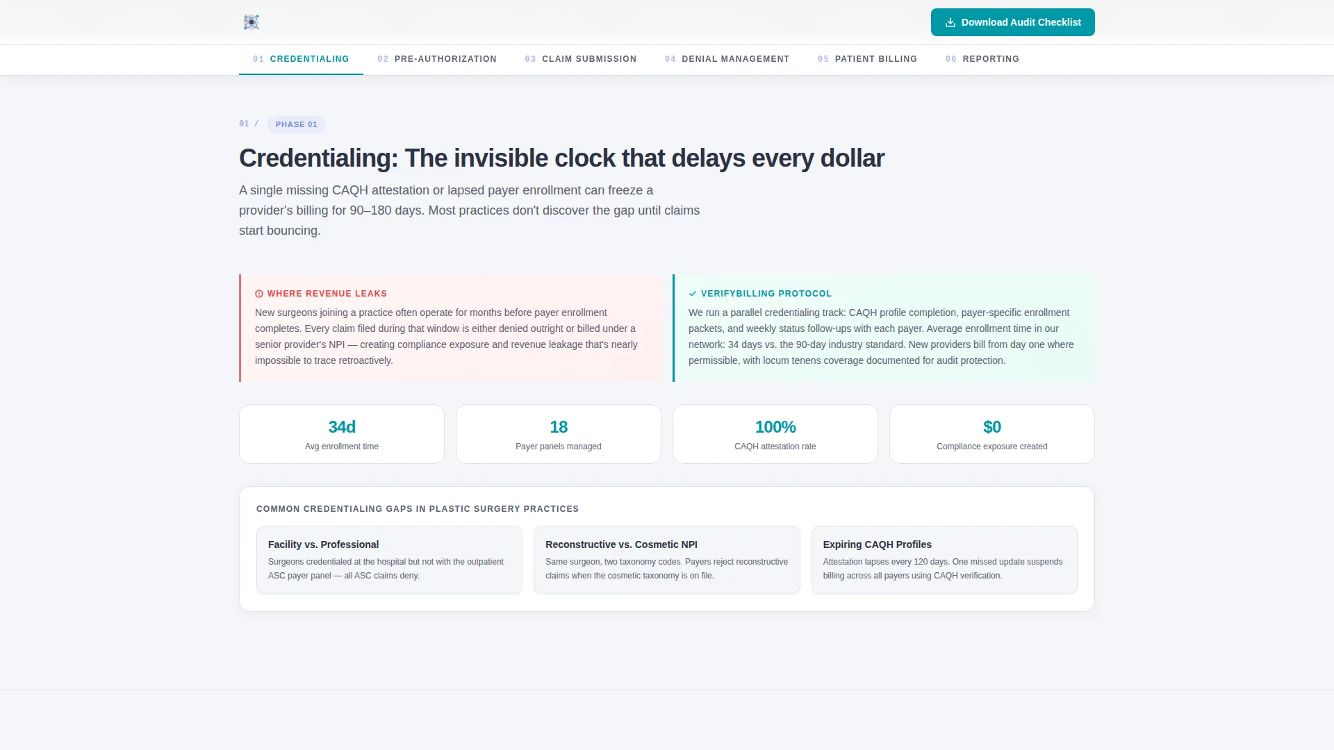
- Visitors see their exact pain points named in order, from credentialing delays to denial management to AR reporting
- Each section earns trust before asking for a conversion, so the checklist download feels like a natural next step
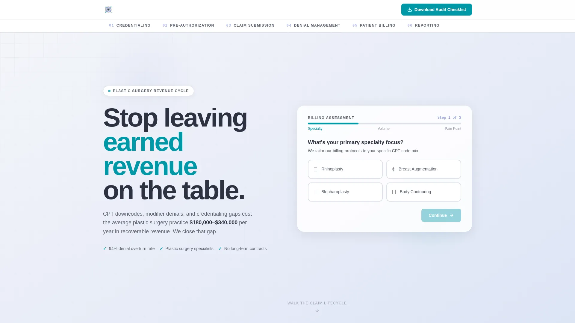
- The interactive assessment form gives visitors immediate value and frames the firm as a specialist, not a generalist
What you get with this template
The template delivers a fully structured, desktop-first landing page with high interactivity and a clear conversion path. Every component is purposeful and tied to a specific phase of the billing workflow.
- A three-step assessment form in the header with a progress bar, specialty selector, claim-volume slider, and pain-point picker
- Six anchor-navigated spoke sections covering credentialing, pre-authorization, claim submission, denial management, patient billing, and reporting
- Contextual secondary calls to action at the end of each spoke, including a stats overlay and a video modal for an ERA walkthrough
Feature list
A brief overview of what makes this template operationally distinct from a standard service page.
Three-Step Billing Assessment Form
The header contains a multi-step form presented as an interactive billing assessment. Step one asks specialty focus, step two uses a slider for monthly claim volume, and step three surfaces the visitor's biggest pain point. A teal progress bar fills as each step completes, making the form feel productive rather than gatekeeping.
Hub-and-Spoke Anchor Navigation
A persistent spoke navigation links to each phase of the revenue cycle. Charcoal slate anchors highlight in clinical periwinkle on scroll, so visitors always know exactly where they are in the claim lifecycle. Scrolling through the page mirrors walking through a real billing workflow.
Contextual Section-Level Calls to Action
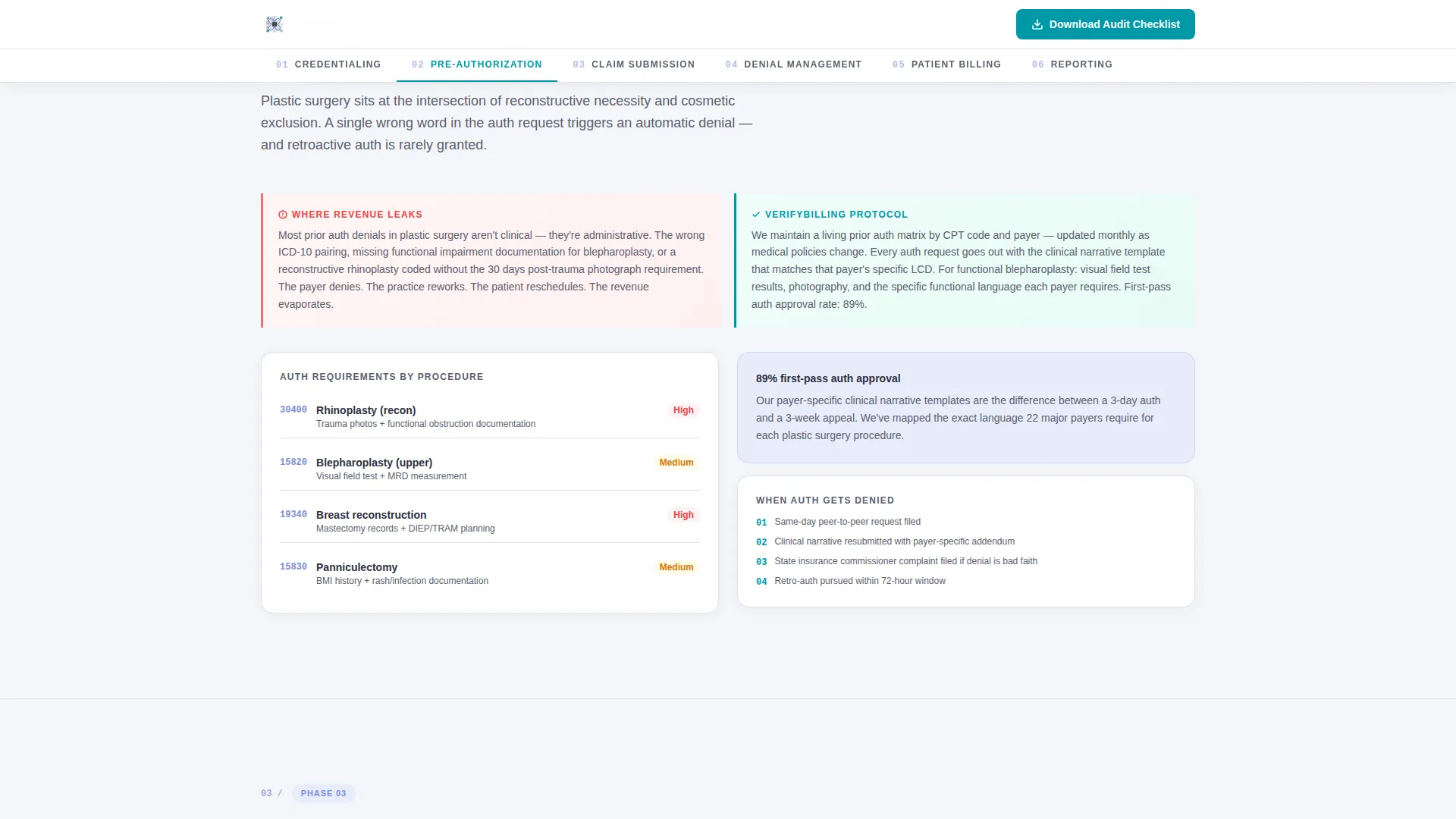
Each spoke section ends with a secondary conversion prompt tied to that section's content. "See Our Denial Overturn Rate" opens a stats overlay. "View Sample ERA Walkthrough" triggers a video modal. These micro-conversions let hesitant visitors engage with proof before committing to the primary download.
Gated Checklist Download
The primary call to action is a downloadable plastic surgery billing audit checklist. It is gated behind the data captured in the assessment form, plus an email field and practice name. Because the form is completed first, the gate feels minimal rather than obstructive.
Scroll-Reveal Content Architecture
Sections are revealed progressively as the visitor scrolls. Early sections validate familiar pain points. Later sections expose billing blind spots the visitor may not have considered. This escalating complexity builds quiet urgency that compounds toward the final download prompt.
Stats Counter and Modal Overlays
Animated counters display social proof figures such as denial overturn rates and AR recovery percentages. Modal overlays deliver supporting evidence without navigating away from the page, keeping the visitor inside the conversion flow.
Page sections overview
| Section | Purpose |
|---|---|
| Hero Assessment Form | Captures specialty, claim volume, and pain point via multi-step form |
| Credentialing Hub | Covers payer enrollment timelines and specialty credentialing gaps |
| Pre-Authorization Spoke | Addresses prior auth failure rates for aesthetic versus reconstructive procedures |
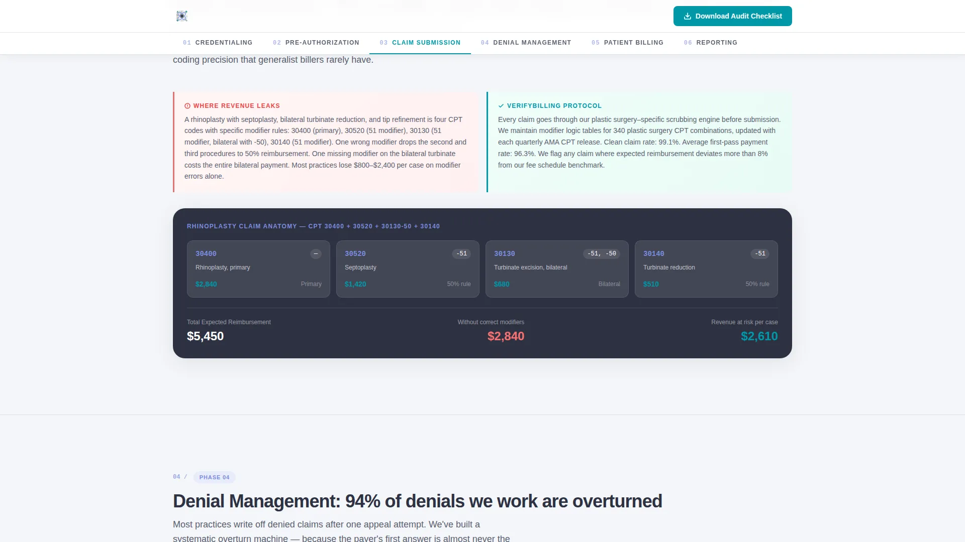
| Claim Submission Spoke | Details CPT code and modifier stacking for plastic surgery specifics |
| Denial Management Spoke | Presents overturn rates, appeal protocols, and stats overlay call to action |
| Patient Billing and Reporting | Shows AR aging dashboard, ERA walkthrough modal, and checklist download |
| Footer | Single-row linear pattern with navigation and contact links |
Design & branding system
The visual identity follows a Corporate Precision theme. The aesthetic is described as a freshly printed explanation of benefits that actually makes sense: clean paper, sharp ink, one decisive highlight where the eye needs to land.
- Color palette: cloud white (#F4F6F9) backgrounds, charcoal slate (#2D3142) for primary text and navigation, clinical periwinkle (#7B8CDE) for active states and progress indicators, and teal (#0097A7) reserved exclusively for calls to action and confirmation states
- Typography: Plus Jakarta Sans for headings and DM Sans for body copy, keeping hierarchy crisp and scannable
- No photography is used; the multi-step form floats over a soft gradient from cloud white to pale periwinkle, making the interactive element the visual centerpiece
Mobile & speed optimization
The template is built desktop-first, reflecting the reality that practice managers typically review billing data on workstations at the end of the day. Interactivity is handled efficiently to keep the experience smooth.
- Interactive elements such as the multi-step form, anchor navigation highlights, modal overlays, and slider input are built as client components, keeping the static base lean
- Scroll-reveal animations, progress bar transitions, and stats counters use medium-weight animation so motion feels purposeful rather than heavy
- The single-row footer pattern minimizes layout complexity at the bottom of the page
How this template helps you convert
The conversion strategy is layered. The page earns the primary download by delivering genuine operational knowledge in every section first.
- The three-step assessment form at the top qualifies the visitor and frames the firm as a specialist before a single word of body copy is read, reducing friction for the final checklist gate.
- Contextual secondary calls to action at each spoke section let visitors self-select into proof moments, such as the stats overlay or ERA video modal, building confidence incrementally before they reach the download prompt.
Other information about this template
This template is categorized under Health and Medical, specifically within the plastic surgeon website and insurance billing niche. It is well suited for firms offering revenue cycle management services to surgical specialties.
- The template style is Hub and Spoke with anchor navigation, and the creative direction follows a Step-by-Step Guide structure that mirrors the actual claim lifecycle
- The header concept is a Multi-Step Form, and the landing page direction is Content and Resource, meaning the page leads with education and converts through a downloadable asset
- The color system is Cloud Canvas, and the overall theme is Corporate Precision, both of which reinforce a clinical, organized, trustworthy impression for a B2B medical billing audience
- Social proof elements are designed to reference specific overturn rates, AR recovery percentages, and claim volume statistics tied to practice types rather than named individuals
Theme
Corporate Precision
Creative direction
Step-by-Step Guide
Color system
Cloud Canvas
Style
Hub & Spoke (Anchor Nav)
Direction
Content/Resource
Page Sections
Three-step Billing Assessment Form
Hub-and-spoke Anchor Navigation
Contextual Section-level Ctas
Gated Checklist Download
Scroll-reveal Content Architecture
Animated Stats Counters and Modals
Related questions
What type of business is this template designed for?
Does the template include the multi-step form and modal overlays?
Can I customize the spoke sections for my firm's services?
What makes this different from a generic medical billing template?
Is this template better suited for desktop or mobile visitors?



