Orthodontist Insurance Verification Website Template
Verify is a hub-and-spoke orthodontic insurance landing page built for practices that need to turn confusing coverage details into clear patient conversations. It walks visitors through five interactive checklist spokes, from plan-type verification to pre-authorization prep, and converts them through a free benefits audit booking form. The earthy Forest Trust design keeps the experience calm, organized, and credible.
by Rocket studio
Quick summary
Verify is a single-page orthodontic insurance resource built around five sequential checklist spokes and an anchor navigation system. Each spoke covers a distinct coverage topic, from plan type identification to out-of-pocket math, and converts engaged visitors into booked benefits audit appointments. The design follows an Educational Guide theme with an earthy, field-journal visual identity.
Who this template is for
This template is built for orthodontic practices that handle complex insurance conversations every day. It serves both patient-facing education and internal billing support needs.
- Parents trying to decode Phase I or Phase II coverage limits for their children
- Adults evaluating whether clear aligner treatment falls under their plan's orthodontic benefit codes
- Dental office managers managing rejected claims caused by silent payer policy changes
What problem this template solves
Orthodontic insurance is genuinely difficult. Patients overpay, claims get denied, and families leave money unused because no one translated the fine print into plain language. This template gives practices a structured page that does exactly that.
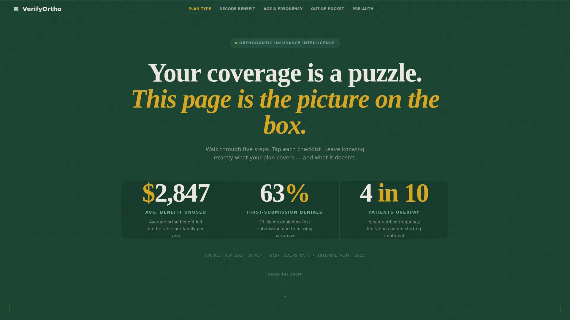
- Families lose an average of $2,847 in unused orthodontic benefits per year because they never verify their coverage
- 63 percent of claims are denied on first submission due to missing narratives
- 4 in 10 patients overpay because frequency limitations are never explained before treatment begins
What you get with this template
You get a complete, ready-to-customize landing page designed around sequential education and appointment conversion. Every section is purposefully sequenced to build understanding before asking for a commitment.
- A six-section hub-and-spoke layout with sticky anchor navigation and scroll-triggered progress tracking
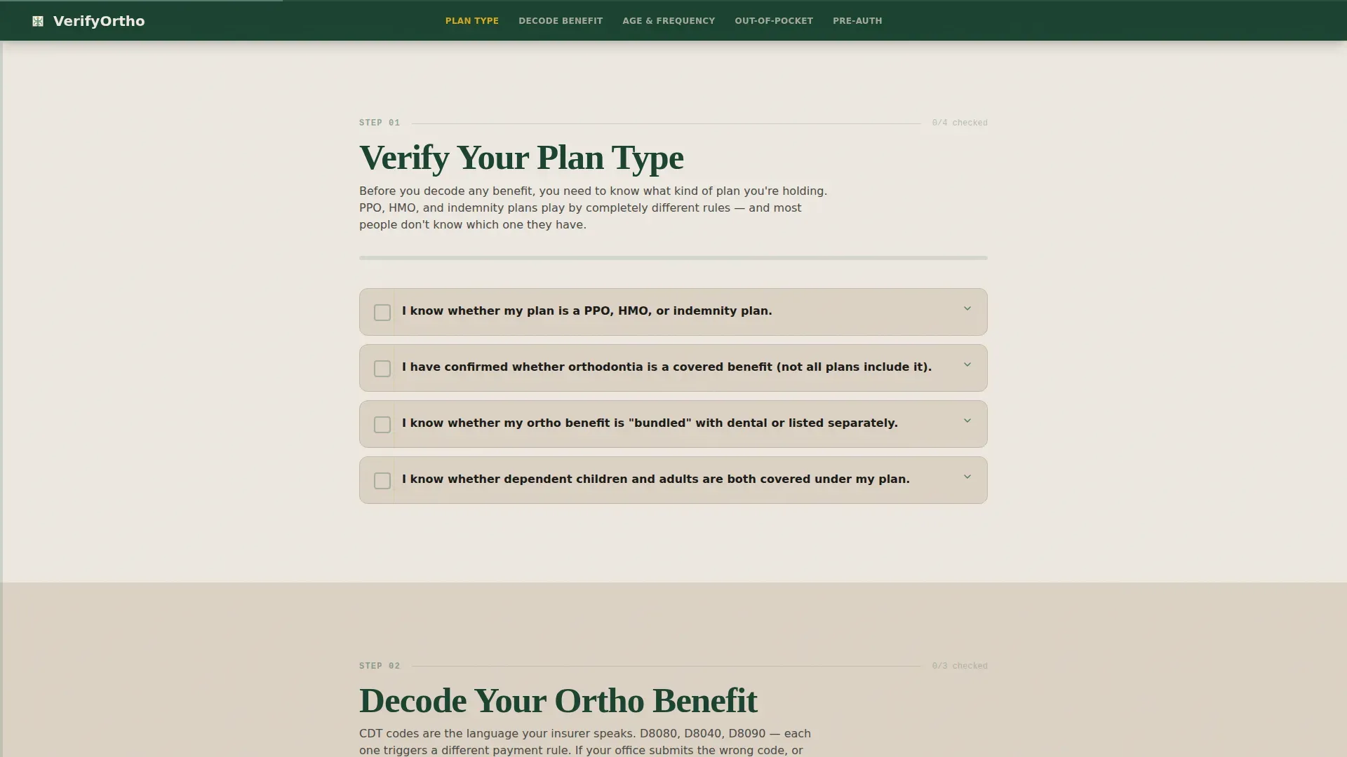
- Five interactive checklist spokes that reveal explanatory content only after the visitor engages with each step
- Two conversion paths: a primary booking form for a free benefits audit and a secondary email-gated checklist download
Feature list
This template ships with several purpose-built components that work together to educate, engage, and convert.
Animated Stats Header
Three oversized odometer-style counters load on page entry and settle into place against a deep evergreen background. Each counter surfaces a specific, high-stakes statistic about unused benefits, denial rates, and overpayment. The birch-toned tagline below anchors the emotional framing before visitors scroll further.
Interactive Checklist Spokes
Five anchor-linked spokes each open with a mini-checklist the visitor taps through. Explanatory content appears only after engagement, keeping the experience active rather than passive. Topics escalate in complexity from basic plan-type definitions to coordination of benefits conflicts and lifetime maximum pitfalls.
Sticky Anchor Navigation with Progress Bar
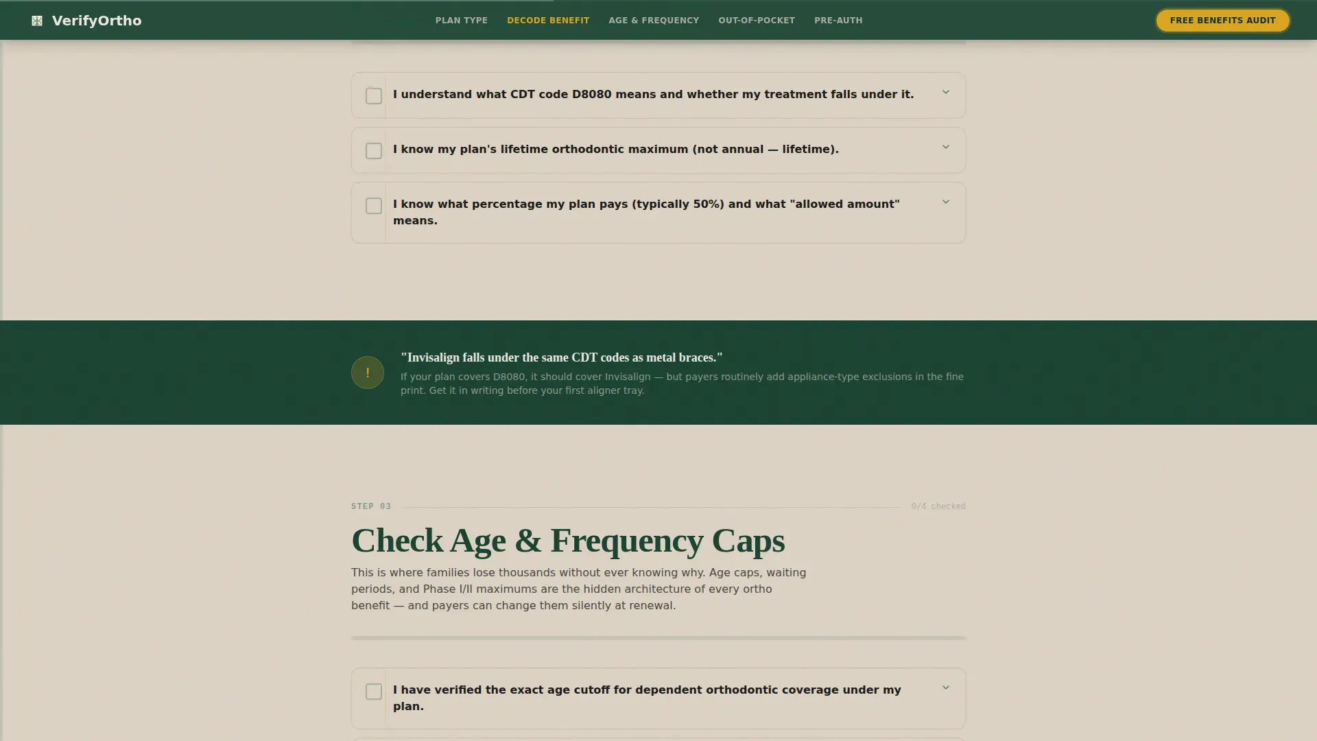
A persistent navigation bar links directly to each of the five spoke sections. After the visitor scrolls past 40 percent of the page, a goldenrod "Book Your Free Benefits Audit" button pins itself to the nav bar. A fern-colored progress bar fills as sections are completed, making scrolling feel like finishing steps.
Two-Path Conversion System
The primary path is a three-field booking form: insurance carrier selected from a dropdown of the twenty most common orthodontic payers, patient age, and a preferred call-back window. The secondary path offers a downloadable pre-visit insurance checklist gated behind a single email field, capturing visitors who are engaged but not yet ready to call.
Educational CDT Code Explanations
The "Decode Your Ortho Benefit" spoke explains procedure codes, including the commonly misunderstood D8040 code and how payers treat clear aligner treatment differently from traditional braces. Content is written for patients, not billers, so families leave with real answers.
Age and Frequency Cap Audit Section
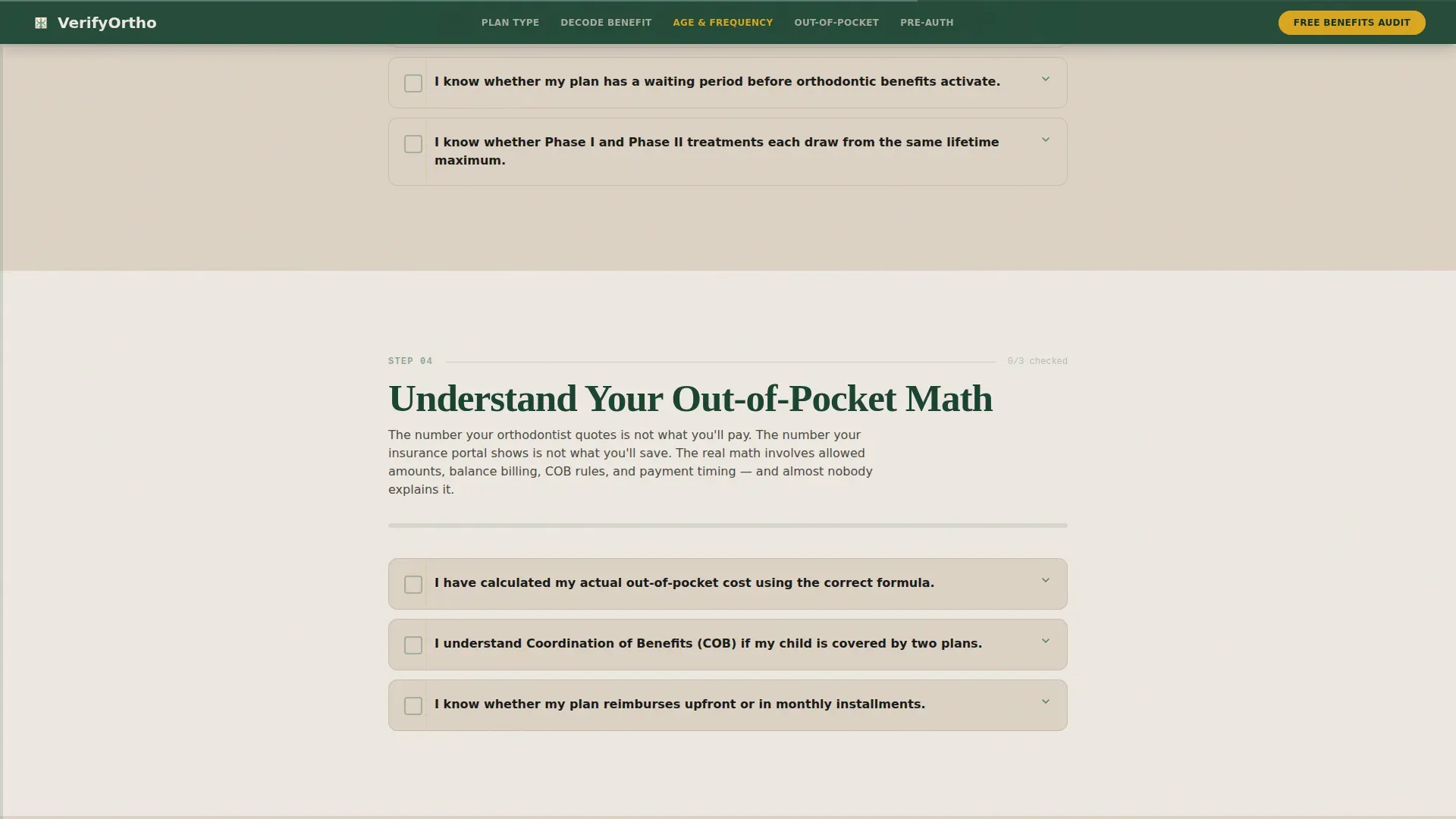
A dedicated spoke walks visitors through hidden plan rules that routinely catch families off guard. Lifetime maximums, orthodontic age caps, and frequency limitations are each addressed with checklist prompts that surface the right questions to ask before treatment begins.
Page sections overview
| Section | Purpose |
|---|---|
| Hero Stats Wall | Surfaces three key denial and overpayment statistics to establish urgency on load |
| Anchor Navigation Bar | Sticky hub nav links all five spokes and hosts the primary call to action after 40% scroll |
| Verify Your Plan Type | Spoke one introduces HMO, PPO, and discount plan differences with checklist prompts |
| Decode Your Ortho Benefit | Spoke two explains CDT codes, D8040, and how payers classify orthodontic treatment |
| Check Age and Frequency Caps | Spoke three exposes hidden lifetime maximums and payer age cap rules |
| Understand Out-of-Pocket Math | Spoke four covers coordination of benefits conflicts and real cost calculations |
| Pre-Authorization Prep | Spoke five guides visitors through documentation before booking a consultation |
| Booking and call to action Module | Full-width form to book a free benefits audit with three simple fields |
| Checklist PDF Gate | Secondary conversion path offering a downloadable pre-visit checklist via email |
| Footer | Single-row linear layout with practice contact and navigation links |
Design & branding system
The visual identity follows an Educational Guide theme styled as a field journal: organized, unhurried, and immediately trustworthy. Every color choice reinforces credibility without clinical coldness.
- Deep evergreen (#1B4332) anchors primary backgrounds and the sticky navigation bar; warm birch (#DCD2C4) fills content panels to mimic unbleached paper; soft fern (#52796F) marks secondary headings and the scroll progress indicator
- Goldenrod (#DAA520) is reserved exclusively for call-to-action buttons and active checklist checkmarks, ensuring high contrast and clear visual priority
- Typography pairs Fraunces serif headings with DM Sans body text, balancing editorial warmth with clean readability across all section types
Mobile & speed optimization
The template is designed desktop-first for office managers working at a desk, with a solid mobile layout for parents checking coverage on their phones between school pickups.
- Interactive checklist state is handled through client-side components, while static sections use server components to keep initial load efficient
- The sticky anchor nav and progress bar reflow cleanly for smaller screens, maintaining the step-by-step experience on mobile without sacrificing function
- Scroll-triggered animations, including odometer counters and checklist reveal effects, are scoped to keep visual performance smooth across both device contexts
How this template helps you convert
Every structural decision in this template points toward one outcome: turning an overwhelmed visitor into a booked appointment.
- The animated stats header creates immediate relevance by surfacing real financial stakes in the first three seconds, before a visitor reads a single paragraph
- The interactive checklist structure rewards engagement progressively, so by the time a visitor reaches the booking form, they have already invested effort and built trust through completed steps
- The two-path conversion system captures both ready-to-book visitors and early-stage researchers, expanding the total number of leads without adding friction to either path
Other information about this template
This template is categorized under Health and Medical, specifically within the Orthodontist Website subcategory, and is purpose-built for the orthodontic insurance and billing page use case.
- The hub-and-spoke layout with anchor navigation is well suited for practices that want one authoritative resource page rather than scattered blog posts
- The localization defaults are set for United States audiences, using USD currency formatting and MM/DD/YYYY date conventions throughout
- Animation intensity is high by design: odometer counters, checklist reveal transitions, scroll triggers, and a live progress bar are all included as part of the interactive layer
- The footer follows a linear single-row pattern, keeping the page exit clean and uncluttered
- This template is built on an intersection of the Checklist and Audit creative direction, the Stats and Metrics header concept, and the Booking and Scheduling conversion direction, making it one of the more complete orthodontic insurance resource templates in the Health and Medical category
Theme
Educational Guide
Creative direction
Checklist & Audit
Color system
Forest Trust
Style
Hub & Spoke (Anchor Nav)
Direction
Booking/Scheduling
Page Sections
Animated Stats Header with Odometer Counters
Five Interactive Checklist Spokes
Sticky Anchor Nav with Scroll Progress Bar
Two-path Conversion System
CDT Code and Benefit Decoder Section
Age Cap and Frequency Limitation Audit
Related questions
Who is this landing page template designed for?
Can I customize the insurance carrier dropdown in the booking form?
Does the interactive checklist require a special plugin or third-party service?
What are the two conversion paths included in this template?
What does the fern-colored progress bar in the navigation track?



