Vascular Surgeon Condition & Treatment Landing Page
Vessel is a comparison table landing page built for vascular surgeons who want to educate patients, caregivers, and referring physicians before they ever book a call. It maps conditions from varicose veins to aortic aneurysm in structured side-by-side tables, pairs them with a trust-building surgeon portrait, and routes every informed visitor toward a consultation with a single pulse-orange button.
by Rocket studio
Quick summary
Vessel is a single-page vascular condition and treatment library designed for board-certified vascular surgeons. It presents complex pathology in plain-language comparison tables, builds authority through credentials and peer-reviewed citations, and converts informed visitors into consultation bookings with a frictionless click-through flow.
Who this template is for
This template is built for interventional vascular surgeons who need a credible, content-rich online presence that serves more than one kind of visitor at once. It bridges the gap between clinical depth and patient-friendly clarity without sacrificing either.
- Vascular surgeons wanting to educate post-diagnosis patients before a first consultation
- Caregivers researching treatment options for parents with conditions such as peripheral artery disease or carotid stenosis
- Referring primary care physicians comparing interventional approaches before writing a referral
What problem this template solves
Patients who leave a vascular appointment with a new diagnosis often turn to unreliable sources because most medical websites are either too clinical or too vague. Vessel solves that gap by presenting structured, authoritative information in a format that feels reassuring rather than overwhelming.
- Confusing medical language that leaves patients anxious and under-informed after diagnosis
- No clear side-by-side view of treatment options, recovery timelines, and risk profiles for conditions like deep vein thrombosis or peripheral artery disease
- Surgeon websites that build no real trust before asking a visitor to book
What you get with this template
You get a fully structured single-page layout with every section pre-built and ready to customize. The design, content architecture, and conversion flow are already in place so you focus on adding your credentials and clinical content.
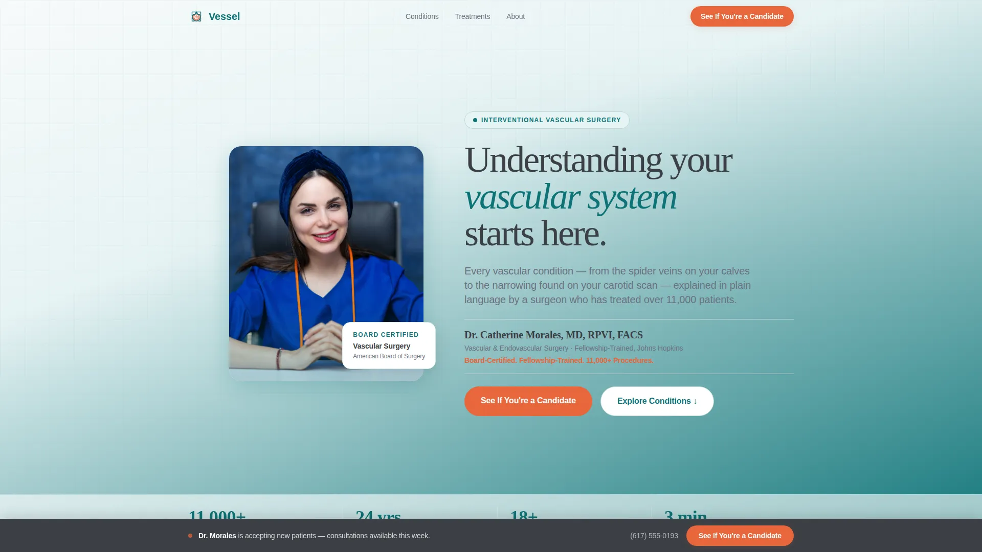
- A portrait-centered hero section with credential display, fellowship details, and a procedure count stat line
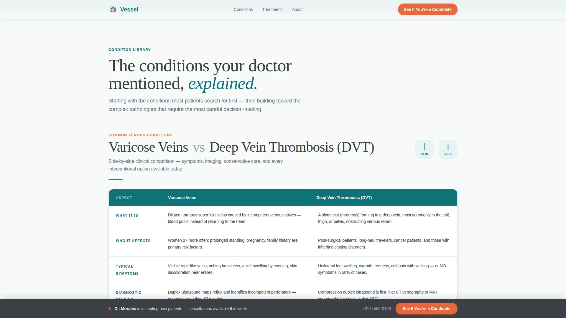
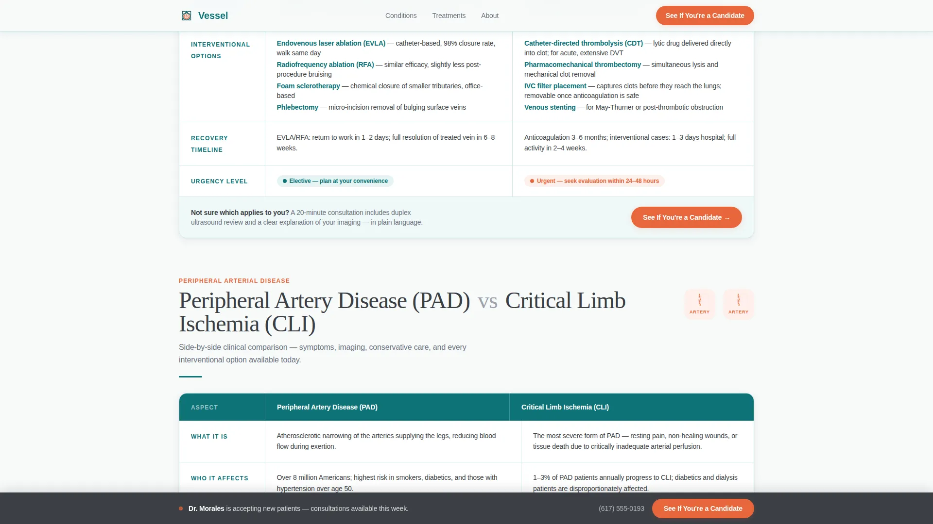
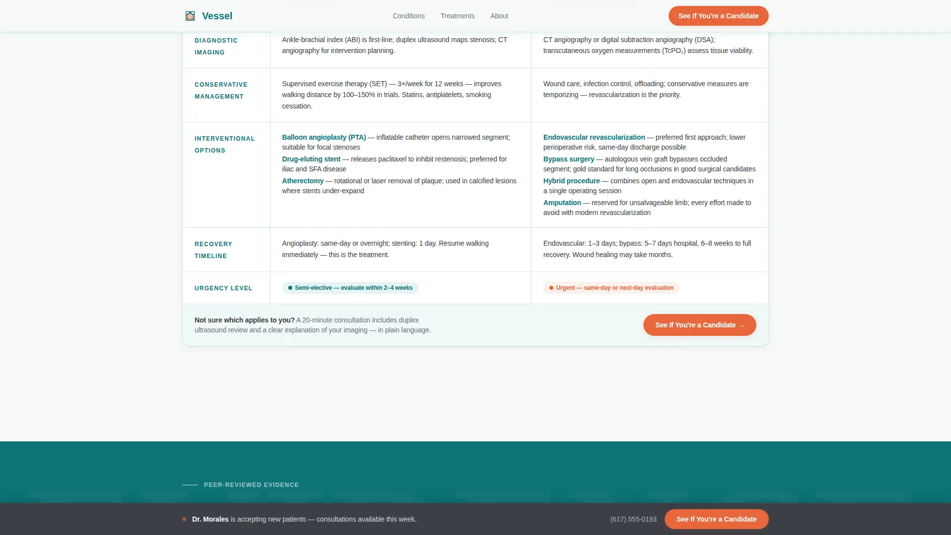
- Structured comparison tables covering conditions from varicose veins and deep vein thrombosis to peripheral artery disease, critical limb ischemia, carotid stenosis, and abdominal aortic aneurysm
- A sticky bottom call-to-action bar, scroll-triggered animations, and a pulse-orange button system that routes visitors to your consultation booking flow
Feature list
This template is built around a focused set of deliberate design and content decisions, each serving the goal of turning an informed visitor into a booked consultation.
Portrait-Centered Hero Section
The hero leads with a waist-up, white-coat surgeon portrait against a sterile white to surgical teal gradient. Name, credentials, and fellowship appear in warm graphite beside the image. A single credential line in pulse-orange reads the surgeon's board certification, fellowship training, and procedure count.
Structured Condition Comparison Tables
Each vascular condition gets its own self-contained comparison table. Columns contrast symptoms, diagnostic imaging, conservative management, interventional options such as angioplasty versus stenting versus atherectomy, risk profiles, and expected recovery timelines. Rows are hover-interactive to help readers track across columns easily.
Expert Panel Scroll Architecture
The page scrolls from common conditions visitors likely searched for, such as varicose veins and deep vein thrombosis, toward complex pathologies like aortic aneurysm and mesenteric ischemia. Each section opens with an anatomical illustration rather than a photograph, keeping the tone educational without clinical shock.
Journal Authority Strip
Pull quotes from peer-reviewed journals appear between condition sections. These citations serve as quiet credentials that reinforce the surgeon's expertise without interrupting the reading flow. Each strip is paired with an anatomical illustration accent.
Sticky Click-Through Call to Action
A sticky bottom bar appears after the visitor passes the second scroll depth. It displays the same "See If You're a Candidate" button and the surgeon's direct office line. No form is present on this page; the goal is informed confidence followed by a near-zero-friction booking click.
Scroll-Triggered Animation System
Condition table sections reveal with stagger animations as the visitor scrolls. The pacing feels deliberate and calm, matching the Medical Clarity visual identity rather than feeling like a sales page.
Page sections overview
| Section | Purpose |
|---|---|
| Hero Portrait | Establish surgeon identity, credentials, and immediate trust |
| Varicose Veins versus. DVT | Compare symptoms, imaging, treatment, and recovery side by side |
| PAD versus. Critical Limb Ischemia | Escalate clinical depth for peripheral arterial conditions |
| Carotid Stenosis versus. AAA | Present advanced pathology for high-authority positioning |
| Journal Authority Strip | Reinforce expertise with peer-reviewed citation pull quotes |
| Candidate Call to Action | Route informed visitors to consultation booking with one click |
| Sticky Bottom Bar | Persist the call to action and office line across the full scroll depth |
| Footer | Linear single-row footer with essential practice links |
Design & branding system
The visual identity follows a Medical Clarity theme. Every color and typographic choice is calibrated to feel like a modern interventional suite: calm enough to lower anxiety, precise enough to earn trust.
- Color palette: deep surgical teal (#0D7377) for headers and navigation, sterile white (#F7FAFA) for content backgrounds, warm graphite (#3B3F45) for body text, and pulse-orange (#E8673C) reserved exclusively for interactive elements and call-to-action buttons
- Typography: Fraunces serif for headlines to convey authority and warmth, paired with DM Sans for body text and interface elements to maintain clinical readability
- Anatomical illustrations rather than clinical photographs keep the visual tone educational and avoid shock imagery
Mobile & speed optimization
The template is designed desktop-first to serve physicians who need to scan comparison tables across wide columns. It includes full mobile responsiveness so patients and caregivers on phones can still navigate conditions clearly.
- Comparison tables reflow for smaller screens without losing the parallel structure that makes them useful
- Scroll-triggered reveals and stagger animations use minimal JavaScript, keeping interactive elements lightweight across devices
- Server Components power static content sections, reducing unnecessary client-side rendering overhead
How this template helps you convert
The conversion strategy in Vessel is built around informed confidence rather than pressure. Visitors who understand their condition are far more likely to take action than those who feel confused or rushed.
- The comparison tables do the convincing by presenting treatment options, recovery timelines, and risk profiles side by side, so the visitor arrives at the consultation button already educated and ready.
- The sticky bottom call-to-action bar keeps the "See If You're a Candidate" button and the surgeon's direct office line visible at all times after the second scroll depth, removing the need to scroll back up to act.
Other information about this template
Vessel is built for the Health and Medical category with a specific focus on the vascular surgeon website niche. It is designed as a condition and treatment library rather than a general practice homepage, making it a strong fit for surgeons who want a standalone educational resource.
- Template style is Comparison Table, which is the core structural decision that differentiates this page from a standard bio or service-list layout
- The landing page direction is Click-Through, meaning no form lives on this page; the only goal is moving an informed visitor to a booking page
- The creative direction is Expert Panel, organizing clinical content by condition with escalating complexity to build authority as the visitor scrolls
- The header concept is Portrait-Centered, prioritizing the surgeon's face, credentials, and human presence over abstract imagery or icons
- The color system is Teal Catalyst, a palette designed specifically for medical contexts where trust, calm, and precision must coexist
Theme
Medical Clarity
Creative direction
Expert Panel
Color system
Teal Catalyst
Style
Comparison Table
Direction
Click-Through
Page Sections
Portrait-centered Hero with Credentials
Structured Condition Comparison Tables
Expert Panel Scroll Architecture
Journal Authority Citation Strip
Sticky Click-through Call to Action Bar
Scroll-triggered Reveal Animations
Related questions
Who is this landing page template designed for?
Is there a contact form on this page?
Can I customize the comparison tables with my own conditions and treatments?
What makes this template different from a standard medical website template?
Does this template work for patients without a medical background?



