Premium Beverage Drinkware Landing Page Template
Hydrate is a bold, Neo-Retro landing page template built for print-on-demand drinkware stores. It pairs a price-anchored header, a modular card grid, and a Comparison Journey scroll structure to turn browsers into buyers. Electric colors, punchy product cards, and sticky call-to-action buttons make every visit feel like a discovery rather than a decision.
by Rocket studio
Quick summary
Hydrate is a single-page landing page template designed for print-on-demand drinkware shops. It opens with a price-anchored split header, then guides visitors through a Comparison Journey built from modular card grids. The Neo-Retro color palette and sticky calls to action keep the energy high and the path to purchase short.
Who this template is for
This template is made for store owners who sell personality-forward drinkware. It fits brands that print to order and want to stand out from generic retail options.
- Print-on-demand shop owners selling insulated bottles, tumblers, or camp mugs
- Gift-focused sellers who need to show product variety fast
- Drinkware entrepreneurs targeting buyers tired of plain, mass-produced alternatives
What problem this template solves
Generic product pages make custom drinkware look the same as everything else on the shelf. This template fixes that by making the visual and price argument immediately clear.
- Visitors leave before they understand why custom is worth it
- Plain layouts fail to show product personality or price value side by side
- No sticky call to action means interested visitors lose momentum mid-scroll
What you get with this template
You get a fully structured, single-page layout ready for a print-on-demand drinkware store. Every section is modular, so cards can be swapped, reordered, or scaled without breaking the layout.
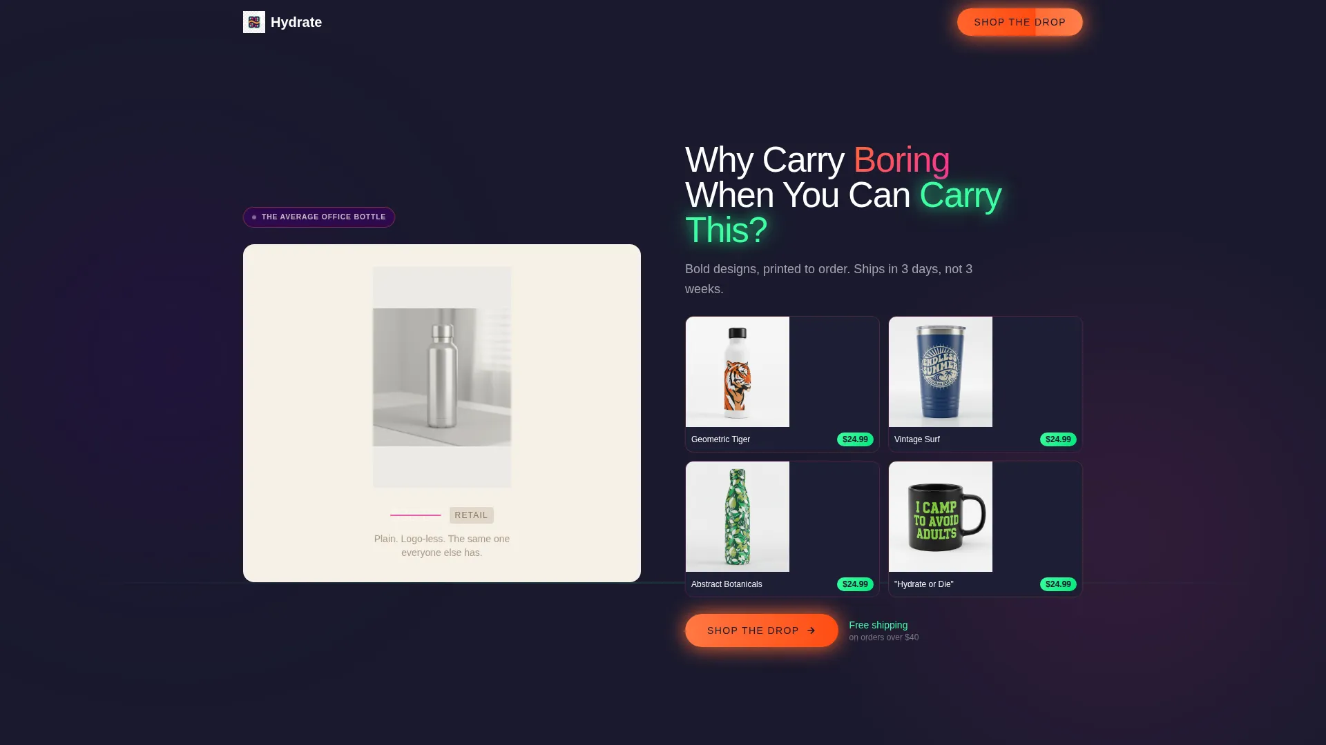
- A price-anchored split header comparing plain retail bottles to custom printed designs
- A Comparison Journey card grid covering design appeal, material quality, and print durability
- Sticky "Shop the Drop" call-to-action button and per-card "Grab This One" product links
Feature list
This template ships with a focused set of layout and visual features drawn directly from the design brief.
Price-Anchored Split Header
The header divides the screen between a plain stainless steel bottle tagged at a crossed-out retail price and a grid of four bold custom-printed designs each priced at $24.99. The contrast does the selling before a visitor reads a single word.
Modular Bento Card Grid
Cards follow a mixed-width bento layout. Single-width slots hold tight product shots while double-width slots carry lifestyle scenes of bottles in backpacks, on dashboards, and next to laptops. The rhythm keeps the eye moving and the grid breathing.
Comparison Journey Scroll Structure
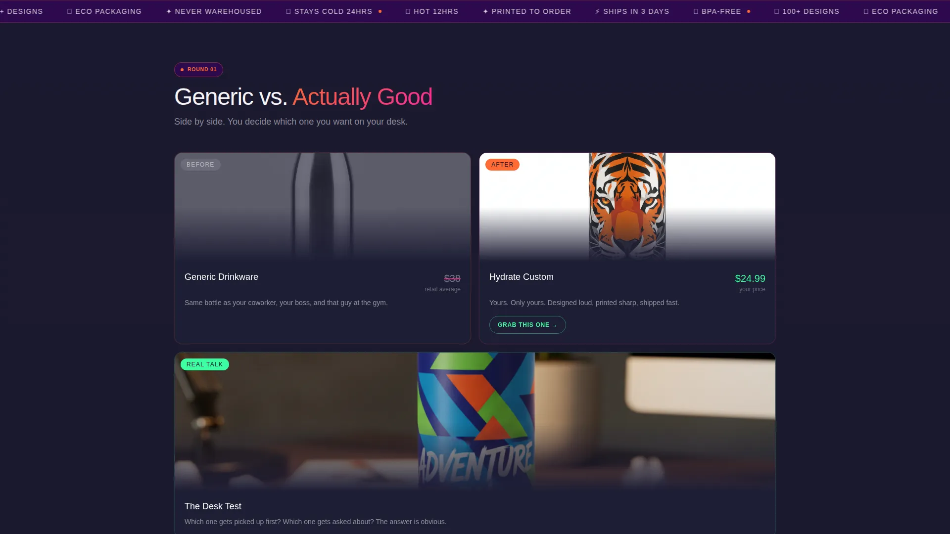
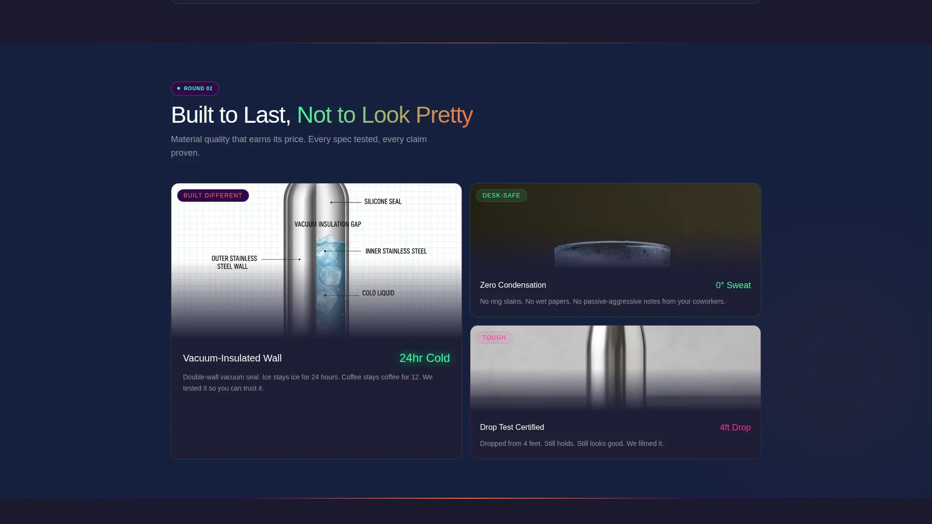
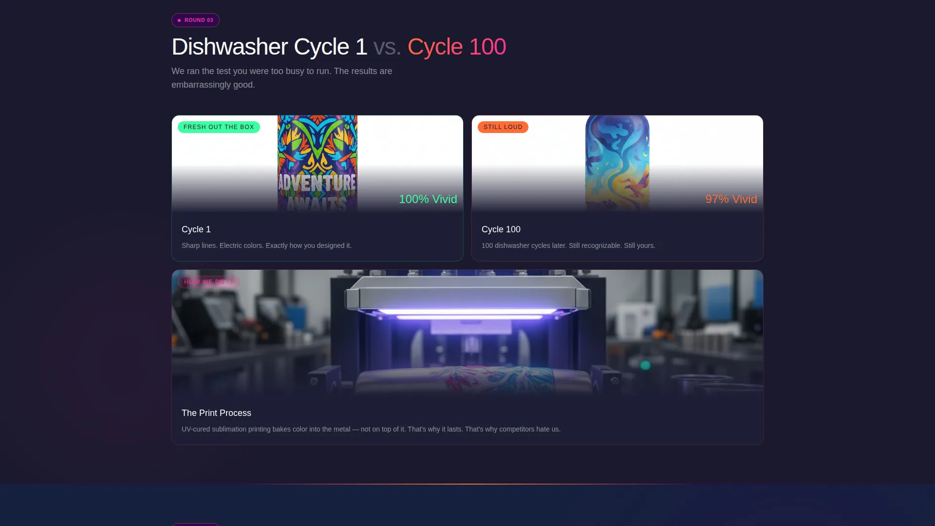
The page is organized as a three-stage argument. First, custom design versus generic. Second, material quality with vacuum-insulated cutaway visuals and condensation references. Third, print durability shown through dishwasher-cycle close-up comparisons.
Sticky Call-to-Action Button
After the first scroll, a tangerine sticky button labeled "Shop the Drop" stays visible as visitors move through the grid. It routes directly to the full product catalog without interrupting the browsing flow.
Per-Card Product Links
Every product card carries its own "Grab This One" button linked directly to that design's product page. No extra navigation is needed. The click path from interest to product page is one step.
Neo-Retro Dopamine Pop Color System
The palette uses electric tangerine, serotonin pink, deep arcade purple, minty screen-glow green, and near-black charcoal. Color roles are assigned precisely: green marks hover states and price tags, purple anchors section dividers, and charcoal keeps the saturated tones from feeling chaotic.
Page sections overview
| Section | Purpose |
|---|---|
| Split Price Header | Anchors value by contrasting plain retail cost against custom pricing |
| Design Comparison Cards | Shows custom versus generic drinkware side by side |
| Material Quality Grid | Communicates build quality through cutaway and condensation visuals |
| Print Durability Row | Demonstrates long-term print quality across dishwasher cycle comparisons |
| Lifestyle Scene Cards | Places products in real-life contexts using double-width card slots |
| Product Card Grid | Displays individual designs with direct "Grab This One" purchase links |
| Sticky call to action Bar | Keeps the "Shop the Drop" button visible throughout the full scroll |
Design & branding system
The visual identity follows a Neo-Retro theme powered by a Dopamine Pop color system. Every color has a defined role that keeps the layout lively but controlled.
- Electric tangerine (#FF6B35) and serotonin pink (#FF2D9B) trade off as card accent borders across the grid
- Minty screen-glow green (#3DFFA2) marks interactive hover states and price tag labels
- Deep arcade purple (#2D0A4E) anchors section dividers while near-black charcoal (#1A1A2E) grounds the background
Mobile & speed optimization
The modular card grid is built to reflow naturally on smaller screens. Single-width and double-width cards stack cleanly without losing the visual hierarchy.
- Card borders and accent colors remain vivid at mobile screen widths
- The sticky call-to-action button stays accessible without blocking product card content
- Lifestyle scene cards and product shots are composed to read clearly at reduced sizes
How this template helps you convert
The entire layout is built around removing hesitation. Every design choice pushes the visitor one step closer to clicking.
- The price-anchored header kills sticker shock immediately by showing $24.99 custom next to a crossed-out $38 retail tag, so value is obvious before the visitor scrolls.
- The Comparison Journey stacks three rounds of visual proof covering looks, quality, and durability, so the visitor has answered their own objections by the time they reach a product card.
- The sticky "Shop the Drop" button and per-card "Grab This One" links mean a ready buyer never has to hunt for a way to act on their interest.
Other information about this template
This template is part of a broader Neo-Retro design direction suited for bold retail and e-commerce landing pages. It works well within the print-on-demand space where speed-to-market and strong visual differentiation matter most.
- The template style is a Bento Grid layout, a modular format that supports varied card sizes and mixed content types within a single cohesive page
- The creative direction follows a Comparison Journey pattern, a scroll structure designed to build a layered argument rather than presenting static product rows
- The header concept is Price-Anchored, meaning the very first thing a visitor sees is a concrete value comparison rather than a brand statement
Theme
Neo-Retro
Creative direction
Comparison Journey
Color system
Cloud Canvas
Style
Bento Grid
Direction
Marketplace/Multi
Page Sections
Price-anchored Split Header
Modular Bento Card Grid
Comparison Journey Scroll Structure
Sticky Shop-the-drop Button
Per-card Direct Product Links
Neo-retro Dopamine Pop Color System
Related questions
Is this template suitable for a store with many drinkware designs?
Does this template include product pages or just the landing page?
Can I change the color palette to match my own brand?
Who is the target customer this landing page is designed to attract?
Does the sticky call-to-action button work on mobile screens?



