Student Finance Cost Calculator Website Template
Vest is a dark-terminal student retirement account landing page built to turn $50 monthly contributions into a compelling compounding story. The split-screen layout pairs a sequential retirement readiness checklist with dynamic calculators and mint-resolved status indicators. A single click-through call to action routes students directly into the account opening flow, no forms, no friction.
by Rocket studio
Quick summary
Vest is a single-page finance template built for student retirement account platforms. It uses a 50/50 split-screen layout, a dark gunmetal color system, and scroll-triggered interactions to make compound interest feel real. The primary call to action, "Open Your IRA in 10 Minutes", appears three times and routes visitors into an onboarding app with zero on-page form friction.
Who this template is for
This template is built for FinTech founders and finance educators who want to reach college students with a retirement savings message. It works especially well for platforms targeting first-generation students, campus side-hustlers, and young adults with internship income who have never opened an Individual Retirement Account (IRA) before.
- Student finance platforms converting 20 to 24-year-olds into IRA account holders
- Parents or financial educators using a gift or education angle to introduce retirement basics
- Early-stage FinTech products that need a polished click-through landing page without a backend form
What problem this template solves
Most college students have never seen a 401(k) statement. They understand that saving money is smart, but nothing has made the math feel urgent or personal. Generic financial templates talk about wealth but never show it growing in real time.
- Students leave the page without acting because the value is abstract and the next step is unclear
- First-generation students have no household model to reference, so the template does the explaining visually
- Platforms lose signups because the page asks for too much too soon, instead of routing cleanly to an onboarding app
What you get with this template
You get a fully structured, single-page layout built around one goal: moving a college student from curious to committed in one scroll session. Every section is sequenced to build trust and then convert.
- A dark full-bleed hero with an animated compound interest SVG curve and a count-up dollar endpoint
- A 50/50 checklist section with scroll-linked right panel, mint status indicators, and an inline calculator
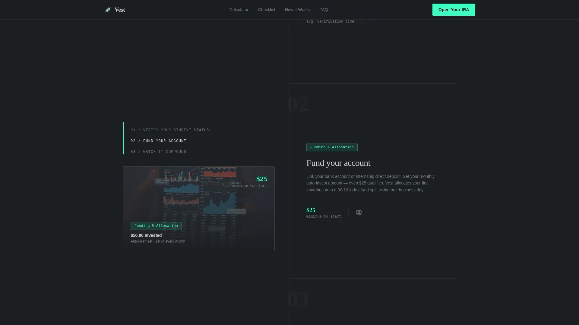
- A mobile-first layout with a persistent bottom call-to-action bar and a three-step "How It Works" sticky scroll
Feature list
This section covers the core built-in capabilities that make Vest work as a high-converting student finance landing page.
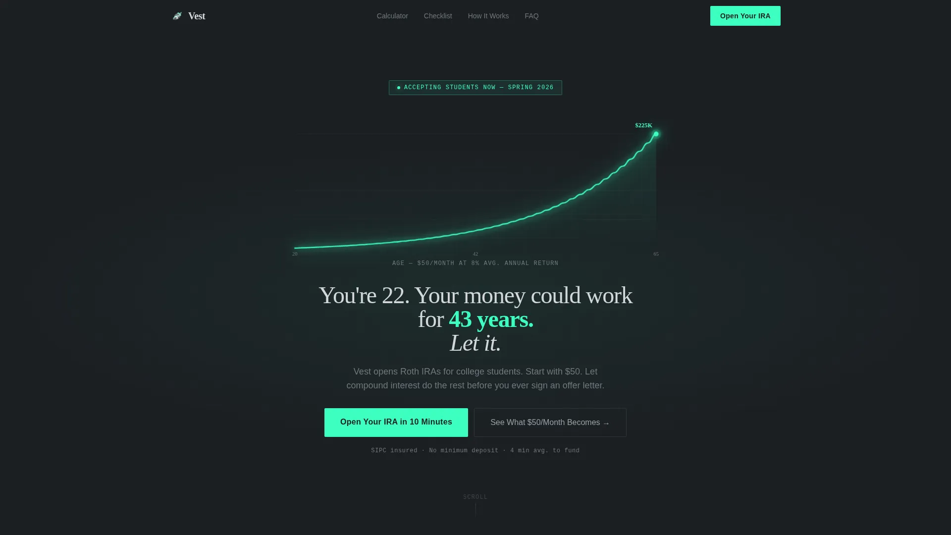
Animated Compound Interest Hero
The header is a full-bleed dark screen with a single SVG curve drawn in electric mint (#3DFFC0). The line starts at age 20 and climbs to age 65, with a dollar figure that animates upward at the endpoint. Below the curve, a single line of chrome-white text delivers the core message with no stock photos and no clutter.
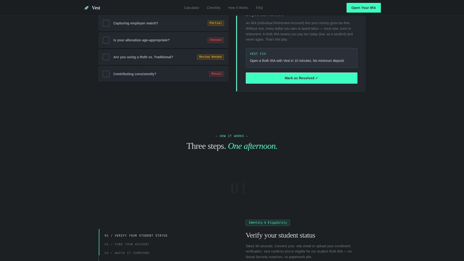
Split-Screen Checklist with Scroll-Linked Panel
The left panel displays a sequential retirement readiness checklist. As each item is reviewed, the right panel responds with explanations, calculators, and status indicators that shift from red to mint. This scroll-triggered interaction replaces financial anxiety with visible, step-by-step clarity.
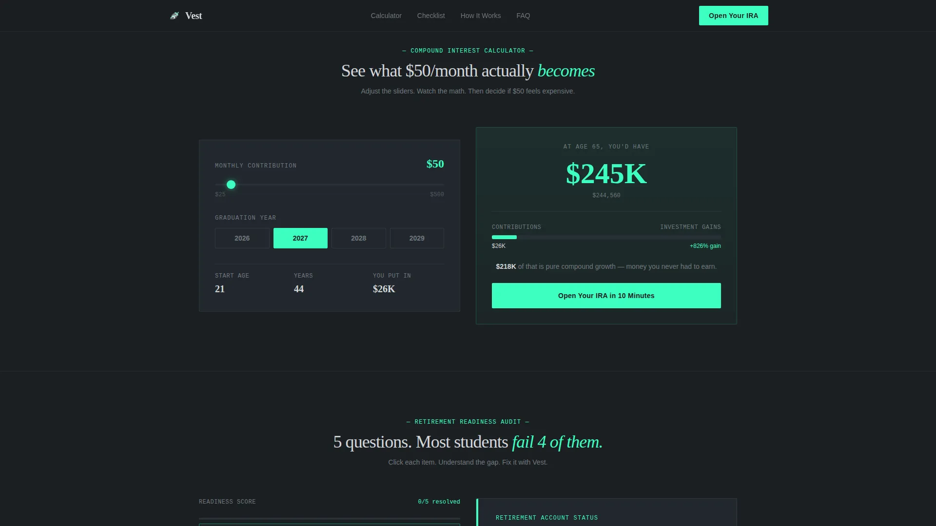
Inline Compound Interest Calculator
A personalized calculator lets visitors enter their graduation year and see what $50 per month becomes over time. The projection builds emotional stake before the primary call to action appears, making the decision to open an account feel like the logical next move.
Three-Time Click-Through Call to Action
The primary call to action, "Open Your IRA in 10 Minutes," appears in the hero, again at the checklist midpoint, and as a persistent bottom bar on mobile. No form lives on the page. Every click routes directly to the account opening flow.
Trust Section with Stats and Testimonials
A social proof section includes a stats bar with specific dollar metrics, student count figures, and testimonial cards with real names and schools. A Frequently Asked Questions accordion sits below to handle common objections before they become exit clicks.
Corporate Precision Typography System
Display numerals use Fraunces, a typeface that makes large financial figures feel deliberate and serious. Body copy uses DM Sans for clean readability. Together they create a dark-terminal aesthetic that feels like a brokerage platform, not a student app.
Page sections overview
| Section | Purpose |
|---|---|
| Hero with Curve | Animate compound growth and deliver the primary call to action |
| Inline Calculator | Personalize $50/month projection by graduation year |
| Checklist Audit | Walk students through retirement readiness with scroll-linked responses |
| How It Works | Explain the three-step account opening process with sticky scroll |
| Trust and Stats | Build credibility with student metrics and testimonial cards |
| FAQ Accordion | Answer common objections before they cause a drop-off |
| Footer | Provide navigation and closing context using a horizontal flow layout |
Design & branding system
The visual identity follows a Corporate Precision theme built around a Monochrome Steel color system. The palette is deliberately cold and serious, the kind of design that makes routing numbers feel safe.
- Core colors: deep gunmetal (#1B1F23) background, brushed steel (#71797E) for mid-level text, polished chrome (#D4D7DB) for primary type, and electric mint (#3DFFC0) reserved exclusively for interactive elements and live numbers
- Typography: Fraunces for large financial display numerals, DM Sans for all body and user interface text
- The electric mint accent is used only on call-to-action buttons, checklist resolution states, and the animated SVG curve, never decoratively
Mobile & speed optimization
The template is built mobile-first, recognizing that most college students will land on this page from a phone. The layout adapts without losing the impact of the split-screen concept.
- The persistent bottom call-to-action bar keeps "Open Your IRA in 10 Minutes" visible throughout the entire mobile scroll session
- Animations and scroll-triggered interactions are handled client-side while static sections use server components, keeping the page responsive even with high interactivity
- The split-screen checklist reflows into a single-column stacked layout on smaller screens without breaking the scroll-linked right-panel logic
How this template helps you convert
Every design and copy decision in this template pushes toward one outcome: a student clicking through to open a retirement account. The page removes friction at every stage.
- The animated hero makes compound interest visceral in the first five seconds, establishing urgency before a single word of body copy is read.
- The inline calculator personalizes the outcome by graduation year, so the student sees their specific projection rather than a generic claim.
- The three-time call-to-action placement, combined with the persistent mobile bar, ensures the next step is always one tap away regardless of where the visitor stops scrolling.
Other information about this template
This template is localized for United States audiences. Currency displays in USD and date formatting follows MM/DD/YYYY conventions. The project is scoped for a FinTech or personal finance product operating in a business-to-consumer model.
- Animation level is high throughout: SVG path drawing, count-up number transitions, scroll-triggered checklist state changes, and a pulsing compound curve in the hero
- Interactivity is handled via an inline calculator, a checklist toggle system, and a scroll-linked right panel, all designed to work without routing visitors away from the page until they are ready to convert
- The footer follows a horizontal flow pattern suitable for a minimal FinTech brand with a small navigation footprint
Theme
Corporate Precision
Creative direction
Checklist & Audit
Color system
Monochrome Steel
Style
Split Screen (50/50)
Direction
Click-Through
Page Sections
Animated Compound Interest Hero
Split-screen Checklist with Scroll-linked Panel
Inline Compound Interest Calculator
Three-time Click-through Call to Action
Trust Section with Stats and Testimonials
Corporate Precision Typography System
Related questions
Does this template include a signup form?
Can I customize the electric mint accent color?
Is the compound interest calculator functional out of the box?
Does the checklist section need a backend connection?
Who is this landing page template designed for?


