Veterinary Consulting Specialist Blog Website Template
Vettech is an editorial-style landing page template built for veterinary technology consultants. It uses a split-screen layout, rich typographic hierarchy, and a structured click-through flow to present case profiles, credentials, and a clear call to action. The design feels like a premium industry journal, authoritative, warm, and built to earn a specialist's trust before asking for a click.
by Rocket studio
Quick summary
Vettech is a single-page, click-through landing page template designed for veterinary technology and practice-efficiency consultants. It pairs editorial magazine aesthetics with a persuasion structure built on human proof, real clinic stories, credentials, and a primary call to action that leads to a diagnostic questionnaire. The result is a page that feels credible before it ever asks for anything.
Who this template is for
This template is designed for independent consultants and boutique firms operating inside veterinary practice management and technology. If your work involves guiding clinics through complex operational or digital transitions, this page positions you with the gravity that work deserves.
- Veterinary technology consultants managing practice information management system (PIMS) migrations and telemedicine rollouts
- Practice-efficiency advisors working with multi-location veterinary groups or hospital directors preparing for accreditation audits
- Independent specialists whose credibility depends on visible proof, real clients, real clinics, real outcomes
What problem this template solves
Most consultant landing pages feel generic. They lead with a service list and a contact form, leaving prospective clients with no sense of who they are trusting or why. For veterinary technology consultants, that gap is costly. Clinic owners and hospital directors make high-stakes decisions. They need to see demonstrated expertise before they reach out.
- Clinic decision-makers skim past pages that feel like brochures and move on
- Consultants with deep credentials and real case histories have no structured format to show them
- A click-through flow without a form demands a page that earns intent before asking for it
What you get with this template
You get a complete, section-structured landing page built around editorial storytelling and a deliberate click-through conversion path. Every layout decision serves one purpose: stacking human proof until curiosity becomes intent.
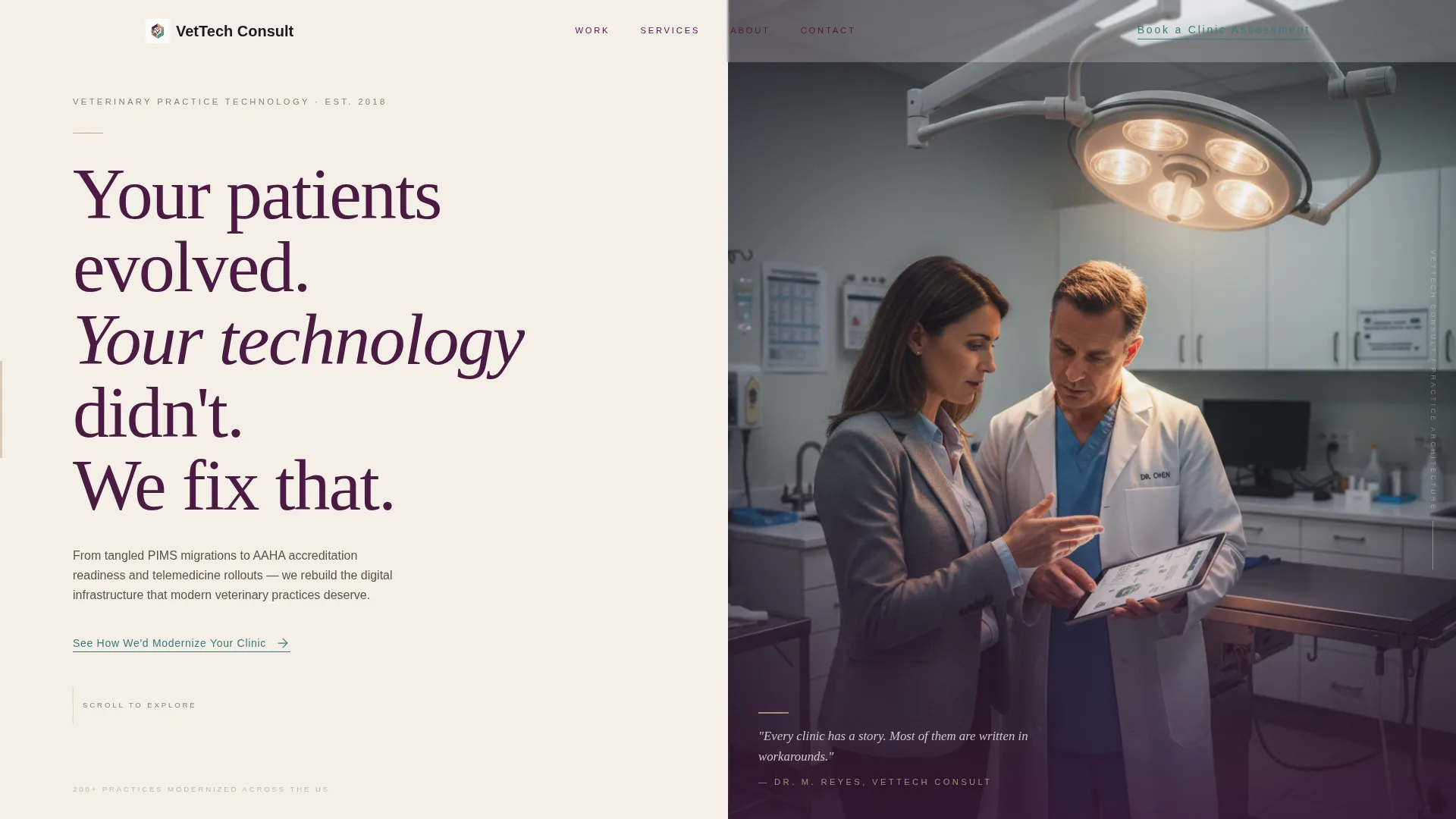
- A full-viewport split-screen header with a bold serif manifesto on the left and an editorial portrait space on the right
- Alternating split-screen case profile sections, a typographic credentials strip, and three strategically placed calls to action
- A cohesive Plum Executive color system with predefined roles for headlines, backgrounds, accent highlights, and interactive link states
Feature list
The Vettech template ships with a focused set of layout components and design decisions drawn directly from the editorial brief. Each one contributes to the page's authority and conversion logic.
Full-Viewport Split-Screen Header
The header divides the screen evenly. The left side carries a bold serif manifesto set in deep plum against warm parchment. The right side frames an editorial portrait of the consultant in a real clinic setting. This opening sets tone and credibility in a single glance.
Alternating Case Profile Layout
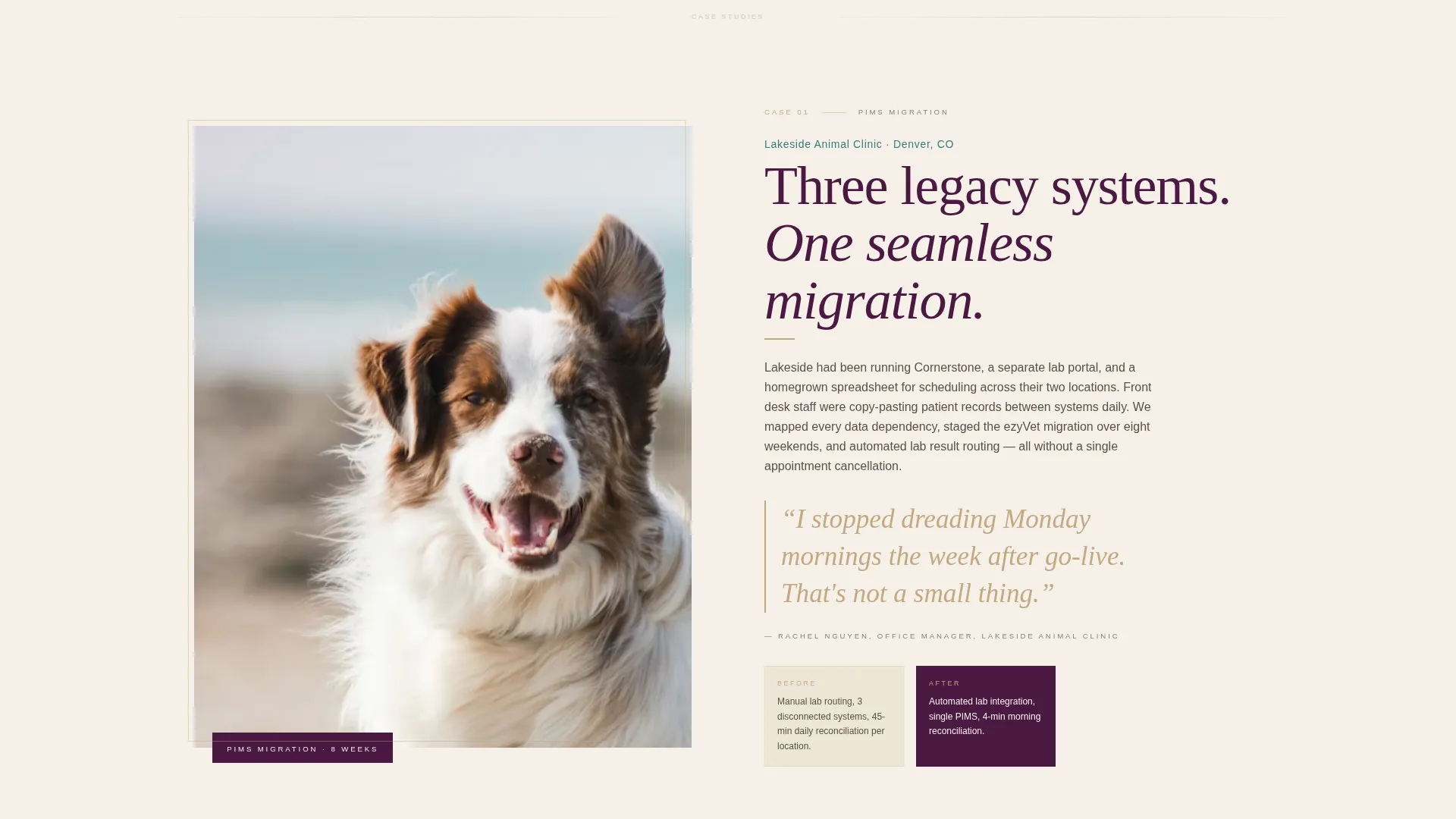
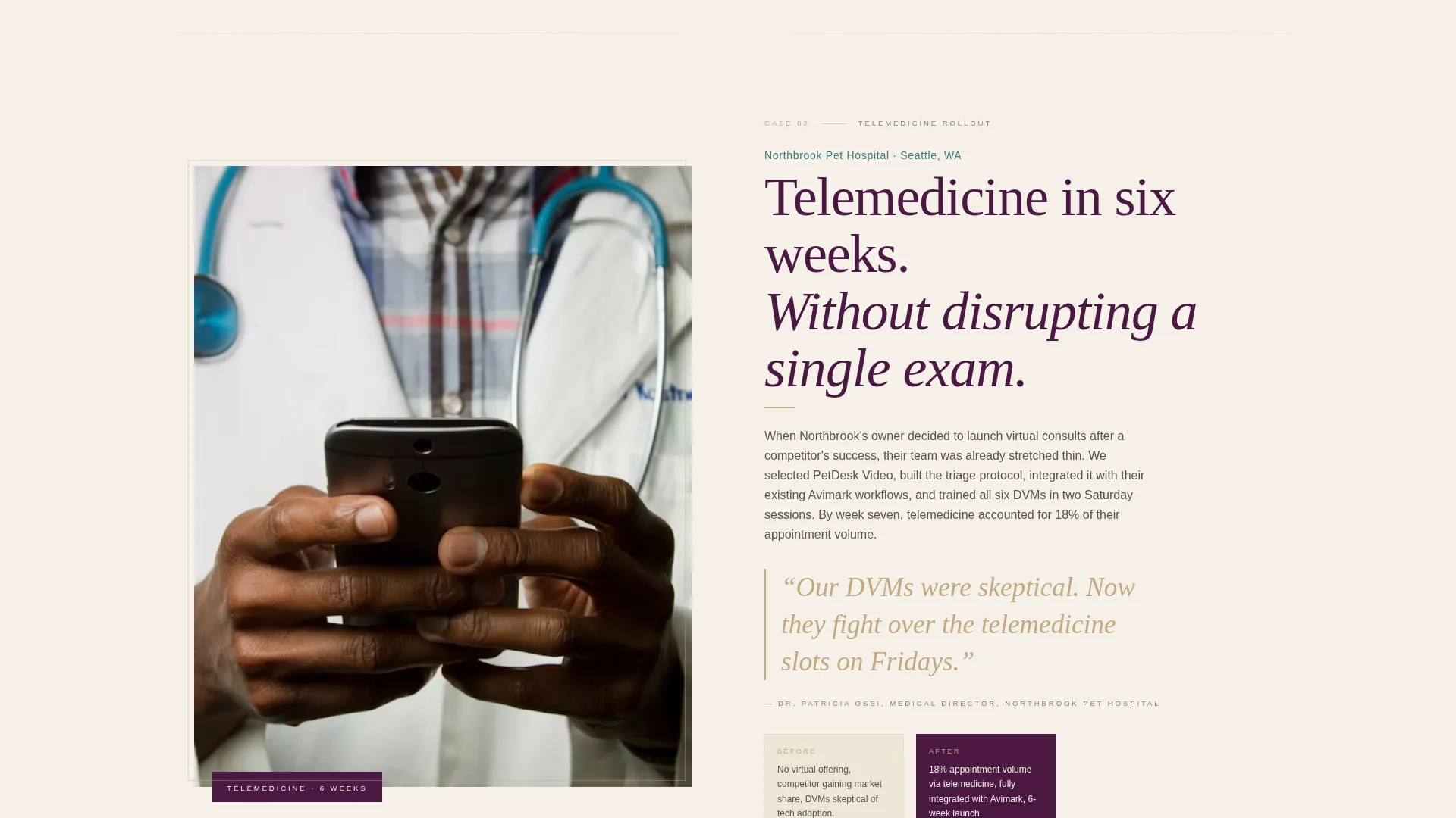
Past the header, each engagement section pairs a clinic team portrait with a transformation narrative. The layout alternates between portrait-left and story-right, then story-left and portrait-right, creating a visual rhythm that feels like turning magazine pages. Pull-quote callouts from practice managers are set as typographic interrupters.
Full-Width Editorial Testimonials
Testimonials are not boxed widgets. They are full-width editorial spreads that include the speaker's name, professional title, and clinic context, formatted like a magazine byline. This presentation makes social proof feel substantive rather than decorative.
Typographic Credentials Strip
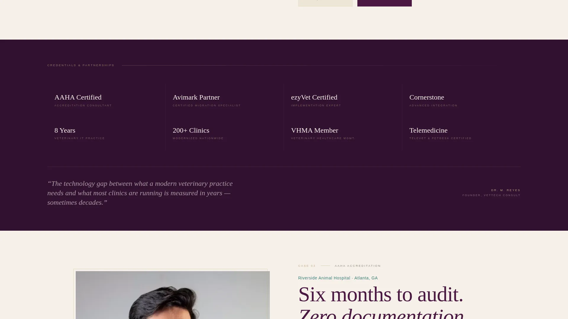
A quiet interlude section presents certifications, vendor partnerships, and years of veterinary information technology experience as a structured typographic block. It reads the way a magazine fact sidebar reads, informative, restrained, and immediately credible.
Three-Point Call-to-Action Structure
The primary call to action, "See How We'd Modernize Your Clinic," appears three times. First as an understated teal text link beneath the manifesto. Then as a full-width parchment-on-plum button after the third case profile. Finally, anchored at the page close. Each placement matches the reader's growing intent.
Click-Through Diagnostic Flow
There is no form on this page. The single call to action leads to a separate diagnostic questionnaire that asks about practice size, current practice management system, and top operational frustration. The landing page's only job is to earn that click.
Page sections overview
| Section | Purpose |
|---|---|
| Split-Screen Header | Open with manifesto and consultant portrait |
| Teal Text Link | First subtle call-to-action placement |
| Case Profile One | First clinic story with portrait and narrative |
| Case Profile Two | Second alternating story and portrait layout |
| Case Profile Three | Third engagement story before primary button |
| Credentials Strip | Display certifications and vendor partnerships |
| Full-Width Button | High-intent call-to-action after social proof |
| Editorial Testimonials | Full-width byline-style social proof spreads |
| Page Close Anchor | Final call-to-action placement at scroll end |
Design & branding system
The Plum Executive color system drives every visual decision on this page. Each color has a defined role, and no color is used arbitrarily. The result is a palette that feels like a velvet-bound professional reference text, rich, authoritative, and easy to read.
- Deep plum (#4A1942) anchors headline type and section dividers; warm parchment (#F5F0E8) breathes across backgrounds; muted rose-gold (#C4A882) highlights pull-quotes and credential badges
- Surgical-scrub teal (#3B7A7A) is reserved exclusively for links and hover states, drawing the eye precisely where a click should happen
- Typography follows an editorial serif system, with large display type on the header manifesto and elegant serif body copy across case profile narratives
Mobile & speed optimization
The split-screen layout and editorial portrait components are built with responsive stacking in mind. On smaller screens, the 50/50 splits reflow into single-column vertical sequences without losing the page's visual hierarchy or narrative logic.
- Split-screen sections collapse to stacked portrait-over-text blocks on mobile viewports
- The credentials strip and full-width testimonial spreads adapt to narrower layouts while preserving typographic readability
- Call-to-action placements remain visible and tappable at each scroll position on touch devices
How this template helps you convert
This template is built around a single conversion event: earning the click to the diagnostic questionnaire. Every design and content decision contributes to that outcome in a specific sequence.
- The manifesto header establishes authority and names the problem within the first three seconds of a visit, giving clinic decision-makers an immediate reason to keep reading.
- Alternating case profiles and editorial testimonials stack progressive human proof, moving the reader from initial interest toward genuine intent across the scroll.
- The three-point call-to-action structure meets the reader at three different stages of readiness, so the invitation to click feels natural rather than forced.
Other information about this template
This template fits inside the Professional Services and Veterinary Consulting category and is aligned with a partnership and business-to-business landing page direction. It is designed for consultants whose work touches practice management system transitions, telemedicine rollouts, automated lab integrations, and accreditation preparation, the kinds of engagements where trust is the real product.
- The template style is Editorial Magazine, and the creative direction follows a Testimonial Mosaic pattern using alternating portrait and narrative layouts
- The header concept uses a Giant Headline Left structure, which places the manifesto copy in the dominant left position of the split screen
- This template is well suited for veterinary compliance consultants, veterinary IT specialists, and practice-efficiency advisors who serve clinic owners, hospital directors, and multi-location veterinary group practices
Theme
Service Utility
Creative direction
Testimonial Mosaic
Color system
Arctic White
Style
Editorial/Magazine
Direction
Partnership/B2B
Page Sections
Full-viewport Split-screen Header
Alternating Case Profile Sections
Full-width Editorial Testimonials
Typographic Credentials Strip
Three-point Call-to-action Structure
Click-through Diagnostic Flow
Related questions
Does this template include a contact form?
Who is this template designed for?
How many times does the call to action appear on the page?
Can I replace the placeholder images with my own photos?
Can I adjust the color palette to match my own brand?



