Trusted House Sitter Reviews Landing Page Template
Vetted is a B2B-focused landing page template for a house sitter reviews and testimonials platform. Built for property management firms, relocation agencies, and luxury real estate brokerages, it uses a zigzag layout to walk partners through a transparent verification process. Every section builds trust layer by layer, from timestamped client reviews to third-party audit trails, ending in a clear partnership call to action.
by Rocket studio
Quick summary
Vetted is a single-page, partnership-directed landing page template for a curated house sitter registry. It uses an alternating zigzag layout to reveal the review verification process step by step. The visual identity follows an Executive Suite theme with a Navy Authority color system, creating a tone of quiet, earned authority designed to convert professional property partners.
Who this template is for
This template is built for platforms and service providers in the house sitter space that need to sell trust to institutional partners, not individual homeowners. It speaks directly to decision-makers managing large property portfolios who need verifiable, audit-ready credentials before attaching their brand to any vendor.
- Property management firms overseeing vacation rental portfolios
- Relocation agencies placing executive families into unfamiliar cities
- Luxury real estate brokerages offering concierge services between client closings
What problem this template solves
Most review pages for house sitters look the same: a wall of five-star ratings with no context and no proof. For professional partners, that is not enough. They need to see the process behind the score, not just the score itself.
- Partners cannot verify that testimonials are tied to real, completed bookings
- There is no visible dispute resolution or quality-control workflow to reassure institutional clients
- Standard review layouts do not communicate the depth of a rigorous, audit-backed vetting system
What you get with this template
You get a fully structured landing page designed to present a verified house sitter review platform to B2B partners. Every section is purpose-built to move a skeptical decision-maker from awareness to a partnership inquiry.
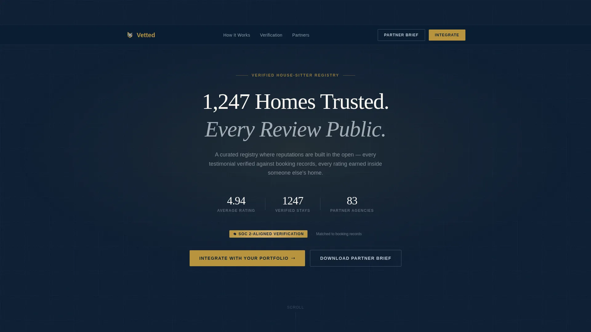
- A dark full-bleed header with a pulsing radial gold glow, a confidence-setting headline, and three animated micro-stat counters
- A zigzag alternating content layout that pairs real testimonials with their corresponding verification methods
- Two conversion paths: a full partnership intake form and a gated PDF download for prospects who need more time
Feature list
This template ships with a focused set of components, each tied directly to the goal of converting professional property partners into platform integrators.
Animated Micro-Stat Header
The header opens on a midnight navy field with a soft radial gold glow at center. Three counters animate on page load, displaying average rating, total verified stays, and partner agencies onboarded. A single platinum headline anchors the visual field with immediate credibility.
Zigzag Testimonial and Verification Layout
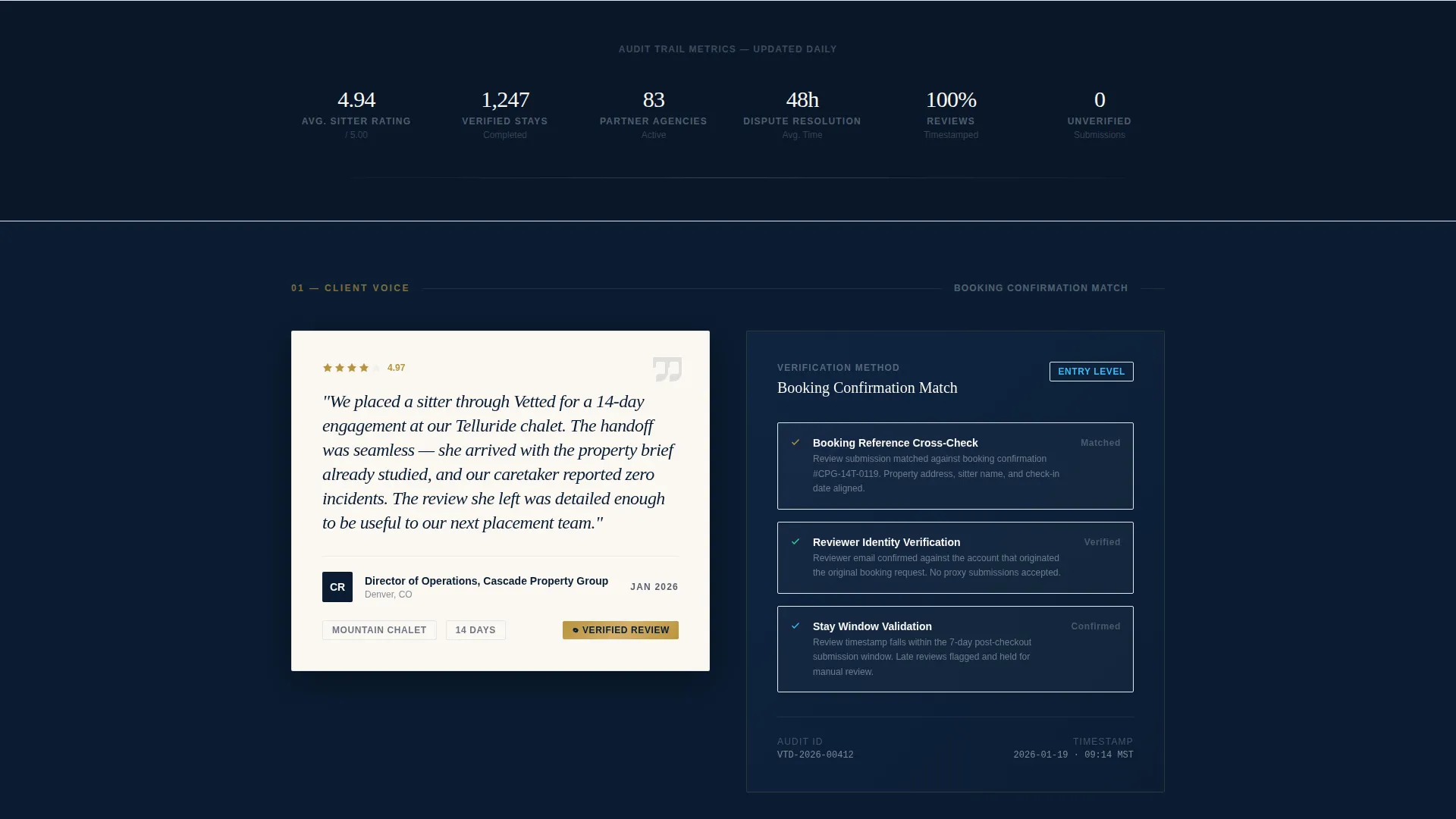
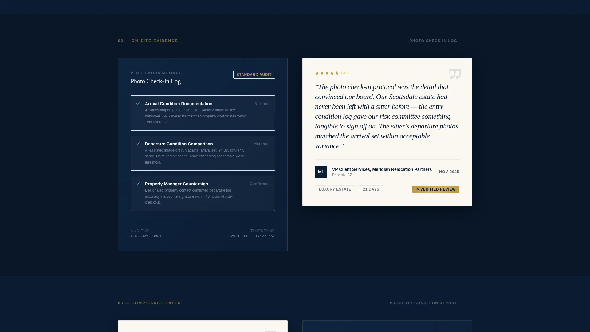
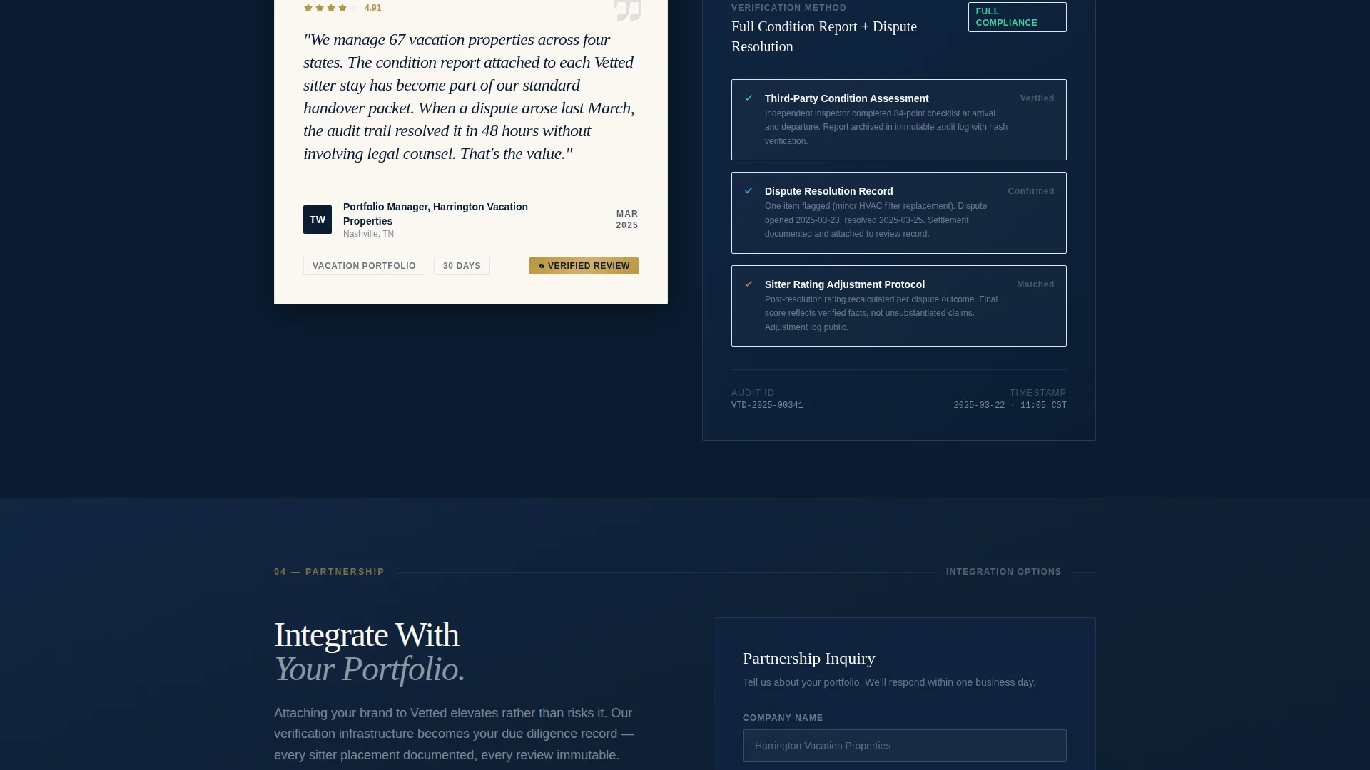
Each alternating row pairs a real client testimonial on one side with its corresponding verification method on the other. Reviewer initials, property type, and stay duration appear on the left block. The right block explains the verification step used: booking confirmation match, photo check-in log, or property condition report.
Escalating Trust Sequence
The zigzag sections are ordered by increasing rigor. The scroll starts with client quotes, moves into third-party verification workflows, and finishes with dispute resolution records. This progression teaches partners that the platform is an audit trail, not just a review wall.
Dual Conversion Path System
After the third zigzag section, the primary call to action appears: "Integrate With Your Portfolio." This links to a partnership form capturing company name, portfolio size, integration type, and work email. A secondary path, "Download the Partner Brief," gates a PDF behind email-only capture for warmer leads not yet ready to commit.
Partnership Intake Form
The form is designed for institutional lead capture. It includes a portfolio size dropdown with four tiers (1 to 10, 11 to 50, 51 to 200, and 200 or more properties) and an integration type selector covering API feed, white-label widget, and referral partnership options.
Footer-Anchored Call to Action
The primary "Integrate With Your Portfolio" call to action repeats at the footer, ensuring that partners who scroll the full page are met with a clear next step without needing to scroll back up.
Page sections overview
| Section | Purpose |
|---|---|
| Full-bleed header | Opens with headline, glow, and animated stats |
| Zigzag row one | Client quote paired with booking confirmation match |
| Zigzag row two | Testimonial paired with photo check-in log |
| Zigzag row three | Review paired with property condition report |
| Primary call to action block | First "Integrate With Your Portfolio" prompt |
| Zigzag row four | Dispute resolution record and process detail |
| Partnership intake form | Captures company, portfolio size, integration type |
| PDF download gate | Email-only capture for the Partner Brief |
| Footer call to action | Repeats primary partnership call to action |
Design & branding system
The visual identity follows an Executive Suite theme. Every color and typographic choice is designed to feel like the lobby of a private members' club: controlled, deliberate, and quietly expensive.
- Midnight command navy (#0B1D33) anchors all backgrounds; brushed platinum (#C5CED6) handles secondary surfaces and divider lines; warm ivory (#FAF7F2) fills testimonial card faces
- Deep gold (#B8943E) appears exclusively on verification badges, star ratings, and hover states, reserving its weight for moments that signal earned credibility
- Platinum-toned type on dark fields keeps headlines readable at any viewport size, while the warm ivory card faces create visual relief across long scroll sequences
Mobile & speed optimization
The layout is built with a mobile reading flow in mind. Each zigzag row stacks cleanly on smaller screens so the testimonial and its paired verification detail remain clearly connected rather than disjointed.
- Full-bleed header and radial glow scale down without losing their visual impact on phone-sized viewports
- The partnership form fields and dropdown selectors are sized for touch interaction, reducing friction for users completing the form on a tablet or phone
How this template helps you convert
The page is engineered around a single idea: trust compounds before the ask arrives. By the time a partner reaches the call to action, the verification infrastructure has already made the case.
- The animated micro-stats in the header (average rating, verified stays, partner agencies) establish numeric credibility in the first three seconds of a visit, before any copy is read.
- The escalating zigzag sequence moves the partner through a structured argument: real quotes, then proof of verification, then dispute process rigor, so each scroll deepens confidence rather than repeating the same claim.
- The dual conversion path removes a common barrier: partners who are not ready to commit to an integration can still enter the funnel by downloading the Partner Brief, giving the platform a warm lead to follow up with.
Other information about this template
This template is part of a broader set of Professional Services templates designed for platforms operating in trust-sensitive niches. A few additional details worth noting:
- The template style is Zigzag/Alternating, a layout particularly effective for B2B pages that need to walk viewers through a multi-step proof, rather than a simple feature list
- The header concept uses a Dark Full-Bleed with Glow treatment, a design choice that signals premium positioning without relying on photography
- The creative direction label for this template is Transparent Process, meaning the layout is structured to reveal how something works, not just assert that it does
- The landing page direction is Partnership/B2B, so all copy, form fields, and calls to action are calibrated for institutional decision-makers rather than individual consumers
- This template is suitable for house sitter online presence platforms that have already built a verified review dataset and are ready to present it to enterprise-level property partners
Theme
Executive Suite
Creative direction
Transparent Process
Color system
Navy Authority
Style
Zigzag/Alternating
Direction
Partnership/B2B
Page Sections
Animated Micro-stat Header
Zigzag Testimonial and Verification Layout
Escalating Trust Sequence
Dual Conversion Path System
Partnership Intake Form
Footer-anchored Call to Action
Related questions
Who is the primary audience for this landing page template?
What makes this layout different from a standard testimonial page?
Is the PDF download gate included in the template?
Can the partnership form fields be customized?
What color system does this template use?



