Driving Instructor Reviews & Comparison Landing Page
Vetted is a driving instructor directory landing page built around trust signals that actually matter. It combines a sortable comparison table with verified pass rates, hourly rates, and review scores, interrupted by real student testimonials. A three-step "Match Me With an Instructor" form turns engaged visitors into qualified leads without pressure.
by Rocket studio
Quick summary
Vetted is a single-page driving instructor directory designed for high-anxiety decision-making. It pairs a sortable comparison table with in-depth student stories, groups instructors by area, and ends every section cluster with a pull-quote strip. A progressive three-step form captures leads once the comparison table has already done the convincing.
Who this template is for
This template is built for anyone running a driving instructor directory or review platform. It suits operators who need to present multiple instructors clearly while earning the trust of visitors who feel genuinely nervous about the decision.
- Driving instructor directory owners who want to present vetted, data-backed listings
- Parents researching instructors for a teenager approaching their test
- Operators targeting first-time learners and test retakers who need honest, comparable information
What problem this template solves
Most directory pages list instructors the same way a spreadsheet lists contacts. There is no warmth, no context, and no proof. Visitors leave without booking because the data alone does not answer the question they are actually asking: "Can this person actually help me pass?"
- Bare listings offer pass rates without any supporting student stories, making numbers feel unverifiable
- Generic lead forms appear before trust is established, so visitors ignore or abandon them
- No structured comparison makes it hard to weigh instructors side by side on the factors that matter
What you get with this template
You get a fully structured, single-page layout that combines data and human storytelling in a deliberate sequence. Every component is designed to move a hesitant visitor from curiosity to confidence before the lead form ever appears.
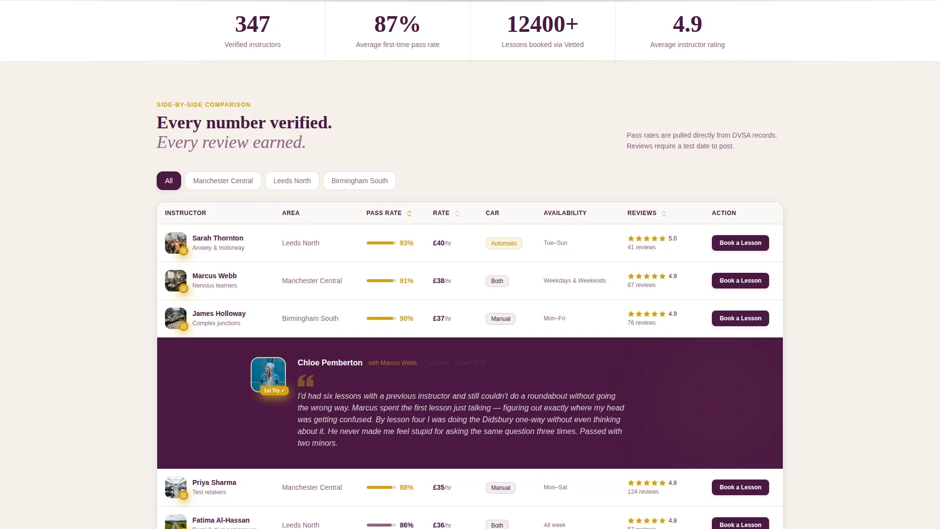
- A sortable comparison table showing pass rates, hourly rates, car type, availability, and average review score
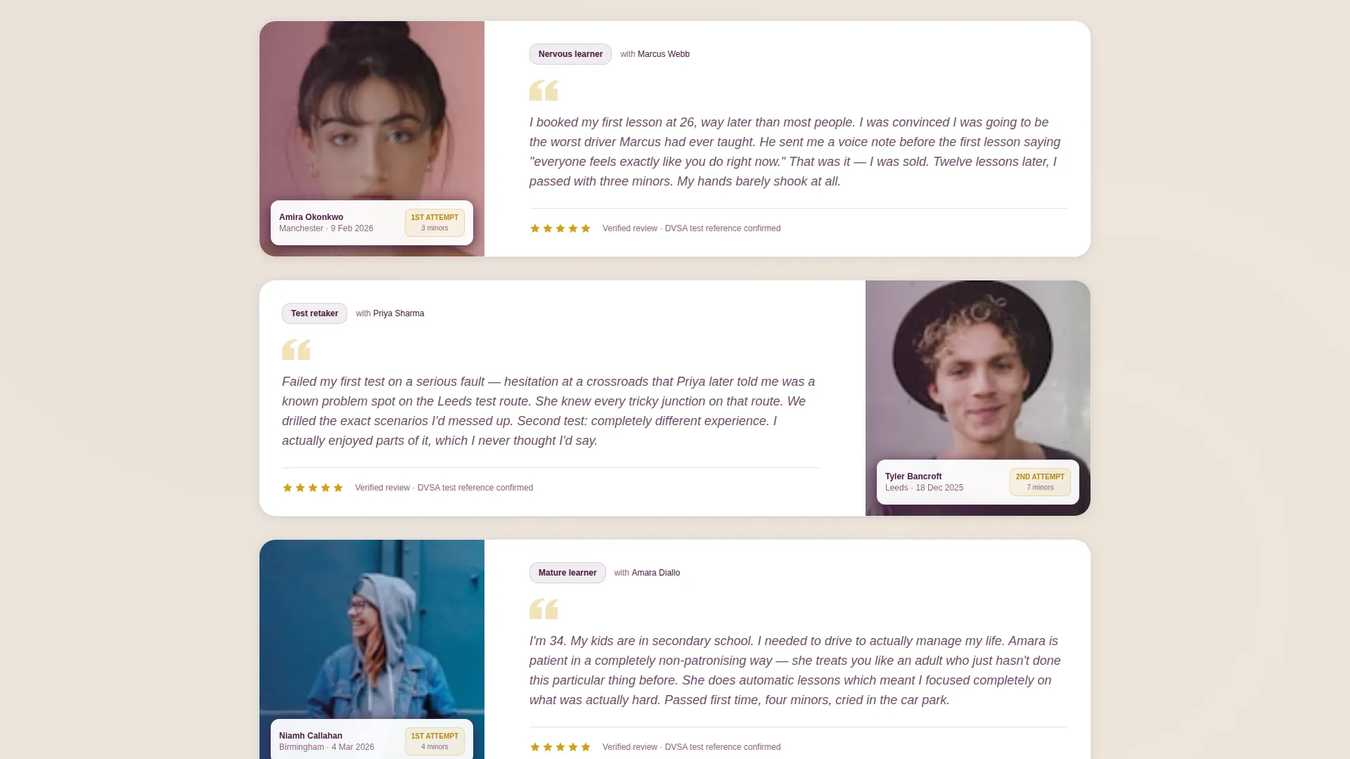
- Full-width student testimonial blocks placed between every three table rows, each with a photo, test date, and personal story
- A three-step progressive lead form that captures postcode, experience level, and budget without overwhelming the visitor
Feature list
A paragraph introducing this section: the features below reflect every functional component described in the brief. Each one plays a specific role in building the trust that turns a late-night search into a booked lesson.
Sortable Instructor Comparison Table
The comparison table displays pass rates, hourly rates, car type, lesson availability, and average review scores in sortable columns. Instructors are grouped by area, making it easy to filter relevant options at a glance.
Embedded Student Testimonial Blocks
After every three rows of comparison data, the page breaks into a full-width testimonial block. Each block shows a student photo, their test date, and a personal one-paragraph story. The layout creates a rhythm of data interrupted by real human experience.
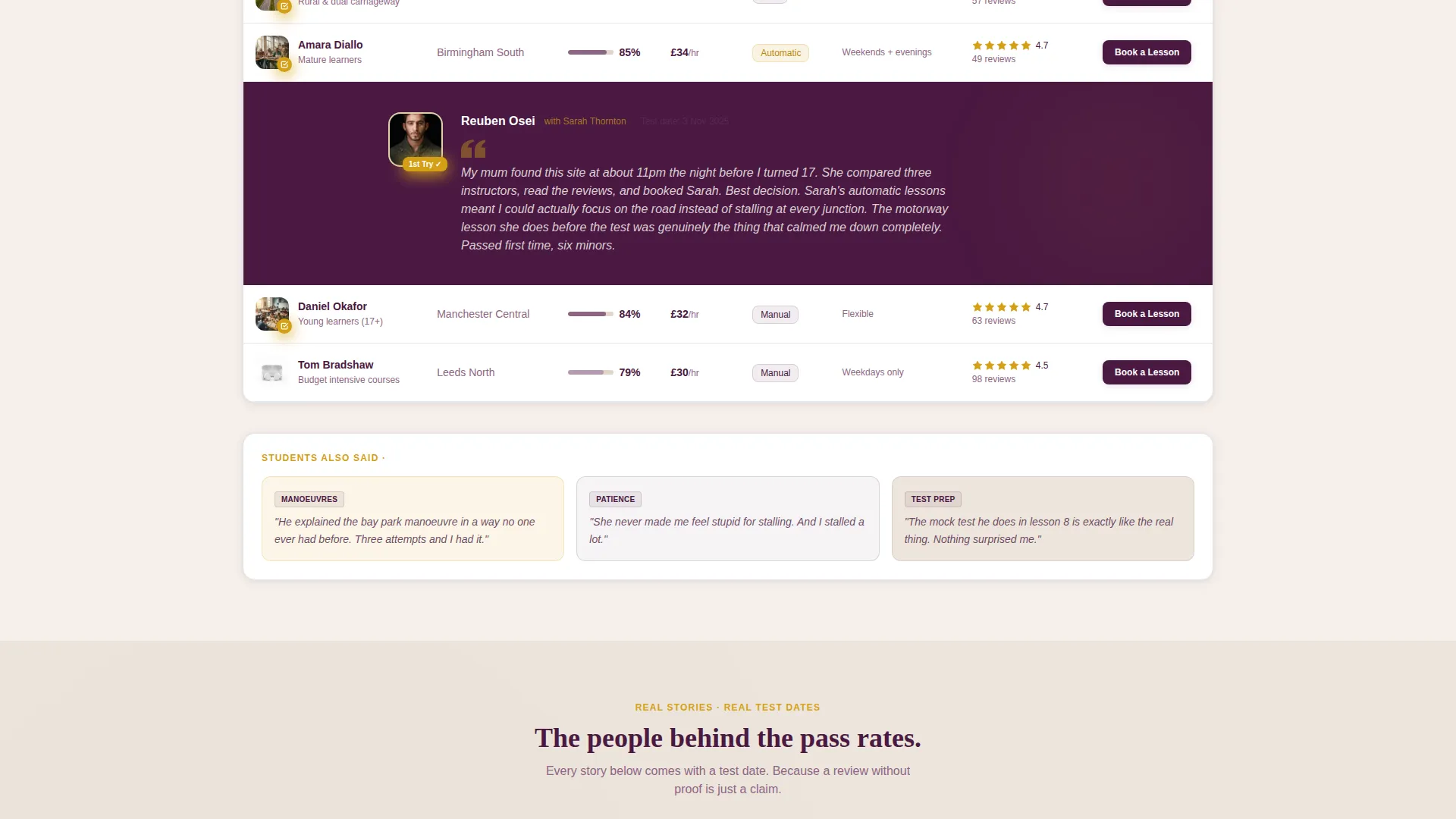
"Students Also Said" Pull-Quote Strip
Each instructor area group closes with a pull-quote strip surfacing recurring praise or honest warnings from students. This gives visitors a quick read on patterns across multiple reviews without having to scroll back through individual entries.
Three-Step Progressive Lead Form
The "Match Me With an Instructor" call to action opens a three-step form. Step one collects postcode and preferred lesson times. Step two asks about experience level. Step three captures budget range and transmission preference. The form only asks for what it needs, in the right order.
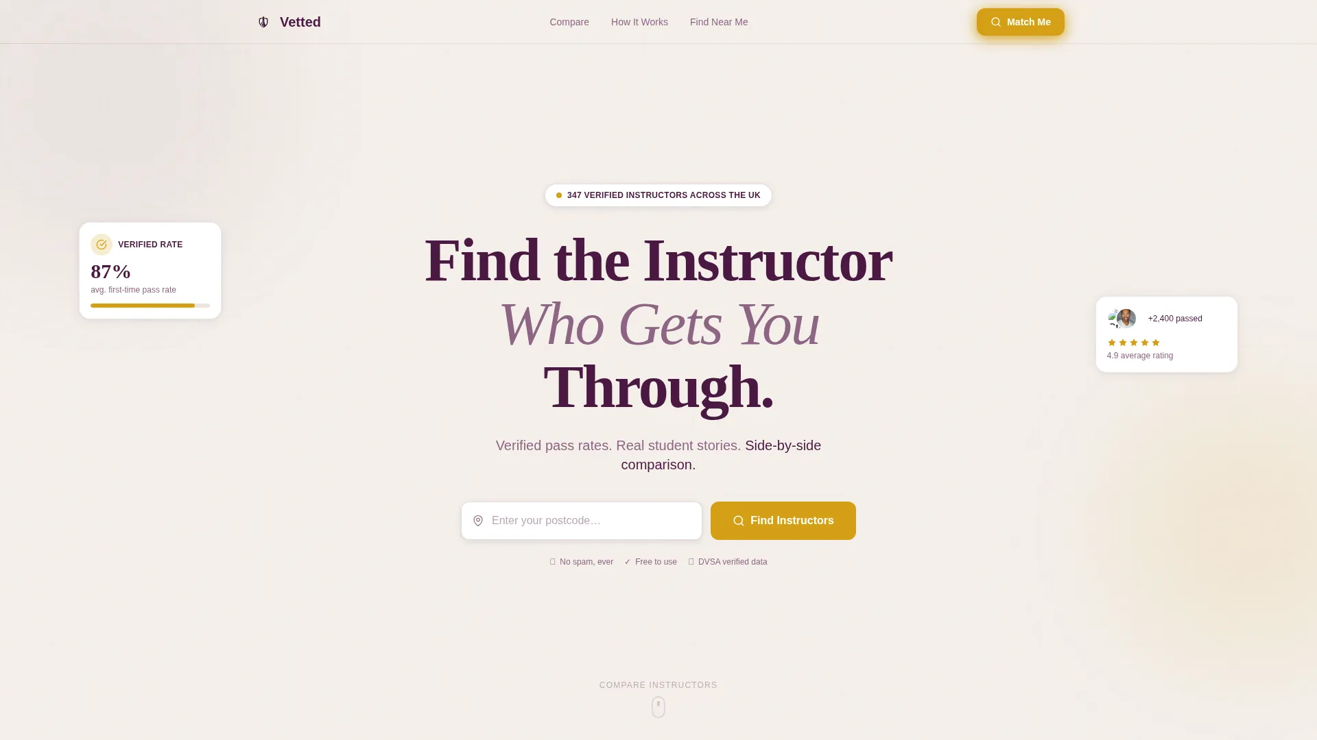
Giant Headline Centered Header
The page opens with a full-width header anchored by large plum type and a single-line subhead. A postcode search field sits below the headline with an amber call-to-action button that pulses gently. No imagery competes with the message.
Area-Grouped Instructor Sections
Instructors are organised into geographic clusters. Each cluster presents instructor listings with human-readable profiles rather than flat database rows. The grouping helps local visitors find relevant results without scrolling through unrelated listings.
Page sections overview
| Section | Purpose |
|---|---|
| Centered headline header | Communicates the core promise and prompts a postcode search immediately |
| Instructor comparison table | Lets visitors sort and compare instructors by pass rate, price, and availability |
| Student testimonial blocks | Breaks data rows with real student stories to build emotional credibility |
| Area group clusters | Groups instructors by location so visitors surface locally relevant results |
| Pull-quote strip | Surfaces recurring student feedback patterns at the end of each area group |
| Match Me form | Captures lead details across three focused steps after trust is established |
Design & branding system
The visual identity follows a Service Utility theme using a Plum Executive color system. The palette feels authoritative and warm at the same time, like a leather-bound notebook left on the passenger seat of a car you actually trust.
- Deep plum (#4A1942) anchors headers and navigation; muted mauve (#8E6585) handles secondary text and table borders; warm parchment (#F5F0EB) fills the background
- Decisive amber (#D4A017) is reserved for star ratings, call-to-action buttons, and verified badges, making trust signals instantly recognisable
- Typography follows the Team and People creative direction, presenting each instructor as a human being rather than a row in a database
Mobile & speed optimization
The layout is built for visitors who are searching late at night on a phone, often in a moment of low confidence. Every component is structured to load clearly and behave predictably on small screens.
- The comparison table is designed to remain readable and scrollable on narrow viewports without losing column clarity
- Testimonial blocks and pull-quote strips stack vertically on mobile, keeping the data-to-story rhythm intact
- The progressive lead form steps are designed to feel manageable one screen at a time, reducing abandonment on smaller devices
How this template helps you convert
The page is engineered so that the lead form only appears after the visitor has already been convinced. Conversion is the outcome of a deliberate content sequence, not a design trick.
- The comparison table gives visitors objective data to evaluate instructors side by side, reducing uncertainty before any commitment is asked of them
- Testimonial blocks and pull-quote strips introduce real student outcomes at regular intervals, making the pass rate numbers feel credible rather than claimed
- The three-step progressive form arrives at the moment of highest intent, asking only focused questions so the visitor feels guided rather than interrogated
Other information about this template
This template sits at the intersection of Professional Services and the driving instructor online presence niche. It is purpose-built for lead generation through a comparison-first, story-second content structure.
- The template style is Comparison Table, meaning the primary content engine is a structured, sortable data layout
- The header concept is Giant Headline Centered, designed to communicate conviction through typographic scale rather than imagery
- The theme is Service Utility, reflecting a page that prioritises practical decision-making over decorative presentation
- The landing page direction is Lead Generation, with every section positioned to earn the final form submission rather than request it upfront
Theme
Service Utility
Creative direction
Team & People
Color system
Plum Executive
Style
Comparison Table
Direction
Lead Generation
Page Sections
Sortable Instructor Comparison Table
Embedded Student Testimonial Blocks
Students Also Said Pull-quote Strip
Three-step Progressive Lead Form
Giant Headline Centered Header
Area-grouped Instructor Sections
Related questions
Can I add or remove instructors from the comparison table?
How does the three-step form work on mobile?
Can I change the geographic area groupings?
What makes this different from a standard directory listing page?
Is the pulsing amber button the only animated element?



