Italy Travel Complete Booking Website Template
Viaggio is a storybook landing page template built for boutique Italy luxury travel agencies. It guides visitors through a cinematic day-in-the-life scroll, from a misty Florentine dawn to a Veronese midnight, using parallax photography, sunset gradients, and a curated four-step booking flow that moves prospects from wonder to a reserved planning session.
by Rocket studio
Quick summary
Viaggio is a single-page luxury travel template designed for agencies selling private, curated Italy experiences. The Organic Flow theme, warm sunset gradients, and Day-in-the-Life narrative structure work together to make every scroll feel like a lived moment. Visitors end the page ready to book, not just browse.
Who this template is for
This template suits agencies and travel designers who sell highly personal, high-value Italy itineraries. It speaks to a clientele that has already seen Italy and wants something quieter, rarer, and more intimate.
- Boutique travel agencies specializing in private Italy tours and bespoke itinerary design
- Independent travel architects serving affluent couples, milestone anniversary travelers, and multi-generational families
- Luxury hospitality brands offering villa stays, wine-country experiences, or coastal sailing packages
What problem this template solves
Generic travel pages list destinations. Viaggio makes visitors feel the journey before they ever inquire. The challenge for luxury agencies is earning emotional buy-in fast enough to justify a premium price point. This template solves that by building narrative momentum with every scroll.
- Visitors often leave travel pages before reaching the call to action; the Day-in-the-Life structure holds attention through a compelling sensory arc
- High-value buyers hesitate without trust; the storybook scroll and curated booking steps signal craft and intention
- Agencies struggle to differentiate from tour operators; this template communicates the "whispered version" of Italy through visual storytelling alone
What you get with this template
You receive a complete, production-ready landing page layout built around a single narrative arc. Every section is pre-structured and intentionally sequenced to move a visitor from curiosity to commitment.
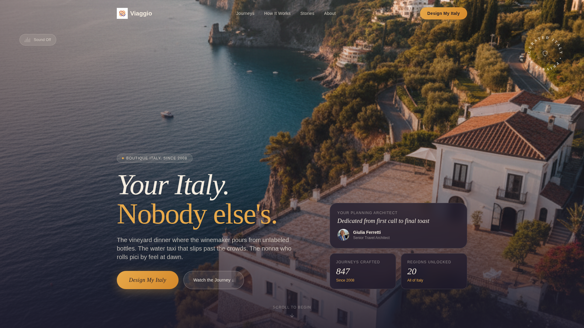
- A full-screen video header section with ambient sound toggle and a hand-written script headline
- Five Day-in-the-Life content sections spanning dawn through midnight, each with parallax-layered photography and italic sensory transition lines
- A four-step curated booking flow with illustrated Italy map, travel month selector, experience intensity picker, and a €500 planning session deposit step
- A mid-scroll "Gift This Journey" secondary path linked to a printable voucher checkout
- A floating amber "Design My Italy" pill call-to-action and an anchored repeat at the journey's end
Feature list
This template is built from distinct, purposeful components. Each one serves the larger goal of turning a page visit into a planning session reservation.
Full-Screen Video Header
A slow-motion twelve-second aerial shot drifts over the Amalfi coastline at sunset. The camera tilts from cerulean water through terraced lemon groves to a candlelit terrace. Sound is off by default, but a waveform icon lets visitors toggle cicadas, clinking porcelain, and a distant church bell.
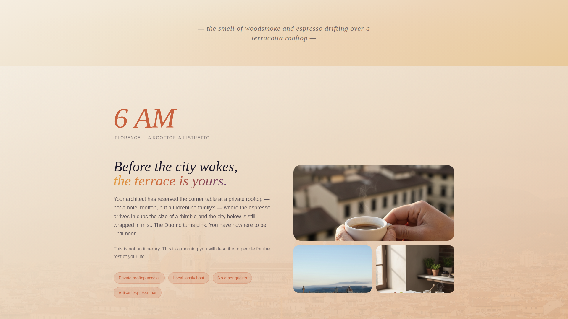
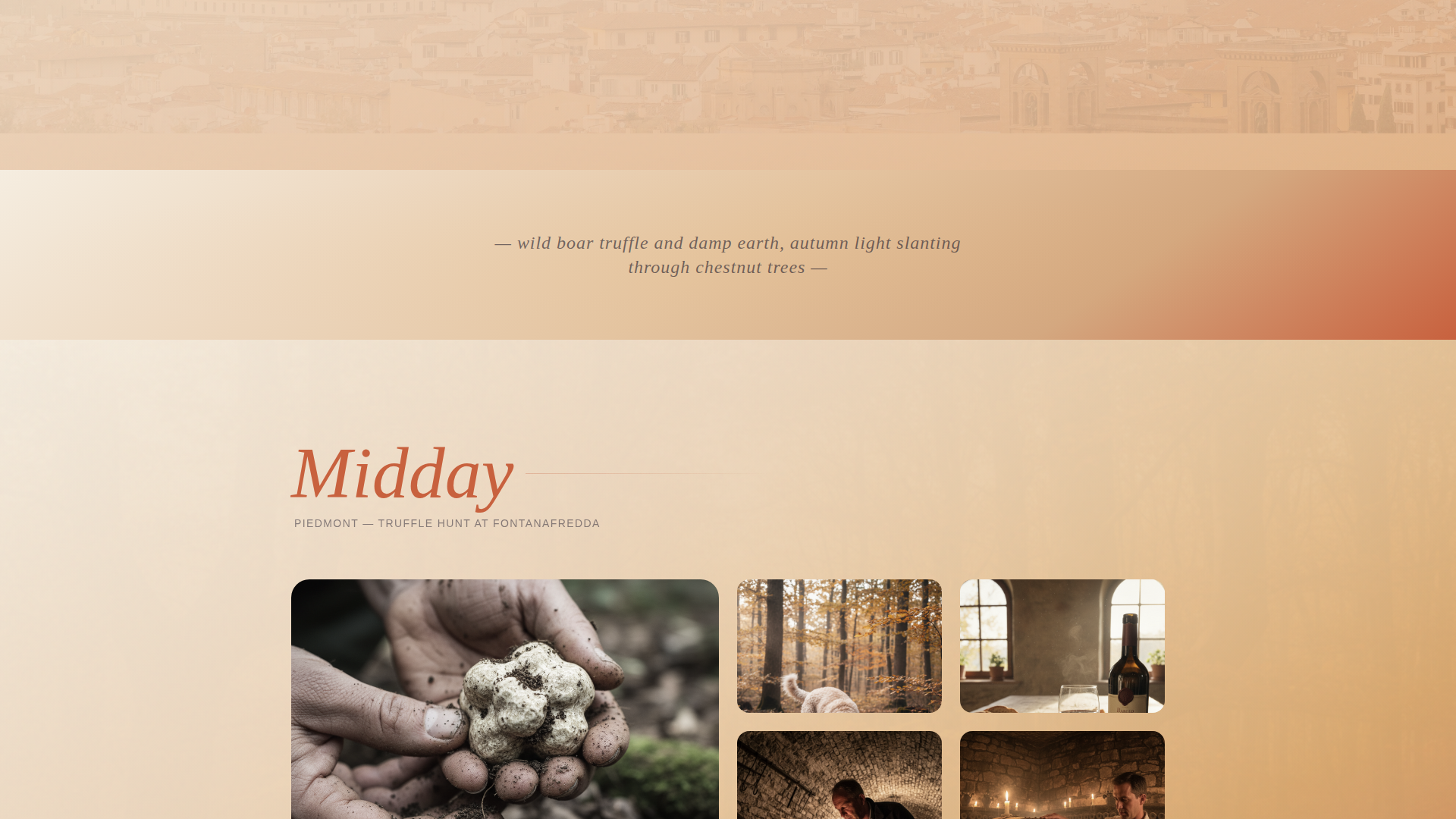
Day-in-the-Life Scroll Narrative
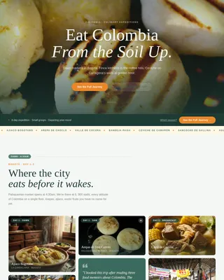
Five full-page sections each represent one hour of a day in Italy, from a 6 a.m. espresso in Florence to a midnight opera echo in Verona. The gradient palette shifts gradually from warm to cool as the day progresses, mirroring the arc of natural light.
Parallax Photography Layers
Foreground imagery of food, hands, and close detail moves faster. Background landscapes move slower and more cinematically. The result makes scrolling feel like turning pages of a private travel journal.
Curated Four-Step Booking Flow
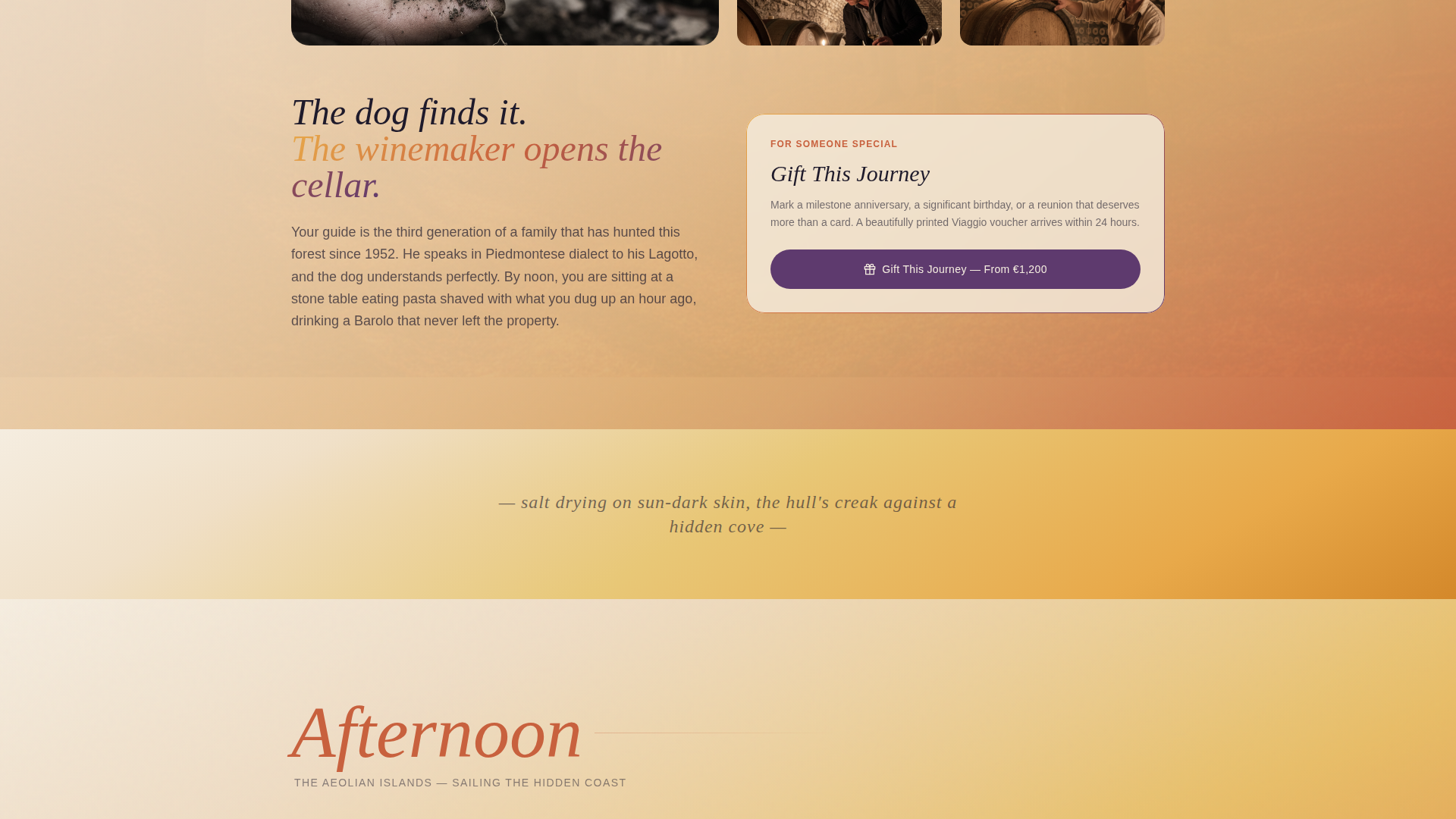
Step one lets visitors select regions on an illustrated map of Italy. Step two captures travel month and party size. Step three presents three experience intensities: Slow and Intimate, Cultural Deep-Dive, and Adventure and Coast. Step four requests a €500 deposit to reserve a session with a dedicated travel architect.
Sensory Transition Lines
Between each hour-section, a single italic line of sensory detail bridges the mood. Examples include phrases like "the smell of wild rosemary crushed underfoot" and "salt drying on sun-dark skin." These micro-moments sustain immersion across section breaks.
Gift Journey Secondary Path
A mid-scroll "Gift This Journey" call-to-action targets anniversary and birthday buyers. It links to a printable voucher checkout, opening a second revenue path without disrupting the primary booking narrative.
Page sections overview
| Section | Purpose |
|---|---|
| Video Hero Header | Opens with cinematic aerial footage and the brand headline |
| Sound Toggle Icon | Lets visitors activate ambient Italy audio |
| Dawn Espresso Section | Begins the Day-in-the-Life arc at 6 a.m. Florence |
| Truffle Hunt Section | Carries the story into a Piedmont midday experience |
| Aeolian Sailing Section | Shifts the narrative to an afternoon on the coast |
| Vespa Ride Section | Builds golden-hour warmth along the Appian Way |
| Midnight Opera Section | Closes the daily arc in a Veronese arena |
| Sensory Transition Lines | Bridges each hour-section with one italic sensory phrase |
| Gift Journey call to action | Offers a mid-scroll voucher path for gifting buyers |
| Design My Italy call to action | Floating pill and anchored end-page booking prompt |
| Four-Step Booking Flow | Guides visitors through region, date, style, and deposit |
Design & branding system
The visual identity follows an Organic Flow theme built on a Sunset Gradient color system. Every color is grounded in the Italian landscape: warm earth, ripe fruit, late afternoon stone, and deep night sky. Gradients wash behind sections like watercolor on wet paper, with no hard edges.
- Core palette: terra di Siena (#C8613E), ripe fig purple (#5E3A6E), golden hour amber (#E8A94A), travertine cream (#F5EDE0), and deep Tuscan night (#1E1A2B) for text
- Buttons glow in amber with fig-purple hover states; body text rests in Tuscan night on travertine cream for unhurried, effortless reading
- Typography blends hand-written script for hero headlines with clean, readable body type to balance romance and clarity
Mobile & speed optimization
The layout is designed to translate the cinematic desktop experience to smaller screens without losing its immersive feel. Parallax effects and video elements are structured to adapt gracefully across device widths.
- The full-screen video header and parallax layers are built to scale across desktop, tablet, and mobile viewports
- The four-step booking flow uses a clean step-by-step layout that remains navigable on touch screens
- Gradient backgrounds and typography sizing are set to maintain visual warmth and readability at any screen size
How this template helps you convert
The page is built around a single commercial principle: make the visitor live the trip before they pay for it. By the time a reader reaches the final section, they are not imagining Italy, they are remembering it. That emotional shift is what drives inquiry.
- The Day-in-the-Life narrative builds desire progressively across five sections, so interest compounds rather than fades with each scroll
- The floating "Design My Italy" call-to-action appears early as a pill and repeats at the journey's end, capturing buyers at peak intent without interrupting the story
- The four-step booking flow reduces friction by turning a complex travel inquiry into a structured, confidence-building sequence that ends with a clear, low-barrier next step
Other information about this template
Viaggio is suited to any agency looking to position itself at the premium end of the Italy travel market. The template's narrative structure and visual depth are intentionally built to justify higher price points and longer planning timelines.
- The "Gift This Journey" voucher path makes the template useful for seasonal gifting campaigns around anniversaries, milestone birthdays, and holidays
- The illustrated Italy map in step one of the booking flow adds a tactile, editorial quality that reinforces the agency's curatorial identity
- The template style is Storybook and Full-Page, optimized for the Direct Sales landing page direction, meaning every design choice serves the goal of moving visitors toward the planning session deposit
- The template is well suited for showcasing experiences across Tuscany, the Amalfi Coast, Piedmont, Sicily, the Aeolian Islands, Umbria, and the Veneto
Theme
Organic Flow
Creative direction
Day-in-the-Life
Color system
Sunset Gradient
Style
Storybook/Full-Page
Direction
Direct Sales
Page Sections
Full-screen Video Header with Sound Toggle
Day-in-the-life Scroll Narrative
Parallax-layered Photography
Curated Four-step Booking Flow
Sensory Transition Lines
Gift Journey Secondary Path
Related questions
What kind of travel agency is this template designed for?
How does the four-step booking flow work?
Can this template support a gift voucher offering?
What is the Day-in-the-Life narrative structure?
What does the sensory transition feature look like?